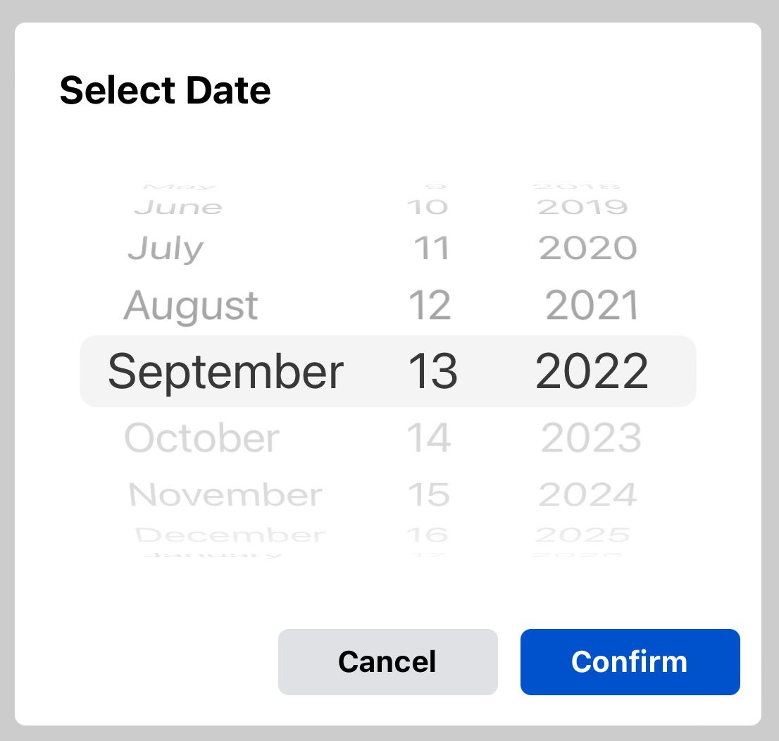
A cross platform fully customisable and advanced date picker with flexibility to customise variety options built on top of react-native-date-picker.
This is a React Native Customized Date Picker with following main features:
📱 Supports iOS, Android
🕑 3 different modes: Time, Date, DateTime
🎨 Fully Customizable
- Xcode >= 11.6
- React Native >= 0.57.
- If using React Native 0.64, 0.64.2 or later must be used.
- If using Expo, SDK 42 or later must be used. If using Expo SDK 44, 44.0.4 or later must be used.
- Download package and dependency with npm or yarn
npm install react-native-date-picker react-native-customized-datepicker
yarn add react-native-date-picker react-native-customized-datepicker
- Install pods
cd ios && pod install
- Rebuild the project
npx react-native run-android
npx react-native run-ios
import React, { useState } from "react";
import { Button } from "react-native";
import DatePicker from "react-native-customized-datepicker";

export default () => {
  const [date, setDate] = useState(new Date());
  const [open, setOpen] = useState(false);

  return (
    <>
      <Button title="Open" onPress={() => setOpen(true)} />
      <DatePicker
        date={date}
        visible={open}
        onConfirm={setDate}
        onCancel={setOpen}
      />
    </>
  );
};import React, { useState } from "react";
import { Button } from "react-native";
import DatePicker from "react-native-customized-datepicker";
export default () => {
const [date, setDate] = useState(new Date());
const [open, setOpen] = useState(false);
return (
<>
<Button title="Open" onPress={() => setOpen(true)} />
<DatePicker
date={date}
visible={show}
onCancel={setShow}
onConfirm={setDate}
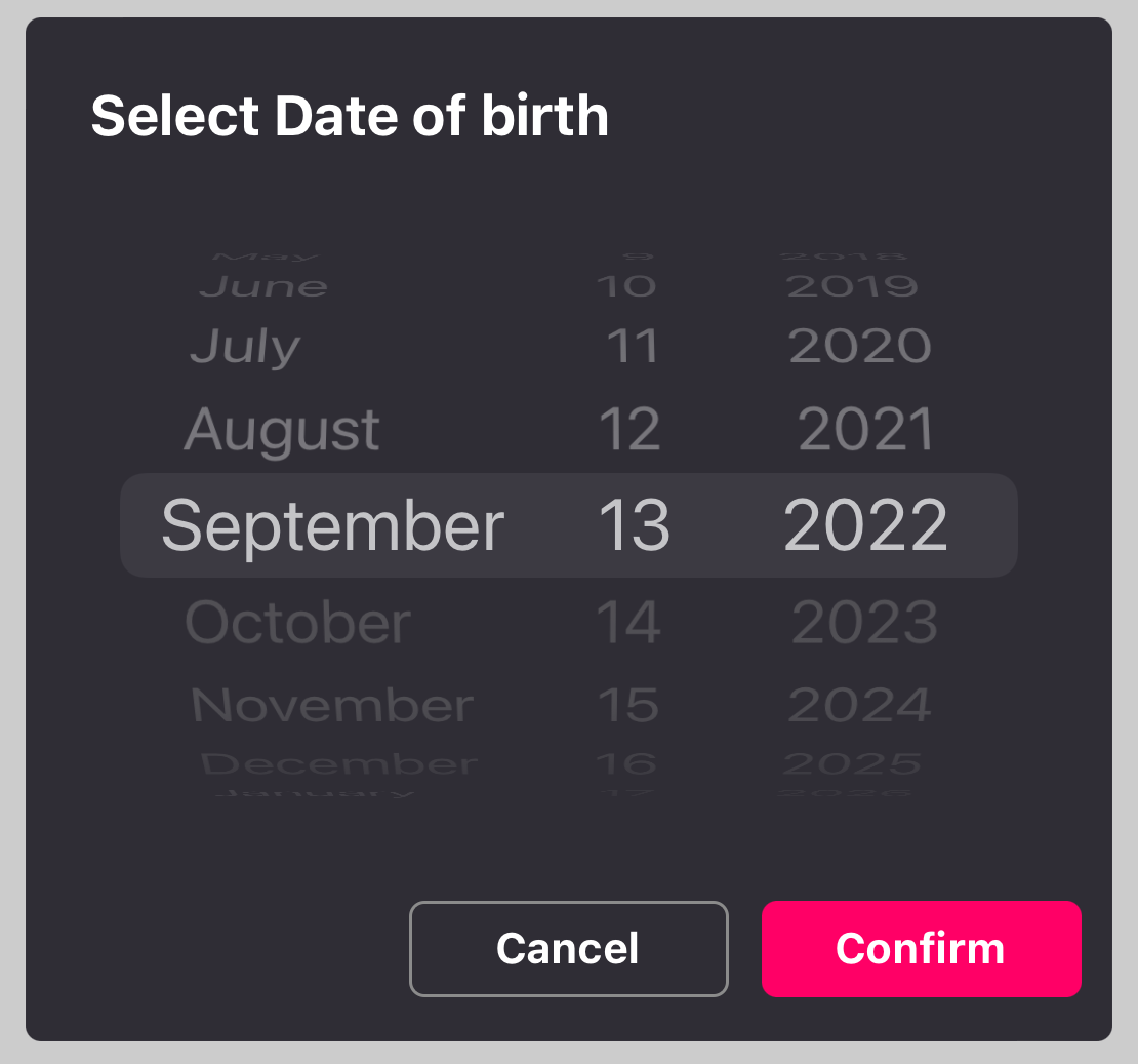
backgroundColor={"#2F2D35"}
pickerTitle={"Select Date of birth"}
pickerTitleColor={"#FFFFFF"}
cancelButtonTextColor={"#FFFFFF"}
cancelButtonBackground={"#2F2D35"}
cancelButtonBorderColor={"#8B8B8B"}
confirmButtonBackground={"#FF0066"}
theme={"dark"}
/>
</>
);
};| Prop | Description |
|---|---|
date |
The default or selected date [Required] |
visible |
Boolean indicating datepicker visibility [Required] |
onConfirm |
Callback function to get the date after user selects and click on confirm button [Required] |
onCancel |
Callback function to dismiss datepicker after user clicks on cancel button [Required] |
backgroundColor |
Background Color of the datepicker default to #FFFFFF [Optional] |
pickerTitle |
Title of datepicker default to "Select Date" [Optional] |
pickerTitleColor |
Text Color of title default to #000000 [Optional] |
cancelButtonText |
Cancel button text default to "Cancel" [Optional] |
confirmButtonText |
Confirm button text default to "Confirm" [Optional] |
confirmButtonBackground |
Confirm button background color default to #0052CC [Optional] |
cancelButtonBackground |
Cancel button background color default to #E0E1E4 [Optional] |
cancelButtonTextColor |
Cancel button text color default to #000000 [Optional] |
confirmButtonTextColor |
Confirm button text color default to #FFFFFF [Optional] |
cancelButtonBorderColor |
Cancel button border color default to "transparent" [Optional] |
minimumDate |
Minimum selectable date For Example : new Date("2004-09-12") [Optional] |
maximumDate |
Maximum selectable date For Example : new Date("2022-01-31") default to today's date [Optional] |
androidVariant |
Choose from 2 android style variants. "iosClone", "nativeAndroid" [Optional] |
modalAnimationType |
Modal apperance animatiion choose from 3 animation variants "fade", "none" , "slide"; default to "slide" [Optional] |
theme |
iOS 13+: The theme of the modal. "light", "dark", "auto". default to "auto". [Optional] |
mode |
The date picker mode. "datetime", "date", "time" [Optional] |
cancelButtonStyle |
Cancel Button Style [Optional] |
confirmButtonStyle |
Confirm Button Style [Optional] |
buttonTextSize |
Font Size for the buttons [Optional] |
modalHeight |
Height for the datpicker[Optional] |
modalWidth |
Width for the datepicker[Optional] |
If you like this package, consider giving it a github star ⭐ Also, PR's are welcome!

