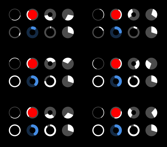
UIView subclass written in Swift to show circular progress.
Is your app using it? Let me know!
Please see the included example app for sample usage.
- Indeterminate (spins infinitely)
- Normal (set progress between 0.0 and 1.0)
- Mixed (can make it indeterminate, but also animate progress to 1.0)
/**
 Enables or disables the indeterminate (spinning) animation

 - parameter enabled:    Whether or not to enable the animation (defaults to `true`)
 - parameter completion: An optional closure to execute after the animation completes
 */
open func enableIndeterminate(_ enabled: Bool = true, completion: CompletionBlock? = nil) {}
/**
Updates the progress bar to the given value with the optional properties
- parameter progress: The progress to update to, pinned between `0` and `1`
- parameter animated: Whether or not the update should be animated (defaults to `true`)
- parameter initialDelay: Sets an initial delay before the animation begins
- parameter duration: Sets the overal duration that the animation should complete within
- parameter completion: An optional closure to execute after the animation completes
*/
open func updateProgress(_ progress: CGFloat, animated: Bool = true, initialDelay: CFTimeInterval = 0, duration: CFTimeInterval? = nil, completion: CompletionBlock? = nil) {}Note: Most properties below are @IBInspectable, but I don't use Interface Builder personally so let me know if you see any issues.
var trackTintColor: UIColor
- The color of the empty progress track (gets drawn over)
var progressTintColor: UIColor
- The color of the progress bar
var innerTintColor: UIColor?
- The color the notched out circle within the progress area (if there is one)
var roundedCorners: Bool
- Sets whether or not the corners of the progress bar should be rounded
var thicknessRatio: CGFloat
- Sets how thick the progress bar should be (pinned between
0.01and1)
var clockwiseProgress: Bool
- Sets whether or not the animation should be clockwise
var timingFunction: CAMediaTimingFunction
- A timing function defining the pacing of the animation. Defaults to ease in, ease out.
var progress: CGFloat
- Getter for the current progress (not observed from any active animations)
var indeterminateProgress: CGFloat
- Sets how much of the progress bar should be filled during an indeterminate animation, pinned between
0.05and0.9 - Note: This can be overriden / animated from by using updateProgress(...)
var indeterminateDuration: CFTimeInterval
- Controls the speed at which the indeterminate progress bar animates
Swift, ARC & iOS 8+, Autolayout or springs and struts
Please feel free to fork and create a pull request for bug fixes or improvements, being sure to maintain the general coding style, adding tests, and adding comments as necessary.
This library is effectively a Swift port of DACircularProgress with some minor changes to the API, so it should be fairly easy to act as a replacement. I really loved that library but unfortunately it wasn't being maintained.


