1.0.0 - 2020/01/18 - Initial release
1.0.1 - 2020/02/05 - Minor bug fixes
2020/08/23 - Documentation corrections (no code changes)
Swift 4.0 or above
iOS 11.0 or above
HKUIButton enhances the functionality of UIButton by providing these additional features:
Allows you to dynamically calculate the corner radius base on one of the followings:
-
the width of the button
-
the height of the button
-
the length of the shorter edge of the button (width or height)
-
the length of the longer edge of the button (width or height)
-
Or, it can also be set to a constant
This is useful for buttons that change size (e.g. device rotation) or for catering to screen sizes of different devices (e.g., iPhone vs. iPad)
Allows you to dynamically calculate the font size base on one of the followings:
- the width of the button
- the height of the button
- the length of the shorter edge of the button (width or height)
- the length of the longer edge of the button (width or height)
This is useful for buttons that change size (e.g. device rotation) or for catering to screen sizes of different devices (e.g., iPhone vs. iPad)
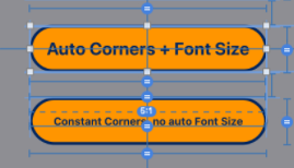
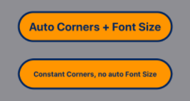
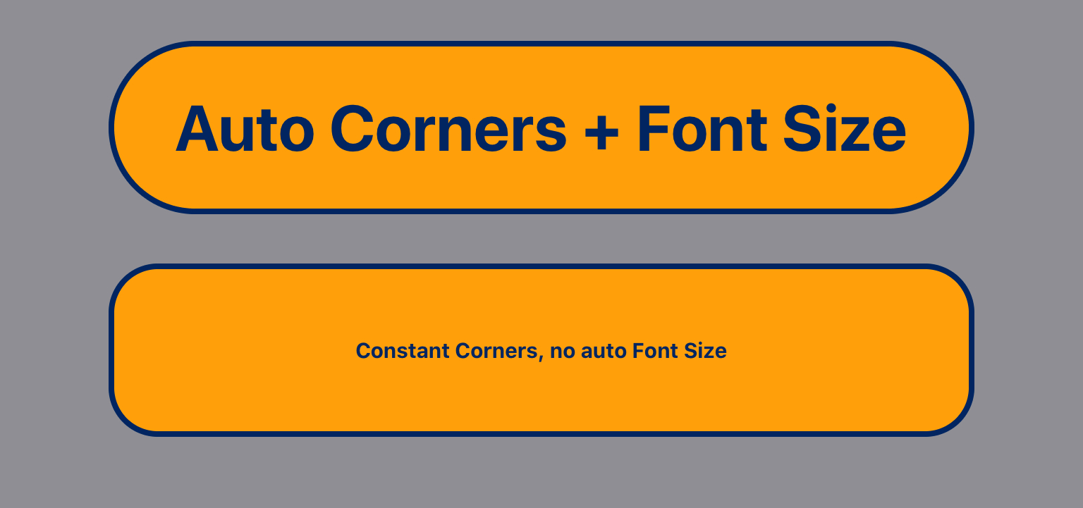
The following examples show how this work. The top button has dynamic corner radius and dynamic font scaling turned on and the bottom button does not. The first screen is an iPhone, the second screen is an iPad. As you can see, the fixed sizes do not look right on the second screen.
It also let users customize the border width, color and alpha value for both normal, highlighted and disabled states.
Use one of the following methods:
The module is avabilable via CocoaPods Trunk. Below is an example podfile. If you already use a podfile for your project, all you have to do is add the line that specifies HKUIButton. The other dependencies will also be automatically installed in the xcworkspace.
platform :ios, '11.0'

target 'MyTarget' do

  use_frameworks!

  pod 'HKUIButton', '~> 1.0.0'
  # other pods for your project

end

# This post_install section fixes a bug in CocoaPod that does not allow
# IBDesignables to render in interface builder

post_install do |installer|
installer.pods_project.targets.each do |target|
    target.new_shell_script_build_phase.shell_script = "mkdir -p $PODS_CONFIGURATION_BUILD_DIR/#{target.name}"
        target.build_configurations.each do |config|
            config.build_settings['CONFIGURATION_BUILD_DIR'] = '$PODS_CONFIGURATION_BUILD_DIR'
            config.build_settings.delete('CODE_SIGNING_ALLOWED')
            config.build_settings.delete('CODE_SIGNING_REQUIRED')
        end
    end
end
If you are installing this as a CocoaPod, you MUST include this script at the end of your Podfile or the Inspectables won't work in Interface Builder. However, if you don't, it will still function as expected at runtime. There is no need to include this if you do are not using Interface Builder.
# This post_install section fixes a bug in CocoaPod that does not allow
# IBDesignables to render in interface builder

post_install do |installer|
    installer.pods_project.targets.each do |target|
        target.new_shell_script_build_phase.shell_script = "mkdir -p $PODS_CONFIGURATION_BUILD_DIR/#{target.name}"
        target.build_configurations.each do |config|
            config.build_settings['CONFIGURATION_BUILD_DIR'] = '$PODS_CONFIGURATION_BUILD_DIR'
            config.build_settings.delete('CODE_SIGNING_ALLOWED')
            config.build_settings.delete('CODE_SIGNING_REQUIRED')
        end
    end
end
Don't forget to import the module in your source code:
import HKUIButton
You can also simply include the following source files in your project:
HKUIButton.swift
UIView+HKAutoCornerRounding.swift
UIView+LengthCalculationBasis.swift
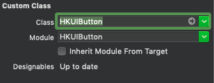
- Drop a UIButton in your view controller then change the class in the Identity Inspector pane to HKUIButton like this:
Note that you might need to wait for the design time code to compile after setting the class.
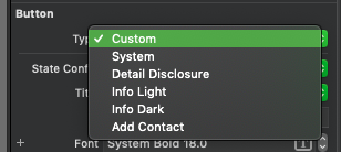
- You must set the Button Type to Custom in the Attribute Inspector pane or the button will not render correctly:
-
As with any UI elements, you must also ensure that your button is properly constrainted or it might disappear when it is tapped.
-
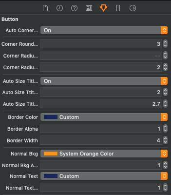
There will be 28 inspectable variables at the Attribute Inspector pane:
-
the 1st one Auto Corner Rounding is an on/off switch to control whether automatic corner radius calculation will be enabled.
-
the 2nd attribute Corner Rounding Basis is an integer that corresponds to the following:
1 = width of the button 2 = height of the button 3 = shorter edge (width or height) of the button 4 = longer edge (width of height) of the button 5 = no calculation, set to a constant If this is set to any number less than 1, it will be assumed to be 1 If this is set to any number greater than 5, it will be assumed to be 5 -
the 3rd atrribute is Corner Radius Constant which is a CGFloat. This is only used if the previous attribute is 5 (constant).
-
the 4th attribute is Corner Radius Factor which is a CGFloat that is used to divide the chosen length in the 2nd attribute to be set as the font size. For example, if this is set to 24 and the previous attribute is 2 = height, the font size will be set to the height of the button divided by 24. Experiment to get the desired result. This attribute is not used if the 2nd attribute is set to 5 (constant).
-
The 5th attribute is Auto Size Title Font. is an on/off switch to control whether dynamic font sizing will be enabled.
-
The 6th attribute Auto Size Title Font Basis is an integer that corresponds to the following:
1 = width of the button 2 = height of the button 3 = shorter edge (width or height) of the button 4 = longer edge (width of height) of the button If this is set to any number less than 1, it will be assumed to be 1 If this is set to any number greater than 4, it will be assumed to be 4 -
the 7th attribute is Auto Size Title Font Factor which is a CGFloat that is used to divide the chosen length in the 2nd attribute to be set as the font size. For example, if this is set to 24 and the previous attribute is 2 = height, the font size will be set to the height of the button divided by 24. Experiment to get the desired result. This attribute is not used if the 2nd attribute is set to 5 (constant).
-
The 8th, 9th and 10th attributes are Border Color, Border Alpha, and Border Width. Which are self explanatory.
-
The 11th, 12th, 13th and 14th attribute are Normal Bkg, Normal Bkg Alpha, Normal Text, Normal Text Alpha. Which are the normal background color, normal background alpha, normal text color and normal text alpha, respectively.
-
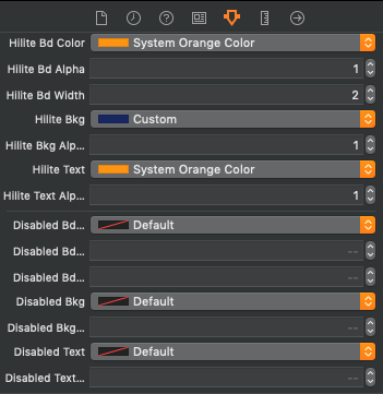
The 15th, 16th, 17th, and 18th attributes are Hilite Bd Color, Hilite Bd Alpha, and Hilite Bd Width. Which are the highlighted border color, hightlighted border alpha, and hightlighted border width, respectively.
-
The 19th, 20th and 21st attributes are Hilite Bkg, Hilite Bkg Alpha, Hilite Text. Which are the hightlighted background color, hightlighted alpha, and highlighted text color, respectively.
-
The 22nd - 24th attributes are Disabled Bd Color, Disabled Bd Alpha, and Disabled Bd Width. Which are the disabled border color, disabled border alpha, and disabled border width, respectively.
-
The 25th and 26th attributes are Disabled Bkg and Disabled Bkg Alpha. Which are the disabled background color and disabled background alpha, respectively.
-
The 27th and 28th attributes are Disabled Text and Disabled Text Alpha. Which are the disabled text color and disabled text alpha, respectively.
- Of course, the immediate appearance of the button might differ from the one at runtime if the button size changes.
Create an instance of the class and then set the attributes (see Interface Builder above for explanations of the attributes)
let myButton = HKUIButton()

myButton.autoCornerRounding = true
myButton.roundingBasis = .height
myButton.cornerRadiusConstant = 0.0  // not used here, only used if roundingBasis is .constant
myButton.cornerRadiusFactor = 24.0

myButton.autoSizeTitleFont = true
myButton.titleFontBasis = .height
myButton.autoSizeTitleFontFactor = 2.7

myButton.borderColor = UIColor.red
myButton.borderAlpha = 1.0
myButton.borderWidth = 5.0

myButton.normalBkg = UIColor.yellow
myButton.normalBkgAlpha = 1.0
myButton.normalText = UIColor.blue
myButton.normalTextAlpha = 1.0

myButton.hiliteBdColor = UIColor.yellow
myButton.hiliteBdAlpha = 1.0
myButton.hiliteBdWidth = 5.0

myButton.hiliteBkg = UIColor.blue
myButton.hiliteBkgAlpha = 0.5

myButton.hiliteText = UIColor.yellow
myButton.hiliteTextAlpha = 1.0

myButton.disabledBdColor = UIColor.gray
myButton.disabledBdAlpha = 0.5
myButton.disabledBdWidth = 5.0

myButton.disabledBkgColor = UIColor.black
myButton.disabledBkgAlpha = 0.7
myButton.disabledText = UIColor.gray
myButton.disabledTextAlpha = 0.7
Note that the attributes roundingBasis and titleFontBasis are of enumeration type that is declared in UIView+LengthCalculationBasis.swift as follow:
@objc public enum LengthCalculationBasis: Int {
   case width = 1
   case height
   case shorterEdge
   case longerEdge
   case constant
}
There are no known issues currently.


