Responsive Images for Statamic 3.
This Addon provides responsive images inspired by Our Medialibrary Package.
We invest a lot of resources into creating best in class open source packages. You can support us by buying one of our paid products.
We highly appreciate you sending us a postcard from your hometown, mentioning which of our package(s) you are using. You'll find our address on our contact page. We publish all received postcards on our virtual postcard wall.
Require it using Composer.
composer require spatie/statamic-responsive-images
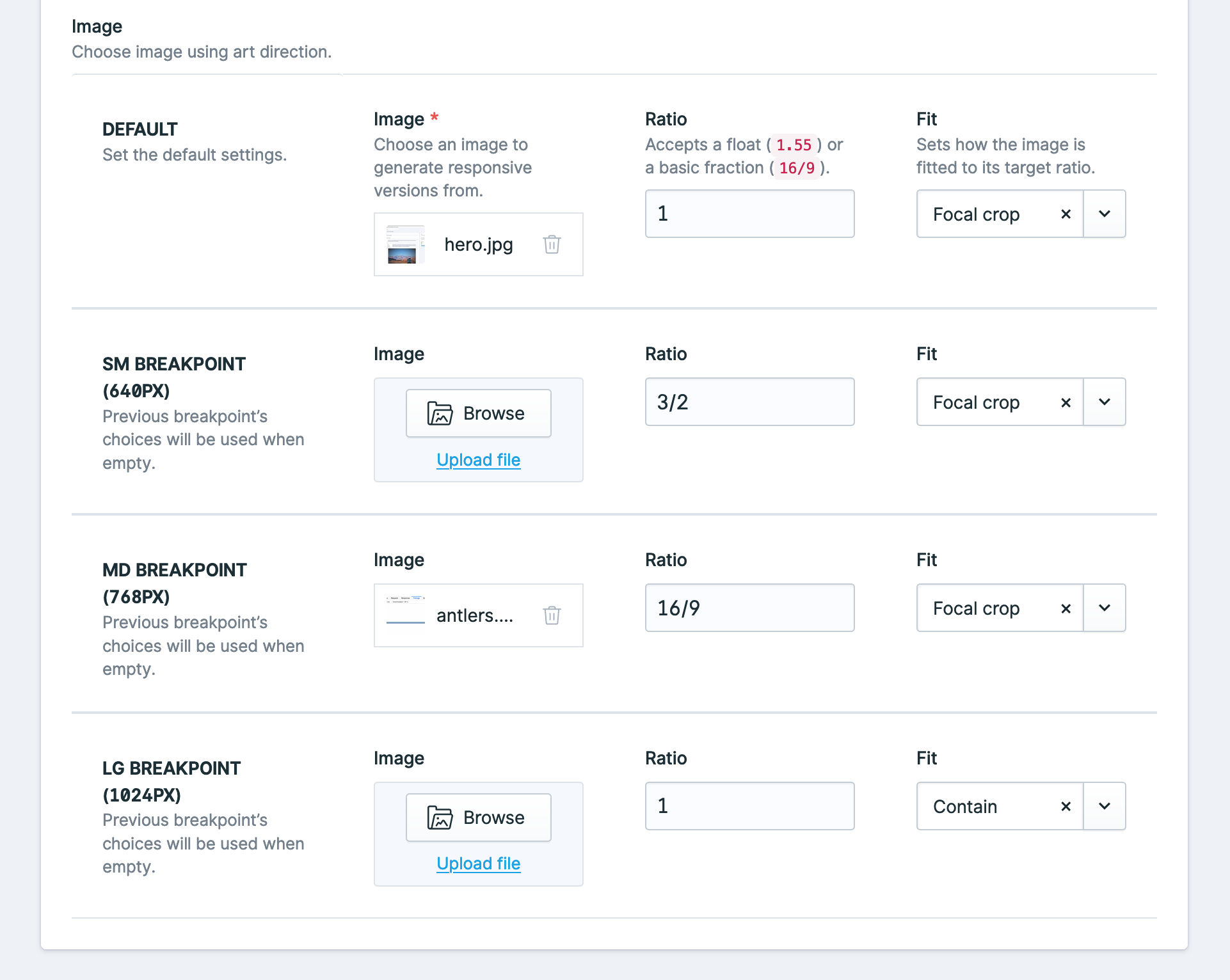
This addon includes a fieldtype that allows for full Art direction with responsive images.
This fieldtype is configured with the following yaml configuration:
-
    handle: image
    field:
      use_breakpoints: true
      allow_ratio: true
      allow_fit: true
      breakpoints:
        - sm
        - md
        - lg
      display: Image
      instructions: 'Choose image using art direction.'
      type: responsive
      icon: assets
      listable: hidden
      container: assets
      restrict: false
      allow_uploads: true
The configuration above can be used within Antlers using the responsive tag:
{{ responsive:image }}The breakpoints are configured in the breakpoints array of the config file.
Responsive Images will generate responsive versions of the images whenever a new asset is uploaded. These presets are determined by this package and not by your own Glide presets.
We generally recommend setting statamic.assets.image_manipulation.cache to false so only images actually requested by a browser are generated. The first time the conversion is loaded will be slow, but Glide still has an internal cache that it will serve from the next time. This saves a lot on server resources and storage requirements.
Pass an image to the responsive tag.
{{ responsive:image_field }}This will render an image tag with the default srcsets. The tag uses JS to define the value of the sizes attribute. This way the browser will always download the correct image.
You can make sure images are a certain ratio by passing a ratio parameter, either as a string 16/10 or as a float 1.6.
{{ responsive:image_field ratio="16/9" }}By default, responsive images generates a small base64 encoded placeholder to show while your image loads. If you want to disable this you can pass placeholder="false" to the tag.
{{ responsive:image_field placeholder="false" }}By default, responsive tag generates original source image file format and WEBP variants of the image, so if you use a JPG image as source then by default JPG and WEBP variants will be generated. You can toggle WEBP and AVIF variant generation with the tag parameters.
{{ responsive:image_field webp="true" avif="false" }}You can also toggle this in responsive-images.php config file, it will apply your preferences globally.
'webp' => true,
'avif' => false,
Image format quality settings can be set globally through config. If you wish to override the config quality values you can use tag parameters. You can utilize breakpoints for the quality parameter too!
{{ responsive:image_field quality:webp="50" md:quality:webp="75" }}You can still pass any parameters from the Glide tag that you would want to, just make sure to prefix them with glide:.
Passing glide:width will consider the width as a max width, which can prevent unnecessary large images from being generated.
{{ responsive:image_field glide:blur="20" glide:width="1600" }}If you want to add additional attributes (for example a title attribute) to your image, you can add them as parameters to the tag, any attributes will be added to the image.
{{ responsive:image_field alt="{title}" class="my-class" }}You can define breakpoints in the config file, by default the breakpoints of TailwindCSS are used.
Breakpoints allow you to use, for example, different ratios:
{{ responsive:image_field ratio="1/1" lg:ratio="16/9" 2xl:ratio="2/1" }}This will apply a default ratio of 1/1. From breakpoint lg up to 2xl, the ratio will be 16/9. From 2xl up, the ratio will be 2/1.
The breakpoints can be configured in the config and default to the breakpoints of Tailwind CSS.
Or different assets:
{{ responsive:image_field :lg:src="image_field_lg" :2xl:src="image_field_2xl" }}Breakpoints support the ratio, src, quality and glide parameters.
If you want to customize the generated html, you can publish the views using
php artisan vendor:publishand choosing Spatie\ResponsiveImages\ServiceProvider
If you need to regenerate the responsive images for a reason, you can use the regenerate command which will clear the Glide cache and regenerate the versions. This command only works when you have the statamic.assets.image_manipulation.cache config option set to true (which we generally don't recommend).
php please responsive:regenerateIf you are using a service, like Horizon, for queues then jobs will be queued to handle the image resizing.
By default, the job is queued under the 'default' queue. This can be changed via the queue config key under responsive-images.php
This addon comes with 2 GraphQL goodies, it adds a responsive field to all assets, and allows you to retrieve art directed images through GraphQL as well.
You can retrieve a responsive version of an asset like this:
{
  entries {
    data {
      id,
      image {
        responsive {
          label
          value
          unit
          ratio
          mediaString
          srcSet
          srcSetWebp
          srcSetAvif
          placeholder
        }
      }
    }
  }
}
Setting parameters like a ratio is also possible:
{
  entries {
    data {
      id,
      image {
        responsive(ratio: 1.2) {
          label
          value
          unit
          ratio
          mediaString
          srcSet
          srcSetWebp
          srcSetAvif
          placeholder
        }
      }
    }
  }
}A responsive fieldtype has all the same fields as a normal responsive field from an asset, except they're under a breakpoints key.
{
  entries {
    data {
      id,
      art_image {
        breakpoints {
          label
          value
          unit
          ratio
          mediaString
          srcSet
          srcSetWebp
          srcSetAvif
          placeholder
        }
      }
    }
  }
}Please see CHANGELOG for more information what has changed recently.
Please see CONTRIBUTING for details.
If you discover any security related issues, please email security@spatie.be instead of using the issue tracker.
The MIT License (MIT). Please see License File for more information.


