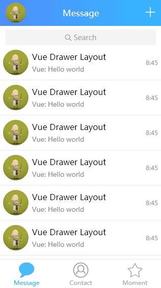
A simple DrawerLayout component for Vue.js
http://share.codehuang.com/vue-drawer-layout
Mobile QQ by Alexander Huang(click me or scan the qrcode)
Click the avatar at the top-left or touch(click) and drag to right(left).
If the image is not animating, maybe your browser does not supports APNG, you could turn to the GIF demo.
- Vue.js (2.x)
Modern (mobile) browsers and Internet Explorer 10+(due to CSS transition support) and X5 core is supported.
npm install vue-drawer-layout --saveThe following examples can also be used with CommonJS by replacing ES6-specific syntax with CommonJS equivalents.
import Vue from 'vue'
import DrawerLayout from 'vue-drawer-layout'

Vue.use(DrawerLayout)
// or
import {DrawerLayout} from 'vue-drawer-layout'
Vue.component(DrawerLayout.name, DrawerLayout)
You can easily just set nothing or only drawer-width prop to get a simple drawer.It act above the main content.
<vue-drawer-layout ref="drawer" :drawer-width="800">
  <div class="drawer-content" slot="drawer">
    <!-- drawer-content -->
  </div>
  <div slot="content">
    <!-- main-content -->
  </div>
</vue-drawer-layout>
Or you can set every prop as you want to get a fantastic drawer like mobile QQ has(It act below the main content and with distance is 1/3 of the main content drag).
<vue-drawer-layout
  ref="drawer"
  :drawer-width="800"
  :enable="true"
  :animatable="true"
  :z-index="0"
  :drawable-distance="Math.floor(800/3)"
  :content-drawable="true"
  :backdrop="true"
  :backdrop-opacity-range="[0,0.4]"
  @slide-start="handleSlideStart"
  @slide-move="handleSlideMove"
  @slide-end="handleSlideEnd"
  @mask-click="handleMaskClick">
    <div class="drawer-content" slot="drawer">
      <!-- drawer-content -->
    </div>
    <div slot="content">
      <!-- main-content -->
    </div>
</vue-drawer-layout>| Name | Info | Type | Default |
|---|---|---|---|
| drawer-width | width of drawer(px) | Number |
80% of the container(parentNode) width |
| drawable-distance | farthest distance to draw(px) | Number |
same as drawer-width prop |
| z-index | z-index of drawer | Number |
818(Don't Ask^_^) |
| content-drawable | whether to make content-wrapper drawable | Boolean |
false |
| backdrop | whether to show backdrop | Boolean |
true |
| backdrop-opacity-range | the opacity range of backdrop[min,max] | Array |
[0,0.4] |
| enable | is drawer enable | Boolean |
true |
| animatable | is drawer animate during moving | Boolean |
true |
| reverse | is drawer slide out from right | Boolean |
false |
| Name | Info |
|---|---|
| drawer | content in drawer-content |
| content | content in main-content |
| Name | Info | Arguments | Usage |
|---|---|---|---|
| toggle | method to show and hide drawer | visible(Boolean) |
toggle(true/false) or toggle()to show(hide) |
| Name | Info | Callback Arguments |
|---|---|---|
| slide-start | drawer start to slide (fired when touchdown) | - |
| slide-move | drawer sliding (fired when touchmove) | pos(int) |
| slide-end | drawer sliding (fired when touchend or transitionend) | visible(boolean) |
| mask-click | touch(click) on mask | - |
Copyright (c) 2018 Alexander Huang.


