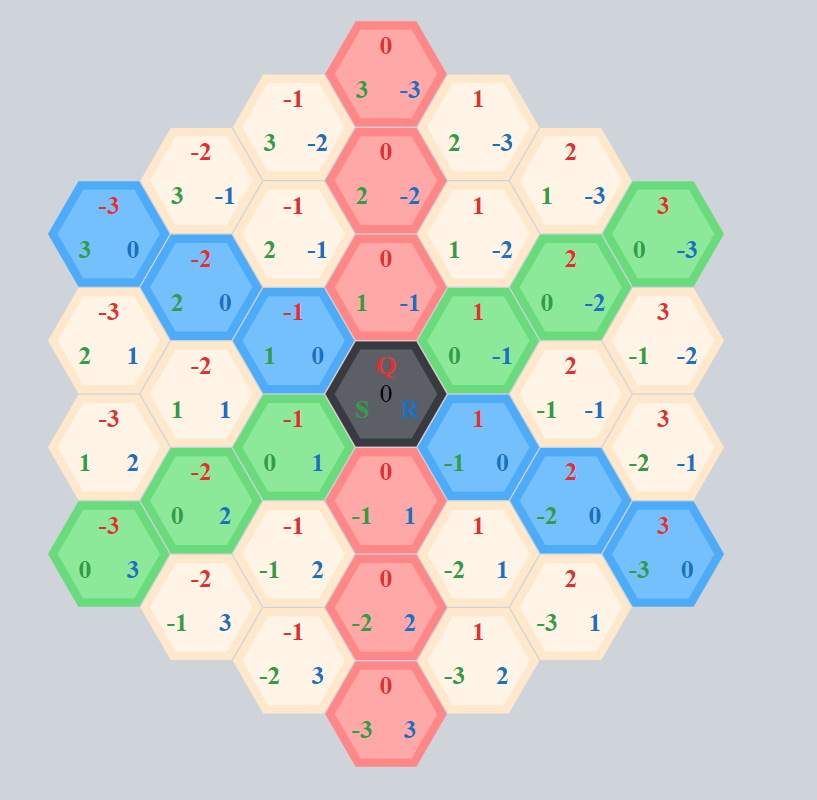
React components to build interactive hexagon grids. This library uses SVG and allows you to create fully customizable and scalable interactive hexagon grids with a simple api.
The component based approach allows you to customize the grid shape to suit your needs or even apply your own components or SVG elements to it. You can use the pre-defined generator to create certain grid shapes or you may build your own grid as you wish, while still keeping it under control and interactive.
You could easily use this library to build a nice portfolio, image library or even a game (just to name a few)! , enjoy!
With inspiration from http://www.redblobgames.com/grids/hexagons.
🖊️ Codepen to play around with: https://codepen.io/hellenic/project/editor/AYMbMM#
Discord server: https://discord.gg/TxNb6EZZZE
The new version should not contain any breaking changes. There is typescript support, some storybook examples for easy development and testing. The new version uses the newer react context api under the hood. Though there should not be any breaking changes, there could be issues. Feel free to checkout the current beta release and give feedback.
Install via:
npm install react-hexgrid@beta
Install it via npm:
npm install --save react-hexgridMore documentation in the Wiki.
This hexagonal grid uses a cubic coordinate system with three coordinates q, r and s.
 . If you want to read about some hexagon mathematics and different coordinate systems maybe have a look at https://www.redblobgames.com/grids/hexagons/
import { HexGrid, Layout, Hexagon, Text, Pattern, Path, Hex } from 'react-hexgrid';
import './App.css';

class App extends Component {
  render() {
    return (
      <div>
        <HexGrid width={1200} height={800} viewBox="-50 -50 100 100">
          {/* Grid with manually inserted hexagons */}
          <Layout size={{ x: 10, y: 10 }} flat={true} spacing={1.1} origin={{ x: 0, y: 0 }}>
            <Hexagon q={0} r={0} s={0} />
            {/* Using pattern (defined below) to fill the hexagon */}
            <Hexagon q={0} r={-1} s={1} fill="pat-1" />
            <Hexagon q={0} r={1} s={-1} />
            <Hexagon q={1} r={-1} s={0}>
              <Text>1, -1, 0</Text>
            </Hexagon>
            <Hexagon q={1} r={0} s={-1}>
              <Text>1, 0, -1</Text>
            </Hexagon>
            {/* Pattern and text */}
            <Hexagon q={-1} r={1} s={0} fill="pat-2">
              <Text>-1, 1, 0</Text>
            </Hexagon>
            <Hexagon q={-1} r={0} s={1} />
            <Hexagon q={-2} r={0} s={1} />
            <Path start={new Hex(0, 0, 0)} end={new Hex(-2, 0, 1)} />
          </Layout>
          <Pattern id="pat-1" link="http://cat-picture" />
          <Pattern id="pat-2" link="http://cat-picture2" />
        </HexGrid>
      </div>
    );
  }
}
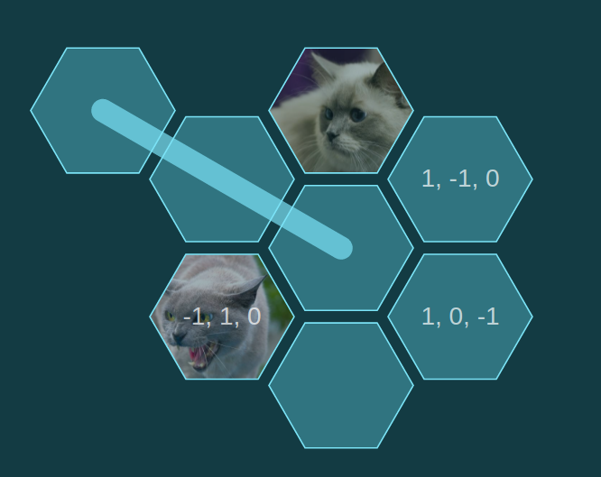
Will look something like this (custom CSS applied):

There are many options on how to apply css styling. Examples of inline styling, classic css styling and css-in-js styling with emotion are shown in the storybook examples (under /src/stories/).
There are examples of drag and drop implementations with native html5 drag and drop api, however these are not yet really well worked out. Feel free to jump in and maybe provide implementations with other drag and drop libraries.
To run storybook run npm i and then npm run storybook. Other examples are available in the examples (standalone versions based on create react app).
- basic-board - Basic usage of react-hexgrid
- custom-grid - Simple custom grid
- templates - Ready-made grid templates
- pathfinding - Pathfinding
- drag & drop - Drag & drop with two grids
- animations - Animations & effects
You can test changes locally by running storybook. You can also use something like npm 7 workspaces to link this library on your local file system side by side with your application.
MIT


