ProgressBar SwiftUI
Fully customizable Circular progress bar that supports animated text, built with SwiftUI
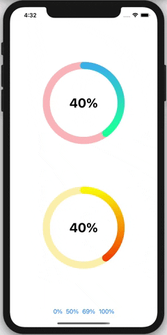
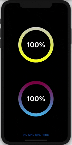
Demo
Instalation
It requires iOS 13 and Xcode 11
In Xcode go to File -> Swift Packages -> Add Package Dependency and paste in the repo's url: https://github.com/AmeddahAchraf/Progress-Bar-SwifttUI
Usage:
import the package in the file you would like to use it: import Progress_Bar
You can costumize the the progress bar with different arguments
CircularProgress(
  percentage: CGFloat,
  fontSize: CGFloat,
  backgroundColor: Color,
  fontColor: Color,
  borderColor1: Color,
  borderColor2: LinearGradient,
  borderWidth: CGFloat)
Example:
 CircularProgress(percentage: 0.5,
                                  fontSize: 25,
                                  backgroundColor: .white,
                                  fontColor : .black,
                                  borderColor1: .blue,
                                  borderColor2: LinearGradient(gradient: Gradient(colors: [.pink, .blue]),startPoint: .top, endPoint: .bottom),
                                  borderWidth: 20
                  )
                  .frame(width: 200, height: 200, alignment: .center)
Features
- Fully customizable.
- Uses AnimatableModifier to animate the text.
- Scalable TextView.
TO DO
- Linear progress bar.