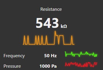
Node-RED dashboard widget to show small trail of value history near some numeric value
The value trail is not as regular line chart. There is no time component involved. Every incoming payload creates new datapoint. All currently visible datapoints are evenly distributed along x-axis.
This means that by looking on value trail you can easily detect rising or falling conditions. Or say things like "Resistance value is ok at 543 kilo-ohm’s, but I don't like this strange peak" or "Pressure needs some maintenance cos it shows too much instability"
By all this I want to say that with this widget you can get primary conditions of equipment or measurements but nothing more for deeper analysis.
Configurable options:
- Color of line
- Glow (on/off)
- Show value (on/off) with rounding option (default is 0 so value is shown as integer)
- Show min/max values (initial state). You can restrict toggling the min/max values at runtime by unticking the Allow toggle option.
- Stroke width (1 ... 6)
- Amount of datapoints per unit. (2 ... 24)
unit represents 1x1 Widget Size in dashboard Site configuration
Configured input property should carry single numeric value.
Widget doesn't use any storage options. There aren’t any options to deal with historical data. Only "live" data can be presented.


