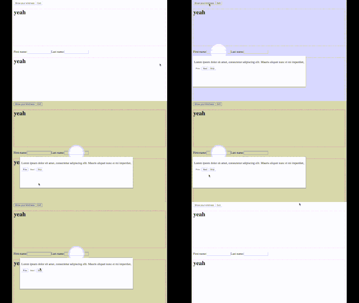
A lightweight, fully-customizable kind screen guide for React
To install
$ npm install --save react-kindnessPut this somewhere in your component tree,
import {KindnessPanel, Kindness} from 'react-kindness';
import 'react-kindness/dist/index.css';

// ...
    <KindnessPanel enabled={this.state.show}
                   onExit={() => this.setState({show: false})} />
then point out some elements that you want your guests to focus on
<Kindness>
    <input type="text" {...} />
</Kindness>

<Kindness message="Click here to submit your post!">
    <button type="submit">Submit</button>
</Kindness>
When the <KindnessPanel /> becomes enabled={true}, the screen guide starts.
opaque type SeriesId = string;

type KindnessPanelProps = {|
  enabled: boolean,
  onExit: () => void,
  shape?: 'circle' | 'rect', // 'circle' by default
  initialIndex?: number, // 0 by default
  children?: (KindnessPanelContentArgs) => React.Component,
  seriesId?: SeriesId, // 'default' by default
  onClickOutside?: () => ?boolean, // () => {} by default.
                                   // If false was returned, react-kindness
                                   // tries to disable user interactions.
|};type KindnessProps = {|
children: mixed,
shape?: 'circle' | 'rect', // Use <KindnessPanel shape={} /> by default and being able to override it
title?: mixed, // null by default
message?: mixed, // null by default
order?: number | 'auto', // 'auto' by default
seriesId?: SeriesId, // 'default' by default
|}By default <KindnessPanel /> uses <KindnessPanelContent /> internally. By passing a function as a child, you can customize the content.
<KindnessPanel enabled={true}>
    {
        ({totalSize, currentIndex, goPrev, goNext}) => (
            <div>
                <h3>{`This is ${currentIndex + 1} of ${totalSize} item.`}</h3>
                <button onClick={goPrev}>Go previous</button>
                <button onClick={goNext}>Go next</button>
            </div>
        )
    }
</KindnessPanel>
Properties of the argument is these:
type KindnessPanelContentArgs = {|
  title: mixed,
  message: mixed,
  totalSize: number,
  currentIndex: number,
  goPrev: () => void,
  goNext: () => void,
  skip: () => void,
  goIndex: (number) => void,
  transitionEmitter: EventEmitter,
|};When you pass a function to <Kindness /> as a child, you can use additional variables.
<Kindness>
    { (focused) => <div style={focused && {fontWeight: 'bold'}}>yeah</div> }
</Kindness>- When scrolling a spot is something wrong
- How can I put all into a single root dom
- Jump to a target with animated-scroll-to
- Why my popper doesn't flip on viewport boundary
- 0.3.0 Fancy API for customising
- 0.4.0 More tests
- Scroll X
-
onClickOutsideof<KindnessPanel /> - Disabling user interactions
onClickOutside - feat:
<Kindness shape={'circle'|'rect'} />with smooth spot transition of each - mod: Scroll to a target with decent margin even with circle spot
- Accept a function as a child to
<Kindness />
MIT
