J-stroke is a project undertaken to examine the current methods of basketball player evaluations and is a data visualization tool to complement currently used methods. The developers were very interested in building a tool that not only communicates the playing style and patters of a player, but also helps compare different players with different playing styles.
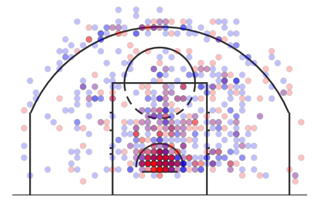
We started out by creating a single view dashboard containing the shot chart for a specific player. We utilized a single visual encoding channel, color, to showcase the field goal percent and used aggregation to combine similar shots together. Our shot chart can be see below-
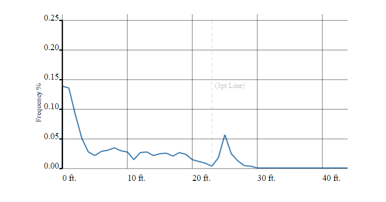
Next, we built the frequncy chart of field goal percentage and distance. This chart can be seen below-
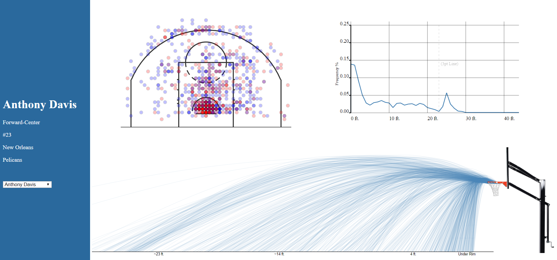
Finally, after exploring D3 techniques like line interpolations, seeded randomness, and arcs, we built the shot path/curve chart which can be seen below-
All these charts worked really well together with the shot chart being highly visual, the frequency chart being highly quantitative and the shit curve chart combining the two concepts. Our final dashboard can be seen below-
We went above and beyond in this project, both from technical and design standpoints as shown below-
Here's a description of our Technical Achievements for this project.
- Aggregation: We used aggregation of similar data points to make our graphs faster to load. At any given point of time, we're visualizing between 1500 and 5000 data points aggregated into 10-50 points. We edited an aggregation algorithm we found to fit our needs and achieve the desired results.
- Multi-View binding: We created a three-way binding between the graphs to give the user a much better experience. Instead of treating one graph as the master and updating the other two based on the primary one, we bound listeners and updates to all three charts.
- D3 Interpolation: We utilized the D3 interpolation technique to create the graph of the shot curve. This was a highly complex graph, which involved creating the path data randomly based on certain parameters, the interpolating and visualizing the lines.
Here's a description of our Design Achievements for this project.
- Visual Feedback: We incorporated subtle visual feedback queues to make the user experience as pleasant as possible. In the shot chart, we create an arc to showcase the distance of focus, the in the frequency graph we create a vertical line wherever the user hovers and finally on the shot curve chart we change colors of all points which originate from the same distance.
- Dashboard: We created a complete dashboard look and feel with our visualizations being laid out using good CSS practices, a sidebar with player info a dropdown to change between players, in which case the data get recreated.
- Custom Court: We used D3's built in arcs and paths to create the basketball court for the first graph from scratch.
- Custom path chart: We used D3's seeded randomness techniques to induce minimal randomness to the path created by the ball in the shot chart graph to mimic real life and appear more realistic.


