SeuratExtend is an R package designed to provide an improved and easy-to-use toolkit for scRNA-seq analysis and visualization, built upon the Seurat object. While Seurat is a widely-used tool in the R community that offers a foundational framework for scRNA-seq analysis, it has limitations when it comes to more advanced analysis and customized visualization. SeuratExtend expands upon Seurat by offering an array of enhanced visualization tools, an integrated functional and pathway analysis pipeline, seamless integration with popular Python tools, and a suite of utility functions for data manipulation and presentation. Designed to be user-friendly even for beginners, the package retains a level of professionalism that ensures rigorous analysis.
Key Features:
- Enhanced Data Visualization: Includes heatmaps, violin plots, feature plots, waterfall plots, proportion bars, and GSEA plots.
- Integrated Functional and Pathway Analysis: Supports GO and Reactome databases, with the option to use custom databases.
- Python Tool Integration: Easily apply tools like scVelo, SCENIC, and Palantir within R using the Seurat object.
- Utility Functions: Assorted functions for calculations and color selections to streamline your scRNA-seq analysis.
- GitHub Repository: Access the source code and contribute to SeuratExtend on GitHub.
- Online Tutorial: For a comprehensive guide on using SeuratExtend, visit our tutorial website.
- SeuratExtend Chatbot: Try our AI-powered assistant (beta version, powered by ChatGPT) for help with scRNA-seq analysis: scRNA-seq Assistant.
Install SeuratExtend directly from GitHub:
if (!requireNamespace("remotes", quietly = TRUE)) {
    install.packages("remotes")
}
remotes::install_github("huayc09/SeuratExtend")- Generate a Heatmap Plot
Heatmap - Create an Enhanced Dimensional Reduction Plot
DimPlot2FeaturePlot3FeaturePlot3.grid - Create an Enhanced Violin Plot
VlnPlot2 - Visualize Cluster Distribution in Samples
ClusterDistrBar - Generate a Waterfall Plot
WaterfallPlot - Explore Color Functions
color_procolor_iwhryb2rgbsave_colors
- Conduct GSEA using the GO or Reactome database
GeneSetAnalysisGOGeneSetAnalysisReactome - Perform GSEA using customized genesets
GeneSetAnalysis - Find pathways in the GO/Reactome database or customized genesets
SearchDatabaseSearchPathways - Convert GO/Reactome pathway IDs to pathway names
RenameGORenameReactome - Filter the GO/Reactome pathway list based on certain criteria
FilterGOTermsFilterReactomeTerms - Create a GSEA plot emulating the Broad Institute analysis
GSEAplot
- scVelo Tutorial for Trajectory Analysis
scVelo.SeuratToAnndatascVelo.Plot - Palantir Tutorial for Trajectory and Pseudotime Analysis
Palantir.RunDMPalantir.Pseudotime - MAGIC for Denoising and Smoothing Gene Expression
Palantir.Magic - CellRank Tutorial for Trajectory Analysis
Cellrank.ComputeCellrank.Plot - Gene Expression Dynamics Along Differentiation Trajectories
GeneTrendCurve.PalantirGeneTrendHeatmap.PalantirGeneTrendCurve.SlingshotGeneTrendHeatmap.Slingshot - Slingshot Tutorial for Pseudotime Analysis
RunSlingshot - Integration of Seurat with Python Tools
create_condaenv_seuratextendSeu2AdataSeu2Loomadata.LoadLoomadata.AddDRadata.AddMetadataadata.Saveadata.Load
- Importing SCENIC Loom Files into Seurat
ImportPyscenicLoom - Visualizing SCENIC Results
- Facilitate Gene Naming Conversions
HumanToMouseGenesymbolMouseToHumanGenesymbolEnsemblToGenesymbolGenesymbolToEnsemblUniprotToGenesymbol - Compute Statistics Grouped by Clusters
CalcStats - Assess Proportion of Positive Cells in Clusters
feature_percent - Run Standard Seurat Pipeline
RunBasicSeurat
This quick start-up guide provides an overview of the most frequently
used functions in single-cell RNA sequencing (scRNA-seq) analysis. After
running the standard Seurat pipeline (refer to this Seurat pbmc3k
tutorial), you
should have a Seurat object ready for further analysis. Below, we
illustrate the use of a subset of the pbmc dataset as an example to
demonstrate various functionalities of the SeuratExtend package.
library(Seurat)
library(SeuratExtend)

# Visualizing cell clusters using DimPlot2
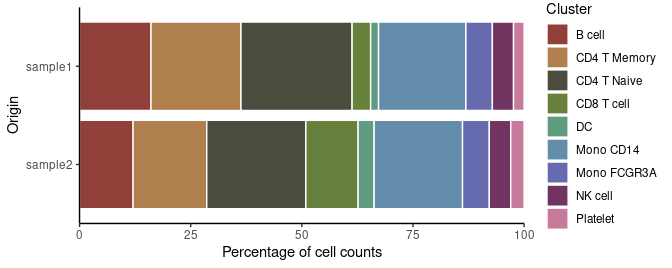
DimPlot2(pbmc)To check the percentage of each cluster within different samples:
# Cluster distribution bar plot
ClusterDistrBar(pbmc$orig.ident, pbmc$cluster)To examine the marker genes of each cluster and visualize them using a heatmap:
# Calculating z-scores for variable features
genes.zscore <- CalcStats(
  pbmc,
  features = VariableFeatures(pbmc),
  group.by = "cluster",
  order = "p",
  n = 4)

# Displaying heatmap
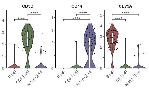
Heatmap(genes.zscore, lab_fill = "zscore")For visualizing specific markers via a violin plot that incorporates box plots, median lines, and performs statistical testing:
# Specifying genes and cells of interest
genes <- c("CD3D", "CD14", "CD79A")
cells <- WhichCells(pbmc, idents = c("B cell", "CD8 T cell", "Mono CD14"))

# Violin plot with statistical analysis
VlnPlot2(
  pbmc,
  features = genes,
  group.by = "cluster",
  cells = cells,
stat.method = "wilcox.test")Displaying three markers on a single UMAP, using RYB coloring for each marker:
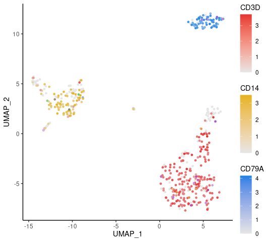
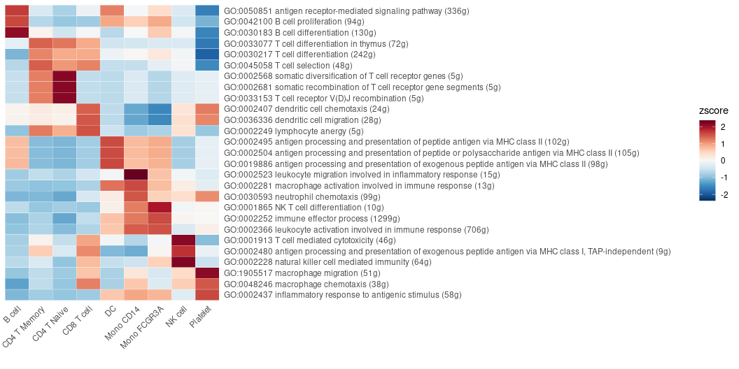
FeaturePlot3(pbmc, feature.1 = "CD3D", feature.2 = "CD14", feature.3 = "CD79A")Examining all the pathways of the immune process in the Gene Ontology (GO) database, and visualizing by a heatmap that displays the top pathways of each cluster across multiple cell types:
options(spe = "human")
pbmc <- GeneSetAnalysisGO(pbmc, parent = "immune_system_process", n.min = 5)
matr <- RenameGO(pbmc@misc$AUCell$GO$immune_system_process)
go_zscore <- CalcStats(
  matr,
  f = pbmc$cluster,
  order = "p",
  n = 3)
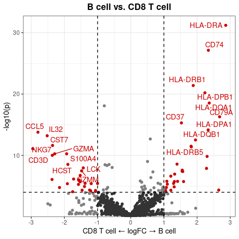
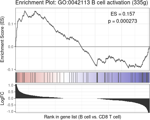
Heatmap(go_zscore, lab_fill = "zscore")Using a GSEA plot to focus on a specific pathway for deeper comparative analysis:
GSEAplot(
  pbmc,
  ident.1 = "B cell",
  ident.2 = "CD8 T cell",
  title = "GO:0042113 B cell activation (335g)",
geneset = GO_Data$human$GO2Gene[["GO:0042113"]])After conducting Gene Regulatory Networks Analysis using pySCENIC, import the output and visualize various aspects within Seurat:
# Downloading a pre-computed SCENIC loom file
scenic_loom_path <- file.path(tempdir(), "pyscenic_integrated-output.loom")
download.file("https://zenodo.org/records/10944066/files/pbmc3k_small_pyscenic_integrated-output.loom", scenic_loom_path)

# Importing SCENIC Loom Files into Seurat
pbmc <- ImportPyscenicLoom(scenic_loom_path, seu = pbmc)

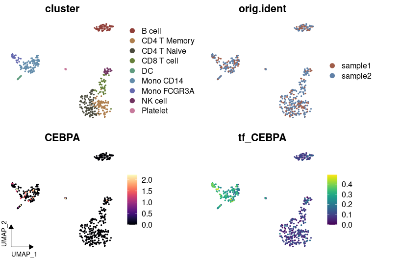
# Visualizing variables such as cluster, gene expression, and SCENIC regulon activity with customized colors
DimPlot2(
  pbmc,
  features = c("cluster", "orig.ident", "CEBPA", "tf_CEBPA"),
  cols = list("tf_CEBPA" = "D"),
  theme = NoAxes()
)
# Creating a waterfall plot to compare regulon activity between cell types
DefaultAssay(pbmc) <- "TF"
WaterfallPlot(
pbmc,
features = rownames(pbmc),
ident.1 = "Mono CD14",
ident.2 = "CD8 T cell",
exp.transform = FALSE,
top.n = 20)Trajectory analysis helps identify developmental pathways and transitions between different cell states. In this section, we demonstrate how to perform trajectory analysis using the Palantir algorithm on a subset of myeloid cells, integrating everything within the R environment.
First, we download a small subset of myeloid cells to illustrate the analysis:
# Download the example Seurat Object with myeloid cells
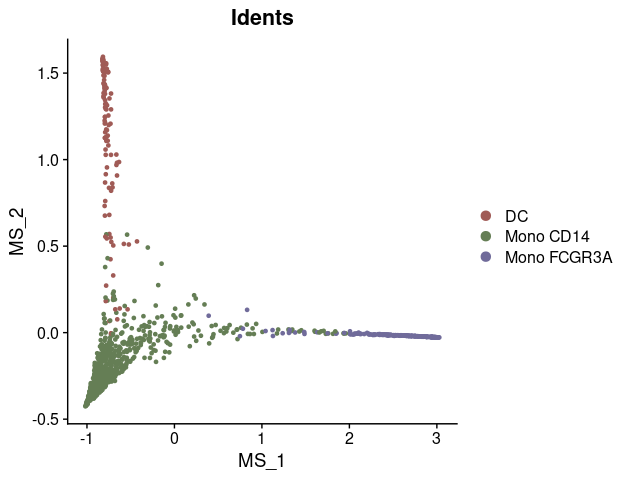
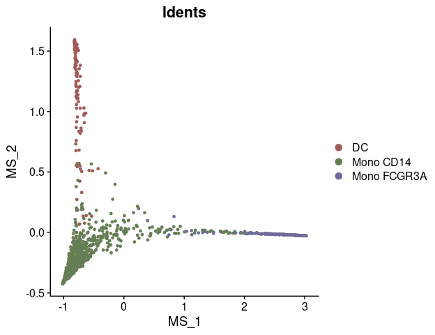
mye_small <- readRDS(url("https://zenodo.org/records/10944066/files/pbmc10k_mye_small_velocyto.rds", "rb"))Palantir uses diffusion maps for dimensionality reduction to infer trajectories. Here’s how to compute and visualize them:
# Compute diffusion map
mye_small <- Palantir.RunDM(mye_small)

# Visualize the first two diffusion map dimensions
DimPlot2(mye_small, reduction = "ms")
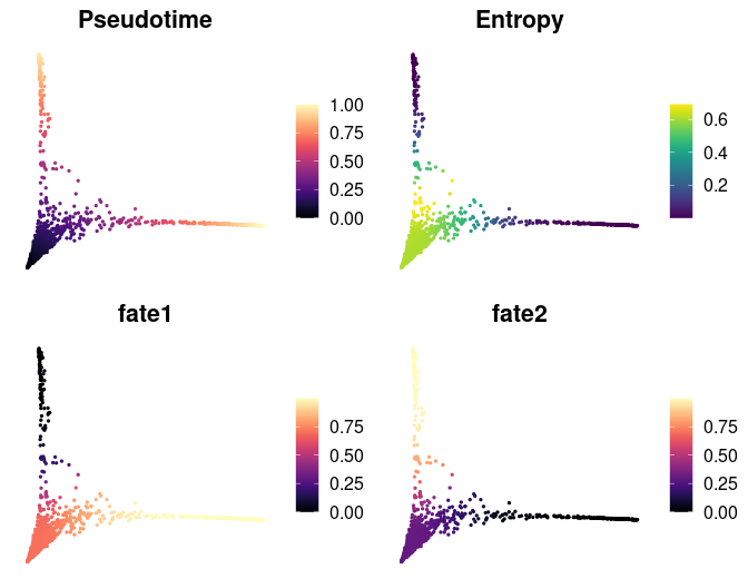
Pseudotime ordering assigns each cell a time point in a trajectory, indicating its progression along a developmental path:
# Calculate pseudotime with a specified start cell
mye_small <- Palantir.Pseudotime(mye_small, start_cell = "sample1_GAGAGGTAGCAGTACG-1")

# Store pseudotime results in meta.data for easy plotting
ps <- mye_small@misc$Palantir$Pseudotime
colnames(ps)[3:4] <- c("fate1", "fate2")
mye_small@meta.data[,colnames(ps)] <- ps

# Visualize pseudotime and cell fates
DimPlot2(
  mye_small,
  features = colnames(ps),
  reduction = "ms",
cols = list(Entropy = "D"))Visualizing gene expression or regulon activity along calculated trajectories can provide insights into dynamic changes:
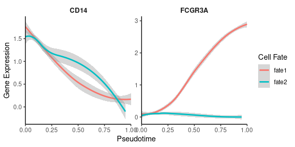
# Create smoothed gene expression curves along trajectory
GeneTrendCurve.Palantir(
  mye_small,
  pseudotime.data = ps,
  features = c("CD14", "FCGR3A")
)
# Create a gene trend heatmap for different fates
GeneTrendHeatmap.Palantir(
mye_small,
features = VariableFeatures(mye_small)[1:10],
pseudotime.data = ps,
lineage = "fate1"
)scVelo is a Python tool used for RNA velocity analysis. We demonstrate how to integrate and analyze velocyto-generated data within the Seurat workflow using scVelo.
First, download the pre-calculated velocyto loom file:
# Download velocyto loom file
loom_path <- file.path(tempdir(), "pbmc10k_mye_small.loom")
download.file("https://zenodo.org/records/10944066/files/pbmc10k_mye_small.loom", loom_path)

# Path for saving the integrated AnnData object
adata_path <- file.path(tempdir(), "mye_small.h5ad")

# Integrate Seurat Object and velocyto loom into an AnnData object
scVelo.SeuratToAnndata(
  mye_small,
  filename = adata_path,
  velocyto.loompath = loom_path,
  prefix = "sample1_",
  postfix = "-1"
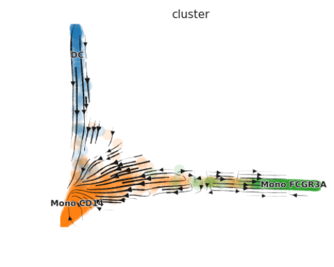
)Once the data is processed, visualize the RNA velocity:
# Plot RNA velocity
scVelo.Plot(color = "cluster", basis = "ms_cell_embeddings", figsize = c(5,4))
For detailed usage of the functions and more advanced analysis, please refer to the vignettes and tutorials.
GPL (>= 3)
- Hua, Y., Vella, G., Rambow, F., et al. (2022). Cancer immunotherapies transition endothelial cells into HEVs that generate TCF1+ T lymphocyte niches through a feed-forward loop. Cancer Cell 40, 1600-1618. https://doi.org/10.1016/j.ccell.2022.11.002
- Hua, Y., Wu, N., Miao, J., Shen, M. (2023). Single-cell transcriptomic analysis in two patients with rare systemic autoinflammatory diseases treated with anti-TNF therapy. Front. Immunol. 14. https://doi.org/10.3389/fimmu.2023.1091336
