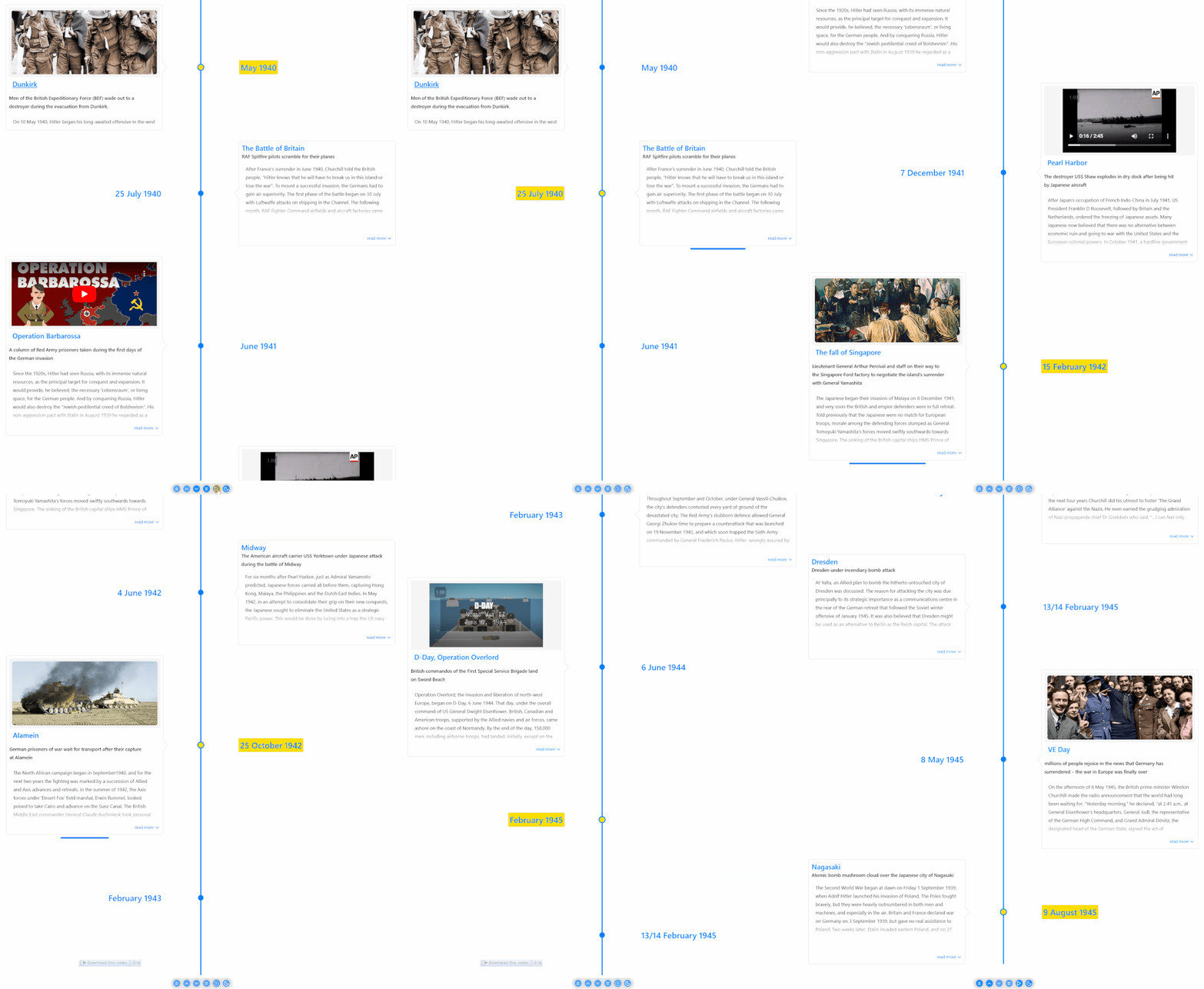
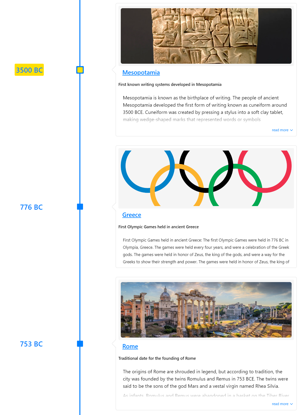
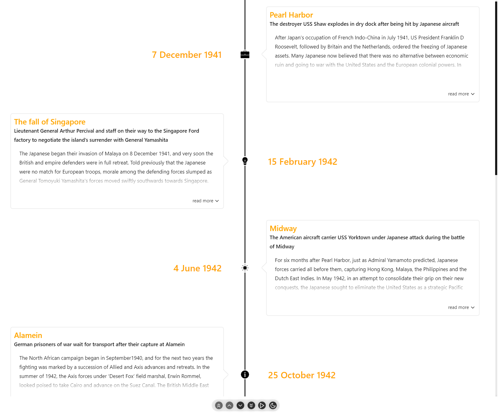
- 🚥 Render timelines in three different modes (Horizontal, Vertical, Vertical-Alternating).
- 📺 Auto play the timeline with the slideshow mode.
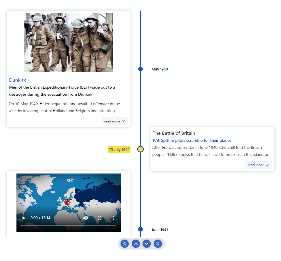
- 🖼️ Display Images & Videos in the timeline with ease.
- ⌨ Keyboard accessible.
- 🔧 Render custom content easily.
- 🌿 Nested timelines.
- ⚡ Data driven API.
- 🎨 Customize colors with ease.
- 🎭 Use custom icons in the timeline.
- 💪 Built with Typescript.
- 🎨 Styled with emotion.
- ⚡ Installation
- Getting Started
- Props
- Using custom class names
- 📦CodeSandbox Examples
- Kitchen Sink
- 📚Storybook
- 🔨Build Setup
- 🧪Tests
- 🤝Contributing
- 🧱Built with
- Meta
- Contributors ✨
// install with yarn
yarn add react-chrono

// or with npm
npm install react-chronoPlease make sure you wrap the component in a container that has a width and height.
When no mode is specified, the component defaults to HORIZONTAL mode. Please check props for all the available options.
  import React from "react"
  import { Chrono } from "react-chrono";

  const Home = () => {
    const items = [{
      title: "May 1940",
      cardTitle: "Dunkirk",
      url: "http://www.history.com",
      cardSubtitle:"Men of the British Expeditionary Force (BEF) wade out to..",
      cardDetailedText: "Men of the British Expeditionary Force (BEF) wade out to..",
      media: {
        type: "IMAGE",
        source: {
          url: "http://someurl/image.jpg"
        }
      }
    }, ...];

    return (
      <div style={{ width: "500px", height: "400px" }}>
        <Chrono items={items} />
      </div>
    )
}To render the timeline vertically use the VERTICAL mode
<div style={{ width: '500px', height: '950px' }}>
  <Chrono items={items} mode="VERTICAL" />
</div>In VERTICAL_ALTERNATING mode the timeline is rendered vertically with cards alternating between left and right side.
<div style={{ width: '500px', height: '950px' }}>
  <Chrono items={items} mode="VERTICAL_ALTERNATING" />
</div>| Name | Default | Description |
|---|---|---|
| activeItemIndex | 0 | Selects the active timeline item on load. |
| allowDynamicUpdate | false | Allows dynamic updating of timeline items. |
| borderLessCards | false | Removes border and shadow from timeline cards. |
| buttonTexts | Customize the alt text for all buttons. | |
| cardHeight | 200 | Sets the minimum height of timeline cards. |
| cardLess | false | Disables timeline cards in both horizontal and vertical modes. |
| cardPositionHorizontal | Positions the card in horizontal mode. Can be TOP or BOTTOM. |
|
| cardWidth | Sets the maximum width of timeline cards. | |
| classNames | Applies custom class names for different card elements. | |
| contentDetailsHeight | 150 | Controls height of details section if using cardDetailedText. Refer to TimelineItem model for more info. |
| disableAutoScrollOnClick | false | Disables auto-scrolling when a timeline card is clicked. |
| disableClickOnCircle | false | Disables click action on circular points. |
| disableNavOnKey | false | Disables keyboard navigation. |
| enableBreakPoint | true | Enables automatic switch to vertical mode when vertical breakpoint is reached. |
| enableDarkToggle | false | Enables toggle switch for dark mode. |
| enableOutline | false | Enables outline menu on vertical and vertical alternating modes. |
| flipLayout | false | Flips the layout (RTL). |
| focusActiveItemOnLoad | false | Automatically scrolls and focuses on the activeItemIndex on load. |
| fontSizes | Customizes font sizes. | |
| hideControls | false | Hides navigation controls. |
| itemWidth | 300 | Sets width of timeline section in horizontal mode. |
| items | [] | Collection of Timeline Item Models. |
| lineWidth | 3px | Customizes width of timeline track line. |
| mediaHeight | 200 | Sets minimum height of media element if image or video is embedded in card. |
| mediaSettings | Configures media-specific layout settings. Refer to mediaSettings for more info. | |
| mode | VERTICAL_ALTERNATING | Sets component mode. Can be HORIZONTAL, VERTICAL, or VERTICAL_ALTERNATING. |
| nestedCardHeight | 150 | Sets height of nested timeline card. |
| noUniqueId | false | Disables generating a unique id for the table wrapper |
| onItemSelected | Invokes callback on item selection and passes relevant data. | |
| onScrollEnd | Detects end of timeline via onScrollEnd. |
|
| onThemeChange | Invokes callback when theme is changed. Triggered via enableDarkToggle. |
|
| scrollable | true | Makes timeline scrollable in VERTICAL and VERTICAL alternating modes. |
| showAllCardsHorizontal | false | Displays all cards in horizontal mode. By default, only active card is displayed. |
| slideItemDuration | 5000 | Duration in ms that timeline card is active during a slideshow. |
| slideShow | false | Enables slideshow control. |
| textOverlay | false | Displays text as overlay on media elements. Refer to Text Overlay for more info. |
| theme | Customizes colors. Refer to Theme for more info. | |
| timelinePointDimension | Dimensions of circular points on timeline. | |
| timelinePointShape | circle | Configures shape of timeline points. Can be circle, square, or diamond. |
| titleDateFormat | 'MMM DD, YYYY' | Date format used when date is passed for each timeline item. Supports all dayjs formats. |
| uniqueId | This prop should be used in conjunction with noUniqueId to pass a custom uniqueId for the wrapper |
|
| useReadMore | true | Enables or disables "read more" button. Button only available if text content on card is taller than card itself. |
| verticalBreakPoint | 768px | Number of pixels below which timeline will automatically switch to VERTICAL mode. |
react-chrono supports three modes HORIZONTAL, VERTICAL and VERTICAL_ALTERNATING. No additional setting is required.
<Chrono items={items} mode="HORIZONTAL" /><Chrono items={items} mode="VERTICAL" /><Chrono items={items} mode="VERTICAL_ALTERNATING" />| name | description | type |
|---|---|---|
cardDetailedText |
detailed text displayed in the timeline card | String or String[] |
cardSubtitle |
text displayed in the timeline card | String |
cardTitle |
title that is displayed on the timeline card | String |
date |
date to be used in the title. when used, this will override the title property | Date |
media |
media object to set image or video | Object |
timelineContent |
render custom content instead of text.This prop has higher precedence over cardDetailedText |
ReactNode |
title |
title of the timeline item | String |
url |
url to be used in the title | String |
{
  title: "May 1940",
  cardTitle: "Dunkirk",
  cardSubtitle:
    "Men of the British Expeditionary Force (BEF) wade out to a destroyer during the evacuation from Dunkirk.",
  cardDetailedText: ["paragraph1", "paragraph2"],
  timelineContent: <div>Custom content</div>,
}
if you have a large text to display(via cardDetailedText) and want to split the text into paragraphs, you can pass an array of strings.
each array entry will be created as a paragraph inside the timeline card.
The timeline can be navigated via keyboard.
- For
HORIZONTALmode use your LEFT RIGHT arrow keys for navigation. - For
VERTICALorVERTICAL_ALTERNATINGmode, the timeline can be navigated via the UP DOWN arrow keys. - To easily jump to the first item or the last item in the timeline, use HOME or END keys.
To disable keyboard navigation set disableNavOnKey to true.
<Chrono items={items} disableNavOnKey />With the scrollable prop, you can enable scrolling on both VERTICAL and VERTICAL_ALTERNATING modes.
<Chrono items={items} scrollable />The scrollbar is not shown by default. To enable the scrollbar, pass an object with prop scrollbar to scrollable prop.
<Chrono items={items} scrollable={{ scrollbar: true }} />Both images and videos can be embedded in the timeline.
Just add the media attribute to the Timeline Item model and the component will take care of the rest.
{
  title: "May 1940",
  cardTitle: "Dunkirk",
  media: {
    name: "dunkirk beach",
    source: {
      url: "http://someurl/image.jpg"
    },
    type: "IMAGE"
  }
}Videos start playing automatically when active and will be automatically paused when not active.
Like images, videos are also automatically hidden when not in the visible viewport of the container.
{
  title: "7 December 1941",
  cardTitle: "Pearl Harbor",
  media: {
    source: {
      url: "/pearl-harbor.mp4",
      type: "mp4"
    },
    type: "VIDEO",
    name: "Pearl Harbor"
  }
}
To embed YouTube videos, use the right embed url.
{
  title: "7 December 1941",
  cardTitle: "Pearl Harbor",
  media: {
    source: {
      url: "https://www.youtube.com/embed/f6cz9gtMTeI",
      type: "mp4"
    },
    type: "VIDEO",
    name: "Pearl Harbor"
  }
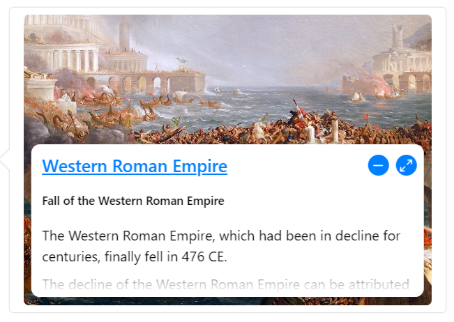
}The textOverlay prop allows you to overlay text on top of a media element in a card.To enable the text overlay feature, simply add the text property to the items array in your Chrono timeline data. Here's an example:
import { Chrono } from 'react-chrono';

const items = [
  {
    title: 'First item',
    media: {
      type: 'IMAGE',
      source: {
        url: 'https://example.com/image.jpg',
      },
    },
    text: 'This is the caption for the first item.',
  },
];

function MyTimeline() {
  return (
    <Chrono items={items} textOverlay />
  );
}
The user can click on the expand button to expand the text and see more details. Here's what it looks like:
With the textOverlay prop, you can give your timeline a modern and sleek look, and provide additional context or information about each item.
The Timeline cards of the component can also support embedded custom content. To insert custom content, pass the blocked elements between the Chrono tags. For instance, the below code snippet will generate two timeline items, where each div element will be automatically converted into a timeline item and inserted into the timeline card. The items collection mentioned in the code is completely optional, and custom rendering is supported on all three modes.
<Chrono mode="VERTICAL">
  <div>
    <p>Lorem Ipsum. Lorem Ipsum. Lorem Ipsum</p>
  </div>
  <div>
    <img src="<url to  a nice image" />
  </div>
</Chrono>
Note that the items collection will also work well with any custom content that is passed. In the following code snippet, the title and cardTitle are set for the custom contents.
const items = [
  { title: 'Timeline title 1', cardTitle: 'Card Title 1' },
  { title: 'Timeline title 2', cardTitle: 'Card Title 2' },
];

<Chrono mode="VERTICAL" items={items}>
  <div>
    <p>Lorem Ipsum. Lorem Ipsum. Lorem Ipsum</p>
  </div>
  <div>
    <img src="<url to  a nice image" />
  </div>
</Chrono>;To utilize personalized icons on the timeline, enclose a collection of images between the chrono tags, wrapped in a container.
The icons are arranged sequentially; meaning, the first image that you pass in will be used as the icon for the first timeline item, and so on.
It is important to note that the image collection must be passed in inside a container with the designated chrono-icons className. This is a required convention, as the component relies on this className to select the appropriate images.
<Chrono items={items} mode="VERTICAL_ALTERNATING">
  <div className="chrono-icons">
    <img src="image1.svg" alt="image1" />
    <img src="image2.svg" alt="image2" />
  </div>
</Chrono>
custom icons also works if you are rendering custom content inside the cards.
<Chrono mode="VERTICAL" items={items}>
  <div>
    <p>Lorem Ipsum. Lorem Ipsum. Lorem Ipsum</p>
  </div>
  <div>
    <img src="<url to  a nice image" />
  </div>
  <div className="chrono-icons">
    <img src="image1.svg" alt="image1" />
    <img src="image2.svg" alt="image2" />
  </div>
</Chrono>Nested timelines in React-Chrono allow you to display timelines within timeline cards. This feature is data-driven, which means that if a timeline item has an items array, the component will automatically attempt to render the nested timeline inside the timeline card.
To use nested timelines, simply provide an array of items within the items property of a timeline item. The component will then take care of rendering the nested timeline for you.
You can also adjust the height of the nested timeline card using the nestedCardHeight prop. This allows you to control the size of the card to fit your specific use case.
const items = [
  {
    title: 'Timeline title 1',
    cardTitle: 'Card Title 1',
    items: [
      { cardTitle: 'nested card title 1' },
      { cardTitle: 'nested card title 2' },
    ],
  },
  { title: 'Timeline title 2', cardTitle: 'Card Title 2' },
];

<Chrono mode="VERTICAL" items={items}></Chrono>;Enabling the slideshow feature can be done by setting the slideShow prop to true. Additionally, an optional slideItemDuration prop can be set to determine the time delay between cards.
Enabling this prop will cause the play button to appear in the timeline control panel. Use the slideShowType prop to set the type of slideshow animation.
| Mode | Default Slideshow Type |
|---|---|
| VERTICAL | reveal |
| VERTICAL_ALTERNATING | slide_from_sides |
| HORIZONTAL | slide_in |
<Chrono
  items={items}
  slideShow
  slideItemDuration={4500}
  slideShowType="reveal"
/>
The slideshow can be cancelled by clicking on the stop button in the control panel or by pressing the
ESCkey.
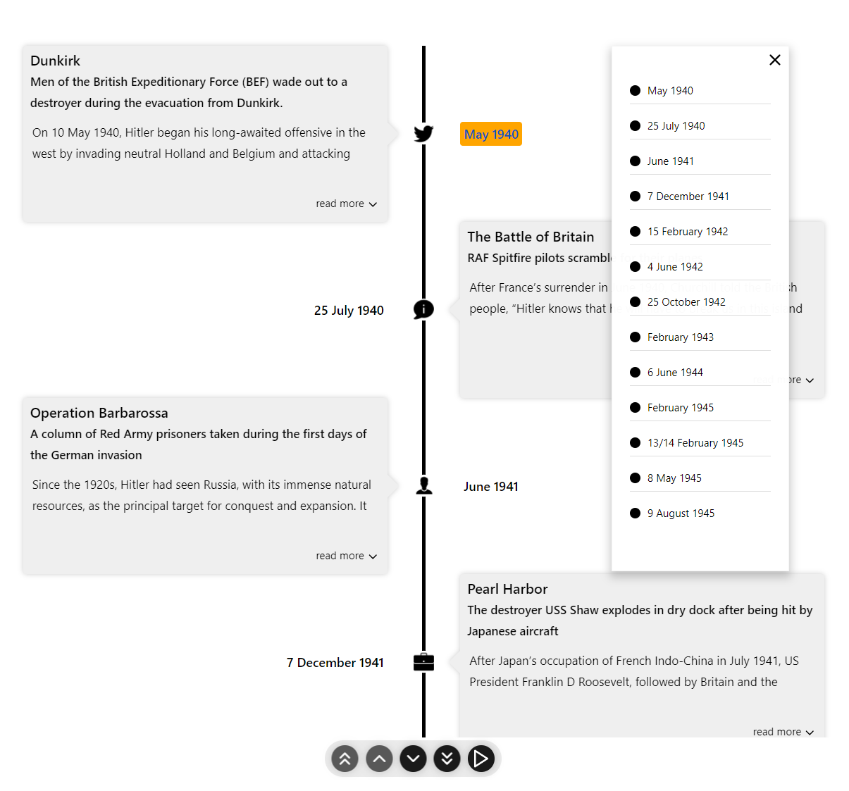
With enableOutline prop you can enable outline on the timelines and quickly jump to a specific timeline item.
The outlines are only supported on VERTICAL and VERTICAL_ALTERNATING modes.
<Chrono items={items} enableOutline />The itemWidth prop can be used to set the width of each individual timeline sections. This setting is applicable only for the HORIZONTAL mode.
Use media settings to align the media or change how a image is displayed in the card.
| Name | Description | Type | Default |
|---|---|---|---|
| align | aligns the media. can be left, right or center | string | center |
| fit | fits the image. can be cover or contain | string | cover |
<Chrono items={items} mediaSettings={{ align: 'right', fit: 'contain' }} />Use the breakpoint feature to automatically switch the timeline to VERTICAL mode when there is not enough space for VERTICAL_ALTERNATING mode, such as on mobile devices. Set the auto switch to happen by enabling the enableBreakPoint prop and specifying the pixel limit with the verticalBreakPoint prop.
<Chrono items={items} enableBreakPoint verticalBreakPoint={400} />Customize colors with the theme prop.
<Chrono
  items={items}
  theme={{
    primary: 'red',
    secondary: 'blue',
    cardBgColor: 'yellow',
    titleColor: 'black',
    titleColorActive: 'red',
  }}
/>Use the fontSizes prop to customize the font sizes of the timeline card.
<Chrono
  items={data}
  mode="HORIZONTAL"
  fontSizes={{
    cardSubtitle: '0.85rem',
    cardText: '0.8rem',
    cardTitle: '1rem',
    title: '1rem',
  }}
></Chrono>With the buttonTexts prop, you can change the button's alt text.
<Chrono
  items={data}
  mode="HORIZONTAL"
  buttonTexts={{
    first: 'Jump to First',
    last: 'Jump to Last',
    next: 'Next',
    previous: 'Previous',
  }}
></Chrono>
Defaults
| Property | Value |
|---|---|
first |
'Go to First' |
last |
'Go to Last' |
next |
'Next' |
play |
'Play Slideshow' |
previous |
'Previous' |
You can use the classNames prop to employ your own class names. The subsequent example illustrates how you can use custom class names on different elements.
<Chrono
  className="my-timeline"
  items={items}
  classNames={{
    card: 'my-card',
    cardMedia: 'my-card-media',
    cardSubTitle: 'my-card-subtitle',
    cardText: 'my-card-text',
    cardTitle: 'my-card-title',
    controls: 'my-controls',
    title: 'my-title',
  }}
/>- Horizontal Basic
- Horizontal - Show all cards
- Vertical basic
- Vertical Alternating
- Vertical All Images
- Vertical Custom content
- Vertical Custom content with items collections
- Custom Icons
Deep dive into wide variety of examples hosted as a Storybook.
# install dependencies
pnpm install

# start dev
pnpm dev

# run css linting
pnpm lint:css

# eslint
pnpm eslint

# prettier
pnpm lint

# package lib
pnpm rollup # run unit tests
pnpm test
# run cypress tests
pnpm cypress:test- Fork it
- Create your feature branch (
git checkout -b new-feature) - Commit your changes (
git commit -am 'Add feature') - Push to the branch (
git push origin new-feature) - Create a new Pull Request
- Typescript.
- Styled with emotion.
Huge thanks to BrowserStack for the Open Source License!
Distributed under the MIT license. See LICENSE for more information.
Prabhu Murthy – @prabhumurthy2 – prabhu.m.murthy@gmail.com https://github.com/prabhuignoto
Thanks goes to these wonderful people (emoji key):
Alois 📖 |
Koji 📖 |
Alexandre Girard 💻 |
Ryuya 📖 |
Taqi Abbas 💻 |
megasoft78 💻 |
Eric(书生) 💻 |
Christophe Bernard 💻 |
This project follows the all-contributors specification. Contributions of any kind welcome!
