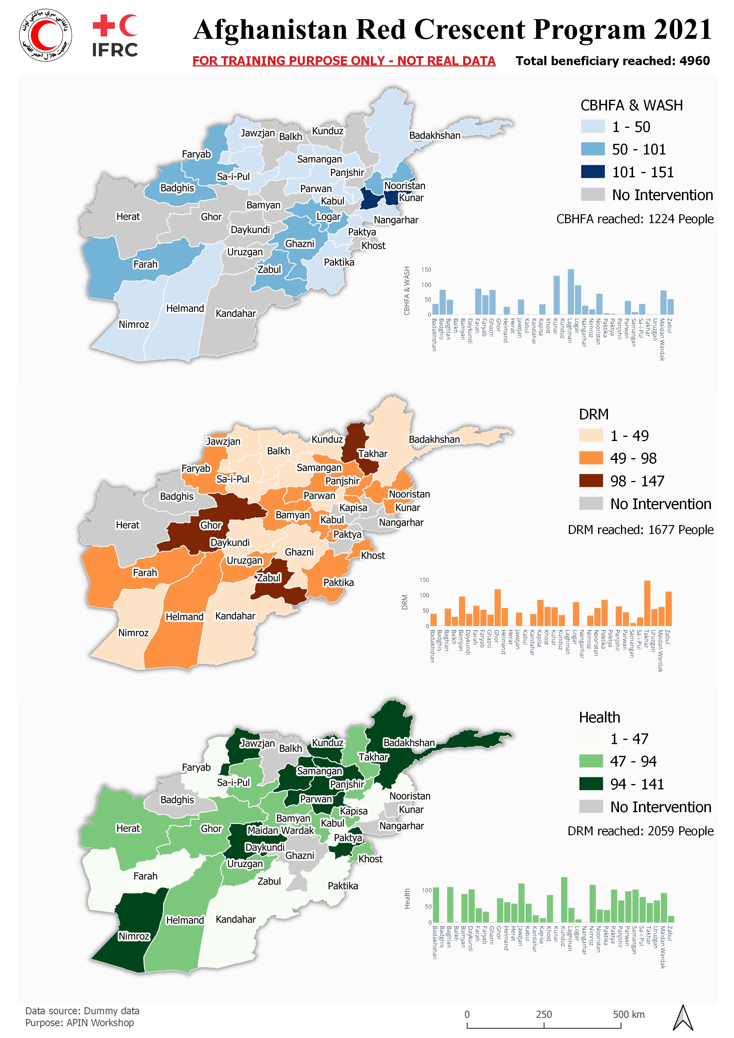
Short workhop on how to use QGIS to visualize data
Orientation on QGIS user interface such as:
- Menu bar
- Toolbar
- Layer panel
- Processing toolbox
Make use of QGIS geopackage (.gpkg) to store geo files and project
Prepare the data using Spreadsheet software, pivoting and proceed to join table operation.
Using Spreadsheet plugin to import raw data into QGIS. Installing DataPlotly for simmple charting
Join non-spatial data to existing spatial data
Play with map style to do choropleth map
Arrange map visual according theme and to be used in QGIS map composer
Create outer boundary/island effect by dissolve geo processing operation
Basic know how where the buttons are
Arranging map and follow map theme and adding map legend, compass and scale bar
Using DataPlotly to create nice bar chart
Sum total data depend on layer and filed data
