I will no longer support for bugs nor questions, I leave it up to the community!
bigSCale is a complete framework for the analysis and visualization of single cell data. It allows to cluster, phenotype, perform pseudotime analysis, infer gene regulatory networks and reduce large datasets in smaller datasets with higher quality. The latest update alos allows analysis of single cell ATAC-seq data.
Why using bigSCale 2?
- bigSCale2 features the most sensitive and accurate marker detection and classification. No method is used to reduce dimensions, every bit of information is retained.
- bigSCale2 allows to infer the gene regulatory networks for any single cell dataset.
- bigSCale2 allows to compress large datasets of any size into a smaller datasets of higher quality, without loss of information. One millions cells are too many to be analyzed by your favourite tool ? Reduce them to a dataset with less cells of increased quality and go for it!
Citatations If you used bigSCale2 please cite out papers Iacono 2018 and Iacono 2019.
UPDATES
v2.0 (22/11/2019): Several Major updates, especially for the networks part. It is now possible to export and visualize the networks in Cytoscape. Also improved processig when inferring networks of different conditions to compare them.
v1.7 (04/07/2019): Fixed a bug inside the differential expression code. You might want to re-run your analysis (including networks, clustering, phenotyping ....) to have better results. Thanks to JasonLiZhou for signalling it.
v1.6 (04/07/2019): Added a pipeline for single cell ATAC-seq data.
v1.5 (28/06/2019): Fixed a bug in the iCells which was causing an excessive use of memory usage.
Quick Start
bigSCale is formed by three sub-tools which can be used either independently or in synergy. Each sub-tool has its own tutorial.
bigSCale 2 Core allows to cluster, phenotype and perform pseudo-time analysis. It's the main tool of bigSCale, published in Iacono 2018.
bigSCale 2 GRN is the newest addition: it is the module to infer gene regulatory networks from single cell data. Iacono 2019
bigSCale 2 iCells allows to reduce the dimension of any given large dataset (also millions of cells, without any loss of information) so that it can be easily and quickly analyzed by any tool.The resulting dataset has less cells with higher quality, so it can be analyzed better. It DOES NOT require any external tool such as the loom framework.
For help or questions contact me at gio.iacono.work@gmail.com
To install the package run
devtools::install_github("iaconogi/bigSCale2")
READ BEFORE STARTING bigSCale2 is a special tool designed to have maximum accuracy in clustering and detection of markers. bigSCale2 achieves extreme accuracy also because it does not use any dimensionality reduction. If you have a large number of cells and you want to cluster/phenotype it with bigSCale2 Core, then first process it with the tool bigSCale2 iCells. As a rule of thumb, you can analyze directly (without process with iCells) up to 20K cells if you have 16 Gb of RAM or up to 40K cells if you have 32b of RAM.
bigSCale2 works with the SingleCellExperiment class. This class is a container meant to store in an organized way single cell data.
bigScale2 requires two elements to be present in the single cell class: the counts counts() and the gene names rownames().
The counts must be raw counts! The genes must no be filtered, aside from removing, if you want, the gene with all zero values.
Let us first load an example dataset : 3005 single cells from adult mouse brain Zeisel 2015
data(sce)
As you can see, the sce object contains the expression values for 19972 genes in 3005 cells. In its most basic use, bigScale is run with just one command sce=bigscale(sce) which will automatically perform all the analysis. However, for time reasons, we will instruct bigSCale2 to perform a quick analysis to save us time, by specifying speed.preset='fast', which greatly reduces the the time required to compute markers and differentially expressed genes, but at the expenses of the quality and accuracy (uses only wilcoxon test). In a real analysis we reccomand not to use this setting, and achieve maximum accuracy leaving as default speed.preset='slow' (leaving speed.preset='fast' works well when you have lots of cells, say>15K or 20K).
sce=bigscale(sce,speed.preset='fast')
The analysis are now all complete and stored again in the sce object. In the next part we'll see how to visualize the results.
bigSCale2 feature a basic set of plot types to visualize the main results of clustering and phenotyping.
First, we make a plot of the clusters and signatures of coexpressed genes. After some recent updates, to view the signaures you must run fisrt some additional lines of code.
sce=setDistances(sce)
sce=setClusters(sce)
sce=storeTransformed(sce)
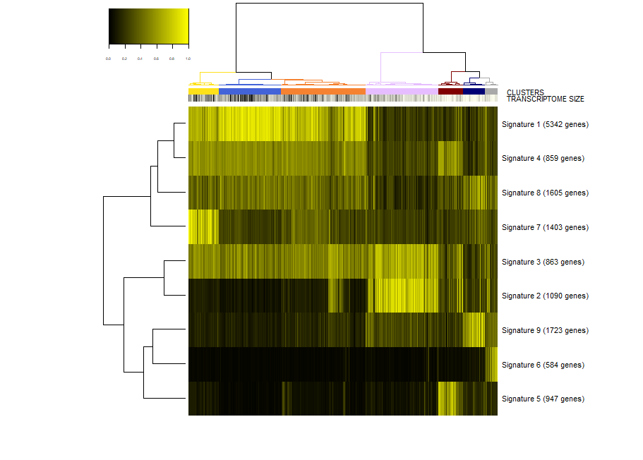
viewSignatures(sce)
In this plot you can see
- The dendrogram representing how the cells are phenotypically organized and clustered
- Colored bars representing the clusters, the library size (meant as a proxy to transcriptome size/complexity) and the pseudotime of the cells. An additional color bar is displayed for any user custom
colData()(for example, sample batches, conditions and so on ...). For custom usercolData, the color codes are automatically chosen upoen the type of data (numeric or factor). - The clustered signatures of coexpressed genes alogside their size. Here, all the genes differentially expressed are organized in signatures of co-expressed genes.
Next, we would like to inspect the markers of a specific cluster, let's say cluster 2. To this end, we run.
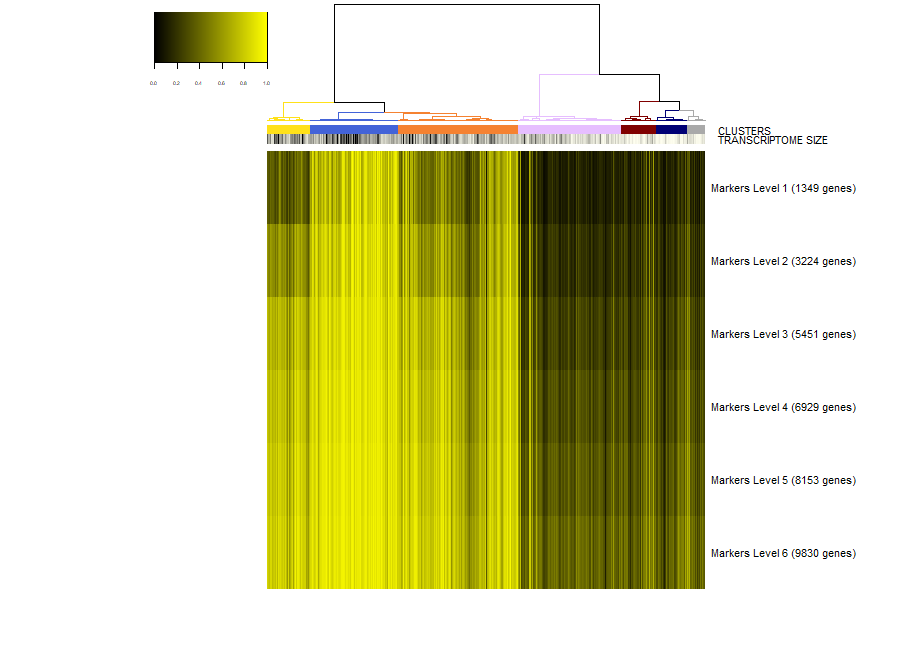
viewSignatures(sce,selected.cluster=2)
Now, the plot is the same as before, but in place of the signatures of coexpressed genes we see the markers of cluster 2 stratified by level of specificity. If you read my paper Iacono 2018 then you'll know what this means. Shortly, markers of level 1 are the most specific to a given cluster. Level 1 means that this 417 genes are expressed only in cluster 2 . However, shared markers are also very important in biology. Think to all the markers shared by neuronal cell types as opposed to glial cell types. Shared genes are represented in biSCale by markers of increasing levels. Markers of level 2 (629 genes) are markers shared between cluster 2 and at most another cluster. Markers of level 3 are shared shared between cluster 2 and at most two other clusters, and so on. These markers of higher levels are typically lost by other computational tools.
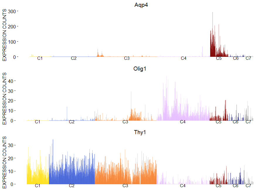
To plot gene expression at single cell level with colored clusters. This plot works well in synergy with the plot of the hierachical clustering.
viewGeneBarPlot(sce,gene.list = c('Aqp4','Olig1','Thy1'))
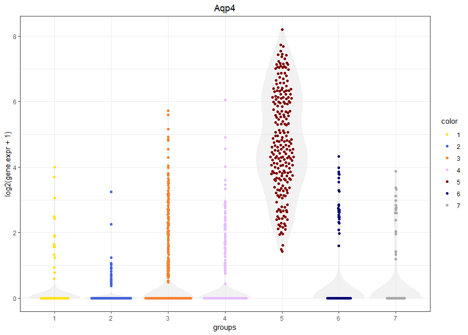
viewGeneViolin(sce,'Aqp4')
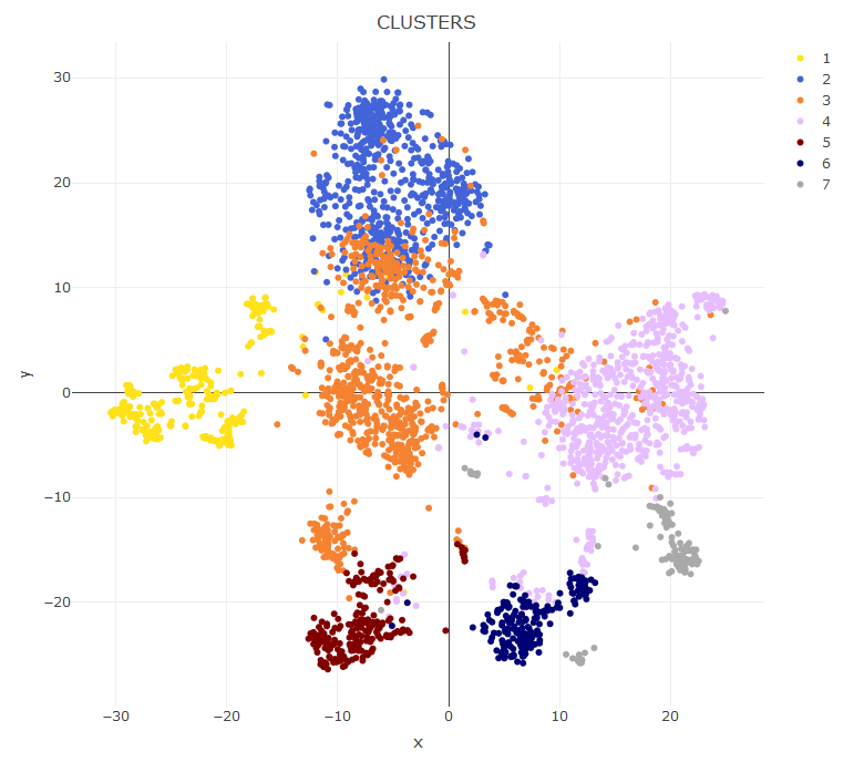
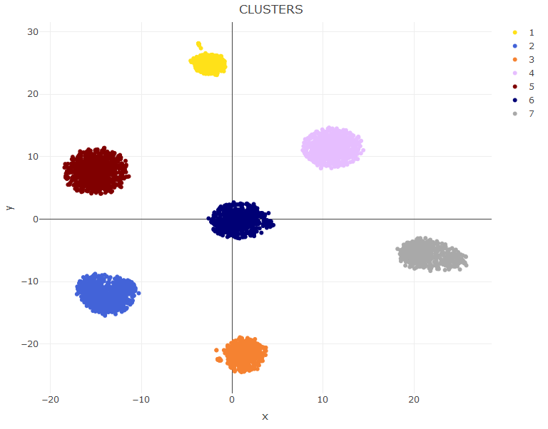
viewReduced(sce) # to see t-SNE with clusters
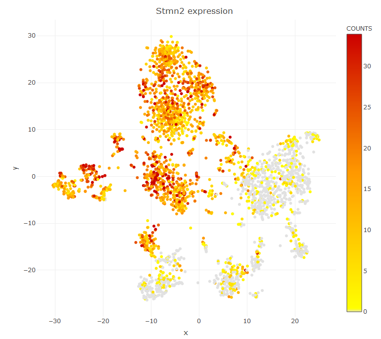
viewReduced(sce,color.by = 'Stmn2') # to see t-SNE with gene expression
If you want to color the cell according to some custom annotation you pass a factor variable in place of a gene name. If you want to visualize a UMAP plot first compute the UMAP data with sce=storeUMAP(sce) and then viewReduced(sce,method = 'UMAP')
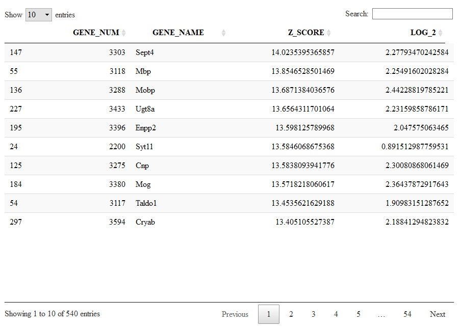
To have a look to the markers found by bigscale we retrive Mlist from the single cell object. Mlist is a 2 dimensional list containing for each cluster the markers of the different levels. Let's inspect the markers of level 1 (most specific) of cluster 4 (oligodendrocytes). We will take advantage of the package DT for interactive visualization.
Running the next command line we will see the markers specific to cluster 4 sorted from the highest (most significant) to the lowest (less significant) Zscore.
Mlist=getMarkers(sce)
DT::datatable(Mlist[[4,1]])
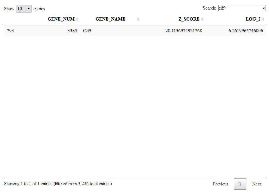
Let us now check other genes marking oligodendrocytes (cluster 5) which are shared with other clusters. We check markers of level 5 to include genes shared with at most 4 other clusters.
DT::datatable(Mlist[[4,5]])
Here we can browse for Cd9, which has now a significant Z-score. Cd9 is a surface receptor expressed in oligodendrocytes but also in all the other glial cells.
Alternatevely to a cluster-based organization of the markers (as shown before, we have clusters and we have levels) there is also a more compact organization of markers into lists of co-expressed genes. This are the same lists shown with viewSignatures(sce).
Let us give a look to signature 1, a large list of 5432 genes expressed in neurons.
Signatures=getSignatures(sce)
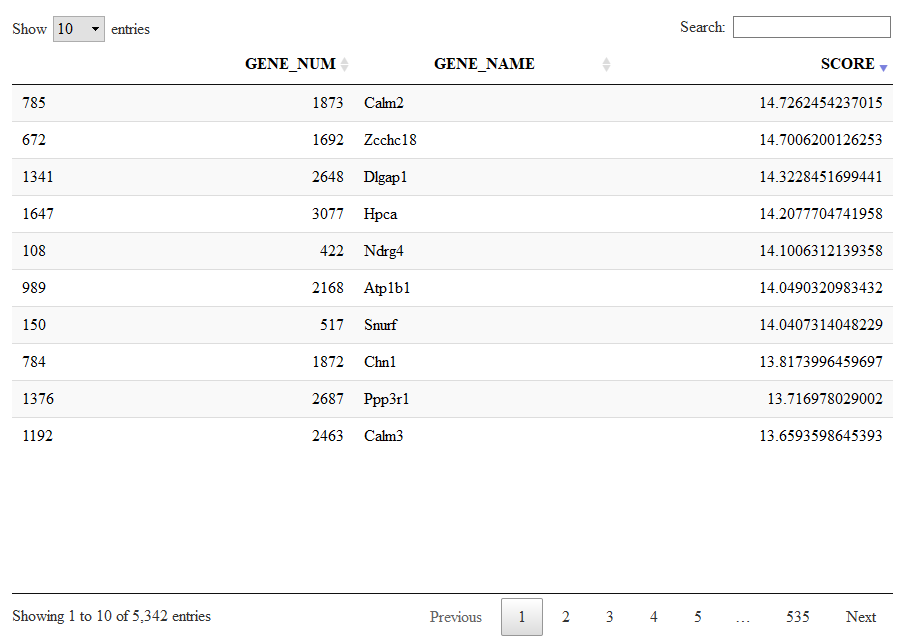
DT::datatable(Signatures[[1]])
Keep in mind that we calculated these markers and signatures with the speed.preset='fast' which means low quality. This plots nd tables are for demonstration purposes only.
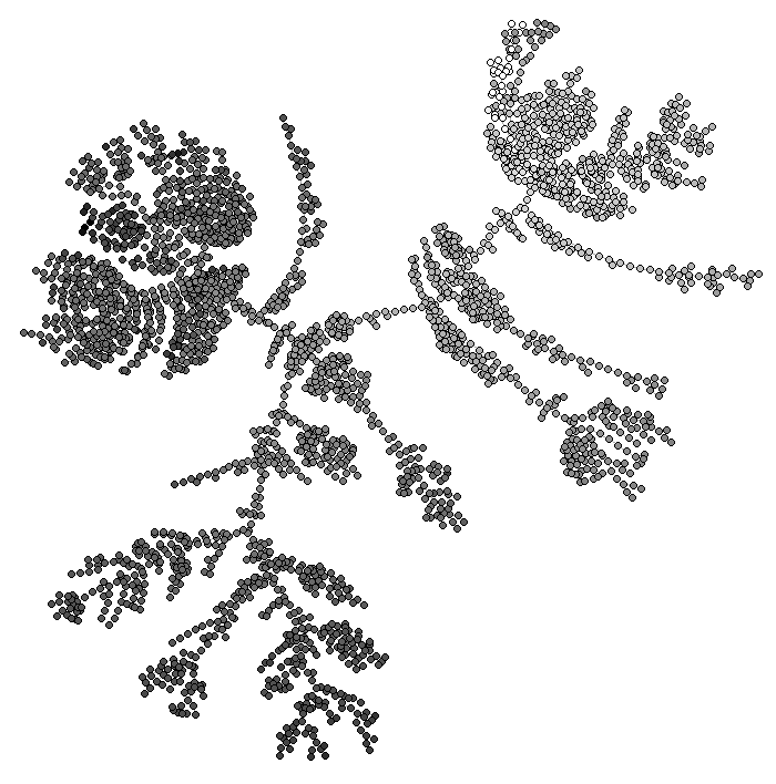
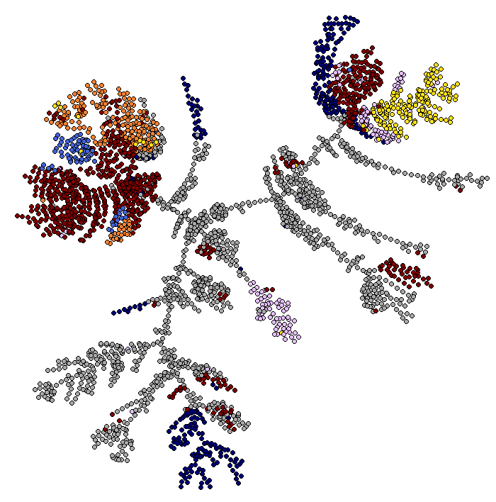
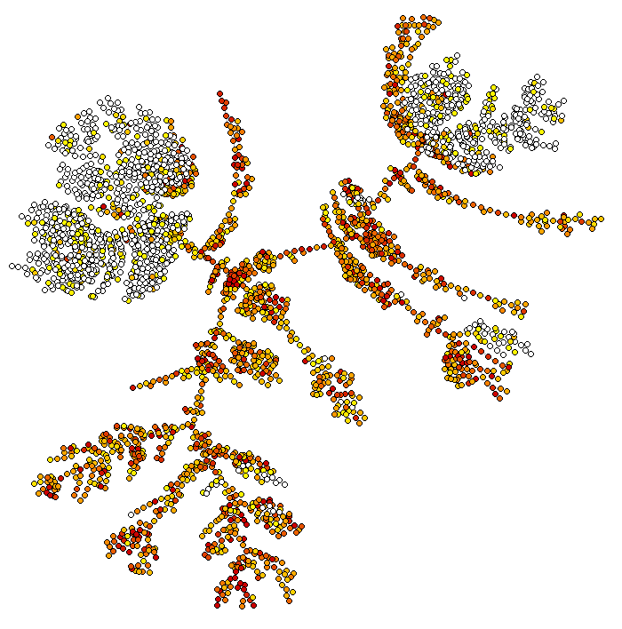
bigSCale2 can infer pseudotime and plot differentiation trajectories. By default, the flag pseudotime=TRUE tells bigSCale to compute psudotime.
It does not make much biological sense to compute pseudtime of fully differentiated brain cells but this is just a technical demonstration. To view the results of the pseudotime we run:
ViewPseudo(sce,color.by = 'pseudo') # colors by pseudotime
ViewPseudo(sce,color.by = 'clusters') # colors by clusters
ViewPseudo(sce,color.by = 'Stmn3') # colors by a specific gene
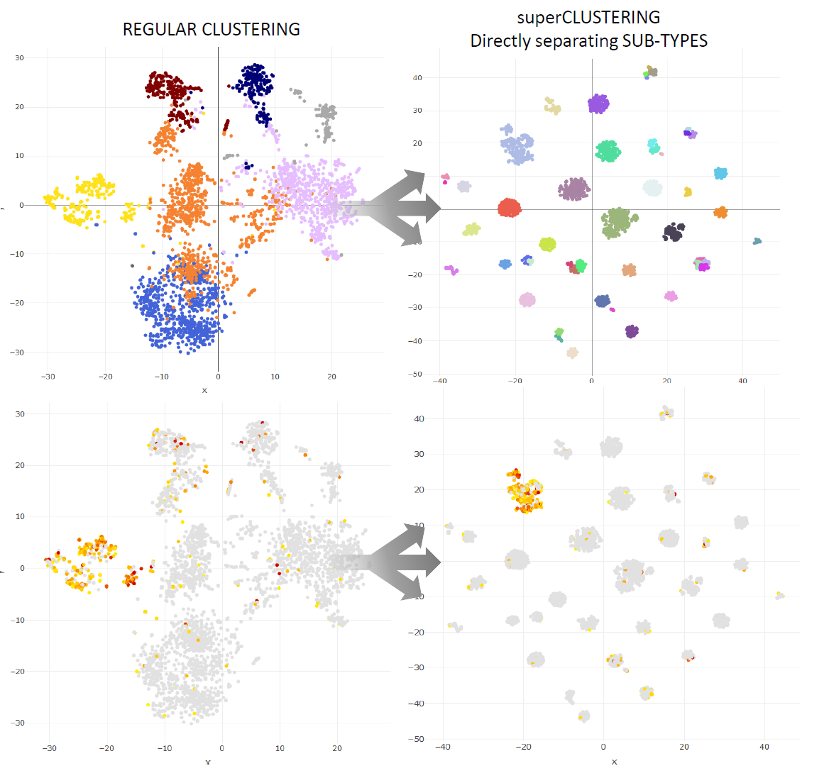
Super Clustering is a highly accurate recursive clustering which directly individautes the sub-types of a dataset.
It can be activated by using the option clustering='recursive' when running bigSCale.
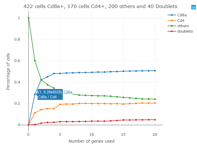
I recently came along a blood dataset in which it was impossible to clearly separate Cd4+ and Cd8+ T-cells. More in general, it can happen that two biologially distinct populations of cells with known, mutuallye exclusive, markers are not separated in the T-sne plot. In these cases you can use the new "classifier" featured introduced in bigSCale2. At the moment the classifier requires two markers of the two cell types you want to separate (works up to three). For example, if you want to separate Cd4+ and Cd8+ T-cells you should run.
sce=setClusters(sce,classifier = c('Cd4','Cd8a'))
This code assigns new clusters to your dataset. Specifically, it will force the creation of 4 clusters (Cd4+,Cd8+,others(double negatives), and doublets (double postivies)).
The tool works by selecting genes co-expressed with your markers and using them to tame the problem of dropouts. The output graph shows how the size of the 4 clusters changes with the increase of the markers used. Passing the cursor over each dot displays which markers have been added in each step. The first markers used in step1 are most of the times the input markers, in this case Cd4 and Cd8. By default, the tools add up to 20 markers (20+20). This number can be changed with the parameter num.classifiers. This tool is still a prototype, so if you encounter problems please do not hesitate to contact me at gio.iacono.work@gmail.com or by opening an issue in GitHub.
bigSCale2 can be used to analyze ATAC-seq data. I assume that your data is stored in a SingleCellExperiment class, same as RNA-seq data. Basically each called peak is a feature with a certain number of reads in each cell. At the end of this brief ATAC-seq tutorial I'll show how to load the data from a 10X atac experiment. Before you continue, you should know that bigSCale2 at the moment supports only small size ATAC-seq datasets. Depending on your available RAM, max size could range from 10k to 30/50k cells. In the future I will add the support for datasets of unlimited size. If you want to know more about bigSCale2 and ATAC-seq contact me at gio.iacono.work@gmail.com
We now load the sample dataset, 5234 PBMCs from the public 10x dataset already stored in a SingleCellExperiment object.
data(atac_sce)
sce
class: SingleCellExperiment
dim: 52914 5234
metadata(0):
assays(1): counts
rownames(52914): OR4F16 distal 1 AL669831.1 distal 2 ... PRORY distal 52913 PRORY distal
  52914
rowData names(0):
colnames: NULL
colData names(0):
reducedDimNames(0):
spikeNames(0):
We have 52914 peaks in 5234 cells. Analysis works with a single line, similar to RNA-seq data.
sce=bigscale.atac(sce)
After the analysis is over we can visualize the results in a similar way as in RNA-seq data, therefore to learn more details please refer to the bigSCale tutorial for visualizing RNA-seq data (example, Browsing markers, Violin plots and so on).
viewReduced(sce) # to see t-SNE with clusters
Mist=getMarkers(sce) # to get the Markers of cell clusters
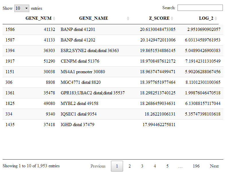
DT::datatable(Mlist[[1,1]]) # to visualize the markers specifc to cluster 1
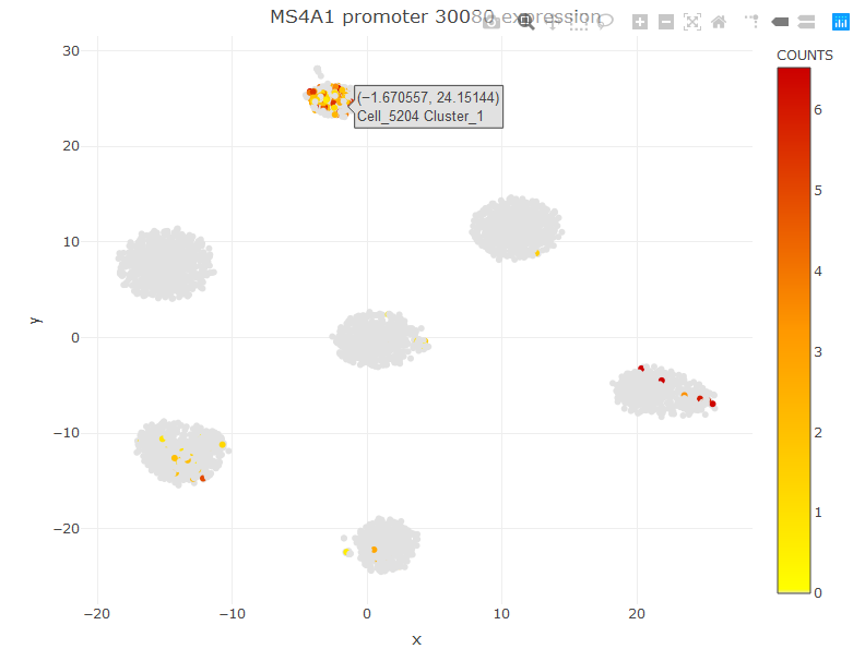
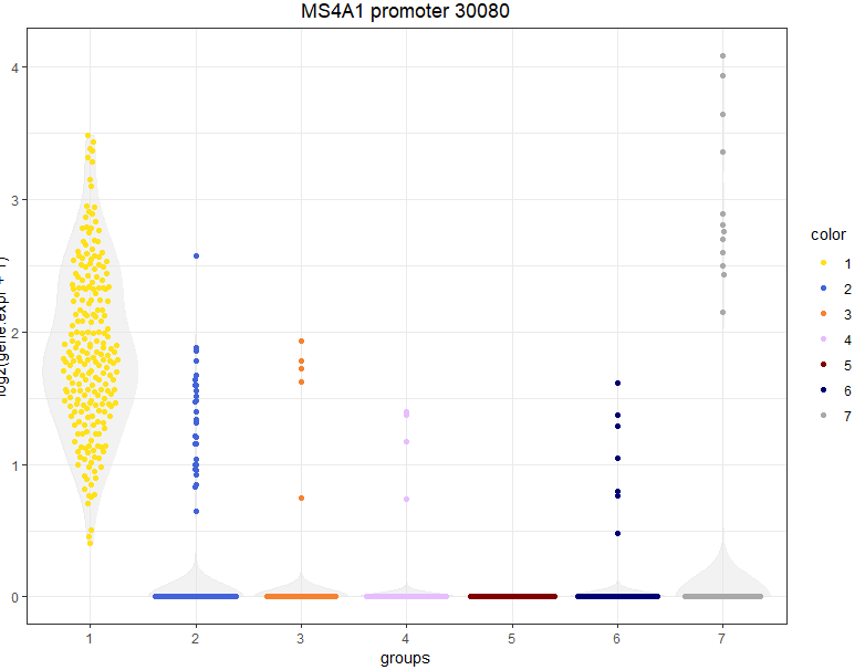
We have almost 2k peaks with higher frequence in cluster 1. The peak names are extracted from the 10x CellRanger output files. I also added a number at the end of each peak beacuse there are otherwise peaks with identical names. So, for example, the peak number 30080 is the the most specific promoter peak distinguishing C1 from the others. We can visualize the expression of this peak in the t-SNE or Violin Plot.
viewReduced(sce,'MS4A1 promoter 30080')
viewGeneViolin(sce,'MS4A1 promoter 30080')
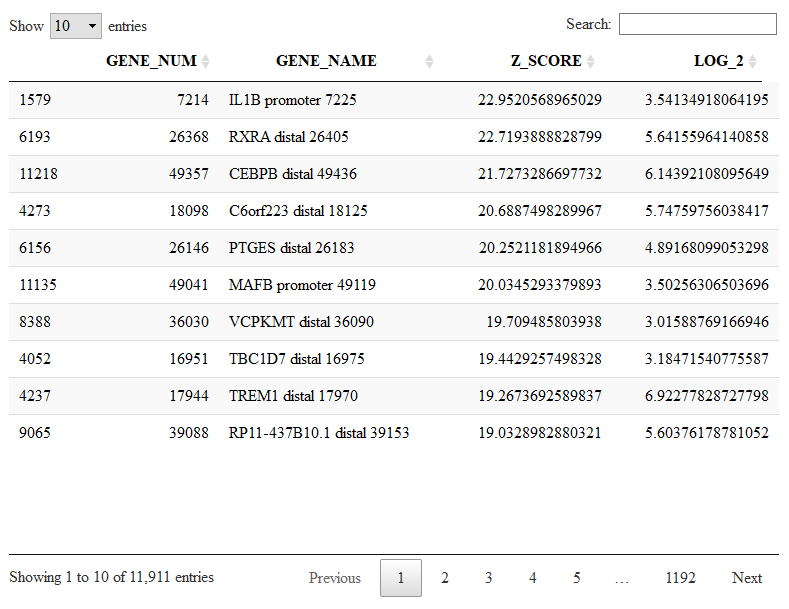
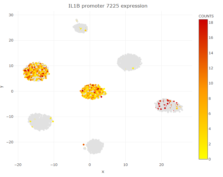
The object Mlist can also be used to search for peaks shared between clusters. For example C5 does not have any specific marker, but it has several markers shared with at most another cluster, as for instance the gene IL1B shared with C6.
DT::datatable(Mlist[[5,2]])
viewReduced(sce,'IL1B promoter 7225')
You can inspect signatures of co-expressed peaks using the command ViewSignatures(). However, for ATAC-seq data it work differently than RNA-seq data. Specifically, you should do:
out=viewSignatures(sce) # We extract the average cell-wise signature expression for each signature
viewReduced(sce,color.by = out$`Signature 1`) # We visualise the t-SNE with the expression of a given signature
Here we see the expression of signature 1, which is shared between clusters 5 and 6. To inspect the genes of signature 1 we run:
signatures=getSignatures(sce)
head(signatures[[1]])
  GENE_NUM                                            GENE_NAME    SCORE
1    25568                                  KLF4 promoter 25605 16.19392
2     7214                                   IL1B promoter 7225 16.08160
3    38594                                 PPCDC promoter 38658 15.61617
4     6095 C2orf61;RP11-761B3.1;TTC7A distal;distal;distal 6102 15.45972
5    26368                                    RXRA distal 26405 14.52509
6    18098                                C6orf223 distal 18125 14.42887
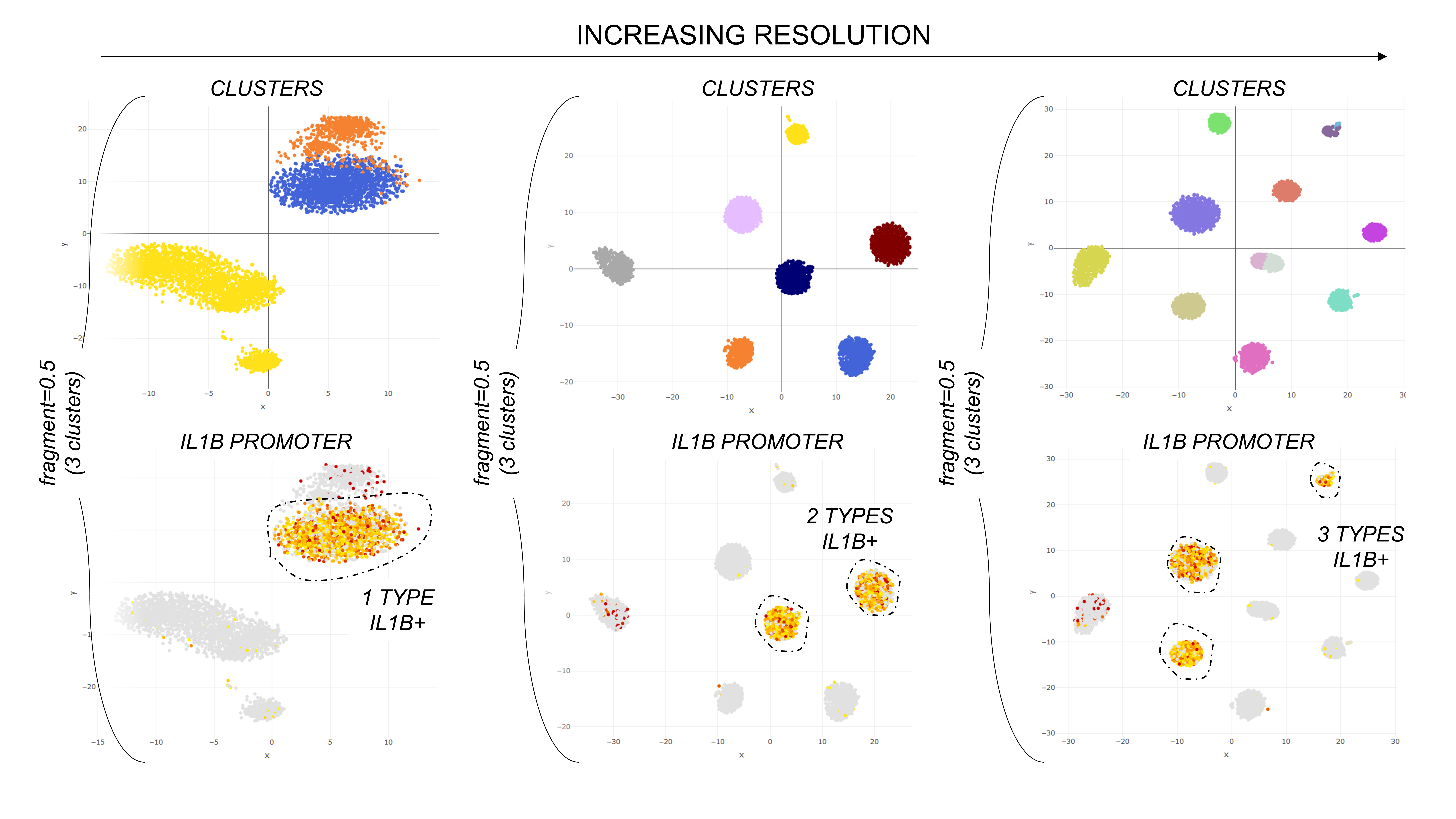
The parameter "fragment" adjusts the resolution of the clustering. By deault fragment=0.1, meaning that clustering stops when the clusters are about 10% or more of the total cell number. This value can be mobdulated to find the desired resolution, as in the plot below.
It is also possible to compute a pseudotime for our dataset.
sce=bigscale.atac.pseudo(sce) # compute pseudotime
ViewPseudo(sce,color.by = 'clusters') # visualize it coloring cells by clusters
For more information on plots with pseudotime plase refer to the pseudotime plot for RNA-seq data or contact me at gio.iacono.work@gmail.com
The bigscale() function which performs all the analysis at once is actually a wrapper for a series of sub-functions.
Here we see how to run each part of the analysis separatly, to customize the pipeline.
We start again from the same dataset of the basic tutorial.
data(sce)
Now, the first step is to pre-process the dataset. This step removes null genes and creates a number of internal variables needed by bigSCale2. In the future I will add the possibility here to specify a custom library size.
sce=preProcess(sce)
Next three passages are non customizable (at least for the moment), we run them at once:
sce = storeNormalized(sce) # stores normalized data
sce=setModel(sce) # computes the numerical model
sce = storeTransformed(sce) # stores transformed expression data (needed for some plots)
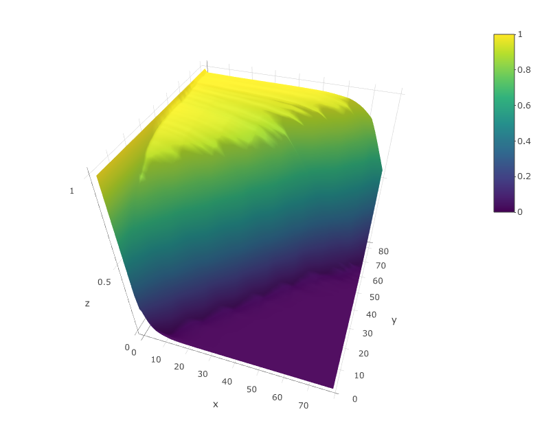
A very important thing is to check that the numerical model of bigSCale2 is not completley messed up. In my experience it is a rare case but can happen. To check the computed model we run:
viewModel(sce)
The model should look similar to the upper figure: a kind of sigmoidal surface decreasing more or less steeply in the diagonal. The sharper the decrese of the surface along the diagonal, the better the quality of the dataset. If the plot is very different from this one contact me. I will probably add in the close future an automated quality check of the model.
Now we compute the highly variable genes and we calculate cell to cell distances.
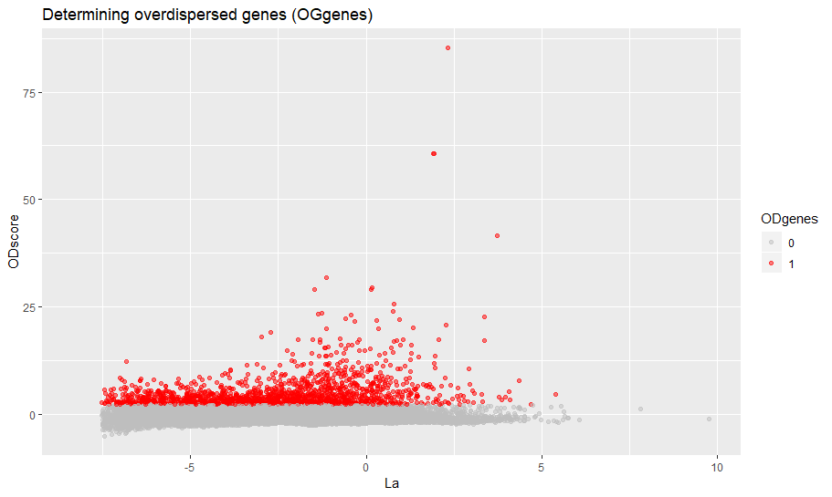
min_ODscore is the Z-score treshold for selecting the genes (default 2.33). Increase it to be more stringent (less genes) and viceversa. It is also possible to exclude specific intervals of expression from highly variable genes (parameter use.expm check documentation of setODgenes). For example, exclude highly expressed genes (e.g. Ribosomal, Mitochondrial) from being selected.
sce = setODgenes(sce,min_ODscore=2.33)
You can visually inspect the selected highly variable genes with:
viewODgenes(sce)
Next we compute the distances, nothing to customize here.
sce=setDistances(sce)
We compute and store the TSNE data, if you want to see TSNE plots of course. Otherwise skip.
sce=storeTsne(sce)
Now we cluster the data. Here you can make a couple of customizations to vary the number of clusters or even providing your own clusters. Check the help of the setClusters to see how to do.
sce=setClusters(sce)
If you want to make also pseuotime analysis then run:
sce=storePseudo(sce)
With the next command we compute the differential expression for all genes. This is generally the slowest part of the analysis. You can trade speed versus accuracy by changing the parameter speed.preset. I reccomand speed.preset='slow', which is maximum accuracy with long computational time. I already discussed this parameter in the basic introduction.
sce=computeMarkers(sce,speed.preset='slow')
Now we organize all the genes into markers and signatures of co-expression. cutoff is a Z-score which filters the genes and retains nly thosw with significant changes of expression. Inrease it if you want to be more stringent or viceversa.
sce=setMarkers(sce,cutoff=3)
Finally, we restore some matrices from the virtual memory and we have competed our analysis.
sce=restoreData(sce)
Important: This short tutorial will show how to infer regulatory networks from single cell data and quantify gene centrality (and some other stuff). Clearly, graph theory is a large word, and there are lots of analysis other than node centrality that you can potentially perform on the networks. We leave this up to you!
bigSCale2 allows to infer the putative gene regulatory network (GRN) from any single cell dataset. Here, we will show how to infer the GRNs from healthy pancreas and from type 2 diabetes (T2D) pancreas and compare them. This is the same pancreas dataset used in our paper, from Segerstolpe 2016. Let's load the data.
data("pancreas")
First, we set to generate the network of the healthy pancreas. For this we simply need the raw expression counts expr.ctl and the gene names gene.names. Please note that for the moment bigSCale2 supports only Gene Symbols or Ensembl, Mouse and Human. Contact me if you want that I add other species or nomenclatures.
There is only one parameter that you will change when doing a basic use of our tool. The parameter is clustering and it works as tradoff between accuracy and time. To put it simply:
clustering='recursive' Is the default. Maximum accuracy, maximum time. If you are okay with leaving overnight then run it.
clustering='direct' Good accuracy, mimimum time. The fastest way to have results, if you are in a hurry.
results.ctl=compute.network(expr.data = expr.ctl,gene.names = gene.names)
The output of compute.network() is a list with a series of useful elements. I will not discuss here all the elements, I added a clear explanation about them in the help of the function compute.network().
Let's have a look to the pancreas healthy network.
results.ctl$graph
IGRAPH 8974736 UN-- 2268 9490 --
+ attr: name (v/c), bigSCale.Degree (v/n), bigSCale.PAGErank (v/n), bigSCale.Closeness (v/n), bigSCale.Betweenness (v/n)
+ edges from 8974736 (vertex names):
 [1] TGFBR3--RGS16     TGFBR3--SIX2      TGFBR3--ENTPD3    TGFBR3--GLP1R     TGFBR3--ASB9      PINK1 --RNF220    PINK1 --APH1A     PINK1 --PCBP1
 [9] PINK1 --TEX261    PINK1 --TADA3     PINK1 --NELFA     PINK1 --HNRNPA0   PINK1 --PNRC1     PINK1 --C7orf26   PINK1 --BRI3      PINK1 --CIZ1
[17] PINK1 --ENDOG     PINK1 --TMEM203   PINK1 --LDB1      PINK1 --SRSF9     PINK1 --ERH       PINK1
+ ... omitted several edges
We have succesfully generated the network. Healthy pancreas network has 2268 nodes (genes) and 9490 edges.
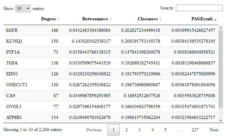
bigSCale2 has already calculated the gene (node) centralities and stored them in the output list. Centralities are a measure of the importance of a gene in the regulatory netowork. You should read our paper to know more. Let us give a look to the most central genes in the healthy network.
DT::datatable(results.t2d$centrality)
Here you have the table with the four centralities for each gene. You can sort each centrality to have a look to the most central genes. In the picture we sorted the PageRank. Genes with high PageRank are important regulation hubs.
To visualize the netwok I reccomand to use Cytoscape, which integrates really well with the purposes of bigSCale2. Since version 2.0, it is possible to export the network in a *.json file which can be loaded directly in Cytoscape.
toCytoscape(G = results.ctl$graph,file.name = 'Ph_net.json')
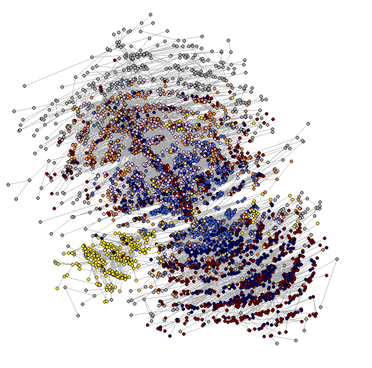
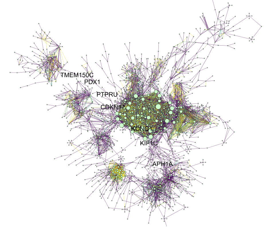
This script exports all the node centralities (PageRank, Degree, Betweenness and Closeness) alongside the node(gene) names. This is the visualization that I get for the network after playing a couple of minutes in Cytoscape.
I have used the "Organic Layout", Nodes are sized according to Degree and Edges colored according to Edge Betweenness (this one calculated in Cytoscape running Tools->Network Analyzer->Network Analysis->Analyze Network). The genes names are shown only for the genes with Betweenness>0.1
Comparing regulatory networks of different conditions (in current example, healthy and diabetic pancreas) is pheraps the most interesting scenario. I have made a number of improvements in the processing of muliple networks to minimize processing artifacts. Also the tutorial is now a bit different. First, we want to establish a numerical model (used by bigSCale for inferring the correlations) which is the same for all networks (whereas in the previous tutorial each network was compute with a different numerical model). To do so we run compute.network.model() on concatenated expression counts Please note that this step is not needed if using the settings modality='pca', which is the default, and clustering='direct', which is not the default.
model=compute.network.model(expr.data = cbind(expr.ctl,expr.t2d))
Now that we have the model we can calculate the two networks (healthy and diabetic) giving the same model as input.
results.ctl=compute.network(expr.data = expr.ctl,gene.names = gene.names,model = model)
results.t2d=compute.network(expr.data = expr.t2d,gene.names = gene.names,model = model)
Now, healthy pancreas has a network of 2301 nodes and 9513 edges, while type 2 diabetes has 5387 nodes and 48583 edges. The two networks have been generated using the same cutoff for pearson correlation, which is equal to 0.9 by default. While we could compare the networks straight away, my current advice is to further manipulate the networks to obtain a similar number of edges between the two. In this way we minimize the processing differences and we will get more meaninful results when comparing node centralities. To homogeneize the number of edges troughout multiple networks, prior to comparison of gene centralities, we run the line:
output=homogenize.networks(list(result.ctl,result,t2d))
result.ctl=output[[1]]
result.t2d=output[[2]]
Now the two networks have very similar amount of edges, anmely 23745 and 23456. To compare changes in node centralities from control to T2D networks we run.
comparison=compare.centrality(list(results.ctl$centrality,results.t2d$centrality),c('Control','TD2'))
The input of compare.centrality() is a list whose elements are the previously calculated centralities. We also provide the complete names of the conditions which will be used to annotate the output. The output of compare.centrality() is a list of data.frames. Each data.frame stores the genes ranked for their change in one given centrality (degree, betweenness, closeness, pagerank in order).
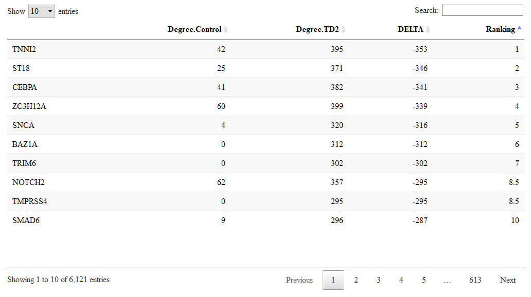
Let us check the genes with changes in degree.
DT::datatable(comparison$Degree)
As you can see, despite having the same amount of total edges, we can observe a heavily rewring around a numer of nodes. For example, BAZ1A becomes an important hub with high degree in the diabetes.
In our paper we show how to integrate node cenrality with differential expression (DE). The idea is simple. The genes with the highest centrality in the regulatory network are the most biologically important. Exploiting the known centrality, you can extract the DE genes with maximal biological relevance.
Let's say that you are particularly interested in a specific gene. Aside from computing its centralities, you can also have a closer look to its correlations using the $correlations matrix in the output of compute.network() (check the help of the function). In this way you can check the correlations between your gene of interest and the rest of the trancriptome. If you have more than one network, you can compare how these correlations change.
Networks are automatically generated by retaining only the most significant correlations. By default, the parameter quantile.p=0.90 retains only the pearson correlations > 0.9. These selected correlations will become the edges of the raw network. Alternatevely, It possible to use a percentile selection instead of a fixed value selection for reasons explained in our paper. To do so, quantile.p must be set be for example to 99.8, which means that only the top 0.2% of correlations are retained (=100-99.8). If quantile.p is between 0 and 1, it will be interpreted as a correlation cutoff, if it is >1 it will be interpreted as a quantile selection.
Let's say we want to be more strict with the selection of the edges, we want to use 0.95 instead of 0.9 for quantile.p for the control network.
results.ctl=compute.network(previous.output = results.ctl,quantile.p = 0.95)
Also, if you believe that your network is too dense (too many edges) or not dense enough (not enough edges), you can re-run the analysis increase or decreasing quantile.p, respectevely.
iCells are the most peculiar and interesting feature of bigSCale2. With iCells, you can reduce large datasets of any size into smaller datasets of significantly higher quality. These datasets can be in turn analyzed with any tool, also those which do not natively support large cell numbers.
Once you find a cluster in the iCell dataset, you can extract the relative cells directly in form of expression counts using extract.cells().
We now show to examples using the two different output format you can typically encounter: mtx and hdf5.
If you have an expression matrix which is loaded in R workspace first write it to .mex file using the very simple Matrix::writeMM() and then proceed as I show next.
As an example we now transform the dataset of 2 millions cells of the recent work: The single-cell transcriptional landscape of mammalian organogenesis.
At the moment the iCells works with either .mex files or .h5 files, which are the typical outputs of CellRanger. We download the 2M cells counts gene_counts.txt from here. This file is in the .mex format.
We now create the iCells, setting to reduce to approximately 15K cells:
out=iCells(file.dir = "gene_counts.txt",target.cells = 15000)
This will take some time (2M cells are a lot). So you can find the iCells here.
The output of iCells() includes the iCells expression counts, the indexes of the original cells for each iCell and other elements (see the the help of the function).
We will now process the 384K cells of the Umbilical cord blood dataset from the human cell atlas portal.
The final result of this tutorial, a dataset of approximately 8K high quality iCells from umbilical cord blood can be found here
This example is different than the previous one in three ways: 1) the format of the input is .h5 instead of .mtx 2) the cell are unfiltered, so we have to filter the cells before running
iCells() 3) We will use the conditions (namely, the patient IDs of each cell) to instruct iCells() not to pool cells of different patients. I do not reccomand doing this, normally: I do not see any problem if an iCell contains cells of, say, two patients. It just means that this iCell represents a cell type present in more than one patient. However, If somebody really needs to keep some conditions disjoint at the iCell level he/she can do as follows.
Having an HDF5 format, first you have to convert it to .mex using bigscale.convert.h5(). I will remove the conversion step in the future, but for the moment ...
First we inspect the structure of the .h5 file to locate where the genome version ( which tells as the field name in which data is stored).
rhdf5::h5ls("ica_cord_blood_h5.h5")
     group                    name       otype  dclass       dim
0        /                  GRCh38   H5I_GROUP
1  /GRCh38                barcodes H5I_DATASET  STRING    384000
2  /GRCh38                    data H5I_DATASET INTEGER 260473471
3  /GRCh38              gene_names H5I_DATASET  STRING     33694
4  /GRCh38                   genes H5I_DATASET  STRING     33694
5  /GRCh38                 indices H5I_DATASET INTEGER 260473471
6  /GRCh38                  indptr H5I_DATASET INTEGER    384001
7  /GRCh38                   shape H5I_DATASET INTEGER         2
8        / PYTABLES_FORMAT_VERSION   H5I_GROUP
9        /                 VERSION   H5I_GROUP
10       /             titldfdffde   H5I_GROUP
11       /                   title   H5I_GROUP
12       /                 version   H5I_GROUP
The genome version is GRCh38. Now we convert to .mtx format and, at the same time, we filter the cells. Here, I select the cells with at least 400 detected genes.
out=bigscale.convert.h5(input.file = "ica_cord_blood_h5.h5",output.file= "ica_cord_blood.mtx.tar.gz",counts.field = "GRCh38",filter.cells = 400)
The output of the funtion contains the indices of the selected cells. Running length(out$filtered.cells) shows that we remained with 278367 cells.
We now fetch the barcodes for these cells, which contain the patient IDs.
barcodes=rhdf5::h5read(file = "ica_cord_blood_h5.h5",name = "GRCh38/barcodes")
barcodes[1]
[1] "MantonCB1_HiSeq_1-AAACCTGAGGAGTTGC-1"
As explained in the cell atlas, the patient ID is the part "CB1" of this barcode. There are 8 patient IDs. With the next command, we create a factor variable containing the IDs and we next fetch those of the fltered cells.
IDs=as.factor(apply(X = barcodes,MARGIN = 1,FUN = substr,start=7,stop=9))
IDs=IDs[out$filtered.cells]
We can finally create the iCells, here I decide that I want to reduce to approximately 8K iCells.
out=iCells(file.dir = "ica_cord_blood.mtx.tar.gz",target.cells = 8000,sample.conditions = IDs)
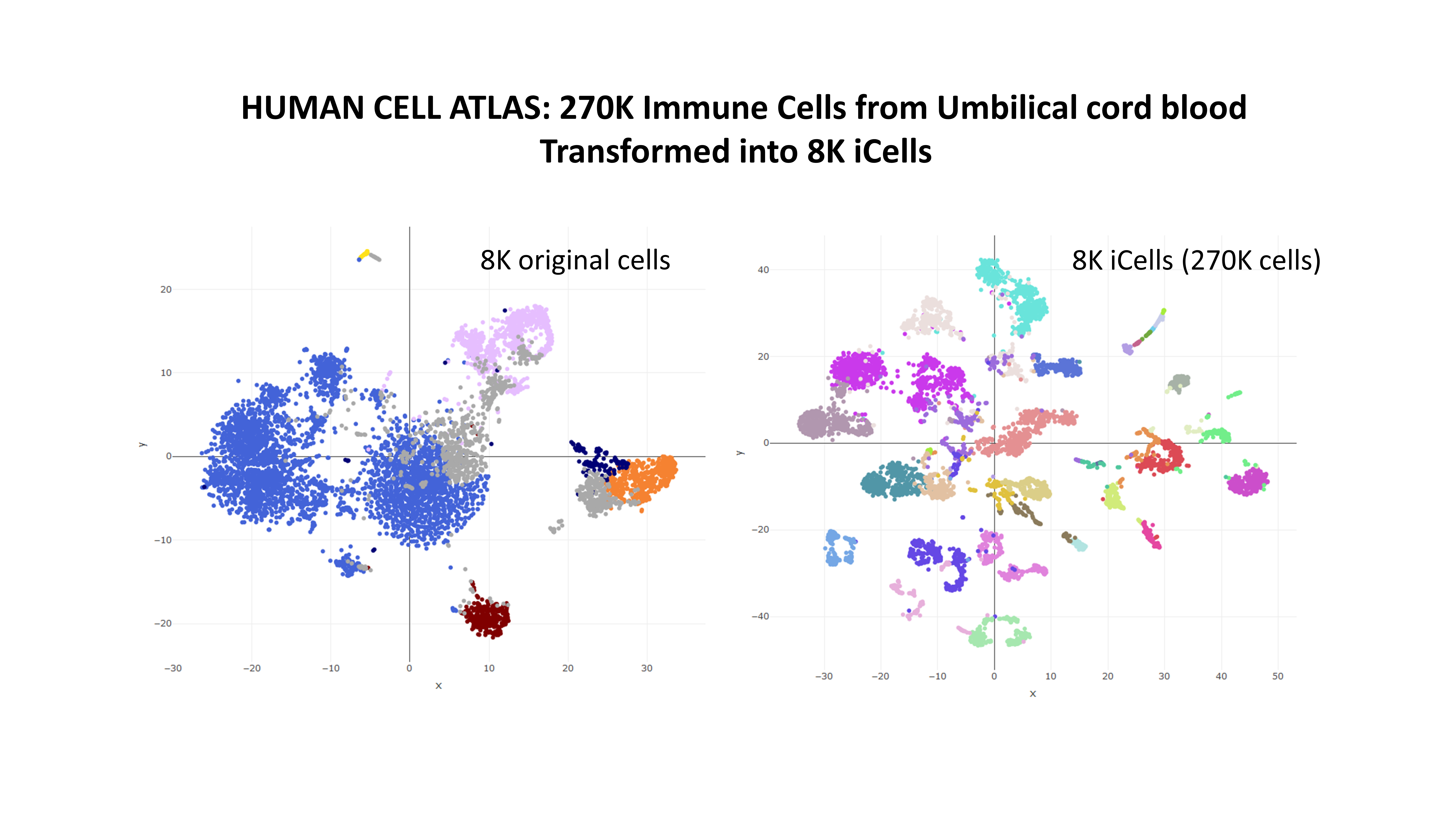
out is a list containing all the necessary information, including the new expression counts and the mapping indeces of each iCell to the original cells. See the help of the function for more information. Gene names are not used for the iCell creation and can be recovered from the original file with rhdf5::h5read(file = "ica_cord_blood_h5.h5",name = "GRCh38/gene_names"). Below, a plot showing how the iCells, having an increased quality, improve the quality of result, as for example the segregation in the TSNE plot.
