Adds dynamic colors to TailwindCSS with light and dark shades that are shown based on the user's color scheme.
With this plugin, bg-primary can be used instead of bg-primary-light dark:bg-primary-dark.
npm install --save-dev tailwind-mode-aware-colors
module.exports = require('tailwind-mode-aware-colors')({
// your usual config
theme: {
colors: {
primary: {
// colors defined with light and dark keys will be dynamic
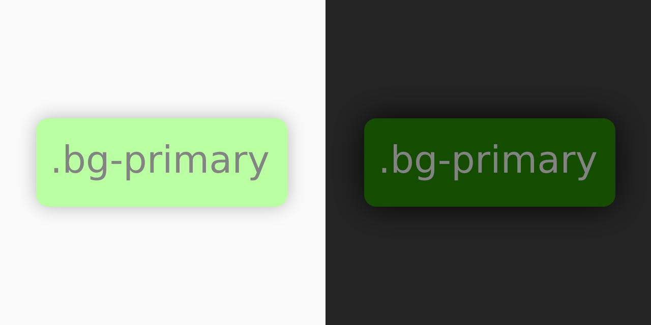
light: '#bbffa3',
dark: '#144b00'
}
...
}
}
...
});Any pair of colors X-light and X-dark will yield a new color X that automatically adapts to the color scheme. You can also have light- and dark- as prefixes or even -light- and -dark- in the middle of it.
-
Works with both
mediaandclassdark mode strategies. -
The original colors will still exist, so you can use the static shades as well as the new dynamic one.
-
Works with arbitrarily nested structures. For example, if you had
primary-surface-variant-lightandprimary-surface-variant-dark, the plugin would generateprimary-surface-variant. -
Of course, you can still use
dark:,md:,hover:and any other Tailwind modifiers.
tailwind-mode-aware-colors modifies your theme.colors object to add the new dynamic colors. The Tailwind engine and any other plugins you may be using will then pick those up. Because of that, it needs to wrap your Tailwind configuration and cannot be called in the plugins array.