To download and install the component library
npm i spiinge-components
To use the component library
import React from 'react'
import ReactDOM from 'react-dom'
import Badge from 'spiinge-comp-lib'


function App(){
    return(
        <Badge text='successful' />
    )
}

ReactDOM.render(<App />, document.querySelector('#app'));
The library contains these components
-
Avatar -
AvatarAndName -
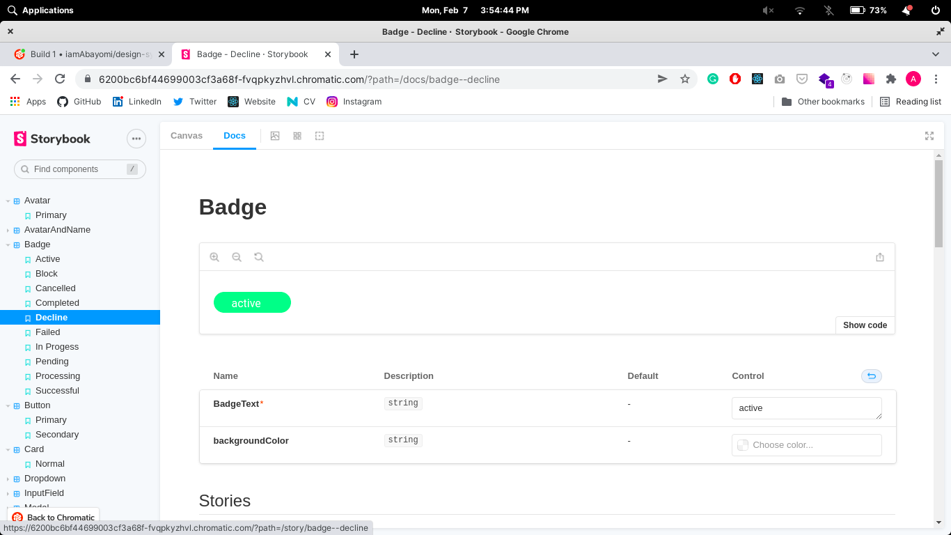
Badge -
Button -
Card -
Checkbox -
Dropdown -
InputField -
Modal -
OverviewCard -
Typography
You can view the storybok canvas and documentation on chromatic at https://6207da00fd8970003a4b561e-ujfarttnqg.chromatic.com/ to see how the component look in your application.
MIT license @ Oladini Abayomi