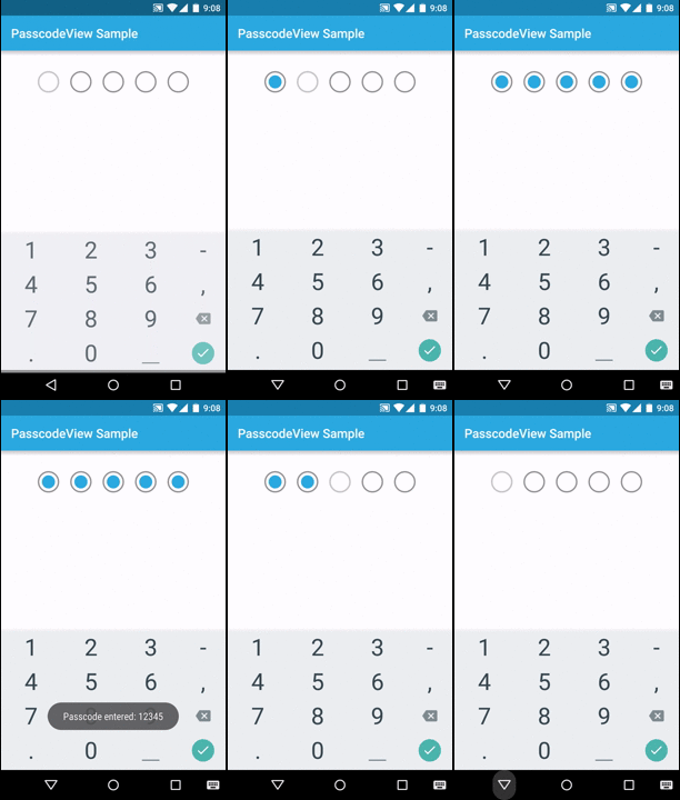
An android widget to input passcode.
<dependency>
  <groupId>online.devliving</groupId>
  <artifactId>passcodeview</artifactId>
  <version>1.0.3</version>
  <type>pom</type>
</dependency>compile 'online.devliving:passcodeview:1.0.3'PasscodeView is a ViewGroup subclass. So it can easily be added in any xml layout file.
<online.devliving.passcodeview.PasscodeView
        android:id="@+id/passcode_view"
        android:layout_width="wrap_content"
        android:layout_height="wrap_content"
        android:layout_gravity="center_horizontal"
        passcodeView:numDigits="5"
        android:layout_marginTop="@dimen/activity_vertical_margin"
/>requestToShowKeyboard()- Request the PasscodeView to be focused programmaticallysetText(CharSequence text)- Set Passcode programmaticallyclearText()- Clear PasscodegetText()- get entered PasscodesetPasscodeEntryListener(PasscodeEntryListener mPasscodeEntryListener)- Set a listener to get notified when the Passcode has been entered
onPasscodeEntered(String passcode)- Called when all the digits of the passcode has been entered
passcodeView.setPasscodeEntryListener(new PasscodeView.PasscodeEntryListener() {
            @Override
            public void onPasscodeEntered(String passcode) {
                Toast.makeText(SampleActivity.this, "Passcode entered: " + passcode, Toast.LENGTH_SHORT).show();
            }
});numDigits- Number of passcode digitsdigitElevation- Elevation of each digit, only applicable for OS version >= LollipopdigitRadius- radius for digit circle16dipby defaultdigitInnerRadius- radius for digit inner circle10dipby defaultcontrolColor- color of the outer circle in normal state, by defaultandroid:colorControlNormalcontrolColorActivated- color of outer circle when focused, by defaultandroid:colorControlHighlighteddigitColorFilled- fill color of the inner circle, by defaultandroid:colorPrimarydigitColorBorder- border color of the inner circle, by defaultandroid:colorPrimaryDark
Licensed under the Apache License, Version 2.0 (the "License");
you may not use this file except in compliance with the License.
You may obtain a copy of the License at

   http://www.apache.org/licenses/LICENSE-2.0

Unless required by applicable law or agreed to in writing, software
distributed under the License is distributed on an "AS IS" BASIS,
WITHOUT WARRANTIES OR CONDITIONS OF ANY KIND, either express or implied.
See the License for the specific language governing permissions and
limitations under the License.


