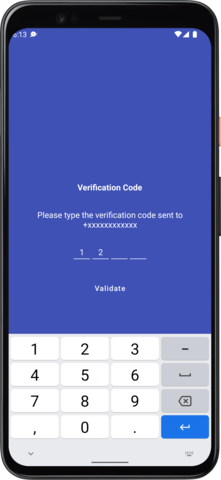
A custom control to enter a four digit code usually in cases of authentication.
Android PinView/OtpView is an independent project with ongoing development and support made possible thanks to donations made by these awesome backers. If you'd like to join them, please consider:
Integrating the project is simple a refined all you need to do is follow the below steps
Step 1. Add the JitPack repository to your build file. Add it in your root build.gradle at the end of repositories:
allprojects {
  repositories {
    ...
    maven { url "https://jitpack.io" }
  }
}
Step 2. Add the dependency
dependencies {
        implementation 'com.github.ibogolyubskiy:OtpView:<latest-version>'
}Okay seems like you integrated the library in your project but how do you use it? Well its really easy just add the following to your xml design to show the otpview
.....
 <com.mukesh.OtpView
      android:id="@+id/otp_view"
      android:layout_width="wrap_content"
      android:layout_height="wrap_content"
      android:layout_marginTop="72dp"
      android:inputType="number"
      android:itemBackground="@color/colorPrimary"
      android:textColor="@android:color/white"
      app:itemCount="6"
      app:lineColor="@color/colorPrimary"
      app:viewType="line"
      />
.....
To get a callback when the user enters the otp make use of OnOtpCompletionListener like wise
 private OtpView otpView;
 otpView = findViewById(R.id.otp_view);
 otpView.setListener(new OnOtpCompletionListener() {
   @Override public void onOtpCompleted(String otp) {

     // do Stuff
     Log.d("onOtpCompleted=>", otp);
   }
 });
That's pretty much it and your all wrapped up.
| Attribute | Use |
|---|---|
| app:itemCount | sets the length of the otp view |
| app:itemWidth | sets the with of each item inside the otp view |
| app:itemHeight | sets the height of each item inside the otp view |
| app:itemSpacing | sets the space between each item in otp view |
| app:lineWidth | sets the line border width |
| app:lineColor | sets the color to the line border |
| app:viewType | sets the view type of the otp view it can be either rectangle line or none |
| app:cursorVisible | sets the visibility of the cursor |
| app:cursorColor | sets the color of the cursor |
| app:cursorWidth | sets width of the cursor |
| app:itemBackground | sets the background color of each item in the otp view |
| app:hideLineWhenFilled | toggles the line border |
Apart from these you can use any property that applies to an EditText.
Maintained by Mukesh Solanki
- Bug reports and pull requests are welcome.
- Make sure you use square/java-code-styles to format your code.
Copyright 2018 Mukesh Solanki

Licensed under the Apache License, Version 2.0 (the "License");
you may not use this file except in compliance with the License.
You may obtain a copy of the License at

http://www.apache.org/licenses/LICENSE-2.0

Unless required by applicable law or agreed to in writing, software
distributed under the License is distributed on an "AS IS" BASIS,
WITHOUT WARRANTIES OR CONDITIONS OF ANY KIND, either express or implied.
See the License for the specific language governing permissions and
limitations under the License.


