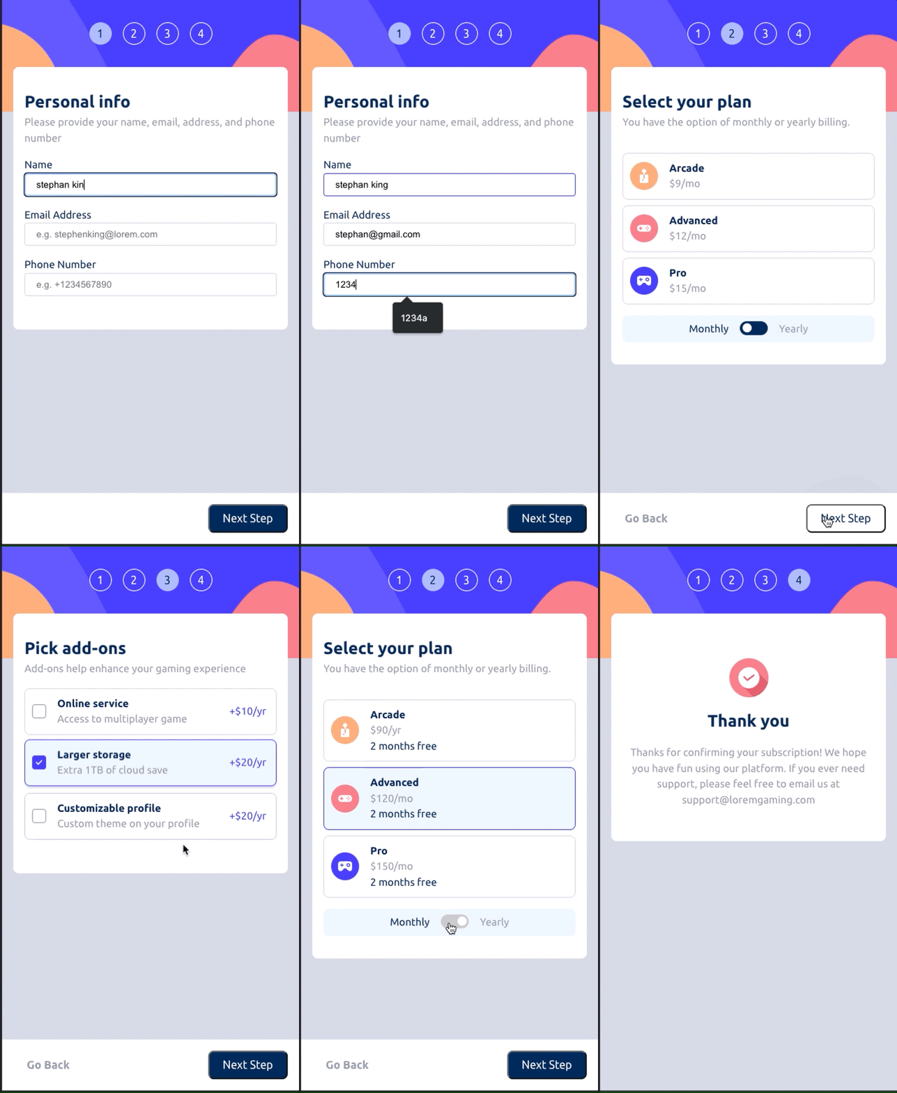
This is a solution to the Multi-step form challenge on Frontend Mentor.
Users should be able to:
- Complete each step of the sequence
- Go back to a previous step to update their selections
- See a summary of their selections on the final step and confirm their order
- View the optimal layout for the interface depending on their device's screen size
- See hover and focus states for all interactive elements on the page
- Receive form validation messages if:
- A field has been missed
- The email address is not formatted correctly
- A step is submitted, but no selection has been made
Mobile Demo
Desktop Screenshot
- Semantic HTML5 markup
- CSS custom properties
- Flexbox
- CSS Grid
- Github Pages
- React - JS library
- [Vite] (https://vitejs.dev/guide/why.html) - JS bundler
- [React Reducer & Context] - (https://beta.reactjs.org/learn/scaling-up-with-reducer-and-context)
In this project, I used vanilla css. I'm proud of using css variables to store colors to form a basic design system when starting the project.
  /* primary colors */
  --color-marine-blue: hsl(213, 96%, 18%);
  --color-purplish-blue: hsl(243, 100%, 62%);
  --color-pastel-blue: hsl(228, 100%, 84%);
  --color-light-blue: hsl(206, 94%, 87%);
  --color-strawberry-red: hsl(354, 84%, 57%);

  /* neutral colors */
  --color-cool-gray: hsl(231, 11%, 63%);
  --color-light-gray: hsl(229, 24%, 87%);
  --color-magnolia: hsl(217, 100%, 97%);
  --color-alabaster: hsl(231, 100%, 99%);
  --color-white: hsl(0, 0%, 100%);
I also played around with using some utility based classes which were inspired from some concepts from Tailwind.css
/* Utility  */
.flex-between {
  display: flex;
  justify-content: space-between;
}

.column-align-center {
  display: flex;
  flex-direction: column;
  align-items: center;
}

.text-center {
  text-align: center;
}

.p-1 {
  padding: 1rem;
}

.mb-1 {
  margin-bottom: 1rem;
}

.min-height-1 {
  min-height: 1rem;
}

.border-b {
  border-bottom: 1px solid var(--color-light-gray);
}

.gap-1 {
  gap: 1rem;
}
I used vanilla React to manage state without an advanced framework like redux. We can see the providers, contexts, and our reducers in reducers/FormContext.jsx
See example reducer
const formReducer = (state, action) => {
  switch (action.type) {
    case REDUCER_ACTIONS.UPDATE_INPUT:
      return {
        ...state,
        [action.field]: action.payload,
      };
    case REDUCER_ACTIONS.SET_ERROR:
      return {
        ...state,
        errors: {
          ...state.errors,
          ...action.payload,
        },
      };
    default:
      return state;
  }
};
We see validation more as a proof of concept here. We opt to not use a 3rd party validation library to showcase basic js. There can be discussion on where this validation logic should sit, whether closer to the form context (reducers) or closer to the html and allow input elements to specify validation properties.
Creating validation in the parent allows the StepForms to focus on internal elements while the parent along with the confirm button allows between page logic to be separated
// As per the HTML Specification
const emailRegExp =
  /^[a-zA-Z0-9.!#$%&'*+/=?^_`{|}~-]+@[a-zA-Z0-9-]+(?:\.[a-zA-Z0-9-]+)*$/;
const defaultError = "This field is required";

const onValidateStep1 = (formState) => {
  const { name, email, phone } = formState;
  // default: empty strings
  const errors = {
    name: "",
    email: "",
    phone: "",
  };

  if (name.length === 0) {
    errors.name = defaultError;
  }

  if (email.length === 0) {
    errors.email = defaultError;
  } else if (!emailRegExp.test(email)) {
    errors.email = "Must enter a valid email";
  }

  if (phone.length === 0) {
    errors.phone = defaultError;
  }

  const hasError = !!errors.name || !!errors.email || !!errors.phone;
  return { errors, hasError };
};


// in the base App()
  const onValidate = () => {
    switch (stepNo) {
      case 1:
        return onValidateStep1(formState);
      case 2:
        return onValidateStep2(formState);
      default:
        return { errors: {}, hasError: false };
    }
  };

  const updateError = (errors) => {
    dispatch({
      type: REDUCER_ACTIONS.SET_ERROR,
      payload: errors,
    });
  };

  const onNextStep = () => {
    const { errors, hasError } = onValidate();
    updateError(errors); // will update or clear errors
    if (!hasError) {
      setStepNo(Math.min(stepNo + 1, 5));
    }
};Curently we use javascript hook to manage desktop vs mobile views along with css media queries. There may be better ways to do this. All feedback is welcome!
- React Reducer and Context - This helped architect the state managment using vanilla react.
- useIsMobile hook - This hook comes in handy for mobile vs desktop conditional logic.
- Frontend Mentor - @dionlow

