This is a webpage to host my portfolio of front-end web development projects to showcase my knowledge and skills for prospective employers and the dev community.
Deployed application
·
GitHub repo
Table of Contents
The goal of this project is to build a webpage to show my portfolio of web development projects as I progress through the Front-End Web Development Bootcamp.
The critical requirements for this portfolio page:
- When the page is loaded the page presents your name, a recent photo or avatar, and links to sections about you, your work, and how to contact you
- When one of the links in the navigation is clicked then the UI scrolls to the corresponding section
- When viewing the section about your work then the section contains titled images of your applications
- When presented with the your first application then that application's image should be larger in size than the others
- When images of the applications are clicked then the user is taken to that deployed application
- When the page is resized or viewed on various screens and devices then the layout is responsive and adapts to my viewport
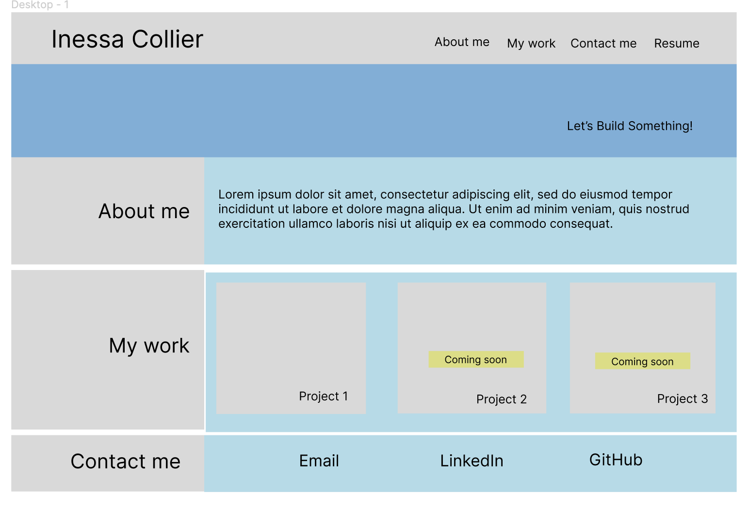
We were presented with a mockup of a portfolio page as an example:

I used the following technologies when building this portfolio page:
The project requires a wireframe to set the visual aspects of the planned portfolio page. This includes object shapes, locations, fonts, and the colour scheme.
The next step is to build an html file and the corresponding css file.
The last step is to adjust the css file for different device screens using media queries.
As explained in the project brief, the portfolio is a one-page application and should contain:
- Header with my name
- Navigation links to the page sections
- An image divider for esthetics
- 'About me' section that provides short overview of my background and skills.
- 'My work' section that displays cards with my projects. The cards contain links to deployed applications.
- 'Contact me' with links to the main contact methods (email, LinkedIn, GitHub).
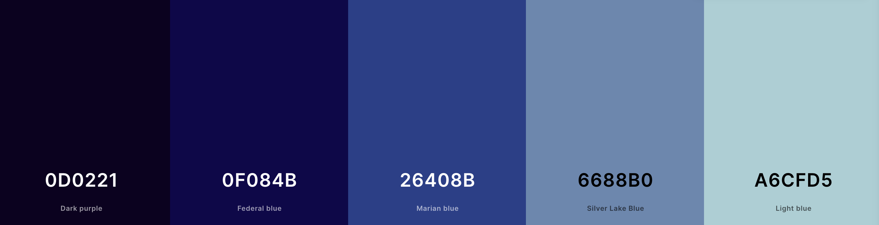
I built the following wireframe using Figma:
I decided to utilize dark tones in my design to create a professional and contemporary portfolio page.
To generate a color palette for the web page, I used the Coloors palette creation tool.
The main palette selected:
I also researched the web design colour trends for 2023 and 2024, and chose to use 2 accent colours mentioned in a blog post on Wix:
7 website color trends that’ll be everywhere in 2024
I used a color contract checker to find the best font color, and selected white.
As a result, I selected the following colours for the website:
- Main background colour: #0D0221
- Secondary background colour: #6688B0
- Main font colour: white
- Visited link: light grey
- Hover link: #C419BE
- Active link: #279DC0
- Highlight background colour: #C2E7D9
- Highlight font colour: #2628DD
These colours are set as global variables in the css file.
I sourced free photos from Unsplash, and used the following images in my design:
- image for the Divider section
- cover image for Project 1
- cover image for Project 2
- cover image for Project 3
- cover image for Project 4
- cover image for Project 5
The navigation links at the top of the page and the links in the 'Contact me' section at the bottom of the page are set to be in text format when displayed on desktop.
However, when displayed on mobile screens, I wanted those links to switch to icons as they would fit the available space better.
Unfortunately, I was not able to find good free white icons for the navigation links.
I used the following free white icons for the 'Contact me' section:
During the project development I faced several challenges as I wanted the page to have certain functionality but did not know how to do it.
In trying to find out how to do various aspects of the page (eg, flex vs grid, etc), I found it very helpful to refer to the practice problems that we worked on during the Module 2 of the Front End Web Development bootcamp.
In particular, I found the 'Jakes Eatery' and the 'Furniture Store' problems very helpful, both for the design solutions and the code under the hood.
I also want to mention the invaluable help I received from tutors in the bootcamp who helped me think about building the page by breaking it into smaller parts and going after them one by one, trying to find similar solutions in previous work or online.
Finally, my fellow students in the bootcamp, Ben Rumbold and John Dick shared valuable insights in their approaches to the webpage design and functionality. These were helpful as I thought about my own portfolio page layout, the colour scheme, other design and coding aspects.
However, in some cases, what I wanted to achieve went beyond what we discussed in the class or worked on in the practice problems. In those cases, I turned to the favourite tool of all programmers - Google.
First of all, I wanted to have my motto "Let's build something great! move across the divider image. I did not know how to do this but after doing some research, I found advice and code in this HubSpot article.
I wanted the cards in the 'Portfolio' section slightly increase in size when moused over. Again, some online research helped me remember how to do it. Namely, this article was very helpful.
I also wanted the project cards to have a dark shadow when moused over, adding to the highlight effect. I found a great example of dark shadow applied to white font and utilized in my box-shadow property.
In my intended design, the page should scroll smoothly to the related section when one of the 'Navigation' links is clicked. An article from Stackflow was very helpful in solving this problem.
One of the biggest challenges I faced was adding a weblink (<a href>) to images of projects. I placed the images in the css file as backgrounds to the corresponding <div> sections. Some advice online suggested that I would be able to wrap the <div> sections in <a href> however in practice, this did not work.
Another solution would be to move all images into the HTML file but firstly, it would change the page design, and secondly, it would require many more hours of re-writing the code.
I knew that it should be possible to click on the images even if they are placed as backgrounds in the css file. After some research, I found suggestions that JavaScript event listeners can offer a solution to this problem. These articles in particular offered some insights:
- How can I add an event listener to an image inside JavaScript to make the image clickable?
- How do I add a hyperlink to a background image?
However, the code suggested in these articles did not work for my project directly. I then used ChatGPT3.5 to ask clarifying questions and find the exact code that gave me the required solution.
It was an interesting project that challenged me to go over the flex and grid display in css numerous times. I realized the importance of changing the flex display to column when resizing for mobile screens, both for the navigation links, and for the main section of the screen.
Overall, it is clear that the mobile design should be very different from the desktop design, and should be wireframed from the start as well.
I struggled with organizing my 'Portfolio' section, trying to arrange the cards using flex display. In the end, I realized that a much easier and much more functional approach would be to use a grid. Re-arranging components of a grid for a smaller screen is very easy and requires minimum code adjustments.
A grid was also the best solution to make sure that one of the card is larger than the others. I initially used the :nth-of-type(1) selector but the overall flex display worked poorly for the design.
Finally, the media queries, although they may seem quite easy, can take a significant amount of time, mainly due to resizing fonts and margins. I think I still need to understand better when and how to utilize different units of size such as em, rem, %, vh, and vw in order to reduce the number of adjustments for different screen sizes.
The project is now live.

You can find the portfolio and the corresponding code here: