vue-let-it-snow
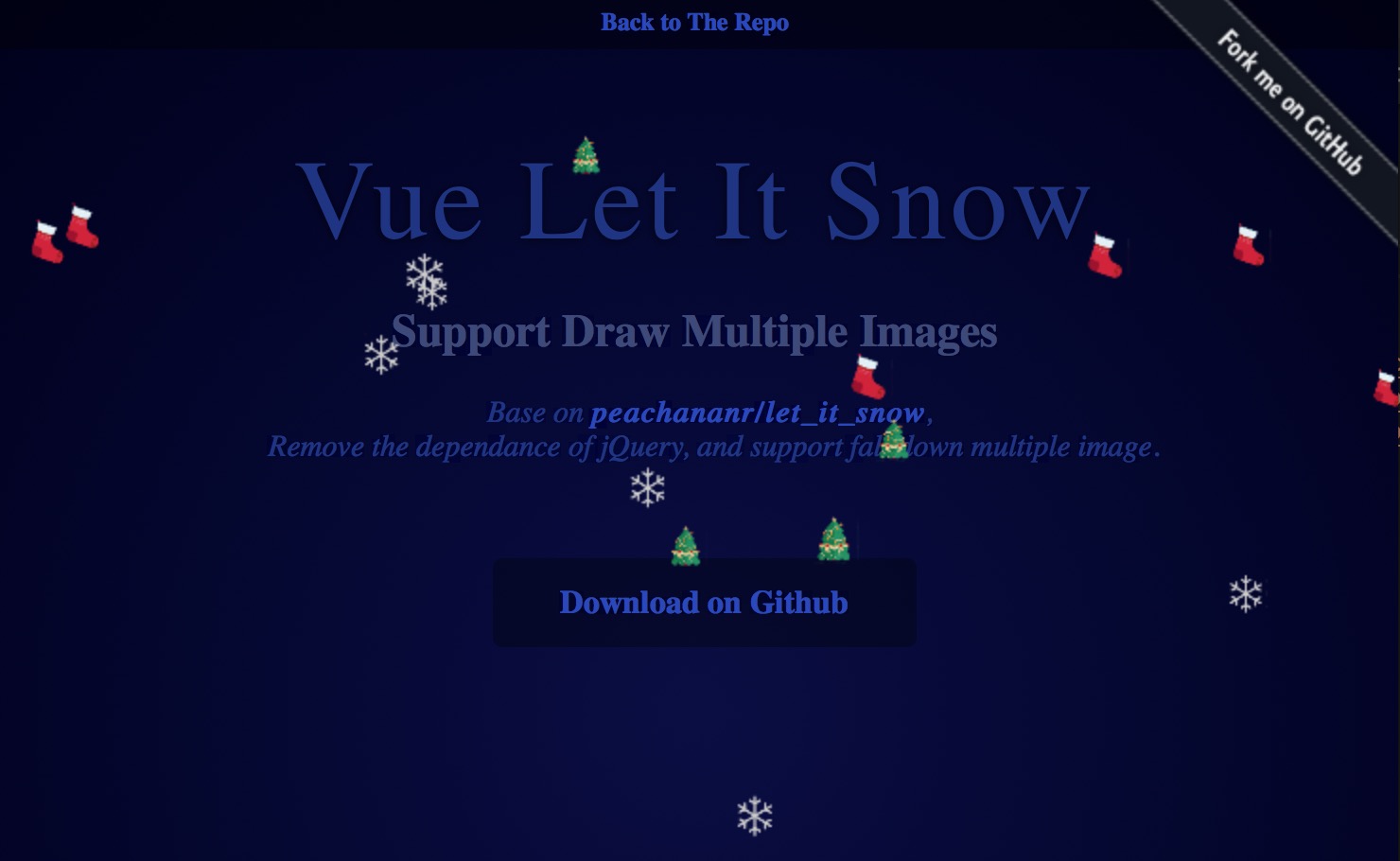
The vue component for peachananr/let_it_snow
Remove the dependance of jQuery, and support fall down multiple image.
Demo
Basic Usage
Install:
npm install --save vue-let-it-snow
In index.js:
import Vue from 'vue'
import LetItSnow from 'vue-let-it-snow';

Vue.use(LetItSnow);
In the component which you want to have fall down effect:
<template>
	<let-it-snow
      v-bind="snowConf"
      :show="show"
    ></let-it-snow>
<template>
export default {
name: 'app',
data () {
return {
snowConf: {
windPower : 1,
speed : 3,
count : 12,
size : 10,
opacity : 1,
images: ['https://raw.githubusercontent.com/bob-chen/let_it_snow/master/demo/snow.png',
'https://raw.githubusercontent.com/bob-chen/let_it_snow/master/demo/sock.png',
'https://raw.githubusercontent.com/bob-chen/let_it_snow/master/demo/tree.png']
},
show: false
}
},
mounted () {
this.show = true
// setTimeout( () => {
// this.show = false
// }, 5000)
// setTimeout( () => {
// this.show = true
// }, 10000)
}
}Props
- speed: How fast the snow falls can be define here. You can choose a number in between 0 - 5. The higher, the faster. The default value is 0.
- interaction: This option allows viewer to interact with the falling snow. Toggle this to false if you don't want the snow to be interactive. The default value is
false. - size: You can set the size of the snow here. Choose a number between 0 - 10+. The higher, the bigger. The default size is 2.
- count: This allows you to set the number of snows displayed at a time. The default count is 200.
- opacity: The opacity variation of the snow. You can choose a number in between 0.00 and 1.00 to set the base opacity and the plugin will randomly generate snows with slightly varied opacity.
- color: You can set the color of the snow here. This option only accepts HEX color code in full 6 digits. The default value is "#ffffff"
- windPower: You can set the wind power here. If you want the wind to blow left, set a positive number in this option., if you want the wind to blow right, set a negative number in this option. The default value is 0.
- images: You can define a path list to an image to be used instead of a default circle here. The default value is
[]. - show: Use to control this component to show or hide. The default value is
false.
License
MIT
