This homework is due on Thursday, February 13th 2014 at 11:59 pm.
In this homework, you will use D3.js to create an interactive data table and a bar chart. D3 stands for "Data Driven Documents." It is a library for JavaScript that is very useful for creating interactive visualizations, but D3 can be used to achieve many tasks that other libraries — like JQuery — also enable. This homework assumes that you have read and coded along with Chapters 1-8 in D3 - Interactive Data Visualization for the Web by Scott Murray. See the Readings Page for access to free online copies.
We use data collected and published by the U.S. Bureau of Labor Statistics. The Bureau defines itself as follows:
The Bureau of Labor Statistics is the principal fact-finding agency for the Federal Government in the broad field of labor economics and statistics.
Unemployment data are regularly published on a specific BLS web page.
The Bureau of Labor Statistics released, for example, a statement:
The unemployment rate declined from 7.0 percent to 6.7 percent in December, while total nonfarm payroll employment edged up (+74,000), the U.S. Bureau of Labor Statistics reported today. Employment rose in retail trade and wholesale trade but was down in information."
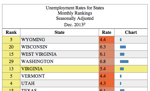
In this homework, we will explore how this unemployment is broken down by state. Below is a brief sample of this data (Nov. 2013., but data on the page are more recent):
| Rank | State | Rate |
|---|---|---|
| 1 | NORTH DAKOTA | 2.6 |
| 2 | SOUTH DAKOTA | 3.6 |
| 3 | NEBRASKA | 3.7 |
| 4 | UTAH | 4.3 |
This is essentially a one dimensional dataset — seems simple enough. We will stick to this dataset, and explore the visualization options for such a tiny and simple dataset. Along the way, you will pick up the D3 skills necessary to tackle bigger and more complex datasets.
Ensure you respond to questions in the appropriate text file (as described in the subheading for each section). You can use Markdown to format your answers. Follow the instructions on Piazza for cloning the repository.
We recommend that you name your GitHub repository following this convention:
cs171-hw1-lastname-firstname
Share it with cs171tf and your grading TF (we will tell you who this is in time), clone it and then copy the files of HW1 to your repository. Use the file templates provided for your answers and your code. It's important that you don't fork the repository and put your solutions in it, since you can't make a fork of a public repository private.
Refer to the CS 171 web page for more information on how to submit your homework.
In case you find an error in this homework, you are welcome to fix the error (open this file on Github and click "edit" in the top right corner) and submit a pull request!
Answer the questions in intro_answers.md.
- If we were interested in understanding summary statistics at a glance (minimum, maximum, etc.), how could you improve the display of the table?
- Find three varied examples on the web that present tabular data in a different layout or in more visually compelling, complete, interactive or interesting ways.
Answer the questions in problem_1_answers.md.
The unemployment data available on the BLS website are accessible as an HTML table, located at the following URL:
Each row represents a state; columns represent the rank, the state's name and the rate of unemployment. Using such a format is common for publishing raw data. However, as you may have noticed during the warm up, tables are not well suited for analysis by humans. For example, finding the minimum and maximum values takes time and requires to scroll as the table is long. Or finding a state if the table is not in alphabetical order also takes time.
Now take a detailed look at how this table is structured:
- Open the DOM inspector in your browser (see Scott Murray Book). As a reminder, the DOM element has a tree structure: identify the subtree corresponding to the table, its root and leaves.
- Open the source code of the page and locate the source HTML of the table.
When looking at the table's DOM or source code:
- What does the
colspan="3"attribute of the<th>node do? - List all the styles (e.g. border width, text alignment, etc.) applied to the
thelement containing "Rank". For each, state whether they are set as an HTML attribute or a CSS style and describe them in a few words. Include only styles directly applied to the element, not styles inherited/cascading from parent elements or styles from the default user agent stylesheet. Exclude overwritten styles. For HTML attributes, state the CSS equivalent. - What differences do you notice between the DOM inspector and the HTML source? Why would you use the DOM inspector? Why is the HTML source useful?
Implement the features in the provided table.html file
Creating a table similar to the one on BLS can be done manually with a simple text editor. However, you'd need to go through the same tedious process every time the data is updated. We can do better. Let's create a table dynamically using D3 and the data we provided. As a reminder, D3 is not just a visualization framework: it's simply designed to help manipulate DOM elements (hence the name "Data Driven Documents"). It's well suited for such a task, in spite of there being no visualization involved (yet).
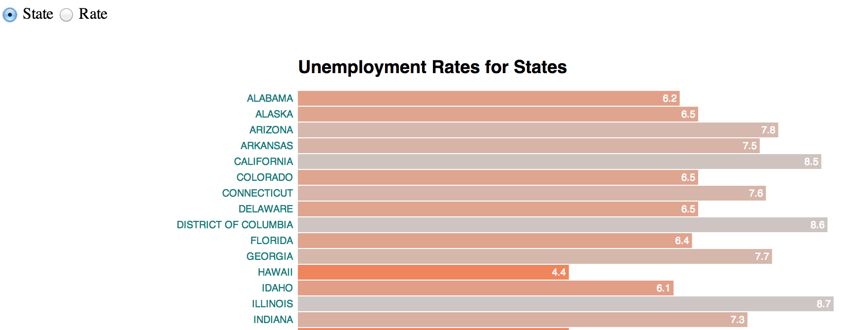
Your final result should look somewhat like this:
To get started,
- Brush up on your knowledge of the HTML
<table>element. See the MDN developer guide and reference on the topic. As is common with real world data, the source BLS page may use incorrect tags or use non-standard features or incorrectly formatted HTML. We expect valid, standards-compliant HTML for your submission. - Inspire yourself from the this Gist.
We extracted the data from the table and put it in the file unemp_states_us_nov_2013.tsv.
Because of the same-origin policy, you'll need a running local web server. Open a terminal window, change directory to the folder containing table.html and run:
python -m SimpleHTTPServer
You'll see your page at http://localhost:8000/table.html. Note that you'll need to have Python installed (you probably already do if you're on Linux or Mac OS). For more details on how to set up a local web server, refer to CH4 of Interactive Data Visualization.
- The
d3.tsv()function skips headers (the first row), but that row contains important information. Replace thed3.tsv()call withd3.text()and use the lower-leveld3.tsv.parseRows()to parse the TSV (see the documentation). - Add column headers
<thead>to the DOM, with the headers you just collected in it. It is constructed the same way as the<tbody>elements, but rows use<th>. - Use D3 to dynamically add an
<h1>element matching the title of the BLS page and a<caption>element for table header title. The text values for these can be hardcoded in your Javascript. - Apply similar table and H1 styling to that used on the BLS website (border, font, etc.). Feel free to cosmetically improve the layout of the page (eg. by adding a background or centering the table). Ensure to use CSS and standards-compliant HTML (HTML validator and CSS validator).
- Add zebra rows to the table (i.e. rows with alternating color for increased legibility). Do this only with D3 without using the
:nth-child(n)CSS selector. - When hovering over a cell, use a yellow shade to highlight both the row and the column of the cell without using the CSS
:hoverselector. You'll find that it's more tricky to highlight the column.
Continue working on table.html.
Dynamically sorting rows (by ascending or descending order) is a simple yet powerful technique to efficiently organize data and find minimal or maximal values on one dimension. We provide you with code samples to make an interactive HTML table and to color cells by rank.
Here is a function that compares two values, and returns 1 if a is greater than b, 0 if a equals b, and -1 if b is greater than a.
function ascending(a, b) {
  return a > b ? 1 : a == b ? 0 : -1;
}
This function is part D3 and can be invoked with d3.ascending()
The next function, .sort(), changes the order of the DOM of the elements. It iterates over all pairs of elements, passing the two elements to the compare function (see the documentation).
For example, this snippet would sort the table alphabetical by state (actually, it will sort it lexicographically):
tbody.selectAll("tr").sort(function(a, b) {
  return d3.ascending(a[1], b[1]);
});
We now use the sorting function to reorder the table. As you may have noticed, an HTML <table> vertically orders rows according to their relative position in the DOM. For instance, NORTH DAKOTA is above SOUTH DAKOTA because it appears before it in the DOM. Changing their DOM position will change their Y-position on the screen.
- Use the above code to trigger a state column sort with a click to the State
<th>cell. - Similarly, provide functionality such that the Rate column is sorted when the respective header cell is clicked. (tip: make sure you are comparing floats, not strings, else the behavior will be subtly wrong)
- Note that sorting by Rate can result into ties, causing random and inconsistent sorting. For instance, MISSOURI and TEXAS have a rate of 6.1. Use the alphabetical state order to solve this issue. See the documentation for additional information.
- Ensure that zebra row coloring developed in the previous problem is maintained after sorting.
- Reverse the sorting when the user clicks twice on the same column. Use reverse alphabetical order to break ties (ie. descending sort should be the exact opposite of ascending sort).
- On load, sort by Rate in ascending order. This happens to be the same order as the source data, but don't assume the source data is sorted.
- Use CSS to change the cursor shown when hovering over the table headers. Use
cursor: s-resizeif clicking will trigger an ascending sort andcursor: n-resizeif it will trigger a descending sort.
Continue working on table.html. Answer the questions in problem_4_answers.md.
Let's color cells according to their sorted position. This will be your first visual encoding of data... yeah! Below is sample code that creates a color scale. Note this is a linear scale (documentation) since we are mapping numerical values to color.
var color = d3.scale.linear()
  .domain([0, tbody.selectAll("tr")[0].length-1])
  .interpolate(d3.interpolateRgb)
.range(["orangered", "silver"])- The
domain()function is the data range upon which the scale is calculated. What doesd3.selectAll("tbody tr")[0].length-1mean? - Add the snippet in your code. Describe, in words, what the following function calls return:
color(0),color(10)andcolor(150)? - If the array passed to
domain()was the minimum and maximum rate values, how would that change the scale? In what situations would this be appropriate?
- Use the scale described above to set the background color of the Rate column based on the position of the row (lowest rate should be red).
- Make the modifications described in question 3 above (ie. so that the column is colored by rate) and update the relevant code that references the scale.
The code below adds an extra column to the table, containing a horizontal bar with a width that is proportional to the rank value:
rows.insert("td").append("svg")
   .attr("width", width)
   .attr("height", height)
   .append("rect")
   .attr("height", height)
.attr("width", function(d) { return parseFloat(d[0]); });- Set suitable numerical values for
widthandheight. - Insert the snippet into your code, add a heading and sorting functionality to this column.
Implement the bar chart in bar.html. Answer the questions in problem_5_answers.md
We are now going to create a horizontal bar chart with its own layout. The bars will be encoded will be similar to the chart column of the previous problem, but this time you will have to create your own layout by setting the bar groups' x, y positions.
Let's first define the perimeter of the visualization canvas and the position on the chart within this canvas. Following D3's margin convention we define the following parameters:
var margin = {top: 50, bottom: 10, left:300, right: 40};
var width = 900 - margin.left - margin.right;
var height = 900 - margin.top - margin.bottom;
Let's now define the vertical position for each bar. We define it as a linear scale yScale. The bars' width will be defined by xScale.
var xScale = d3.scale.linear().range([0, width]);
var yScale = d3.scale.ordinal().rangeRoundBands([0, height], .8, 0);Consider the provided sample code this Gist and answer the following questions:
- What's missing? Is this bar chart usable in its current form?
- What is the role of each of the three nested levels of
gelements? (keep in mind you'll be adding a title to the chart) - Complete the implementation section below. Is there any consequence if you add the
textelements before or after therectelements? Why?
To make the chart more useful, let's add some text labels. Below is a code example showing how add a text node within the same SVG group as the bars:
groups.append("text")
        .attr("x", function(d) { return xScale(d.Rate); })
        .attr("y", function(d) { return bar_height/2; })
        .text(function(d) { return "your text"; })
Open bar.html and add two different labels:
- Row names (ie. state names), which you should put to the left of each bar
- Row values (ie. rank values), will be located within the bar, but at its right end.
Tip: the text-anchor attribute may come handy and you might want to look at dx and dy attributes for relative positioning.
Finally, add a title centered at the top of the chart chart using a text element.
Your next task is to reorder the chart, similarly to what you did for the table. You now have more flexibility than before since SVG elements can be freely moved in the 2D space by setting their coordinates. However, we have to manually manage the x, y position of all the elements or groups of elements.
First, let's add form elements to control the chart's order. Form elements are useful, as they have a familiar affordance (i.e., users know how they work) and their state is visible. Add the following buttons to your bar charts.
<label><input type="radio" name="order" value="state"> State</label>
<label><input type="radio" name="order" value="rate" checked> Rate</label>
Moving bars requires to change their coordinates. If you remember the HTML table, we only had to sort the <tr> nodes to visually re-organize the table. But now, rect elements in SVG are only displayed based on their x, y coordinates. You can use the following strategies to change the position of the bars:
- Change the coordinates (but not the data).
- Change the data (and by consequence the coordinates).
- Change the scale function to reflect the new order.
- Change the relative position
(dx, dy)of the element. - Translate the coordinates
attr("transform", "translate(x, y)")(which does not change the(x, y)but moves ("translates") the element).
We are going to use a data-driven approach and change the bars position using an SVG translation (attr("transform")).
- Create a function
reorder()which is triggered every time the user clicks on a form element (d3.selectAll("input").on("change", reorder);) - Implement the
reorder()function as follows:- Sort the source
data. You may reuse previous sorting code you developed (ensure that your correctly break rate ties) - Translate the bars by completing and using the code snippet below:
- Sort the source
groups
   .transition()
   .duration(750)
   .delay(function(d, i) { return i * 10; })
.attr("transform", function(d, i) { return "translate("+ ??? +", "+ ??? +")"; }) - Toggle the sort order (descending/ascending) when the user clicks again on the same radio button. (tip: listen to
clickevent instead of thechangeevent). - Apply the color scale of the previous problem to the bars (use the final scale we developed: the one based on data range).
That's it, you have created your first D3 visualization. Congratulations! If you're looking for more, you can continue with the bonus problem.
Put your bonus implementation in the files bonus_table.html and bonus_bar.html. Use your previous solution as the basis. If you complete all the steps, you will get 0.5 points extra.
- Insert the bar chart column in the table as the first column instead of the last one (see parameters of the
insert()function) - Add an icon of an arrow pointing up and downwards (as appropriate) next to column header for which the currently sorted column.
Filtering is an important feature to visually reduce the number of displayed objects. It lets the user focus on elements which correspond to a criteria. The markup below adds a slider to the page (ensure you have a modern browser, since this is HTML5 functionality that won't work in <IE10):
<input type="range" name="points" min="0" max="50" step="1" value="50">- Filter the bar chart to the top-k elements, where k is the slider's value.
- If a bar disappears because it is below the filtering threshold, color it red first and then make it exit the scene by moving it outside the bottom bounds of the chart (ensure you actually remove the element from the DOM).
- Similarly, to add a bar to the chart, color it green and move it from the bottom of the visualization to its position in the chart.


