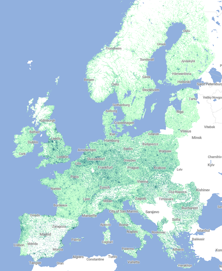
Population Density Map
This repo contains the code for the analysis of the population density in Europe and in Spain. It covers the entire data ETL pipeline: data extraction from european and spanish public institutions, data transformation and analysis, and a visualization stage.
Please, notice that the used datasets are quite large in size, and thus the project has been concieved from an educational point of view, always looking for the maximum efficiency in the entire pipeline.
Self hosted map on Github Pages
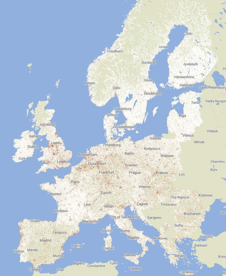
Nodoby Lives Here: High resolution image
What I wanted to do
- Visualize the least populated regions in Europe
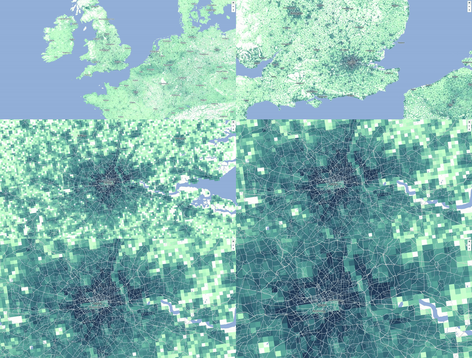
I was very much inspired by this article where John Elledge introduces the visualization of Dan Cookson, a map with the EU Population at 2011 onto a 1km grid. This great visualization is available here.
- Learn how to approach the visualization of large spatial datasets
Prior to this project, I had some experience working with small spatial datasets. Therefore, a large dataset presented a nice challenge! The european 1km per 1km square grid dataset comprises over 2.000.000 features that need to be processed and rendered onto the map.
Data Sources
-
Europe Grid: GEOSTAT-grid-POP-1K-2011-V2-0-1
Detailed grid (1km resolution) available at eurostat. Download link (.zip file)
-
Spain Grid: ETRS89_LAEA_ES_1K
Digitalized cartography (1km resolution grid) of the Spanish territory, available at INE. Download link (.zip file)
-
European countries contour
Vector maps in GeoJSON format are downloaded from this online service
An online geodata converter is used to transform the contour coordinate system from WGS 84 (EPSG:4326) to ETRS89 / LAEA Europe (EPSG:3035). This is a necessary conversion due to the fact that the grid coordinates are represented with the latter system.
Project Structure
population-map
│   README.md
│   index.html
│
└───data
│   └───grid
│   |   └───GEOSTAT-grid-POP-1K-2011-V2-0-1
│   |   └───Grid_ETRS89_LAEA_ES_1K
|   |	└───RJ_CPV_20111101_TT_02_R_INE
|   |
│   └───contour
|	|   contour_eu.geojson
|	|   contour_spain.geojson
|
└───R
│   │   data_preprocessing.R
│   │   map_exploration.R
│   │   map_interactive.R
│   │   map_visualization.R
Project Stages
1. Data Preprocessing
Prior to the visualization stage, there is a data preprocessing stage in which some tasks are carried out:
-
Coordinate system conversion function: subsequently used function to transform coordinates in system from ETRS89 / LAEA Europe (EPSG:3035) to the universal WGS 84 (EPSG:4326) system.
-
Contour dataset: The polygon coordinates are extracted from the GeoJSON files and arranged in R's data.frame format to be exported to CSV. In the process, the coordinate system is converted as described above. Both for Spain and EU.
-
Grid + Population dataset: Instead of reading the huge shapefile containing all the geographical information, I imported a CSV file that just summarized the population of each cell from the grid. The cell ID string contained the ETRS89 coordinates (North-East), that were extracted and then converted to WGS 84 (latitude-longitude).
2. Data Export: GeoJSON vs Vector Tiles
Once the data was correctly processed, it had to be exported to the common formats to store spatial information.
GeoJSON
Built from scratch using R and the library jsonlite, the data was shaped into a collection of features (simple polygons), like this:
{
   "type":"FeatureCollection",
   "features":[
      {
         "type":"Feature",
         "geometry":{
            "type":"Polygon",
            "coordinates":[[
		[10.2181,47.3189],
		[10.218,47.3099],
		[10.2048,47.3099],
		[10.2049,47.3189],
		[10.2181,47.3189]
		]]
         },
         "properties":{
            "p":8,
            "e":false
         }
      },
      {
         ...
      }, ...
   ]
}
MBTiles
The previous GeoJSON file was converted to the MBTiles format. MBTiles is a specification for storing arbitrary tiled map data in SQLite databases for immediate usage and for efficient transfer. For the conversion process I used the tool Tippecanoe, by Mapbox.
It is a highly configurable tool, with lots of different options for large datasets. After some exploration and learning of the implications of each option, this is my final recipe:
tippecanoe --coalesce-densest-as-needed --minimum-zoom=0 --maximum-zoom=g --output-to-directory "tiles" data.geojson
3. Map Visualization
Offline (static) visualization
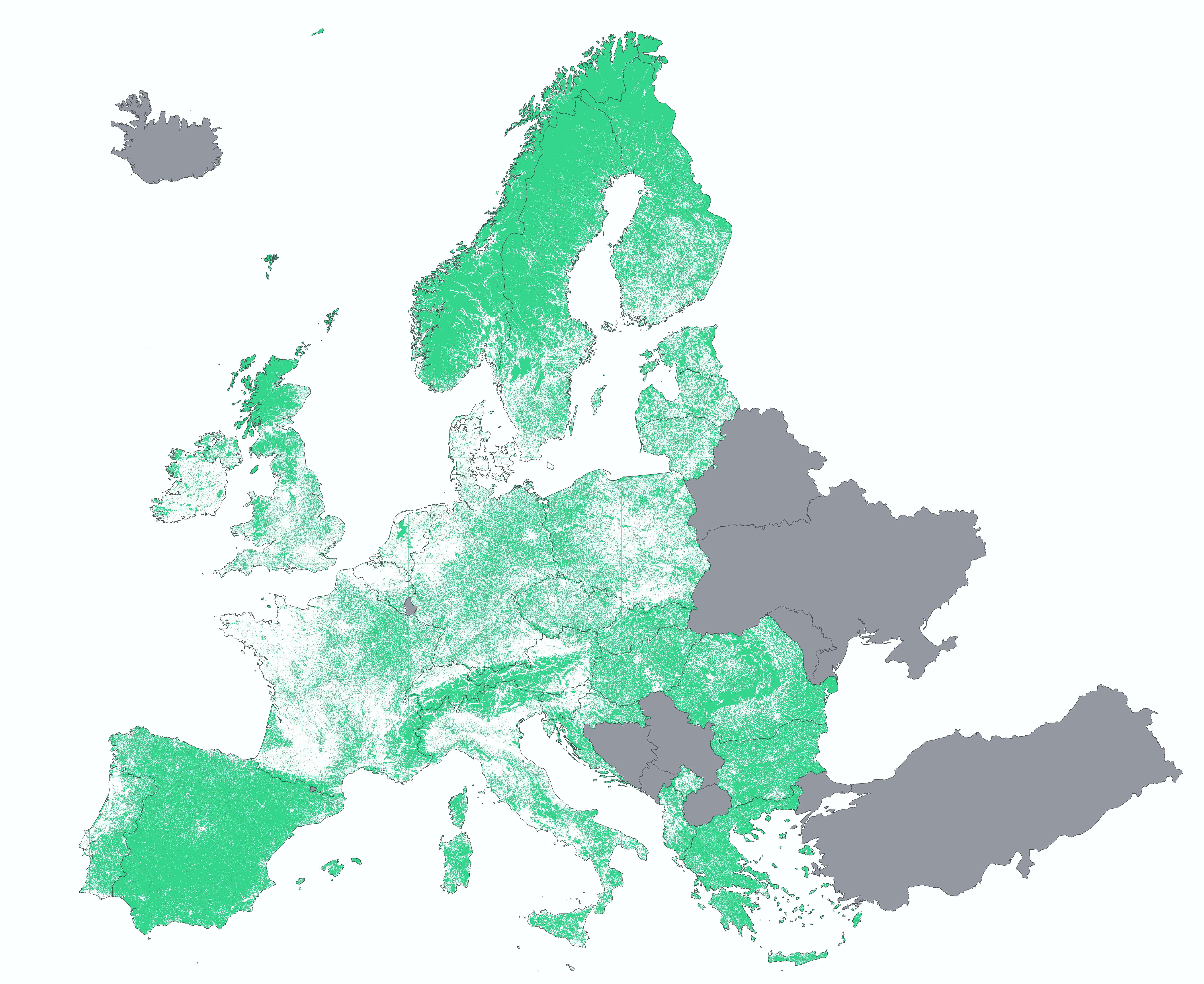
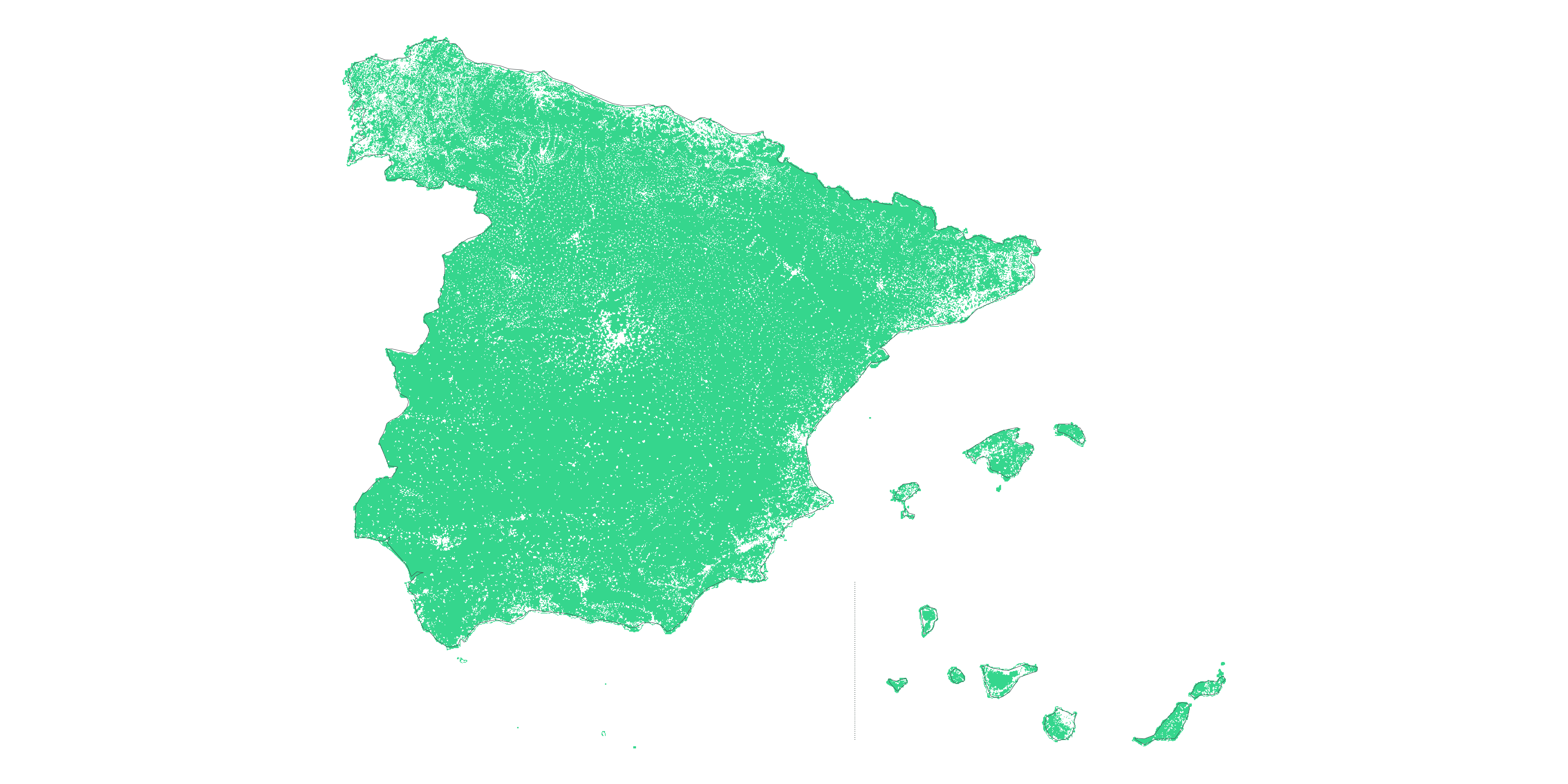
The library ggplot2 for R is used to visualize the population density both in Europe and in Spain. Apart from the population quantity, I also included a map that highlighted the 1km sq cells with no population, which can lead to some interesting analysis.
Online (interactive) visualization
Regarding interactive visualizations, two platforms were studied: CARTO and Mapbox.
On one side, the Student plan from CARTO just offered 350 MB of data storage, whereas the free tier plan from Mapbox offered much larger storage for tilesets (50 GB). Moreover, CARTO Import API does not support MBTiles, so the only remaining alternative was to upload the entire GeoJSON file to be imported and processed into a SQL-like table with the polygon coordinates. Check the CARTO supported formats on the CARTO Documentation.
Therefore, these two points (storage limit and supported formats), were the main reasons not to select CARTO as the visualization platform. Thus, the decision was inclined towards Mapbox. The following screenshots have been taken from the maps generated on Mapbox. To interact with the map by yourself, just click on the images:
In this sense, apart from using the online platform Mapbox Studio, I also explored the way of self-hosting the map and the tiles. This track will be further explained on the next section.
4. Self-Hosted Map Tiles
Deployment on Heroku
The reference I followed on this stage was this article by James Gardner. In the article Mapbox vector tiles are introduced, with a very clear comparison (pros and cons) with GeoJSON or TopoJSON formats.
There is also a section that covers the hosting of the tiles, where the NodeJS package live-server is used. The tiles are in gzipped format ".pbf" and are hosted in a folder structure like this: /{z}/{x}/{y}.pbf. In this sense, it is necessary to unzip each requested tile, and live-server has an integrated a middleware, which does any processing the server performs between receiving a request and responding to it. In this case, it was necessary to set headers on outgoing requests that ended with the format .pbf.
var liveServer = require("live-server");
var params = {
    port: process.env.PORT || 8080,
    open: false,
    file: "index.html",
    middleware: [function(req, res, next) {
		if (req.url.endsWith('.pbf')) {
			console.log(req.url);
			next();
			res.setHeader('Content-Encoding', 'gzip');
		} else {
			next();
		}
   }]
};
liveServer.start(params);
You can check the deployed map on Heroku:
| 3 | 200 | 11000 | 30000 |
|---|---|---|---|
Deployment on Github Pages
I also the checked this GitHub repo by Klokan Technologies GmbH, where they display vector tiles with a local copy of MapBoxGL JS. This option does not require any running server, and it just requires a local copy of the tiles.
The color scale was inspired from CARTO colors
| 10 | 50 | 100 | 1000 | 5000 | 10000 | >10000 |
|---|---|---|---|---|---|---|
What I learned
First of all, I learned how to navigate public institutions open data services to find desired information. Sometimes this information is not prepared to be used right away, and in that sense, the preprocessing stage was crucial.
Overall, I learned how to handle large spatial datasets and the difference between vector tiles and raster tiles. I spent a lot of time exploring lots of online and offline tools to convert data into vector and raster tiles. I found out that several services and libraries are benn recently deprecated or unmaintained.
What's next
I would like to improve the latency of the interactive visualizations. The dataset is large if we consider all the points, but since it is not necessary to show all the points at once, using a more robust tile server could help in this sense. Just reaching the level of smoothness and latency on Dan Cookson map -- available here -- would be amazing.
How I built it
- R - Programming Language / 3.5.2
- RStudio - IDE for R / 1.1.463
- dplyr - A grammar of data manipulation / 0.7.8
- data.table - Data manipulation operations / 1.12.1
- sf - Simple features access for R / 0.7-3
- stringr - Library for string manipulations / 1.4.0
- sp - Classes and methods for spatial data / 1.3.1
- jsonlite - A Robust, High Performance JSON Parser and Generator for R / 1.6
- ggplot2 - Grammar of Graphics for R / 3.1.0
