Brought to you by the Bioinformatics Core Facility of the Institute of Molecular Biology.
A tool to produce overview plots of your data and enable you to inspect your data visually. Contrasting the name of the tool it is not only possible to plot distance data, but also any numeric data as long as there is a column “experiment” to distinguish your samples/experiments in the data set.
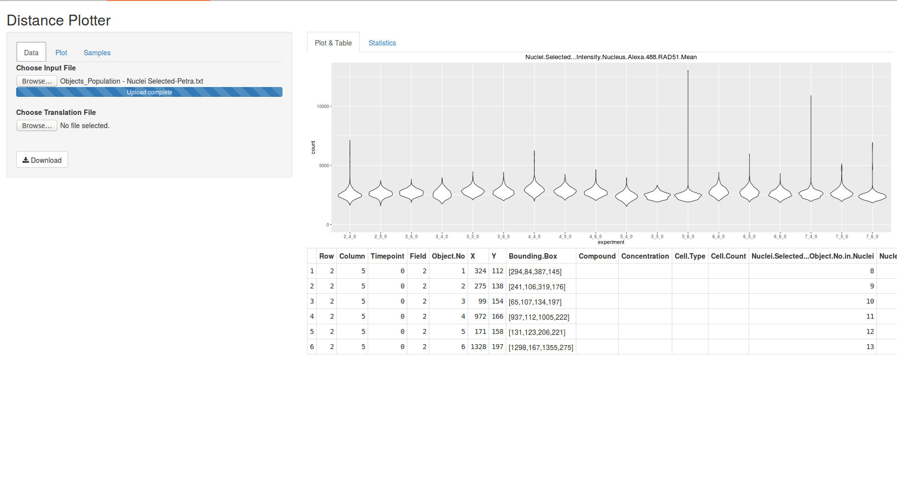
DistancePlotter provides several kinds of plots powered by ggplot2. The tool also sports the possibility to filter your data before plotting to get deeper insights into your data sets.
- create a folder to accomodate DistancePlotter, e.g. PlottingApp
- copy server.R and ui.R into that folder, e.g. PlottingApp or
git clone https://github.com/imbforge/DistancePlotter.git - the application can be run either via command line R or Rstudio
library(shiny)
runApp(PlottingApp)
- open either server.R, ui.R or both
- hit "Run App"
- depending on your preferences you can maximise the window into browser
The "Data" tab is used to open data files and a naming table.
All input files should be saved as TAB delimited files.
-
the file containing the data to be plotted should contain headers
-
DistancePlotter will create an "experiment ID" from the 3 columns named "Row", "Column", "Timepoint", e.g. "2_4_0"
Row Column Timepoint Field Object No ... 2 5 0 2 1 ... 2 5 0 2 2 ... 2 6 0 4 3 ...
- DistancePlotter also digests a folder structure of tab delimited files
- the folder has to be compressed to a zip archive and can be uploaded via the file upload field
- ! Note: as fusion of all input files in the folder may involve a lot of data to process until the plotting area becomes available may take a bit !
-
a translation table can be used to name experiments according to your wishes instead of raw experiment IDs
- the file should be TAB delimited
- the table must contain a header, but the wording is not important
- first column should contain the "experiment ID", e.g. 2_4_0
- second column should contain your desired experiment name
- the order of experiments given in this file will determine the order of experiments plotted
old name real name 2_5_0 treated 2_6_0 untreated
All fields of the "Plot" tab influence the plot shown on the right hand side instantly and can be revised at any time.
-
select the type of plot
- violin plot (a box plot with a rotated kernel density plot on each side.)
- box plot
- jitter plot (a box plot showing all data points instead of boxes)
- density will draw empty areas
- density (fill) will draw colored areas
- histogram (stack) will stack all bars
- histogram (dodge) will print each experiment's bar starting at x-axis
- all plots can be produced in "coloured" variant, which will paint your samples according to colours chosen in "Sample" tab
-
select which column to plot
-
select samples to plot ("Samples" tab)
-
change the title and y-axis label of the plot, whereas y-axis label will be used as x-axis label for density plots and histograms
-
limiting of plotted data and scaling of the y- or x-axis may cause confusion, i.e. log10 scaling with minimal value=0
-
select data column for filtering:
- one column can be selected to filter the plotted data, e.g. to selectively show data of nuclei containing 2 spots, ...
- if you're happy with the filter settings "Add" the filter
- later you can combine several filter settings to your liking
-
Download will save the last plot as "plot.pdf"
The "Samples" tab may be used to:
- select samples to plot (each change will reset this tab including color choices)
- select which colour the samples are plotted in - default colour is white
- ! Note: don't get nervous, if no statistics is shown immediately. It takes a bit... !
- DistancePlotter will calculate Mann-Whitney (aka Wilcoxon) test on all data selected by the chosen column to plot
- a matrix of all vs. all will be shown and can be downloaded as csv (comma separated file)
- add sanity checks for input files

