A dock layout component like visual studio for Vue3
Note: This project is no longer under development. We recommend using vue-code-layout.
- Simple and easy to use, small size
- Customizable
npm install -save @imengyu/vue-dock-layout
import { DockLayout, DockLayoutInterface } from '@imengyu/vue-dock-layout'; To use vue dock layout, you need to first add a container component to your interface (DockLayout), which is the content hosting area of your application.
<template>
  <DockLayout ref="dockLayout" class="full">
    <template #panelRender="{ panel }">
      <template v-if="panel.key==='panel1'">
        <h1>Tab Content</h1>
        <span>This is first tab</span>
      </template>
      <template v-else-if="panel.key==='panel2'">
        <h1>Tab Content</h1>
        <span>This is second tab</span>
      </template>
      <template v-else-if="panel.key==='panel3'">
        <h1>Tab Content</h1>
        <span>This is third tab</span>
        <img src="https://imengyu.top/assets/images/test/1.jpg" />
      </template>
    </template>
  </DockLayout>
</template>
The layout of layout components is based on a grid layout, with each segmented area forming a grid, and your custom content is embedded in the grid as a panel.
The component provides some interfaces that allow you to quickly set the interface layout programmatically:
const dockLayout = ref<DockLayoutInterface>();

onMounted(() => {
  nextTick(() => {
    //Set the interface layout here first
    //Here we have added a horizontal layout with three areas,
    //left/center/right, with a width ratio of 20%: 60%: 20%
    //Then the left region is divided into two regions: leftA/leftB, with a width of 50%: 50%
    dockLayout.value?.setData({
      name: 'root',
      size: 0,
      grids: [
        {
          size: 20,
          name: 'left',
          grids: [
            {
              size: 50,
              name: 'leftA',
            },
            {
              size: 50,
              name: 'leftB',
            },
          ]
        },
        {
          size: 60,
          name: 'center',
          //Here we set that the center area will not be
          //automatically removed when there is no panel
          alwaysVisible: true,
        },
        {
          size: 20,
          name: 'right',
        },
      ],
    });
    //The code below adds a content panel to the grid
    //Each content panel is identified by a key, which can be read from the
    //panel parameter in the panel render slot of DockLayout.
    dockLayout.value?.addPanels([
      {
        key: 'panel1',
        title: 'panel1',
      },
      {
        key: 'panel2',
        title: 'panel2',
      },
    ], 'leftA');
    dockLayout.value?.addPanels([
      {
        key: 'panel3',
        title: 'panel3',
      },
    ], 'leftB');
  })
});
The above examples can be found in online Demo. The first example in was found.
Users can customize the drag and drop interface. Therefore, when the program leaves, if you need to save the user's custom settings, you can read the current grid layout data, set it to the component the next time the program loads.
onBeforeUnmount(() => {
  const layoutData = dockLayout.value?.getSaveData()
  //Save layoutData to anywhere...

  //Next time, load and set to dockLayout
  dockLayout.value?.setData(layoutData);
})The component default provides two themes for you to use: light and dark. The theme can be specified using the theme attribute of the DockLayout component.
<DockLayout ref="dockLayout" theme="light">
  ...
</DockLayout>
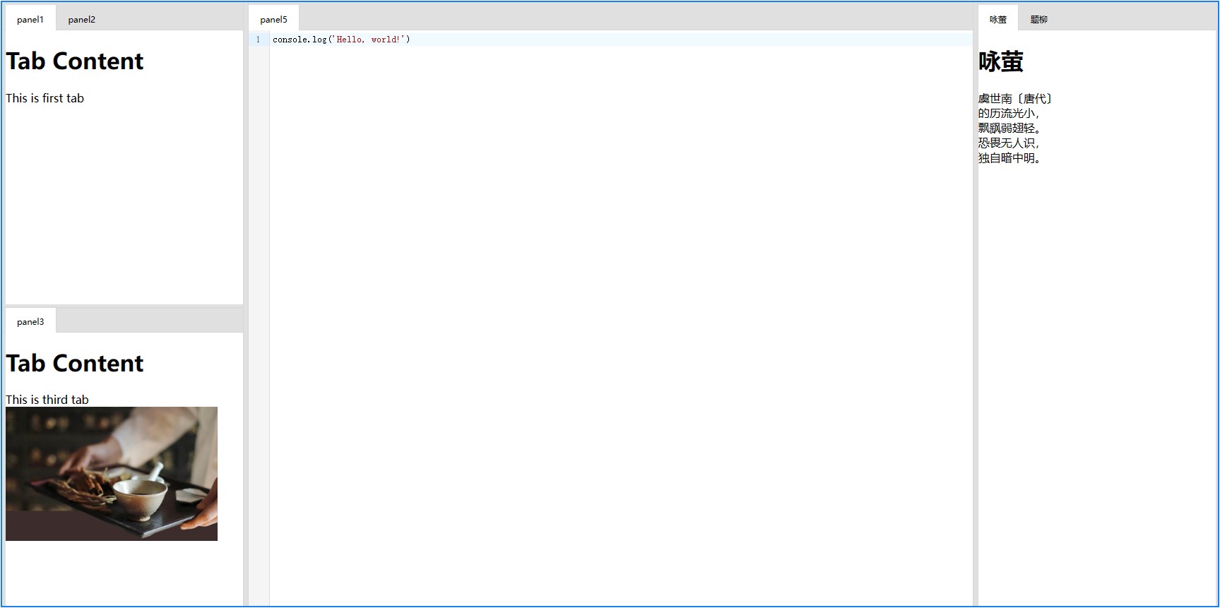
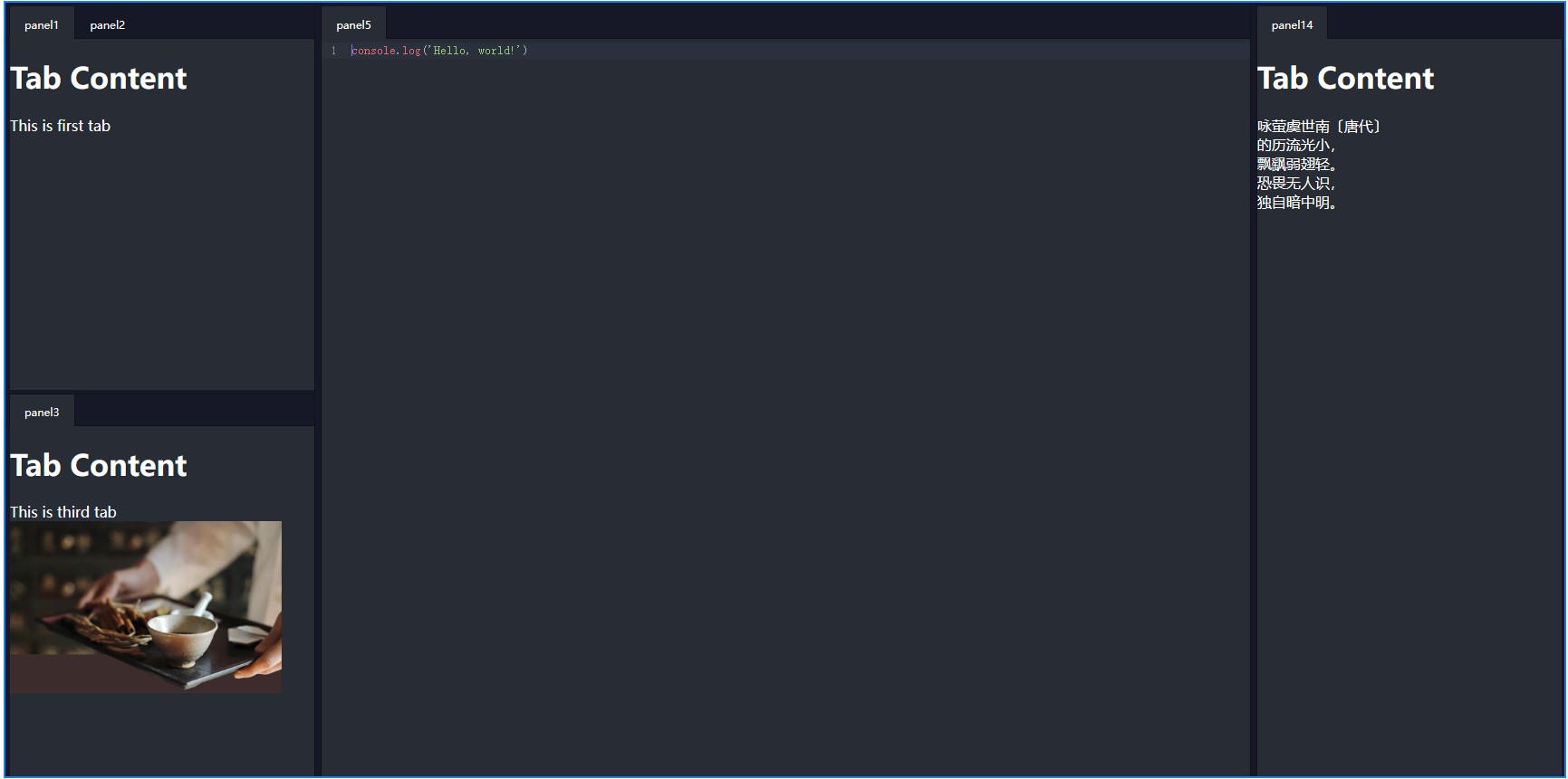
The two theme effects are shown in the following figure:
| light | dark |
|---|---|
 |
 |
The component provides rendering slots in some locations that you can customize for rendering.
For specific examples and source code, please see online Dome.
Custom rendering for panel titles.
<DockLayout ref="dockLayout" class="full">
  <template #tabItemRender="{ dockData, panel, onTabItemMouseDown, onTabItemDragStart, onTabItemDragEnd }">
    <div
      :class="'my-custom-tab drag-target-tab ' + (dockData.activeTab === panel ? 'active' : '')"
      draggable="true"
      @mousedown="onTabItemMouseDown($event, panel)"
      @dragstart="onTabItemDragStart($event, panel)"
      @dragend="onTabItemDragEnd($event)"
    >
      {{ panel.title }}
    </div>
  </template>
</DockLayout>This slot is used to render the backplane displayed when the grid has no content panel.
<DockLayout ref="dockLayout" class="full">
  <template #emptyPanel="{ dockData }">
    <div>
      <h1>{{dockData.name}}</h1>
      <h1>This grid won't be removed from layout even when last Tab is closed</h1>
    </div>
  </template>
</DockLayout>DockLayout is the main container for layout components.
| Name | description | type | default value |
|---|---|---|---|
| tabHeight | The height of the Tab component, used for related calculations | number |
40 |
| startVerticalDirection | Is the first layout grid vertical? | boolean |
false |
| allowFloatWindow | Allow floating windows? | boolean |
false |
| theme | Theme, can be 'light' or 'dark' | string |
dark |
| Name | description | params |
|---|---|---|
| active-tab-change | Trigger event when the active content panel changes | `currentActive : DockPanel |
| tab-closed | Trigger this event when the content panel is closed | panel: DockPanel |
| Name | description | params |
|---|---|---|
| emptyPanel | This slot is used to render panel titles. | { name: string, dockData: DockData } |
| tabItemRender | This slot is used to render the backplane displayed when the grid has no content panel. | DockTabItemRenderData |
//When using TS, you can use DockLayoutInterface to obtain code prompts
const dockLayout = ref<DockLayoutInterface>();Explain:
Obtain current interface grid layout data
Return:
grid layout data
Explain:
Set interface grid layout data
| params | description |
|---|---|
| data | grid layout data |
Explain:
Update properties of panel instances
| params | description |
|---|---|
| panel | Target panel |
Explain:
Insert the panel into the container.
- Note: If the panel key has already been inserted into the current container and
insertTois not empty, the panel will be moved to the operation, and the new panel properties will not change. You need to manually callupdatePanelto update the properties. - Note: If
insertTois not empty, its grid container must first exist, otherwise the addition will fail. panel.keycannot be empty.
| params | description |
|---|---|
| panel | Target panel |
| insertTo | Insert the panel into the grid with the specified name. If left blank, insert it into the top-level grid |
Explain:
Insert the panel into the container. Same as' addPanel ', but this function adds multiple panels at once.
| params | description |
|---|---|
| panels | Panel array |
| insertTo | Insert the panel into the grid with the specified name. If left blank, insert it into the top-level grid |
Explain:
Remove specified panel
| params | description |
|---|---|
| key | Target panel key |
Explain:
Remove multiple specified panels
| params | description |
|---|---|
| keys | Target panel keys |
Explain:
Activate the specified panel
| params | description |
|---|---|
| key | Target panel key |