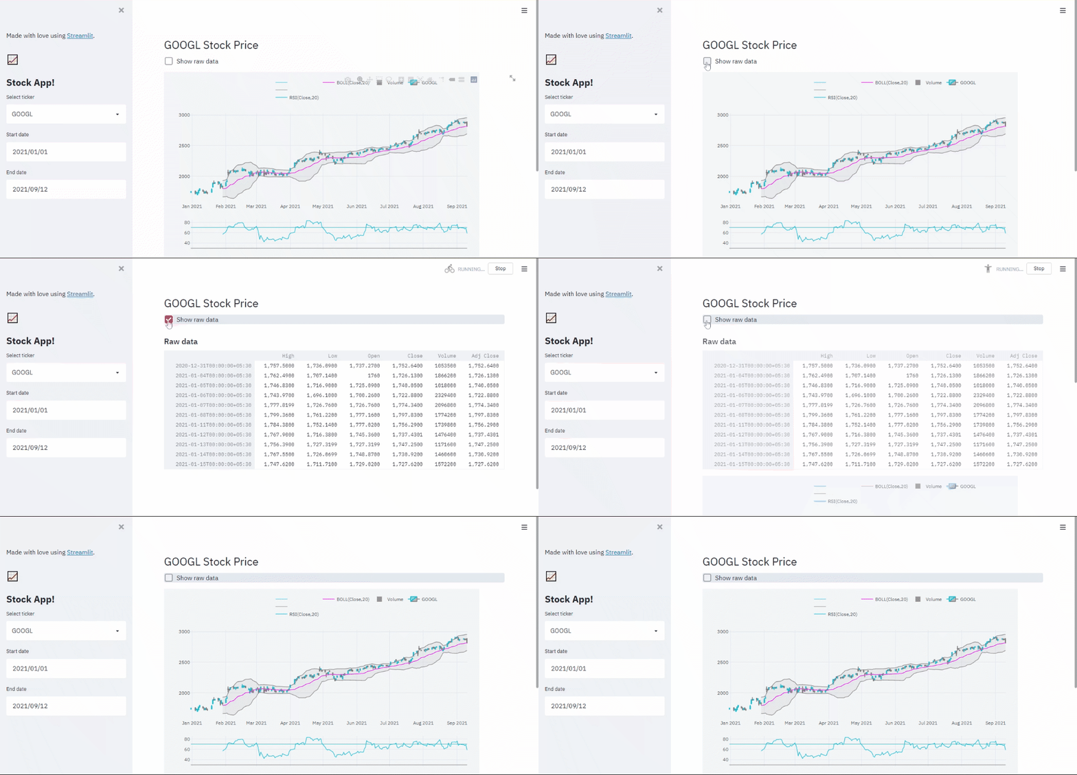
I actually like the Streamlit after I tried it out to deploy my models. I like the smart code of Streamlit to make an interactive data apps for the visual charts.
In this article, We'll use Streamlit to create an interactive data app; exploring a stock market data for different symbols and quickly visualize the stock prices with technical indicators.
Note: The writing of this article is only aimed at demonstrating the steps to create an interactive data app using Streamlit. It doesn't serve any purpose of promoting any stock.
Streamlit is an open-source Python library that makes it easy to create and share beautiful, custom web apps for machine learning and data science.
In just a few minutes you can build and deploy powerful data apps - so let's get started!
-
Make sure that you have Python 3.6+ installed.
-
Install Streamlit using PIP, Add below dependencies to the requirements file:
streamlit
pandas_datareader==0.10.0
plotly==5.2.2
cufflinks==0.17.3
-
Now, Install the required dependencies:
pip install -r requirements.txt
Now that we have set up our environment, let's dive into more of how Streamlit works and how to build great data apps.
-
The first step is to create a new Python script. Let's call it
app.py. -
Open
app.pyin editor, then add these lines:import datetime import streamlit as st import pandas_datareader as pdr import cufflinks as cf
-
Add page configuration:
APP_NAME = "Stock App!" st.set_page_config( page_title=APP_NAME, layout="wide", initial_sidebar_state="expanded", )
-
Every good app has a title, so let's add one:
st.sidebar.title(APP_NAME)
-
Now it's time to run Streamlit from the command line:
streamlit run app.py
As usual, the app should automatically open in a new tab in your browser.
Now that we have an app, the next thing we'll need to do is read the stock market data for specific stock symbol (ticker).
Let's define the list of tickers and assign it to the Streamlit select widget:
# List of tickers
TICKERS = ['FB', 'AMZN', 'AAPL', 'NFLX', 'GOOGL', 'MSFT']
# Select ticker
ticker = st.sidebar.selectbox('Select ticker', sorted(TICKERS), index=0)Now let's set the start and end point to fetch data:
# Set start and end point to fetch data
start_date = st.sidebar.date_input('Start date', datetime.datetime(2021, 1, 1))
end_date = st.sidebar.date_input('End date', datetime.datetime.now().date())We'll use pandas-datareader to read data, which extract data from various Internet sources into a pandas DataFrame.
# Fetch the data for specified ticker e.g. AAPL from yahoo finance
df_ticker = pdr.DataReader(ticker, 'yahoo', start_date, end_date)Now that we have fetch the data successfully from yahoo finance using pandas_datareader. Let's inspect the stock data.
It's always a good idea to take a look at the raw data before start working with it. Let's add some code here and write raw data to the app:
if st.checkbox('Show raw data'):
st.subheader('Raw data')
st.write(df_ticker)Here st.write will render almost anything you pass to it. In this case, we're passing in a dataframe and it's rendering as an interactive table.
We'll use a powerful yet user-friendly plot library, Cufflinks to visualize data. It is an open-source library that is specially dedicated to financial visualization. This library combines the power of Plotly with the flexibility of Pandas for easy plotting.
# Interactive data visualizations using cufflinks
# Create candlestick chart
qf = cf.QuantFig(df_ticker, legend='top', name=ticker)As mentioned above, Cufflinks is dedicated to financial visualization. It can expedite the process of building visualization for some common technical indicators such as moving average, Bollinger Band, RSI.
# Technical Analysis Studies can be added on demand
# Add Relative Strength Indicator (RSI) study to QuantFigure.studies
qf.add_rsi(periods=20, color='java')
# Add Bollinger Bands (BOLL) study to QuantFigure.studies
qf.add_bollinger_bands(periods=20,boll_std=2,colors=['magenta','grey'],fill=True)
# Add 'volume' study to QuantFigure.studies
qf.add_volume()
fig = qf.iplot(asFigure=True, dimensions=(800, 600))Finally, render figure using st.plotly_chart:
# Render plot using plotly_chart
st.plotly_chart(fig)That's it, We've made it to the end. Here's the complete script for our interactive data app.
import datetime
import streamlit as st
import pandas_datareader as pdr
import cufflinks as cf
APP_NAME = "Stock App!"
# Page Configuration
st.set_page_config(
page_title=APP_NAME,
layout="wide",
initial_sidebar_state="expanded",
)
# Add some markdown
st.sidebar.markdown("Made with love using [Streamlit](https://streamlit.io/).")
st.sidebar.markdown("# :chart_with_upwards_trend:")
# Add app title
st.sidebar.title(APP_NAME)
# List of tickers
TICKERS = ['FB', 'AMZN', 'AAPL', 'NFLX', 'GOOGL', 'MSFT']

# Select ticker
ticker = st.sidebar.selectbox('Select ticker', sorted(TICKERS), index=0)
# Set start and end point to fetch data
start_date = st.sidebar.date_input('Start date', datetime.datetime(2021, 1, 1))
end_date = st.sidebar.date_input('End date', datetime.datetime.now().date())
# Fetch the data for specified ticker e.g. AAPL from yahoo finance
df_ticker = pdr.DataReader(ticker, 'yahoo', start_date, end_date)
st.header(f'{ticker} Stock Price')
if st.checkbox('Show raw data'):
    st.subheader('Raw data')
    st.write(df_ticker)
# Interactive data visualizations using cufflinks
# Create candlestick chart
qf = cf.QuantFig(df_ticker, legend='top', name=ticker)
# Technical Analysis Studies can be added on demand
# Add Relative Strength Indicator (RSI) study to QuantFigure.studies
qf.add_rsi(periods=20, color='java')

# Add Bollinger Bands (BOLL) study to QuantFigure.studies
qf.add_bollinger_bands(periods=20,boll_std=2,colors=['magenta','grey'],fill=True)

# Add 'volume' study to QuantFigure.studies
qf.add_volume()

fig = qf.iplot(asFigure=True, dimensions=(800, 600))
# Render plot using plotly_chart
st.plotly_chart(fig)Now that we have created our data app, and ready to share it! We can use Streamlit Cloud to deploy and share our app. Streamlit Cloud has multiple tiers, the free Community tier is the perfect solution if your app is hosted in a public GitHub repo and you'd like anyone in the world to be able to access it.
You can check steps to deploy apps with the free Community tier here..
Thank you for reading. I hope this article was valuable to you and you enjoyed creating an interactive data app using Streamlit.
Streamlit claims to be "the fastest way to build and share data apps", so it has to be intuitive and quick. All the commands can be summarized in this one page of cheat sheet.
Go ahead and clone the repos streamlit-data-app to view the full code of the project.
Happy Coding!
