This template provides simple copy paste solution to build masonry layout for you.
No libs needed, just pure vanilla js.
If this project has helped you in any way or you found it interesting, please consider giving it a star ⭐.
Your support helps me continue to improve and maintain the project, and it means a lot to me!
Remember, a little star can make a big difference!
import { images } from './config';

const MAX_COLUMNS = 3

function getColumns(colIndex: number) {
  // Instead of images you can replace it with any other data source
  return images.filter((_, idx) => idx % MAX_COLUMNS === colIndex);
}

function App() {
  return (
    <div className="grid grid-cols-1 sm:grid-cols-3 gap-4">
      {Array.from({ length: MAX_COLUMNS }, (_, colIndex) => (
        <div key={colIndex} className="grid gap-4">
          {getColumns(colIndex).map((img, idx) => (
            <div key={idx} className="replace-with-your-own-component">
              <img loading="lazy" src={img.src} height={img.height} width={img.width} alt={img.alt} className="h-full w-full object-cover" />
            </div>
          ))}
        </div>
      ))}
    </div>
  )
}- Define
MAX_COLUMNSconstant & changesm:grid-cols-3tosm:grid-cols-{your-cols-count} - Replace
imagesarray with any other data source - Replace
divwith your own component
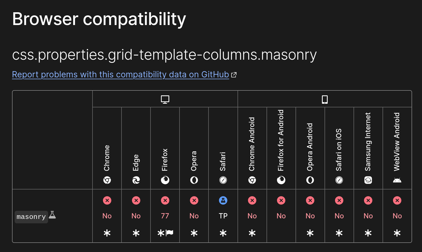
Because native CSS solution still an experimental solution and not supported by all browsers.

Licensed under the MIT license.