ggstatsplot is an
extension of ggplot2 package
for creating graphics with details from statistical tests included in
the plots themselves and targeted primarily at behavioral sciences
community to provide a one-line code to produce information-rich plots.
Currently, it supports only the most common types of statisticla tests
(parametric, nonparametric, and robust versions of
t-tets/anova, correlation, and contingency tables analyses).
Accordingly, it produces limited kinds of plots: violin plots (for
comparisons between groups or conditions), pie charts (for
categorical data), scatterplots (for correlations between
variables), and histograms (for hypothesis about distributions).
Future versions will include other types of analyses and plots as well.
To get the latest, stable CRAN release:
utils::install.packages(pkgs = "ggstatsplot")You can get the development version from GitHub. If you are in hurry and want to reduce the time of installation, prefer-
# install.packages("devtools")                                # needed package to download from GitHub repo
devtools::install_github(repo = "IndrajeetPatil/ggstatsplot", # package path on GitHub
                         quick = TRUE)                        # skips docs, demos, and vignettes
If time is not a constraint-
devtools::install_github(repo = "IndrajeetPatil/ggstatsplot", # package path on GitHub
                         dependencies = TRUE,                 # installs packages which ggstatsplot depends on
                         upgrade_dependencies = TRUE          # updates any out of date dependencies
)
If you are not using the RStudio IDE and you
get an error related to “pandoc” you will either need to remove the
argument build_vignettes = TRUE (to avoid building the vignettes) or
install pandoc. If you have the rmarkdown R
package installed then you can check if you have pandoc by running the
following in R:
rmarkdown::pandoc_available()
#> [1] TRUEDocumentation for any function can be accessed with the standard help
command-
?ggbetweenstats
?ggscatterstats
?gghistostats
?ggpiestats
?ggcorrmat
?combine_plotsggstatsplot relies on non-standard
evaluation,
which means you can’t enter arguments in the following manner: x = data$x, y = data$y. This may work well for most of the functions most
of the time, but is highly discouraged. You should always specify data
argument for all functions.
Additionally, ggstatsplot is a very chatty package and will by default
output information about references for tests, notes on assumptions
about linear models, and warnings. If you don’t want your console to be
cluttered with such messages, they can be turned off by setting
messages = FALSE.
Here are examples of the main functions currently supported in
ggstatsplot:
ggbetweenstats
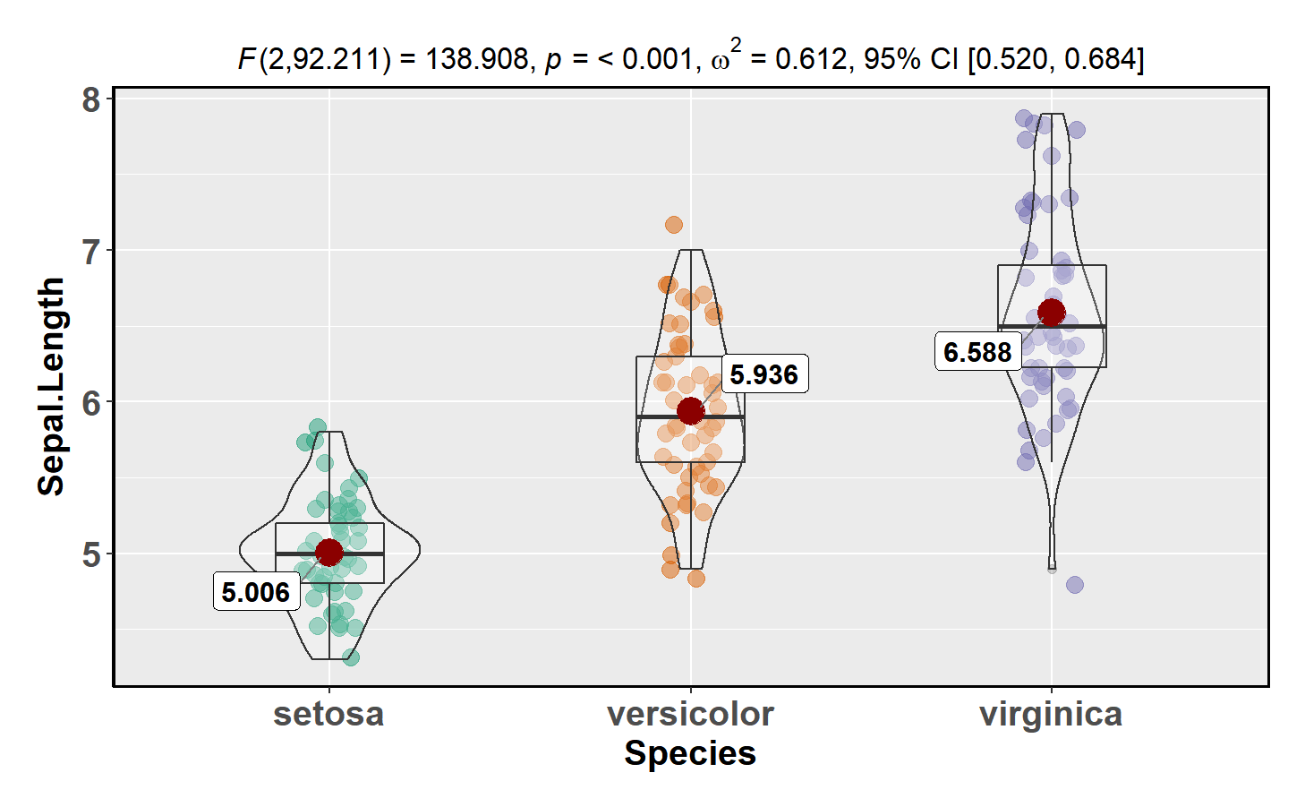
This function creates a violin plot for between-group or between-condition comparisons with results from statistical tests in the subtitle:
ggstatsplot::ggbetweenstats(data = datasets::iris,
                            x = Species,
                            y = Sepal.Length,
                            messages = FALSE)
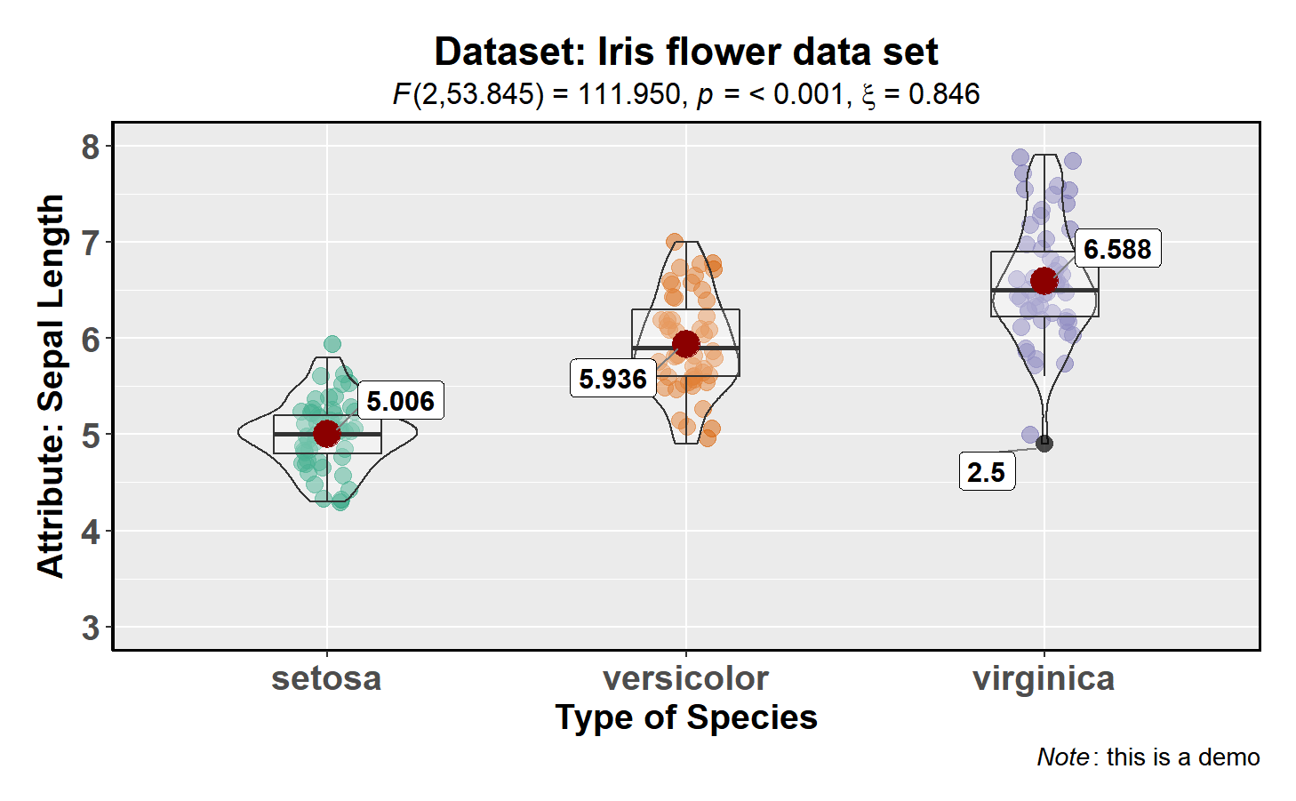
Number of other arguments can be specified to make this plot even more
informative and, additionally, this function returns a ggplot2 object
and thus any of the graphics layers can be further modified:
library(ggplot2)

ggstatsplot::ggbetweenstats(
  data = datasets::iris,
  x = Species,
  y = Sepal.Length,
  mean.plotting = TRUE,                           # whether mean for each group id to be displayed
  type = "robust",                                # which type of test is to be run
  outlier.tagging = TRUE,                         # whether outliers need to be tagged
  outlier.label = Sepal.Width,                    # variable to be used for the outlier tag
  xlab = "Type of Species",                       # label for the x-axis variable
  ylab = "Attribute: Sepal Length",               # label for the y-axis variable
  title = "Dataset: Iris flower data set",        # title text for the plot
  caption = expression(                           # caption text for the plot
    paste(italic("Note"), ": this is a demo")
  ),
  messages = FALSE
) +                                             # further modifcation outside of ggstatsplot
  ggplot2::coord_cartesian(ylim = c(3, 8)) +
  ggplot2::scale_y_continuous(breaks = seq(3, 8, by = 1))
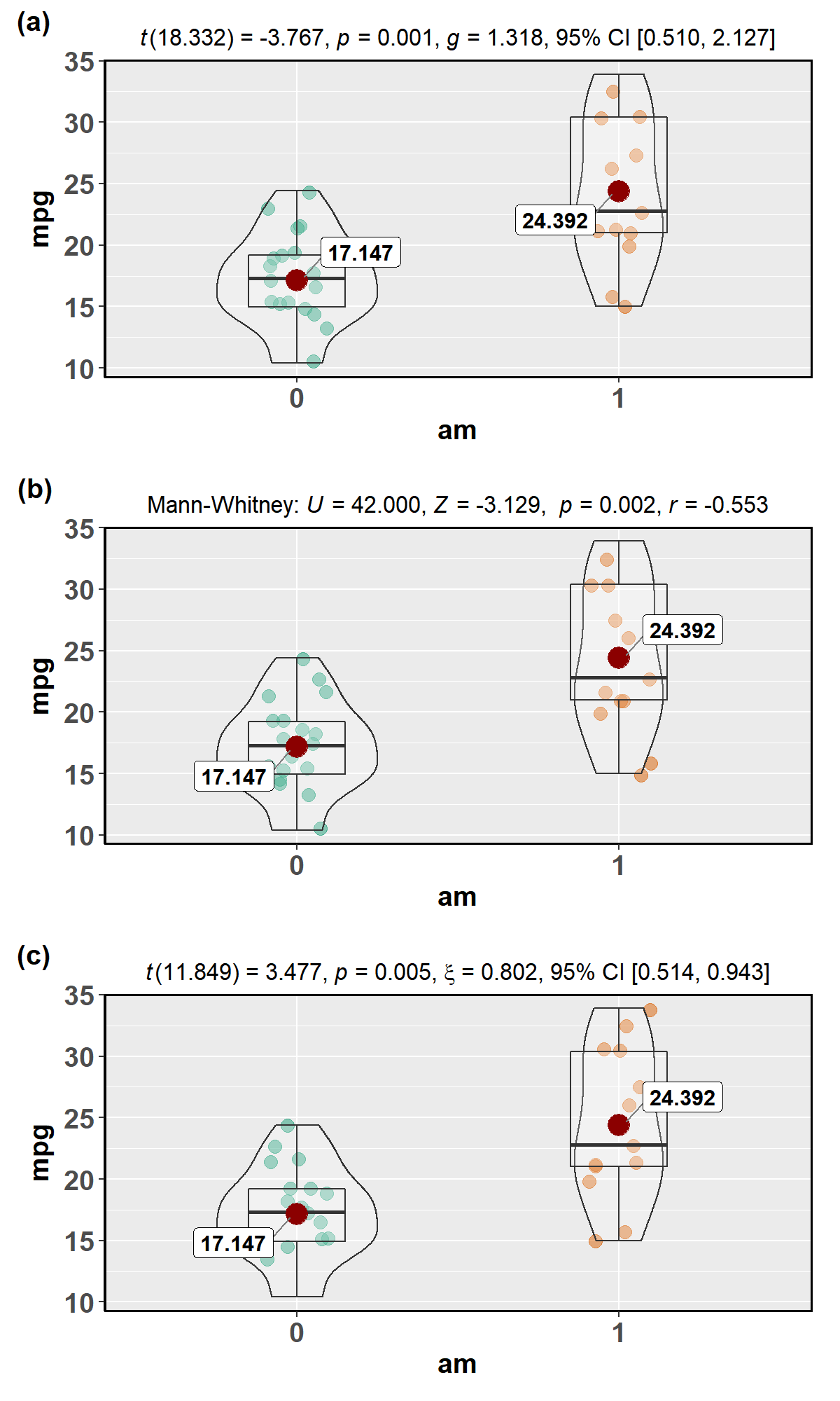
The type (of test) argument also accepts the following abbreviations:
“p” (for parametric), “np” (for nonparametric), “r” (for
robust).
For example,
library(ggplot2)
library(cowplot)

# parametric t-tet
p1 <- ggstatsplot::ggbetweenstats(
  data = datasets::mtcars,
  x = am,
  y = mpg,
  type = "p",
  messages = FALSE
)
#> Warning:  aesthetic `x` was not a factor; converting it to factor

# Mann-Whitney U-test
p2 <- ggstatsplot::ggbetweenstats(
  data = mtcars,
  x = am,
  y = mpg,
  type = "np",
  messages = FALSE
)
#> Warning:  aesthetic `x` was not a factor; converting it to factor

# robust t-test
p3 <- ggstatsplot::ggbetweenstats(
  data = mtcars,
  x = am,
  y = mpg,
  type = "r",
  messages = FALSE
)
#> Warning:  aesthetic `x` was not a factor; converting it to factor

# combining the individual plots into a single plot
cowplot::plot_grid(p1, p2, p3,
                   nrow = 3,
                   ncol = 1,
                   labels = c("(a)", "(b)", "(c)")
)
Variant of this function ggwithinstats is currently under work. You
can still use this function just to prepare the plot, but the
statistical details will be incorrect. You can remove them by adding
labs(subtitle = NULL) to your code which will remove the subtitle
containing stats.
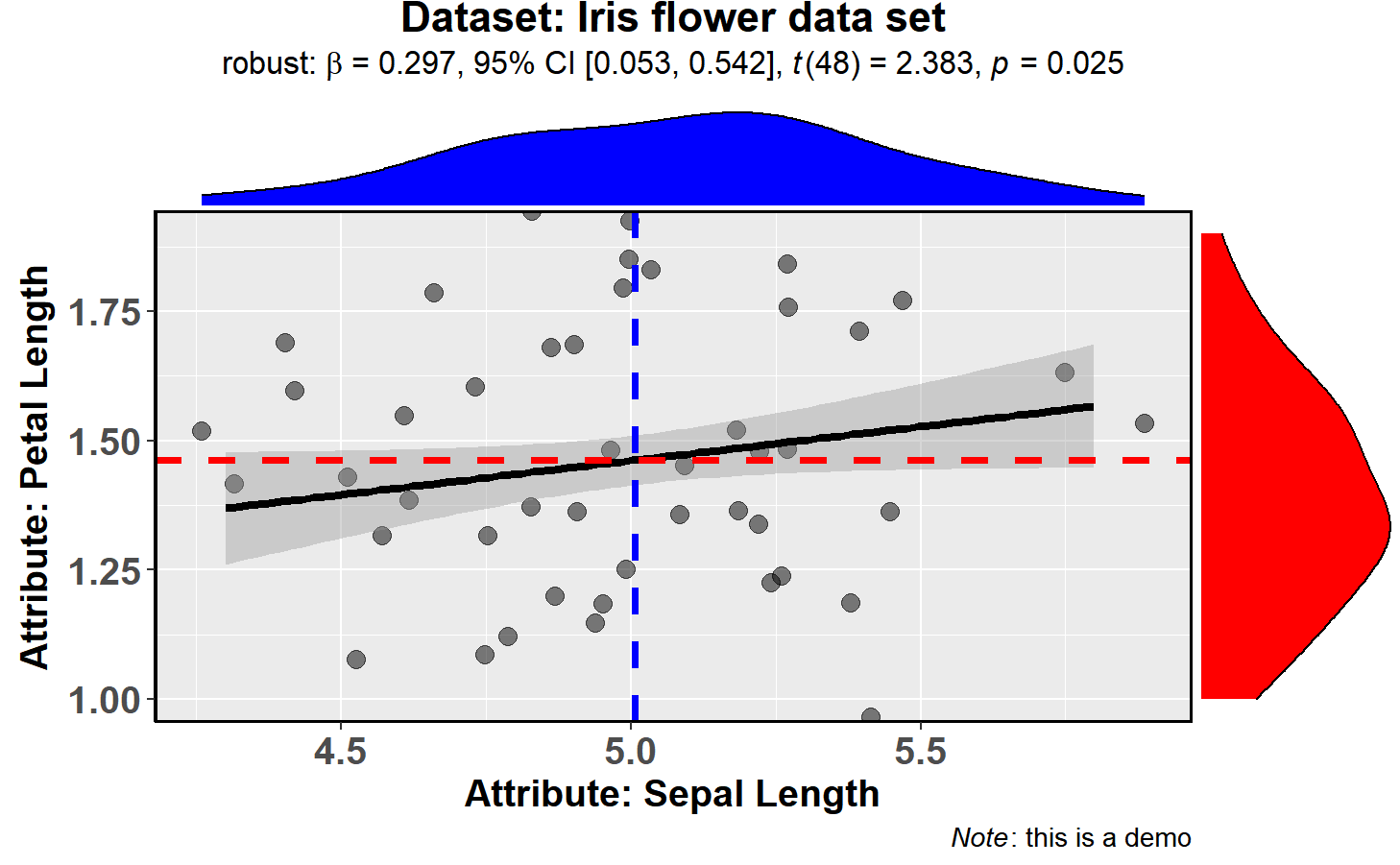
ggscatterstats
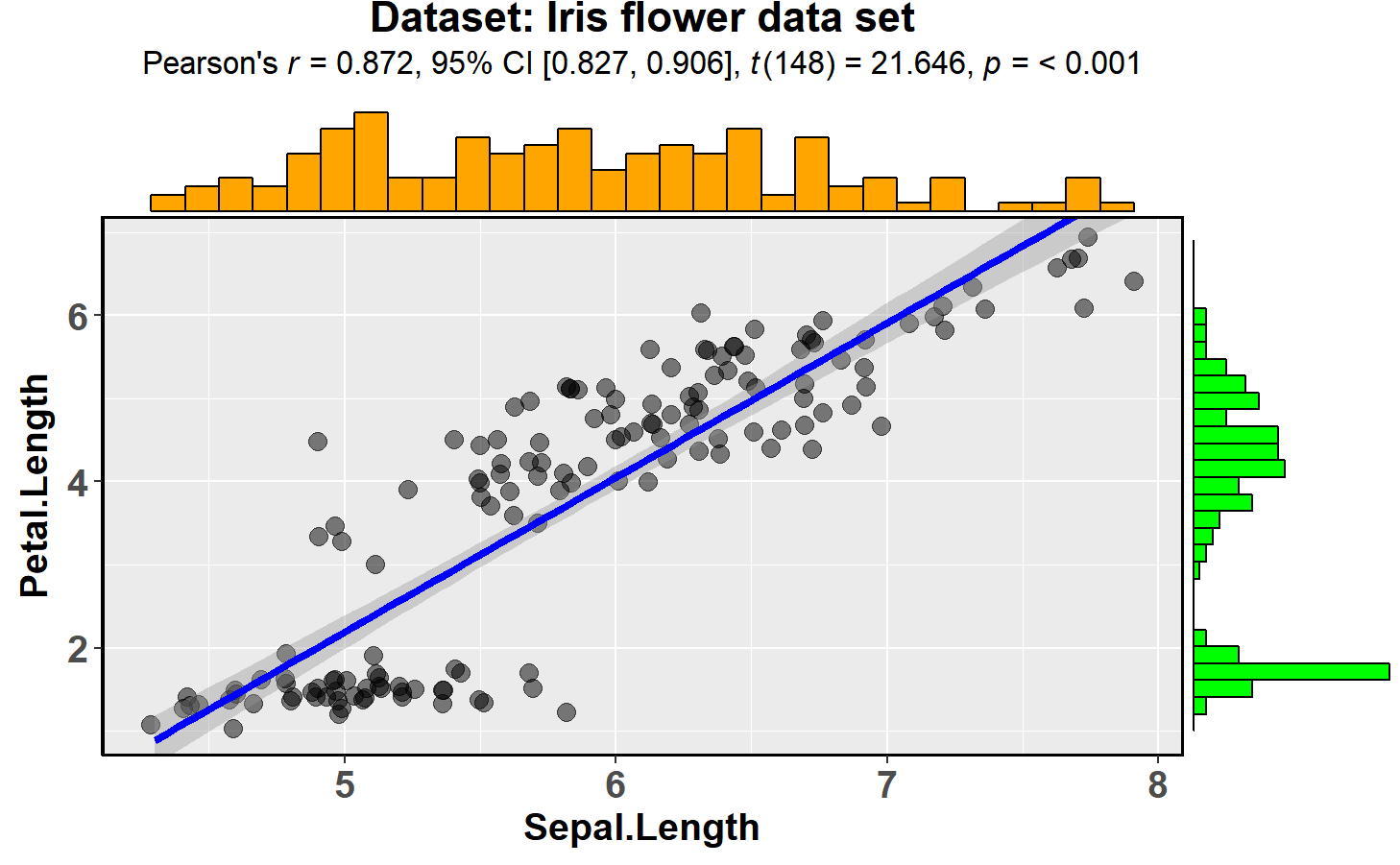
This function creates a scatterplot with marginal
histograms/boxplots/density/violin plots from
ggExtra::ggMarginal()
and results from statistical tests in the subtitle:
ggstatsplot::ggscatterstats(data = datasets::iris,
                            x = Sepal.Length,
                            y = Petal.Length,
                            title = "Dataset: Iris flower data set",
                            messages = FALSE)
Number of other arguments can be specified to modify this basic plot-
library(datasets)

ggstatsplot::ggscatterstats(
  data = subset(datasets::iris, iris$Species == "setosa"),
  x = Sepal.Length,
  y = Petal.Length,
  type = "robust",                               # type of test that needs to be run
  xlab = "Attribute: Sepal Length",              # label for x axis
  ylab = "Attribute: Petal Length",              # label for y axis
  line.colour = "black",                         # changing regression line colour line
  title = "Dataset: Iris flower data set",       # title text for the plot
  caption = expression(                          # caption text for the plot
    paste(italic("Note"), ": this is a demo")
  ),
  marginal.type = "density",                     # type of marginal distribution to be displayed
  xfill = "blue",                                # colour fill for x-axis marginal distribution
  yfill = "red",                                 # colour fill for y-axis marginal distribution
  intercept = "median",                          # which type of intercept line is to be displayed
  width.jitter = 0.2,                            # amount of horizontal jitter for data points
  height.jitter = 0.4,                           # amount of vertical jitter for data points
  messages = FALSE                               # turn off messages and notes
)
The type (of test) argument also accepts the following abbreviations:
“p” (for parametric/pearson’s), “np” (for nonparametric/spearman),
“r” (for robust).
Important: In contrast to all other functions in this package, the
ggscatterstats function returns object that is not further
modifiable with ggplot2. This can be avoided by not plotting the
marginal distributions (marginal = FALSE). Currently trying to find a
workaround this problem.
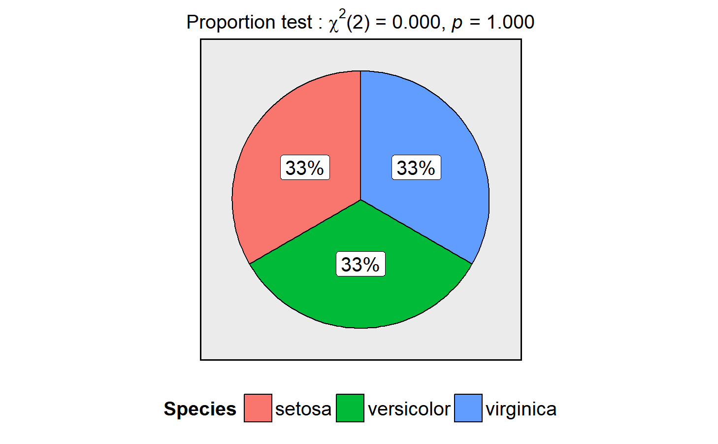
ggpiestats
This function creates a pie chart for categorical variables with results from contingency table analysis included in the subtitle of the plot. If only one categorical variable is entered, proportion test will be carried out.
ggstatsplot::ggpiestats(data = datasets::iris,
                        main = Species,
                        messages = FALSE)
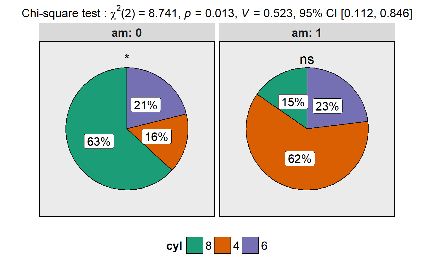
This function can also be used to study an interaction between two
categorical variables. Additionally, as with the other functions in
ggstatsplot, this function returns a ggplot2 object and can further
be modified with ggplot2 syntax (e.g., we can change the color palette
after ggstatsplot has produced the plot)-
library(ggplot2)

ggstatsplot::ggpiestats(data = datasets::mtcars,
                        main = cyl,
                        condition = am,
                        messages = FALSE) +
  ggplot2::scale_fill_brewer(palette = "Dark2")   # further modifcation outside of ggstatsplot
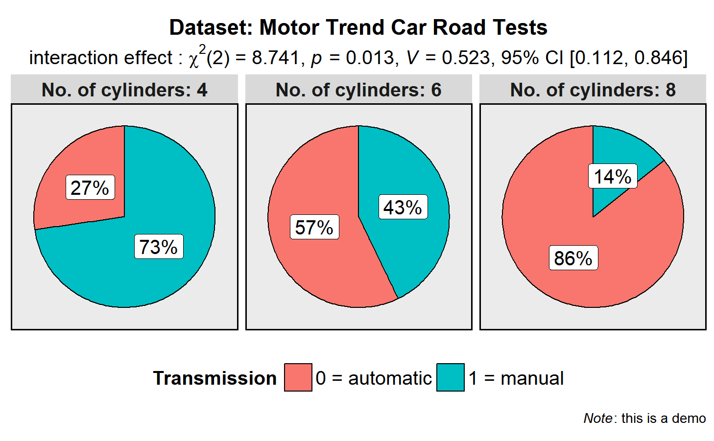
As with the other functions, this basic plot can further be modified with additional arguments:
library(ggplot2)

ggstatsplot::ggpiestats(
  data = datasets::mtcars,
  main = am,
  condition = cyl,
  title = "Dataset: Motor Trend Car Road Tests",      # title for the plot
  stat.title = "interaction effect",                  # title for the results from Pearson's chi-squared test
  legend.title = "Transmission",                      # title for the legend
  factor.levels = c("0 = automatic", "1 = manual"),   # renaming the factor level names for main variable
  facet.wrap.name = "No. of cylinders",               # name for the facetting variable
  facet.proptest = FALSE,                             # turning of facetted proportion test results
  caption = expression(                               # text for the caption
    paste(italic("Note"), ": this is a demo")
  ),
  messages = FALSE                                    # turn off messages and notes
)
gghistostats
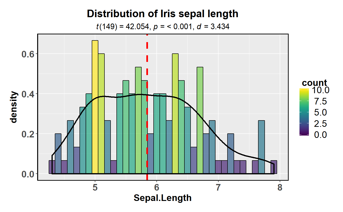
In case you would like to see the distribution of one variable and check if it is significantly different from a specified value with a one sample test, this function will let you do that.
library(datasets)
library(viridis)

ggstatsplot::gghistostats(
  data = datasets::iris,
  x = Sepal.Length,
  title = "Distribution of Iris sepal length",
  type = "parametric",            # one sample t-test
  test.value = 3,                 # default value is 0
  centrality.para = "mean",       # which measure of central tendency is to be plotted
  centrality.colour = "red",      # decides colour of vertical line representing central tendency
  density.plot = TRUE,            # whether density plot is to be overlayed on a histogram
  binwidth.adjust = TRUE,         # whether binwidth needs to be adjusted
  binwidth = 0.10,                # binwidth value (needs to be toyed around with until you find the best one)
  messages = FALSE                # turn off the messages
) +
  viridis::scale_fill_viridis()   # further modifcation outside of ggstatsplot
The type (of test) argument also accepts the following abbreviations:
“p” (for parametric) or “np” (for nonparametric).
ggcorrmat
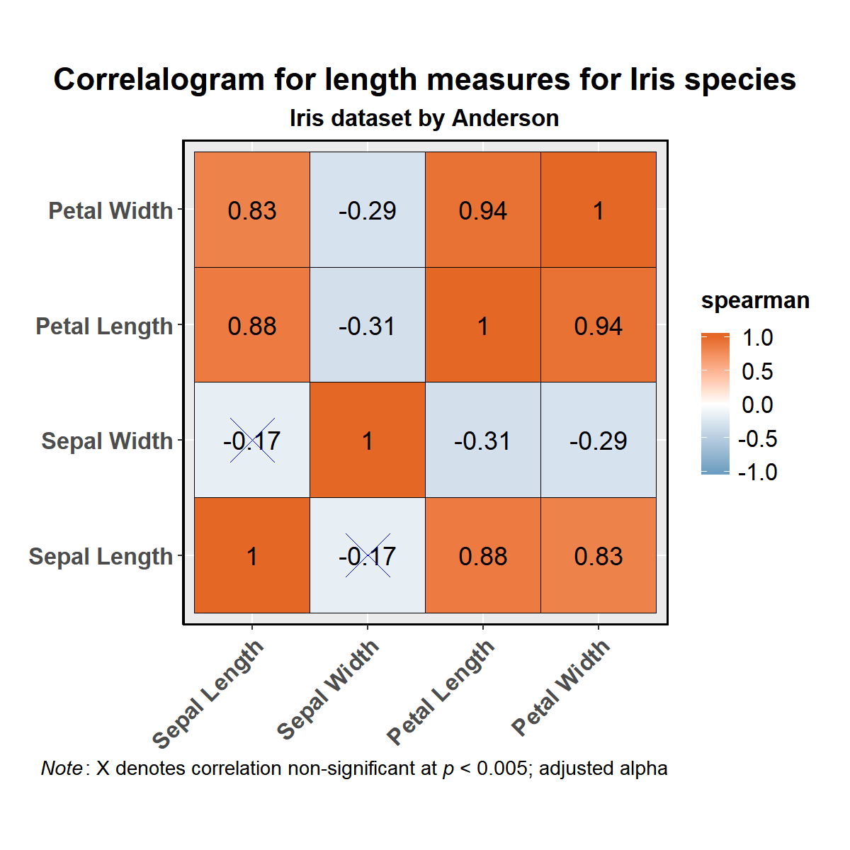
ggcorrmat makes correlalograms with minimal amount of code. Just
sticking to the defaults itself produces publication-ready correlation
matrices. (Wrapper around
ggcorrplot)
# as a default this function outputs a correlalogram plot
ggstatsplot::ggcorrmat(
  data = datasets::iris,
  corr.method = "spearman",      # correlation method
  sig.level = 0.005,              # threshold of significance
  cor.vars = c(Sepal.Length, Sepal.Width, Petal.Length, Petal.Width),
  cor.vars.names = c("Sepal Length", "Sepal Width", "Petal Length", "Petal Width"),
  title = "Correlalogram for length measures for Iris species",
  subtitle = "Iris dataset by Anderson",
  caption = expression(
    paste(
      italic("Note"),
      ": X denotes correlation non-significant at ",
      italic("p "),
      "< 0.005; adjusted alpha"
    )
  )
)
Alternatively, you can use it just to get the correlation matrices and their corresponding p-values (in a tibble format).
# getting correlations
ggstatsplot::ggcorrmat(
  data = datasets::iris,
  cor.vars = c(Sepal.Length, Sepal.Width, Petal.Length, Petal.Width),
  output = "correlations"
)
#> # A tibble: 4 x 5
#>   variable     Sepal.Length Sepal.Width Petal.Length Petal.Width
#>   <chr>               <dbl>       <dbl>        <dbl>       <dbl>
#> 1 Sepal.Length        1.00       -0.120        0.870       0.820
#> 2 Sepal.Width        -0.120       1.00        -0.430      -0.370
#> 3 Petal.Length        0.870      -0.430        1.00        0.960
#> 4 Petal.Width         0.820      -0.370        0.960       1.00

# getting p-values
ggstatsplot::ggcorrmat(
  data = datasets::iris,
  cor.vars = c(Sepal.Length, Sepal.Width, Petal.Length, Petal.Width),
  output = "p-values"
)
#> # A tibble: 4 x 5
#>   variable     Sepal.Length  Sepal.Width Petal.Length Petal.Width
#>   <chr>               <dbl>        <dbl>        <dbl>       <dbl>
#> 1 Sepal.Length     0.       0.152            1.04e-47    2.33e-37
#> 2 Sepal.Width      1.52e- 1 0.               4.51e- 8    4.07e- 6
#> 3 Petal.Length     1.04e-47 0.0000000451     0.          4.68e-86
#> 4 Petal.Width      2.33e-37 0.00000407       4.68e-86    0.
combine_plots
ggstatsplot also contains a helper function combine_plots to combine
multiple plots. This is a wrapper around
cowplot::plot_grid
and lets you combine multiple plots and add combination of title,
caption, and annotation texts with suitable default parameters.
The full power of ggstatsplot can be leveraged with a functional
programming package like purrr that
replaces many for loops with code that is both more succinct and easier
to read and, therefore, purrr should be preferrred.
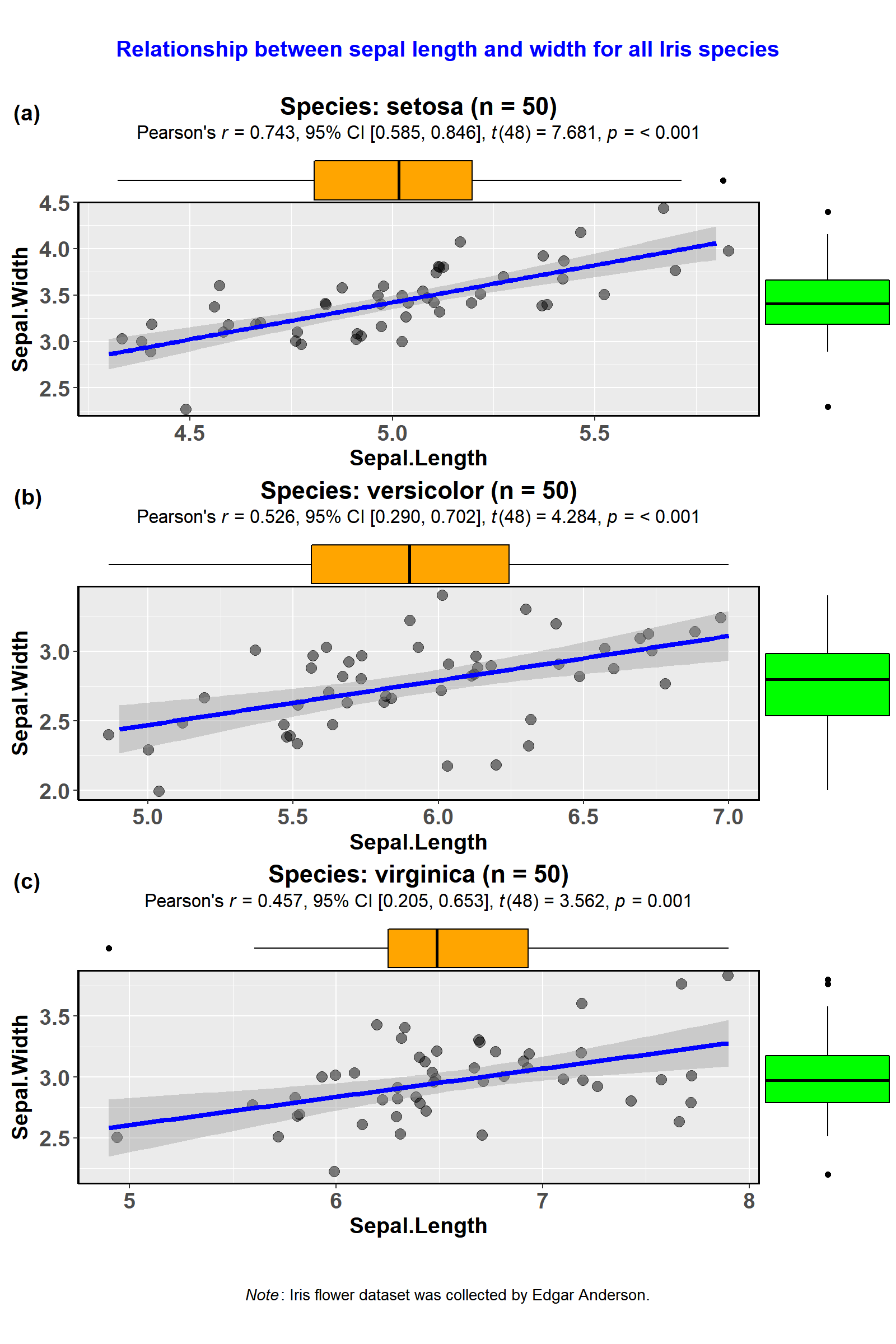
An example is provided below. Notice how little code is needed not only to prepare the plots but also to plot the statistical test results.
library(glue)
library(tidyverse)

### creating a list column with `ggstatsplot` plots
plots <- datasets::iris %>%
  dplyr::mutate(.data = ., Species2 = Species) %>% # just creates a copy of this variable
  dplyr::group_by(.data = ., Species) %>%
  tidyr::nest(data = .) %>%                        # creates a nested dataframe with list column called `data`
  dplyr::mutate(                                   # creating a new list column of ggstatsplot outputs
    .data = .,
    plot = data %>%
      purrr::map(
        .x = .,
        .f = ~ ggstatsplot::ggscatterstats(
          data = .,
          x = Sepal.Length,
          y = Sepal.Width,
          messages = FALSE,                        # turns off all the warnings, notes, and reference messages
          marginal.type = "boxplot",
          title =
            glue::glue("Species: {.$Species2} (n = {length(.$Sepal.Length)})")
        )
      )
  )

### display the new object (notice that the class of the `plot` list column is S3: gg)
plots
#> # A tibble: 3 x 3
#>   Species    data              plot
#>   <fct>      <list>            <list>
#> 1 setosa     <tibble [50 x 5]> <S3: ggExtraPlot>
#> 2 versicolor <tibble [50 x 5]> <S3: ggExtraPlot>
#> 3 virginica  <tibble [50 x 5]> <S3: ggExtraPlot>

### creating a grid with cowplot
ggstatsplot::combine_plots(
  plotlist = plots$plot,                           # list column containing all ggstatsplot objects
  labels = c("(a)", "(b)", "(c)"),
  nrow = 3,
  ncol = 1,
  title.text = "Relationship between sepal length and width for all Iris species",
  title.size = 14,
  title.colour = "blue",
  caption.text = expression(
    paste(
      italic("Note"),
      ": Iris flower dataset was collected by Edgar Anderson."
    ),
    caption.size = 10
  )
)
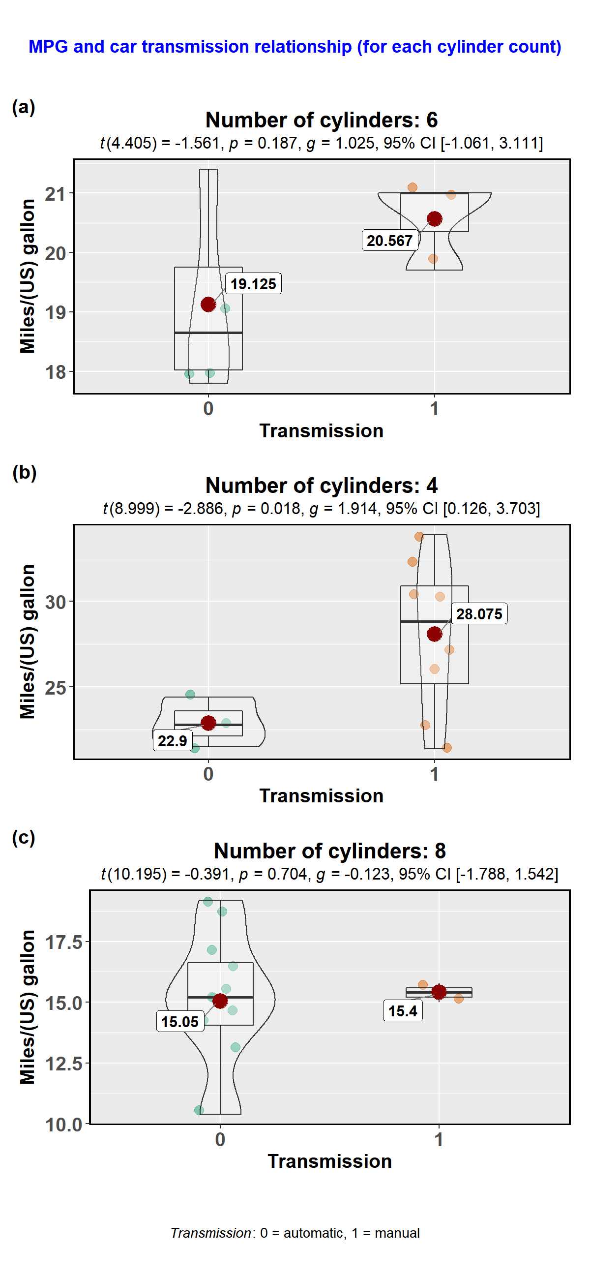
Here is another example with ggbetweenstats-
library(tidyverse)
library(glue)

### creating a list column with `ggstatsplot` plots
plots <- datasets::mtcars %>%
  dplyr::mutate(.data = ., cyl2 = cyl) %>%        # just creates a copy of this variable
  dplyr::group_by(.data = ., cyl) %>%             #
  tidyr::nest(data = .) %>%                       # creates a nested dataframe with list column called `data`
  dplyr::mutate(                                  # creating a new list column of ggstatsplot outputs
    .data = .,
    plot = data %>%
      purrr::map(
        .x = .,
        .f = ~ ggstatsplot::ggbetweenstats(
          data = .,
          x = am,
          y = mpg,
          messages = FALSE,                       # turns off all the warnings, notes, and reference messages
          xlab = "Transmission",
          ylab = "Miles/(US) gallon",
          title = glue::glue(
            "Number of cylinders: {.$cyl2}"       # this is where the duplicated cyl2 column is useful
            )
        )
      )
  )
#> Warning:  aesthetic `x` was not a factor; converting it to factorWarning:  aesthetic `x` was not a factor; converting it to factorWarning:  aesthetic `x` was not a factor; converting it to factor

### display the new object (notice that the class of the `plot` list column is S3: gg)
plots
#> # A tibble: 3 x 3
#>     cyl data               plot
#>   <dbl> <list>             <list>
#> 1    6. <tibble [7 x 11]>  <S3: gg>
#> 2    4. <tibble [11 x 11]> <S3: gg>
#> 3    8. <tibble [14 x 11]> <S3: gg>

### creating a grid with cowplot
ggstatsplot::combine_plots(plotlist = plots$plot,       # list column containing all ggstatsplot objects
                           nrow = 3,
                           ncol = 1,
                           labels = c("(a)","(b)","(c)"),
                           title.text = "MPG and car transmission relationship (for each cylinder count)",
                           title.size = 13,
                           title.colour = "blue",
                           caption.text = expression(
                             paste(
                               italic("Transmission"),
                               ": 0 = automatic, 1 = manual"
                             ),
                             caption.size = 10
                           ))
theme_mprl
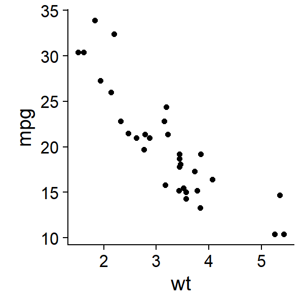
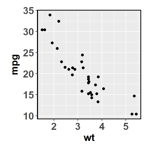
ggstatsplot uses a default theme theme_mprl() that can be used with
any ggplot2 objects.
library(ggplot2)

# Basic scatter plot
ggplot2::ggplot(data = datasets::mtcars,
                mapping = ggplot2::aes(x = wt, y = mpg)) +
  ggplot2::geom_point()
# Basic scatter plot with theme_mprl() added
ggplot2::ggplot(data = datasets::mtcars,
mapping = ggplot2::aes(x = wt, y = mpg)) +
ggplot2::geom_point() +
ggstatsplot::theme_mprl()Please note that this project is released with a Contributor Code of Conduct. By participating in this project you agree to abide by its terms.


