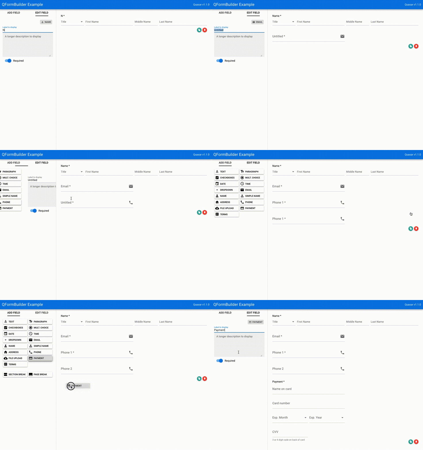
Well, you're in luck. This library leverages the power of Vue and the beauty of Quasar components to present a form builder. Simply invoke this component with a v-model, and all form-building activities are reflected on the @input event. You can then use the same components to render your form at runtime. This library does not handle the saving or use of the data it generates; it's up to you as the developer to watch the model and handle the output as you need. Consequently, when rendering forms created by this builder, you can use the components and definitions provided to render an interface.
This library could be handy for applications like:
- Survey builder (aka SurveyMonkey clone)
- Registration database
- And an infinite world of possibilities....
npm install --save q-form-builder
<q-form-builder v-model="myForm" />import QFormBuilder from 'q-form-builder'
export default {
name: 'MyApp',
components: {
QFormBuilder
},
data: function () {
return {
myForm: []
}
}
}In this example, the myForm data object array will be updated with form elements as they are added/modified/removed from the builder interface. You can then save that data as you see fit.
{
  cid: [unique guid string]
  field_options: {
    description: [text used in hint] (default '')
    options: [array of options if a multiple choice type, like checkbox or radio]
  }
  field_type: [string describing the field type, e.g. 'text' or 'address']
  label: [label to use on the form] (default: 'Untitled')
  required: [boolean whether the field is "required"] (default: true)
}
The field_options property may be undefined or an empty object, as its contents are technically optional. Fields which require its use will fill that value. At a minimum, a field object will always have cid, field_type, label, and required. This data definition was used in order to be backward-compatible with the excellent (but no longer maintained) FormBuilder library.
To re-order or remove the fields available in QFormBuilder, the source-fields property can be specified on the q-form-builder tag as an array of objects specifying the type, icon, and label for each form element. The default list consists of (empty items produce an empty space in the sidebar):
[
  { type: 'text', icon: 'text_format', label: 'Text' },
  { type: 'paragraph', icon: 'text_fields', label: 'Paragraph' },
  { type: 'checkboxes', icon: 'check_box', label: 'Checkboxes' },
  { type: 'radio', icon: 'radio_button_checked', label: 'Mult. Choice' },
  { type: 'date', icon: 'event', label: 'Date' },
  { type: 'time', icon: 'access_time', label: 'Time' },
  { type: 'dropdown', icon: 'arrow_drop_down', label: 'Dropdown' },
  { type: 'email', icon: 'email', label: 'Email' },
  { type: 'name', icon: 'person', label: 'Name' },
  { type: 'simple_name', icon: 'person_outline', label: 'Simple Name' },
  { type: 'address', icon: 'home', label: 'Address' },
  { type: 'phone', icon: 'phone', label: 'Phone' },
  { type: 'file', icon: 'cloud_upload', label: 'File Upload' },
  { type: 'payment', icon: 'payment', label: 'Payment' },
  { type: 'terms', icon: 'ballot', label: 'Terms' },
  { type: '' },
  { type: '' },
  { type: '' },
  { type: 'section_break', icon: 'view_agenda', label: 'Section Break' },
  { type: 'page_break', icon: 'call_to_action', label: 'Page Break' }
]By default, the source fields appear on the left, with the form construction area on the right. To set the source fields on the right, the setting nav-position can be set to right (default is left).
To only include Email and Phone field objects:
<q-form-builder v-model="myForm" nav-position="right" :source-fields="mySourceFields" />import QFormBuilder from 'q-form-builder'
export default {
name: 'MyApp',
components: {
QFormBuilder
},
data: function () {
return {
myForm: [],
mySourceFields: [
{ type: 'email', icon: 'email', label: 'Email' },
{ type: 'phone', icon: 'phone', label: 'Phone' }
]
}
}
}To run the example application, clone the project from https://github.com/baggachipz/q-form-builder.
cd q-form-builder
npm install
npm run serve
This example allows you to add form components and logs the full v-model to the debug console with every change.
Additional field type(s): Terms & ConditionsAdd form rendering example to Sample Application- Ability to load and use custom field types
