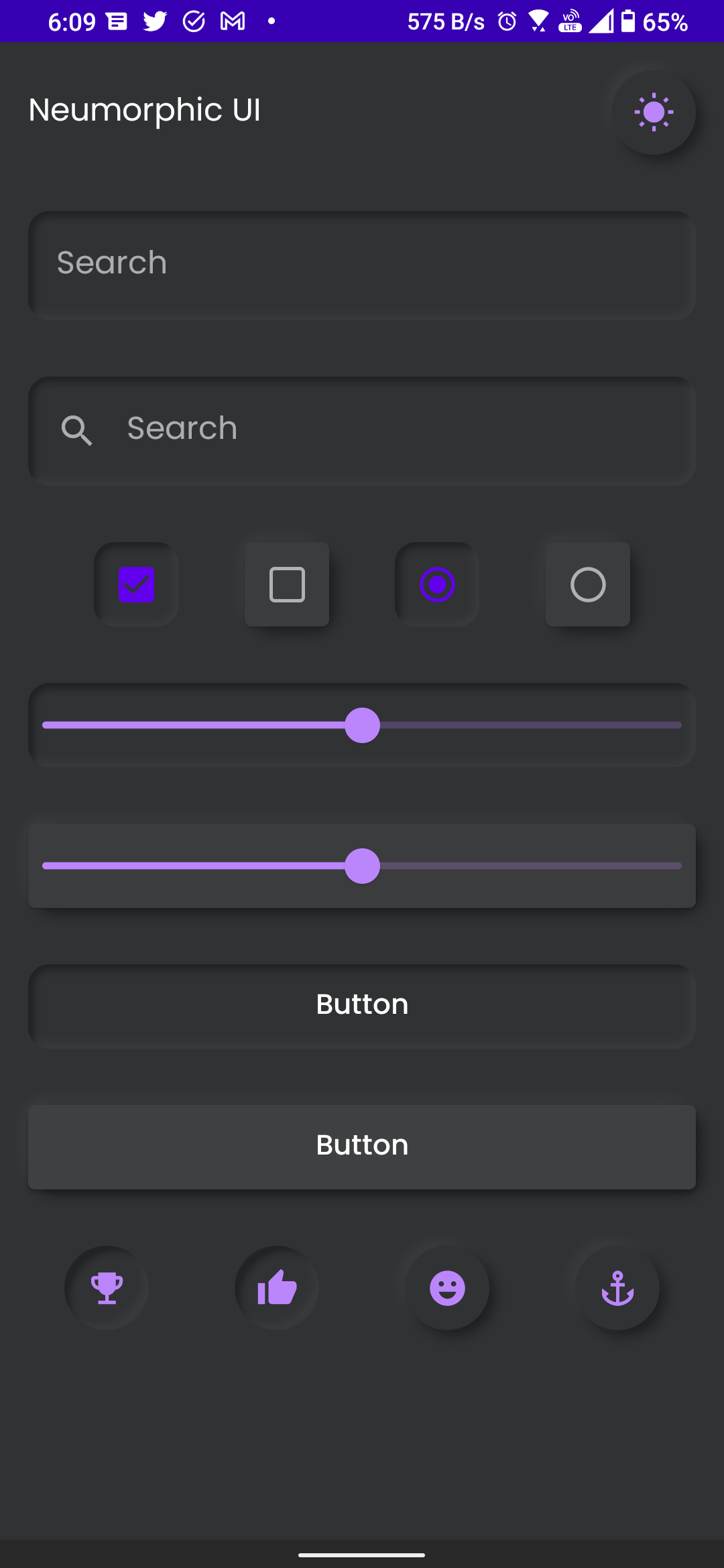
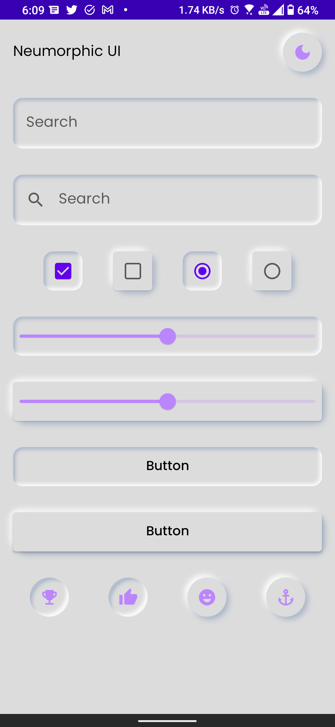
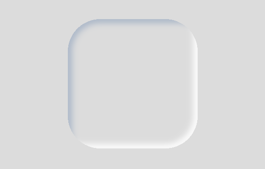
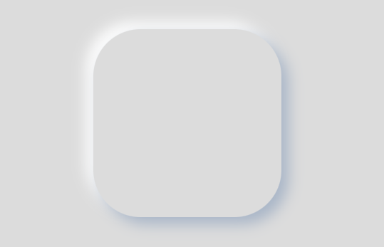
Neumorphism using Jetpack Compose Neumorphism design implementation in jetpack compose.
Neumorphism is a ui design concept which mainly uses shadows to create awesome looking UI.
Basic design concept from Neumorphism are ExtrudedPressed/Flat
Neumorphism design concept allows us to represent a objects like how it appear on real world. (like a extruded volume control nob on a media player app)
This library enables android application to create Neumorphic design using Jetpack Compose
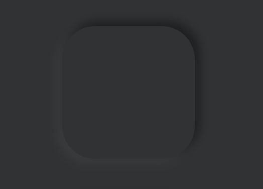
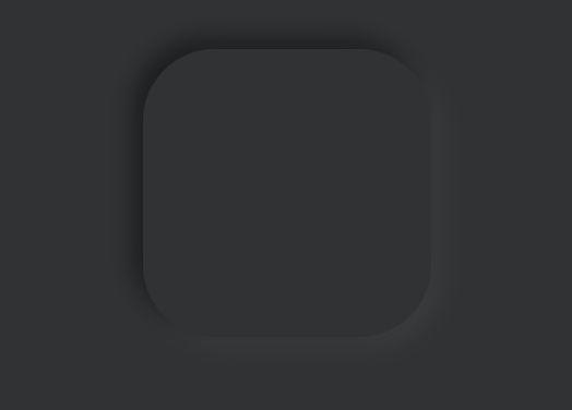
Dark
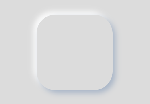
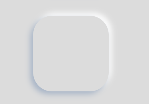
Light
You can install compose-neumorphism by adding this to your build.gradle file
dependencies {
  implementation 'io.github.sridhar-sp:neumorphic:0.0.6'
}
Draw shadows on widget to bring out the neumorphic design, following neumorphic components are supported.
Extruded or Elevated view
Pressed View
All the above neumorphic component support two corner shape
Simply add a single neu modifier on any compose component to create a neumorphic design
Refer the sample app provided for more information.
Extruded or Elevated design Extruded or Elevated button
Dark
Light
    Button(
        modifier = Modifier
            .defaultMinSize(minHeight = 80.dp)
            .fillMaxWidth()
            .padding(defaultWidgetPadding)
            .neu(
                lightShadowColor = AppColors.lightShadow(),
                darkShadowColor = AppColors.darkShadow(),
                shadowElevation = defaultElevation,
                lightSource = LightSource.LEFT_TOP,
                shape = Flat(defaultCornerShape),
            ),
        colors = ButtonDefaults.buttonColors(
            backgroundColor = MaterialTheme.colors.surface
        )
    ) {
        Text(
            text = "Button", style = AppTextStyle.button()
        )
    }
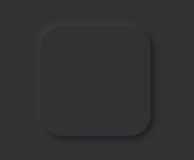
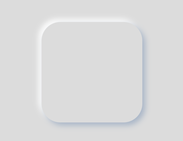
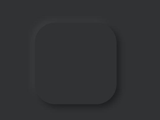
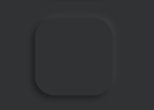
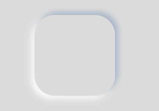
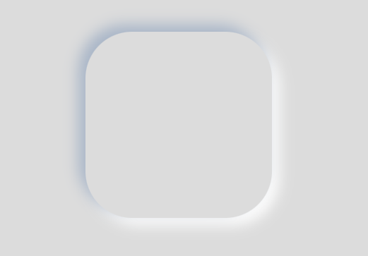
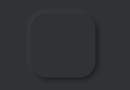
Elevated card view with rounded rectangle shape
Dark
Light
    Card(
        modifier = Modifier
            .size(128.dp)
            .neu(
                lightShadowColor = AppColors.lightShadow(),
                darkShadowColor = AppColors.darkShadow(),
                shadowElevation = defaultElevation,
                lightSource = LightSource.LEFT_TOP,
                shape = Flat(RoundedCorner(24.dp)),
            ),
        elevation = 0.dp,
        shape = RoundedCornerShape(24.dp),
    ){
    	// Add child components here.
    }
Dark
Light
    Button(
        modifier = Modifier
            .fillMaxWidth()
            .padding(defaultWidgetPadding)
            .neu(
                lightShadowColor = AppColors.lightShadow(),
                darkShadowColor = AppColors.darkShadow(),
                shadowElevation = defaultElevation,
                lightSource = LightSource.LEFT_TOP,
                shape = Pressed(defaultCornerShape),
            ),
        colors = ButtonDefaults.buttonColors(
            backgroundColor = MaterialTheme.colors.surface,
        ),
        shape = RoundedCornerShape(12.dp),
        elevation = null

    ) {
        Text(text = "Button", style = AppTextStyle.button())
    }
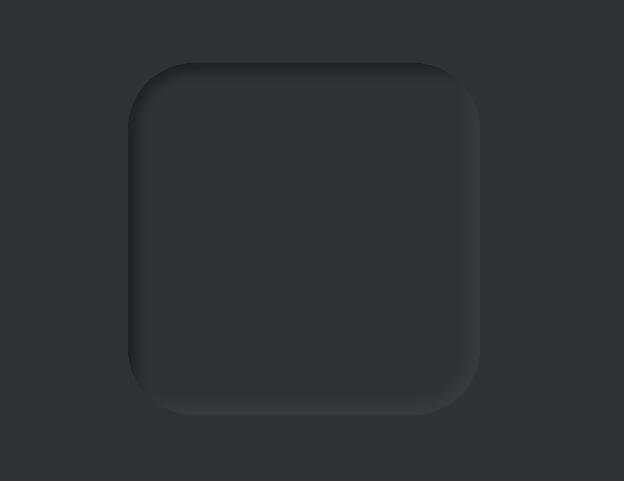
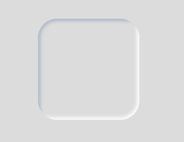
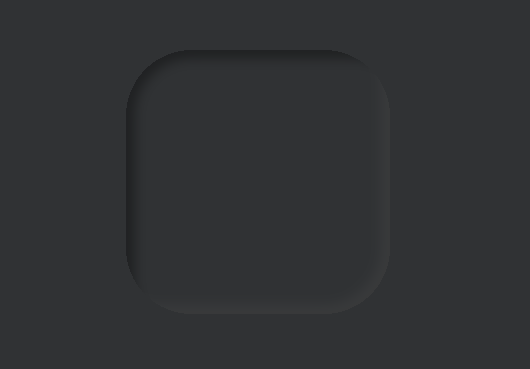
Pressed card view with rounded rectangle shape
Dark
Light
    Card(
        modifier = Modifier
            .size(128.dp)
            .neu(
                lightShadowColor = AppColors.lightShadow(),
                darkShadowColor = AppColors.darkShadow(),
                shadowElevation = defaultElevation,
                lightSource = LightSource.LEFT_TOP,
                shape = Pressed(RoundedCorner(24.dp)),
            ),
        elevation = 0.dp,
        shape = RoundedCornerShape(24.dp),
    ){
    	// Add child components here.
    }
LEFT_TOP
RIGHT_TOP
LEFT_BOTTOM
RIGHT_BOTTOM
