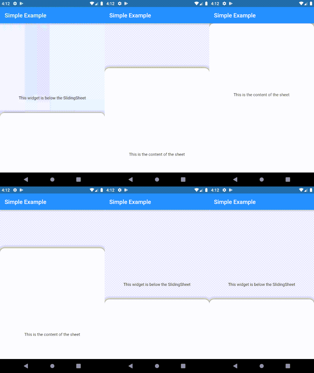
The package is a fork of sliding_sheet.
A widget that can be dragged and scrolled in a single gesture and snapped to a list of extents.
Click here to view the full example.
Add it to your pubspec.yaml file:
dependencies:
  sliding_sheet: ^2.0.0
Install packages from the command line
flutter packages get
If you like this package, consider supporting it by giving it a star on GitHub and a like on pub.dev ❤️
There are two ways in which you can use a SlidingSheet: either as a permanent (or persistent) Widget in your
widget tree or as a BottomSheetDialog.
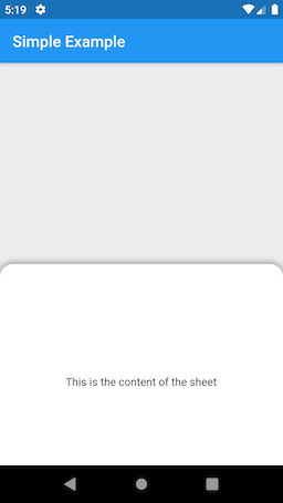
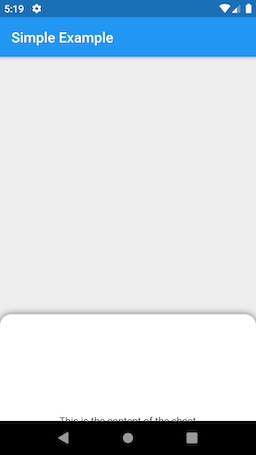
This method can be used to show the SlidingSheet permanently (usually above your other widget) as shown in the example.
@override
Widget build(BuildContext context) {
  return Scaffold(
    backgroundColor: Colors.grey.shade200,
    appBar: AppBar(
      title: Text('Simple Example'),
    ),
    body: SlidingSheet(
      elevation: 8,
      cornerRadius: 16,
      snapSpec: const SnapSpec(
        // Enable snapping. This is true by default.
        snap: true,
        // Set custom snapping points.
        snappings: [0.4, 0.7, 1.0],
        // Define to what the snappings relate to. In this case,
        // the total available space that the sheet can expand to.
        positioning: SnapPositioning.relativeToAvailableSpace,
      ),
      // The body widget will be displayed under the SlidingSheet
      // and a parallax effect can be applied to it.
      body: Center(
        child: Text('This widget is below the SlidingSheet'),
      ),
      builder: (context, state) {
        // This is the content of the sheet that will get
        // scrolled, if the content is bigger than the available
        // height of the sheet.
        return Container(
          height: 500,
          child: Center(
            child: Text('This is the content of the sheet'),
          ),
        );
      },
    ),
  );
}This method can be used to show a SlidingSheet as a BottomSheetDialog by calling the showSlidingBottomSheet function and returning and instance of SlidingSheetDialog.
void showAsBottomSheet() async {
  final result = await showSlidingBottomSheet(
    context,
    builder: (context) {
      return SlidingSheetDialog(
        elevation: 8,
        cornerRadius: 16,
        snapSpec: const SnapSpec(
          snap: true,
          snappings: [0.4, 0.7, 1.0],
          positioning: SnapPositioning.relativeToAvailableSpace,
        ),
        builder: (context, state) {
          return Container(
            height: 400,
            child: Center(
              child: Material(
                child: InkWell(
                  onTap: () => Navigator.pop(context, 'This is the result.'),
                  child: Padding(
                    padding: const EdgeInsets.all(16),
                    child: Text(
                      'This is the content of the sheet',
                      style: Theme.of(context).textTheme.body1,
                    ),
                  ),
                ),
              ),
            ),
          );
        },
      );
    }
  );

  print(result); // This is the result.
}A SlidingSheet can snap to multiple extents or to no at all. You can customize the snapping behavior by
passing an instance of SnapSpec to the SlidingSheet.
| Parameter | Description |
|---|---|
| snap | If true, the SlidingSheet will snap to the provided snappings. If false, the SlidingSheet will slide from minExtent to maxExtent and then begin to scroll, if the content is bigger than the available height. |
| snappings | The extents that the SlidingSheet will snap to, when the user ends a drag interaction. The minimum and maximum values will represent the bounds in which the SlidingSheet will slide until it reaches the maximum from which on it will scroll. |
| positioning | Can be set to one of these three values: SnapPositioning.relativeToAvailableSpace - Positions the snaps relative to total available height that the SlidingSheet can expand to. All values must be between 0 and 1. E.g. a snap of 0.5 in a Scaffold without an AppBar would mean that the snap would be positioned at 40% of the screen height, irrespective of the height of the SlidingSheet. SnapPositioning.relativeToSheetHeight - Positions the snaps relative to the total height of the sheet. All values must be between 0 and 1. E.g. a snap of 0.5 and a total sheet size of 300 pixels would mean the snap would be positioned at a 150 pixel offset from the bottom. SnapPositioning.pixelOffset - Positions the snaps at a fixed pixel offset. double.infinity can be used to refer to the total available space without having to compute it yourself. |
| onSnap | A callback function that gets invoked when the SlidingSheet snaps to an extent. |
There are also some prebuild snaps you can facilitate to snap for example to headers or footers as shown in the example.
| Snap | Description |
|---|---|
| SnapSpec.headerFooterSnap | The snap extent that makes header and footer fully visible without account for vertical padding on the SlidingSheet. |
| SnapSpec.headerSnap | The snap extent that makes the header fully visible without account for top padding on the SlidingSheet. |
| SnapSpec.footerSnap | The snap extent that makes the footer fully visible without account for bottom padding on the SlidingSheet. |
| SnapSpec.expanded | The snap extent that expands the whole SlidingSheet. |
The SheetController can be used to change the state of a SlidingSheet manually, simply passing an instance of SheetController to a SlidingSheet. Note that the methods can only be used after the SlidingSheet has been rendered, however calling them before wont throw an exception.
Note that you can also use the static SheetController.of(context) method to obtain an instance of the SheetController of the closest SlidingSheet. This also works if you didn't assign a SheetController explicitly on the SlidingSheet.
| Method | Description |
|---|---|
expand() |
Expands the SlidingSheet to the maximum extent. |
collapse() |
Collapses the SlidingSheet to the minimum extent. |
snapToExtent() |
Snaps the SlidingSheet to an arbitrary extent. The extent will be clamped to the minimum and maximum extent. If the scroll offset is > 0, the SlidingSheet will first scroll to the top and then slide to the extent. |
scrollTo() |
Scrolls the SlidingSheet to the given offset. If the SlidingSheet is not yet at its maximum extent, it will first snap to the maximum extent and then scroll to the given offset. |
rebuild() |
Calls all builders of the SlidingSheet to rebuild their children. This method can be used to reflect changes in the SlidingSheets children without calling setState(() {}); on the parent widget to improve performance. |
show() |
Visually shows the SlidingSheet if it was previously hidden. Note that calling this method wont have an effect for SlidingSheetDialogs. |
hide() |
Visually hides the SlidingSheet until you call show() again. Note that calling this method wont have an effect for SlidingSheetDialogs. |
Headers and footers are UI elements of a SlidingSheet that will be displayed at the top or bottom of a SlidingSheet respectively and will not get scrolled. The scrollable content will then live in between the header and the footer if specified. Delegating the touch events to the SlidingSheet is done for you. Example:
@override
Widget build(BuildContext context) {
  return Scaffold(
    backgroundColor: Colors.grey.shade200,
    appBar: AppBar(
      title: Text('Simple Example'),
    ),
    body: Stack(
      children: <Widget>[
        SlidingSheet(
          elevation: 8,
          cornerRadius: 16,
          snapSpec: const SnapSpec(
            snap: true,
            snappings: [112, 400, double.infinity],
            positioning: SnapPositioning.pixelOffset,
          ),
          builder: (context, state) {
            return Container(
              height: 500,
              child: Center(
                child: Text(
                  'This is the content of the sheet',
                  style: Theme.of(context).textTheme.body1,
                ),
              ),
            );
          },
          headerBuilder: (context, state) {
            return Container(
              height: 56,
              width: double.infinity,
              color: Colors.green,
              alignment: Alignment.center,
              child: Text(
                'This is the header',
                style: Theme.of(context).textTheme.body1.copyWith(color: Colors.white),
              ),
            );
          },
          footerBuilder: (context, state) {
            return Container(
              height: 56,
              width: double.infinity,
              color: Colors.yellow,
              alignment: Alignment.center,
              child: Text(
                'This is the footer',
                style: Theme.of(context).textTheme.body1.copyWith(color: Colors.black),
              ),
            );
          },
        ),
      ],
    ),
  );
}The children of a SlidingSheet are not allowed to have an inifinite (unbounded) height. Therefore when using a ListView, make sure to set shrinkWrap to true and physics to NeverScrollableScrollPhysics. Similarly when using a Column as a child of a SlidingSheet, make sure to set the mainAxisSize to MainAxisSize.min.
In order to change the UI when the sheet gets interacted with, you can pass a callback to the listener field of a SlidingSheet that gets called with the current SheetState whenever the sheet slides or gets scrolled. You can then rebuild your UI accordingly. When using the SlidingSheet as a bottomSheetDialog you can also use SheetController.rebuild() to rebuild the sheet, if you want to change certain paramerters.
For rebuilding individual children of a SlidingSheet (e.g. elevating the header when content gets scrolled under it), you can also use the SheetListenerBuilder:
return SheetListenerBuilder(
  // buildWhen can be used to only rebuild the widget when needed.
  buildWhen: (oldState, newState) => oldState.isAtTop != newState.isAtTop,
  builder: (context, state) {
    return AnimatedContainer(
      elevation: !state.isAtTop ? elevation : 0.0,
      duration: const Duration(milliseconds: 400),
      child: child,
    );
  },
);
The example for instance decreases the corner radius of the SlidingSheet as it gets dragged to the top and increases the headers top padding by the status bar height. Also, when content gets scrolled under the header it elevates.
Because these are common Material behaviors, SlidingSheet supports those out of the box, which can be achieved by setting the avoidStatusBar field to true, cornerRadiusOnFullscreen to 0 and liftOnScrollHeaderElevation to the elevation.


