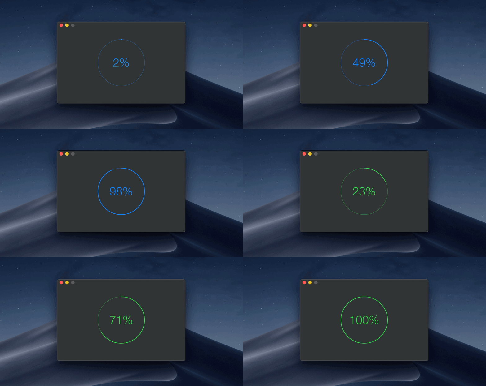
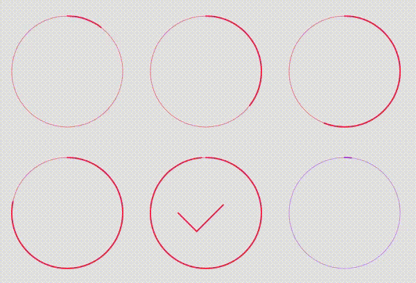
Circular progress indicator for your macOS app
This package is used in production by apps like Gifski and HEIC Converter.
macOS 10.15+
Add https://github.com/sindresorhus/CircularProgress in the “Swift Package Manager” tab in Xcode.
Latest version: 3.0.1
Also check out the example app in the Xcode project.
import Cocoa
import CircularProgress

@main
final class AppDelegate: NSObject, NSApplicationDelegate {
	@IBOutlet private var window: NSWindow!

	let circularProgress = CircularProgress(size: 200)

	func applicationDidFinishLaunching(_ notification: Notification) {
		window.contentView!.addSubview(circularProgress)

		foo.onUpdate = { progress in
			self.circularProgress.progress = progress
		}
	}
}
Specify a Progress instance
The given Progress instance is strongly kept alive as long as the CircularProgress instance or until you set .progressInstance = nil.
import Cocoa
import CircularProgress

@main
final class AppDelegate: NSObject, NSApplicationDelegate {
	@IBOutlet private var window: NSWindow!

	let circularProgress = CircularProgress(size: 200)
	let progress = Progress(totalUnitCount: 1)

	func applicationDidFinishLaunching(_ notification: Notification) {
		window.contentView!.addSubview(circularProgress)

		progress?.becomeCurrent(withPendingUnitCount: 1)
		circularProgress.progressInstance = progress
	}
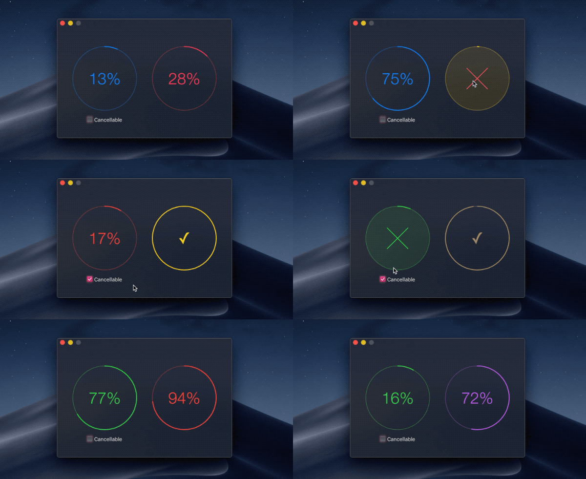
}If you use the .progress property, you need to opt into the cancel button by setting .isCancellable = true. You can be notified of when the button is clicked by setting the .onCancelled property to a closure.
If you use the .progressInstance property, setting a Progress object that is isCancellable, which is the default, automatically enables the cancel button.
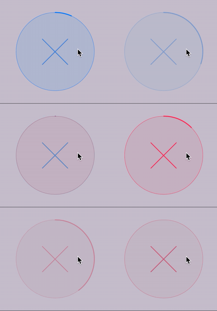
Per default, the cancelled state is indicated by desaturing the current color and reducing the opacity. You can customize this by implementing the .cancelledStateColorHandler callback and returning a color to use for the cancelled state instead. The opacity is not automatically reduced when the callback has been set. To disable the cancelled state visualization entirely, set .visualizeCancelledState to false.
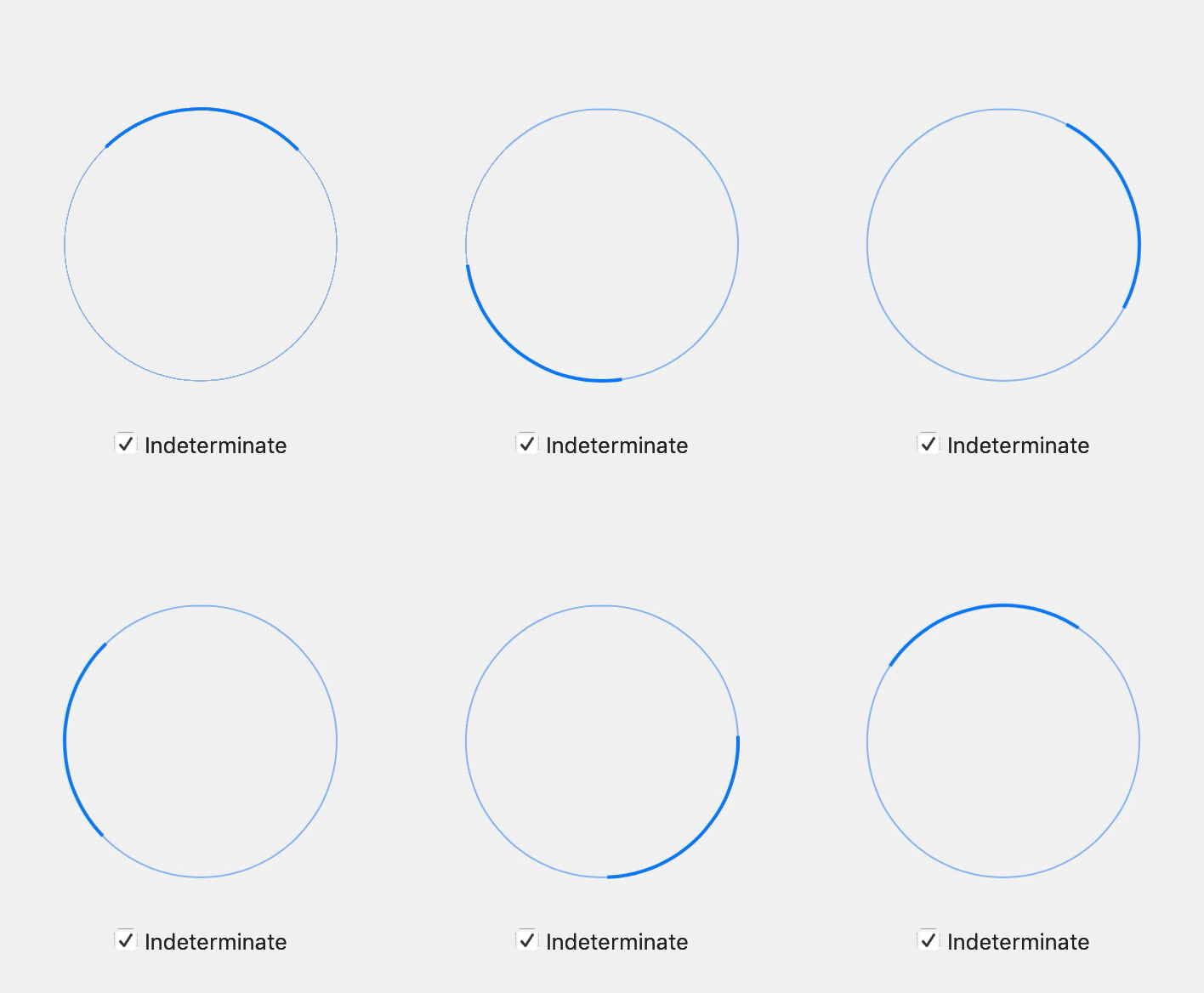
Displays a state that indicates that the remaining progress is indeterminate.
Note that the .progress property and .isIndeterminate are not tied together. You'll need to manually set .isIndeterminate = false when progress is being made again.
If you use the .progressInstance property, the isIndeterminate property will automatically be observed. The view will then switch back and forth to the indeterminate state when appropriate.
Hidden progress label
Displays a spinner without a percentage indicator in the center.
This is accomplished by setting the .isLabelHidden property to true. The default state is false (the label is displayed).
/**
Color of the circular progress view.
*/
@IBInspectable var color: NSColor = .controlAccentColor

/**
Line width of the circular progress view.
*/
@IBInspectable var lineWidth: Double = 2

/**
Show an animated checkmark instead of `100%`.
*/
@IBInspectable var showCheckmarkAtHundredPercent = true

/**
Hide the progress label.

The property supports KVO.
*/
@IBInspectable var isLabelHidden = true

/**
The progress value in the range `0...1`.

- Note: The value will be clamped to `0...1`.
*/
@IBInspectable var progress: Double = 0

/**
Let a `Progress` instance update the `progress` for you.
*/
var progressInstance: Progress?

/**
Reset the progress back to zero without animating.
*/
func resetProgress() {}

/**
Cancels `Progress` if it's set and prevents further updates.
*/
func cancelProgress() {}

/**
Triggers when the progress was cancelled succesfully.
*/
var onCancelled: (() -> Void)?

/**
Returns whether the progress is finished.

The property supports KVO.
*/
@IBInspectable var isFinished: Bool { get }

/**
If the progress view is cancellable it shows the cancel button.
*/
@IBInspectable var isCancellable: Bool

/**
Make the progress indeterminate.

The property supports KVO.
*/
@IBInspectable var isIndeterminate: Bool

/**
Returns whether the progress has been cancelled.

The property supports KVO.
*/
@IBInspectable var isCancelled: Bool { get }

/**
Determines whether to visualize changing into the cancelled state.
*/
var visualizeCancelledState: Bool = true

/**
Supply the base color to use for displaying the cancelled state.
*/
var cancelledStateColorHandler: ((NSColor) -> NSColor)?

init(frame: CGRect) {}
init?(coder: NSCoder) {}

/**
Initialize the progress view with a width/height of the given `size`.
*/
convenience init(size: Double) {}- DockProgress - Show progress in your app's Dock icon
- Defaults - Swifty and modern UserDefaults
- KeyboardShortcuts - Add user-customizable global keyboard shortcuts to your macOS app
- LaunchAtLogin - Add "Launch at Login" functionality to your macOS app
- More…
