King K band website was set up to help the band attract potential wedding and function gigs across the country of Ireland, will a particular focus on the Cork/Munster area. This is aimed to be user friendly and provide all the information needed so that potential customers can make a decision on whether they are appropriate for what the customer needs. The website will make it easier for the band to attract new customers as well as giving the customers more information as well as an easy path to contact them through.
A deployed link to the website can be found here (https://jackcrosbie.github.io/King-K-Ms1/)
The end user or target audience of this project/website is people who are getting married and people/places that host private functions that are looking for a good band that offer something a little different to your average wedding/function band. The main age bracket of these potential clients would range from about 25 - 55 years old.
The end user will want to get as much information on the band as possible to best guide them when making a decision/booking. I would like to help the band increase their bookings by making the website user friendly, making it look good through a good choice of colour scheme and also making it easier for potential clients to contact the band through the "contact us" section and also through easily navigating through the social links.
- As a user I would like find out more information on the band.
- As a user I would like to find this information easily without the need for many clicks.
- As a user I would like to see videos and photos of the band in action.
- As a user I would like to see sample song lists/setlists to see what variety of music the band has to offer.
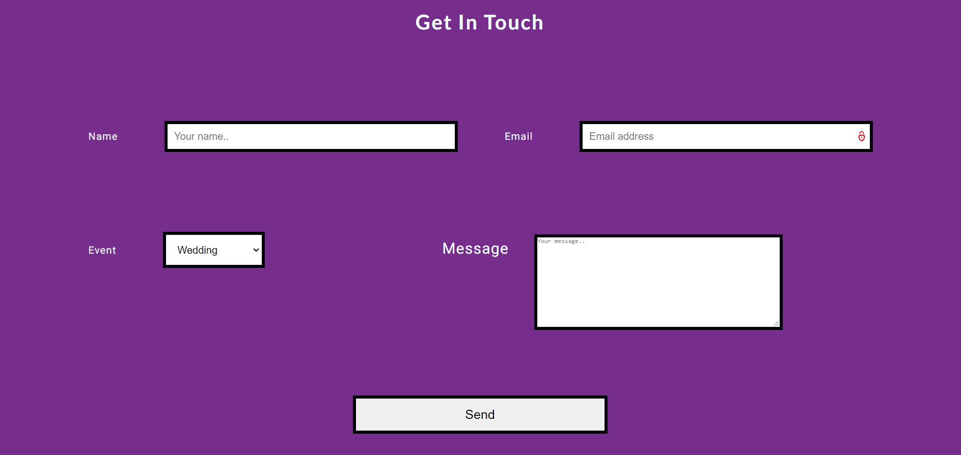
- As a user I would like to have a clear easy method of contacting the band directly.
- As a user I would like to have access to their social media through links easily available on their webpage.
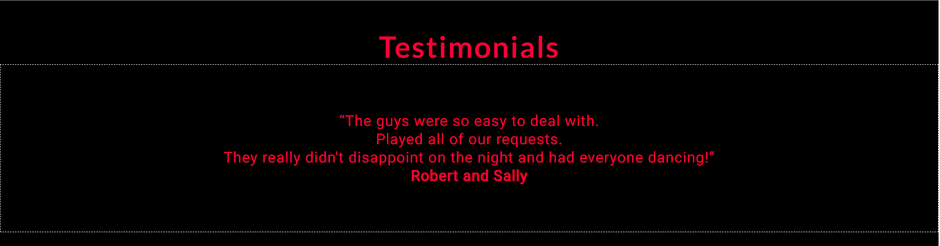
- As a user I would like to see testimonials from people who have booked the band previously.
- As a user I would like to be able to view the webpage on either desktop, mobile device or tablet.
The color scheme I chose was a mix of black, blues and purple. I felt the colors matched well while also being appropriate for a rock style band. Attached is the color pallete I worked from: (https://coolors.co/8b939c-ff0035-772d8b-000000-a1ef8b)
I also used the azure colour to make text standout against the darker colours used for the backgrounds.
I used a combination of Lato and Roboto for my project. The Lato was used predominately for headings while the Roboto was used for the content and paragraphs. I used sans-serif as a fallback in case the fonts were not imported properly or failed to work with a specific browser.
The need of the user is be able to access the information from the website on various platforms. The information should be clear, concise and laid out in a manner that is user friendly. Everything should be only a few clicks away and not be too overloaded with information or design.
It is capable to do this project with the gitpod framework in a timely manner and implement things that the user needs. Creating a three page website gives each page enough information but not so much as to overload the user. The one feature I did not have time to implement, nor the information available, was an interactive calender detailing the different gigs and venues the band are playing. This would enable potential customers to come along and check them out live, therfor increasing the chance of employment. I would hope to implement this in the near future when live music is back and the band have enough gigs booked to fill out their calender.
The intend purpose of this project is to advertise the client to a wider audience of potential customers. It will help potential clients contact the band as well as provide them with as much clear information as possible to help them make a decision regarding employing the band for their wedding day or private function. Their will be links to the bands social media as well to give clients more live, up-to-date information then the website will provide.
For my audience I want to provide recordings, images and songlists to potential customers of the band. I want to provide them with a contact section to further request more information, or to propose special requests for certain songs etc, to give the band a better chance of gaining employment.
The website will be laid out over three pages. Initally I planned to do 5 pages but upon sitting down gathering information, looking at my wireframes and my overall design I decided to reduce it to three pages. The homepage will have a header with links that lead further down the homepage like to the "About Us" section and also links to the two other pages which are "songlist" and "gallery". The reason for reducing the number of pages was I had two little contact spread across too many pages making the website overly complicated for no reason. With three pages I have enough information mixed with imagery and design that I feel it lends to an intuitive user experience with a clear layout.
After the header, containing the navigation bar, and the hero image the homepage brings you onto an "about us" section which has a little about the band overall and between three and five testimonals automatically rotating on a timed basis. The next section is covered in "About Us" is "meet the players" section. Here we have five headshots/photos with a few lines of a bio for each band member. At the bottom of the homepage will be a "Contact Us" section which will have a form area to directly email the band as well as links to their various social media platforms. Repeated in the footer are icons to the social media links which, along with the header and nav bar, will carry across the three pages of the website.
The second page of the website is accessed via the "Songlist" link in the navigation bar. This will bring you to a simple page which contains a number of unordered list breaking the selection of songs the band does down into different catergories. Catergories such as "Wedding Songs", "70's", "80's" and so on. The footer at the bottom of the page will carry the social media icons that will link to their various social media platforms.
The final or third page of the website will bring the users to a gallery. This gallery will contain some recordings of the band playing live as well as various images of them playing different styles of gigs in numerous venues. Like the last two pages the header and navigation bar will carry across as well as the footer with the links to social media platforms.
Desktop Wireframe here - 
Tablet Wireframe here - 
Mobile Wireframe here - 
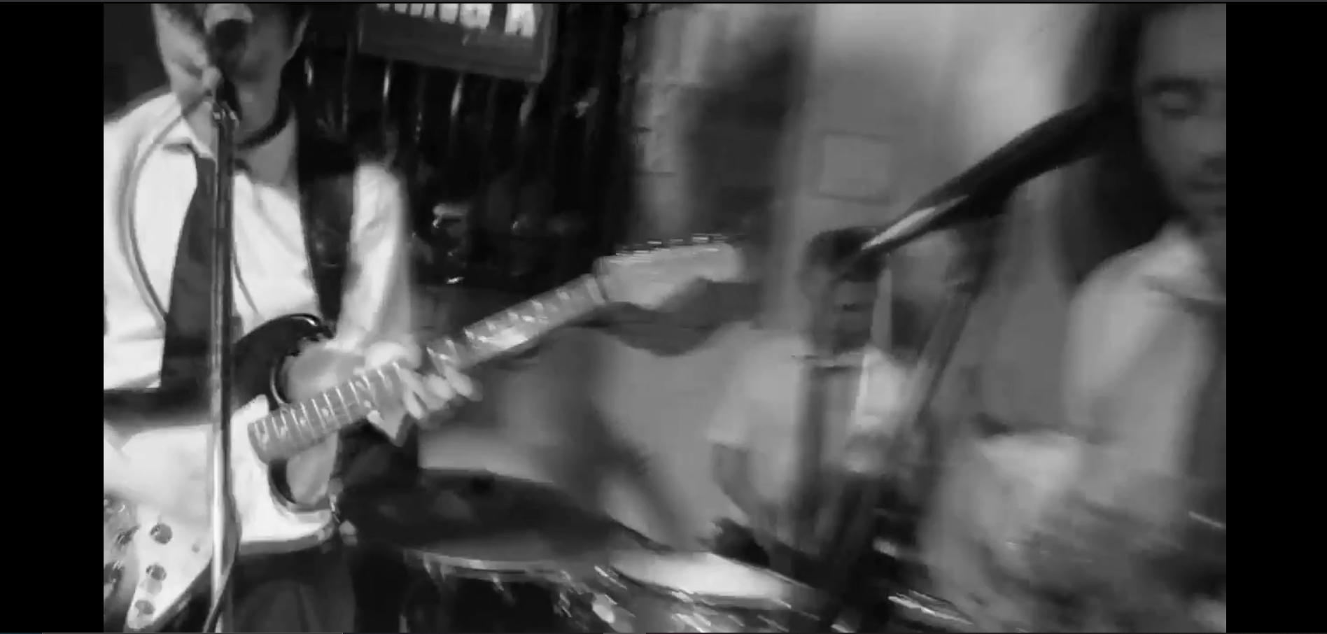
Homepage/Navbar: Opening page shows you the hero video played on a loop and without sound. This gives the user a feel for the band. We have a navigation bar to move around the single page website.
About the band and testimonials section. This gives a little more information on the band itself and is accompanied by some testimonials from previous customers. These testimonials are auto scrolling horizontally across the screen.
Meet the players section just gives you a little bio about each of the members.
Songlist provides the users with a mix of different song catergories the band plays. These are broken into six different lists.
Media section then has a live video of the band playing and then some photos auto scrolling of the band playing live.
Packages section shows what kind of services the band offers to it's clients.
Contact us has a form which can be used to message the band if needed.
- Nav bar in header which links to different sections of the page.

- Autoplaying hero video.
- Auto horizontal scrolling used on the testimonials and the images section. Though not working currently for more images.
- Contact email form for customers to be able to contact the band (not currently operational but will be changing this in future)
- Footer containing social links to the bands social media pages.

- Adding more photo's to the autoscrolling images section
- Fixing the contact us form so it links to the bands email.
- Adding a burger menu for the mobile version of the phone.
- HTML5
- CSS3
- Google Chrome dev tools for responsiveness and debugging
- HTML Validator (https://validator.w3.org/)
- CSS Validator (https://jigsaw.w3.org/css-validator/)
I focused my testing and responsiveness for the following screens.
Iphone 5/6/7 (375 x 667), ipad pro (1024 x 1366) and larger desktop/laptop screens (1920 x 1080). It also works well for most phone and tablet sizes.
All of my testing was done using google chrome dev tools and using a html and CSS validator. This was my first time doing this as it was my first project.
I started with the smallest mobile screen (Iphone 5/6/7), then did the tablet screen (Ipad pro) and worked up to the larger screen devices (laptop and desktop screens). When changes were made I regularly went back and checked the other devices to see if the changes affected anything done previously.
After getting it to a point that it seemed relatively okay on the various sized devices, I then ran my code through the HTML and CSS validator to pick up on mistakes within the code itself. I tried my best to then eleminate or tidy up the problem areas. The validators found some needless tags (left over from removing items etc), some typing mistakes and just general bad bits of code.
I removed and changed all the parts I could and resulted in very little errors when running through the validators.
The process I used can be broken down as follows:
- Focus on website for iphone 5/6/7 - Make sure everything works and is in the right place. This is the basis of my HTML and CSS code.
- Get website to work with Ipad Pro - This involved using media queries and at this stage the Google Dev tools were used to show me the mistakes in responsive when moving from the iphones to ipad.
- The same steps were then followed to make the website responsive for larger screens. This time once changes were implemented I went back to both the Iphone and Ipad Pro to check to see if my changes affected what had been working previously.
- Once I had things to as best as I could manage I put my code through the CSS and HTML validator to pick up on coding mistakes and left over needless code.
My project was made entirely through Github using the Gitpod extenstion for Google Chrome.
Using these together enabled me to write my HTML and CSS code directly into the Gitpod interface while also allowing me to use various terminals to get a live link to my page and also commit changes as needed.
Github is now hosting my website without the need for me to copy my code over to another program or software. I was able to go to my settings in Github and through the pages section change the root directory to master and push the website live. The link again is: (https://jackcrosbie.github.io/King-K-Ms1/)
During the building of the website I encountered several issues or bugs that required me to rethink or rework what i doing.
-
Photos: Initially I got headshots provided to me by each member of the band. Two of the members had proper headshots they had got done for various projects they worked on. The rest either provided me with cropped photos or mobile photos they had had taken of them. When trying to make them work on the various screen sizes I encountered a lot of stretched/pixelated images. In the end I had to take the decision to use substitute photos representing the instruments they played instead of actual headshots in the Meet the players section. This was a better option then using the low quality pictures provided and will be something I look at redoing in future once better headshots are provided.
-
Form Layout: The layout of the form elements caused a few issues when trying to work on the responsiveness for the various devices. With numerous labels and input elements it was hard to get the layout exactly how I liked it. I'm happy with the result on the mobile devices but feel it is not perfect on laptop/larger screens. The balance between the font-size and space between each element is something I would like to improve in future.
-
Parallax photo carousel: Initally I was very happy with the image carousel and it's auto-scrolling features. Even though it still works as intended upon trying to add more photos to it some of the photo's are being skipped in the rotation. I have tried to fix this and as it stands I can't work out why only some photo's are being shown and others not. It is something I will look to fix in future and try to understand what is causing only certain images to be shown.
https://coolors.co/ - For my colour palette and colour ideas
https://pixabay.com/ - For some background stock images
https://www.pexels.com/ - For some background stock images
https://unsplash.com/ - For some background stock images
https://stackoverflow.com/ - For solutions to issues occured while building the website
https://icons8.com/ - For treble clef icon in songlist section
All other images are probably of King K band and were given to me with permission to use any/all of them.
https://fontawesome.com/ - For icons for social links and an icon in about the band section.
https://balsamiq.com/ - Used for creating wireframes
https://github.com/Code-Institute-Solutions/readme-template - For information and README template.
https://code-boxx.com/responsive-pure-css-text-slider/#sec-h - Used a modified version of the code here for my horizontal text slider in Testimonials section.
https://www.w3schools.com/default.asp - Used to find solutions to numerous small issues I encountered with basic HTML and CSS code.
All content on this site is original documentation and profile pictures have been received directly from King K band with permission to use it.
- Aaron Sinnott and Narender Singh for all their advice, chats and general help through the project and in our mentor sessions
- Members of the Slack community who were more then happy to help and answer any questions I had.
- My peer Daisy Gunn for her continous advice and support.
This project is for educational use only and was created for the Code Institute Module of User Centric front end development
By Jack Crosbie