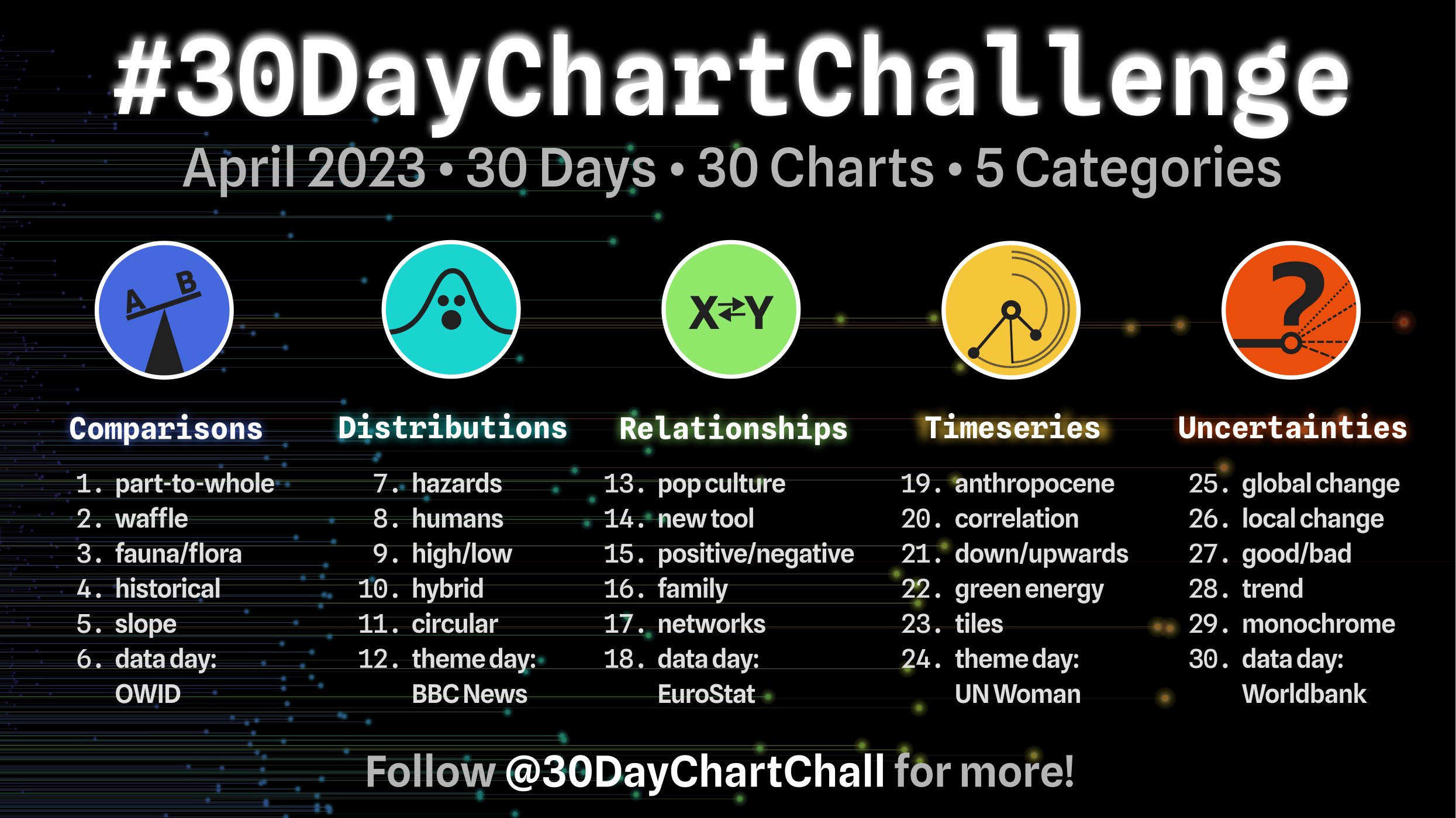
My contributions to the #30DayChartChallenge, a community-driven event with the goal to create a data visualization on a certain topic each day of April. Every day, there is a certain prompt, grouped into five categories: comparisons, distributions, relationships, time series, and uncertainties. Anyone is welcome to contribute, no matter which data source or tool is used to create the visualizations.


