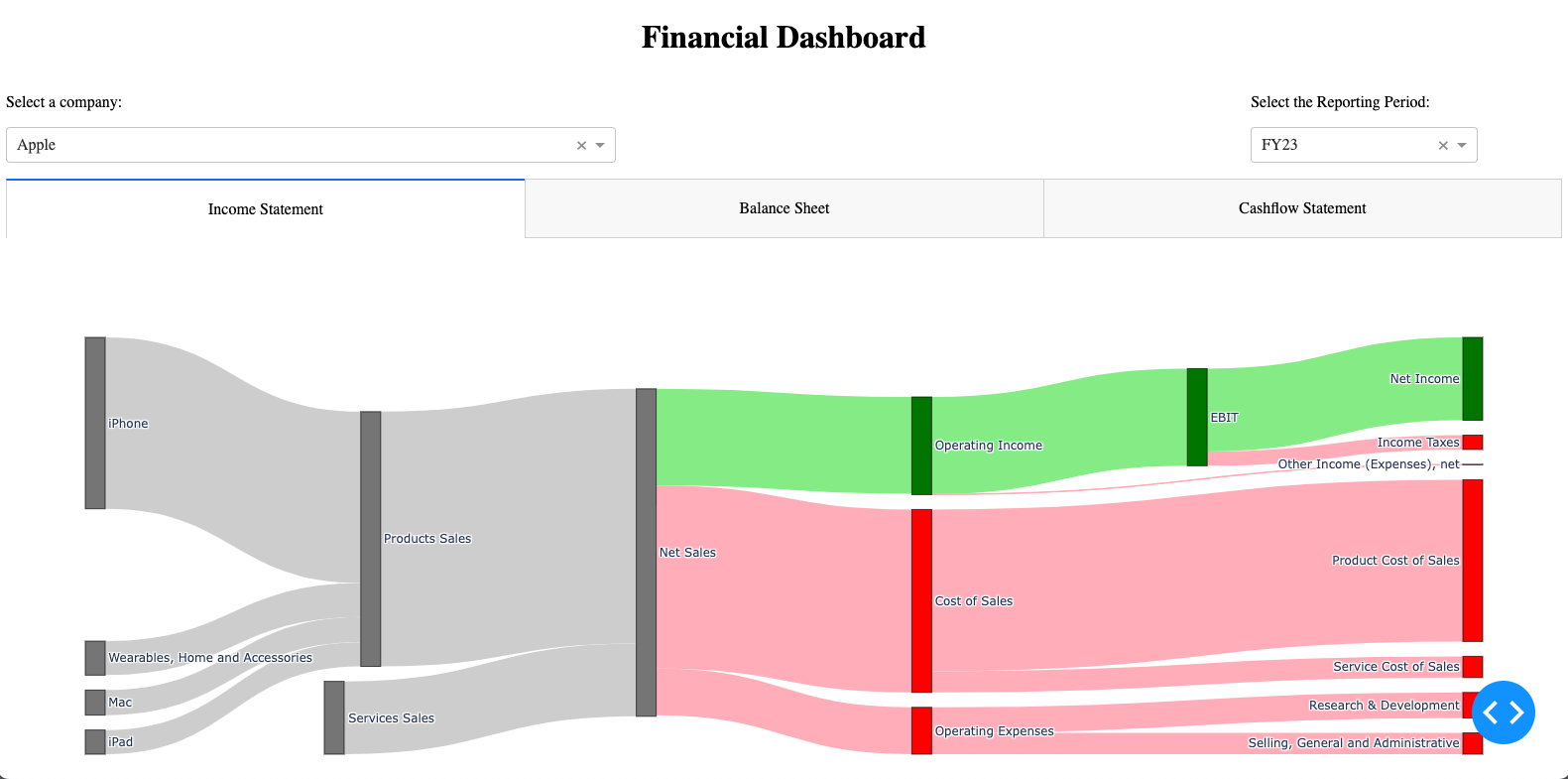
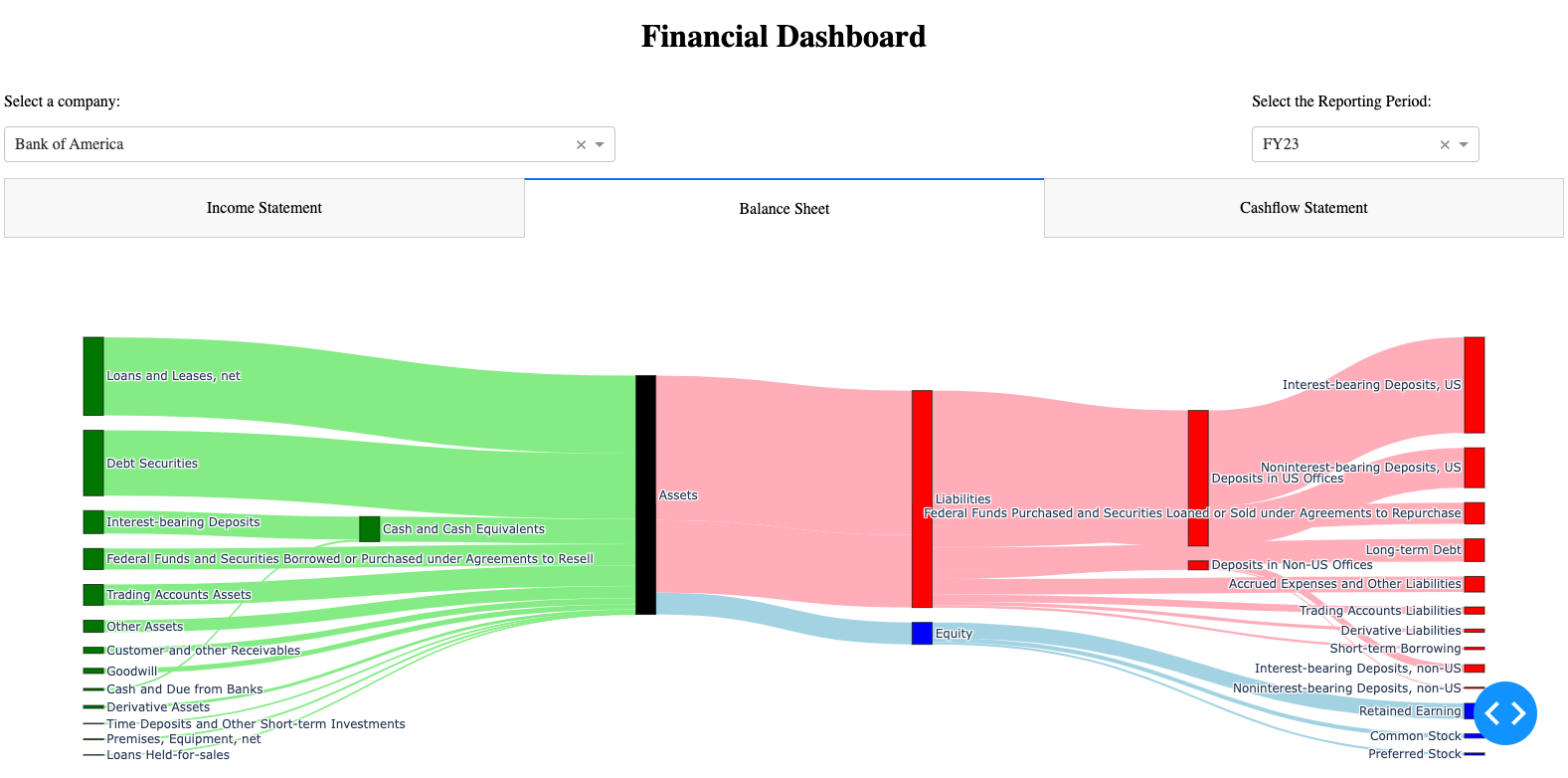
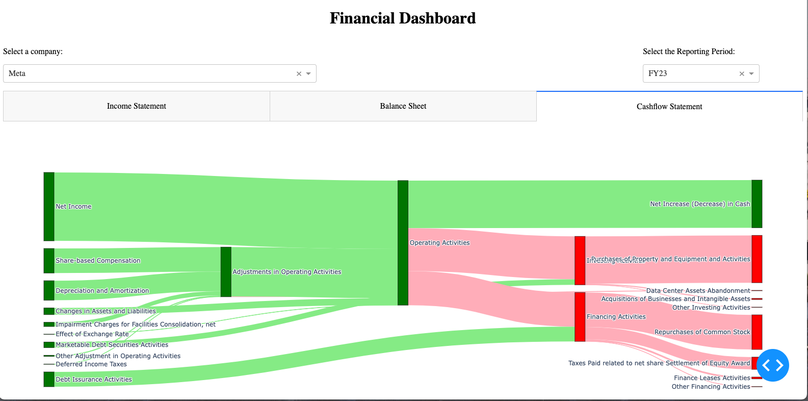
Inspired from the sankey chart found in this post on Reddit, the goal is to develop a dashboard to display similar visualization for other companies on income statement, balance sheet, and cash flow statement. This project is aimed to visualize financial reports with sankey charts along with other useful visualizations that helps users to conduct fundamental analysis on publicly traded company.
Currently, the dashboard is still under development v0.1.2 (Beta).
The Dashboard is in a matured state and allow users to select Google (GOOGL), Meta (META), Apple (AAPL), Bank of America (BAC), General Electrics (GE), and Nvidia (NVDA) on selected period of data. You may check out the progress in the Dashboard folder. You may run the dashboard by execute the following code in the command line:
python dashboard/dashboard.py
Then, go to 127.0.0.1 (localhost) to access the dashboard.
Note: the dashboard.py locates at the dashboard folder, not the current directory
Screenshots of latest development.
Here are the features will be added before Official Launch:
- Feature to ingest data from administrator and ensure data quality
- Add Nvidia (NVDA) to the dashboard
- Docker Configuration
Here is the list of features in consideration after launched, but not committed:
- Allow dashboard to obtain data directly from SEC Edgar site
Before the development phase, the first step is to replicate the sankey chart found in this post to look at the visualization rendered by Plotly and Python before building the framework of the Dashboard. You may find more details on the previous works in the Proof of Concept folder and at this Medium post on how to generate sankey chart with Plotly.
You may find the details on the development plans in the The Plan folder after confirmed in the Proof of Concept phase.
Google Financial Report in Sankey Chart
SEC Edgar (To access 10-Qs and 10-Ks)
Alphabet Inc FY 2022 10-K


