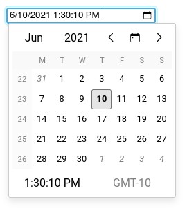
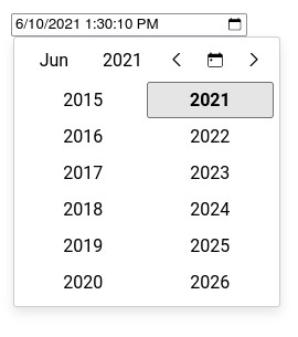
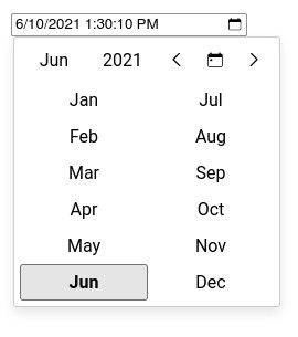
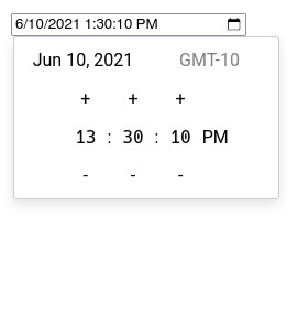
This lib allows you to add datetime inputs in your React applications with the following advantages.
- Available in CJS and ESM
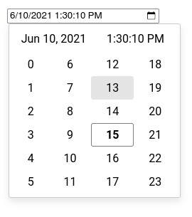
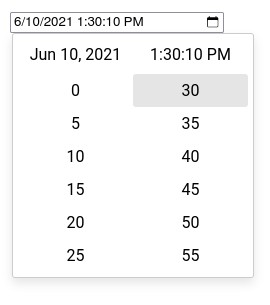
- Multiple selection views (year, month, day, time, hour, minute, second)
- Support for min and max datetime
- Support for custom day renderer
- Customizable datetime format
- Customizable view (locale, week numbers, timezone...)
- Works like a normal input (onChange/value)
- Based on Intl API to support any language (English, French, Chinese...)
- Based on luxon for date and time manipulation
NOTICE : The code has been tested with controlled components only.
The code below shows how to add a datetime input field with a default value and handling its changes.
import { DateTimeInput } from '@jalik/react-datetime-picker';
import React, {
  useCallback,
  useState
} from 'react';

// Don't forget to load default styles.
import '@jalik/react-datetime-picker/src/styles.css';

function App() {
  const [date, setDate] = useState(new Date().toISOString());

  const handleChange = useCallback((event) => {
    setDate(event.target.value);
  }, [])

  return (
    <div>
      <DateTimeInput
        format="D tt"
        locale="fr"
        name="date"
        onChange={handleChange}
        showCalendarIcon
        showCalendarOnFocus
        showTimeZone
        showWeekNumbers
        value={date}
      />
    </div>
  )
}Allow to change the calendar icon in the input field.
Set to true to avoid changes of the input value.
Allow to set a custom format for parsing/formatting the date in the input field.
Formatting is based on
Luxon (https://moment.github.io/luxon/docs/manual/formatting.html#table-of-tokens).
The default value is D tt (localized date and time).
Set the locale to use when displaying dates, month... (based on the Intl API).
The default value is navigator.language.
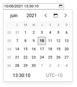
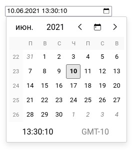
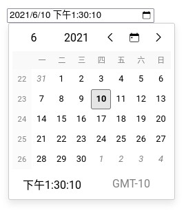
Example of different locales (fr-FR, ru, zh):
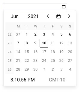
Pass an ISO date string that is the maximal valid datetime.
Example with 2021-06-10T23:59:59.000-10:00:
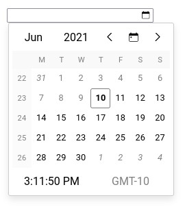
Pass an ISO date string that is the minimal valid datetime.
Example with 2021-06-10T00:00:00.000-10:00:
Pass a function or functional component to customize days rendering.
Set to true to display the calendar icon in the input field.
Set to true to open the calendar when the input receives the focus (by click or keyboard).
Set to true to display the current timezone in the calendar.
Set to true to display week numbers in the calendar.
Used to pass the date in the format defined with format.
The example below shows how to disable selection of week-end days.
import {
  CalendarDay,
  DateTimeInput
} from '@jalik/react-datetime-picker';
import React, {
  useCallback,
  useState
} from 'react';

// Don't forget to load default styles.
import '@jalik/react-datetime-picker/src/styles.css';

// Custom component that renders week-end days in red.
function CustomDayCell(props) {
  const { dateTime, currentMonth, selectedDateTime } = props;
  const isWeekEnd = dateTime.weekday > 5;
  const style = isWeekEnd ? { color: 'red' } : {};
  // We use the default component for rendering day, so we have less code to write.
  // But we could use another component with a complete different logic.
  return <CalendarDay {...props} style={style} />;
}

function App() {
  const [date, setDate] = useState(new Date().toISOString());

  const handleChange = useCallback((event) => {
    setDate(event.target.value);
  }, [])

  return (
    <div>
      <DateTimeInput
        name="date"
        onChange={handleChange}
        renderDay={CustomDayCell}
        value={date}
      />
    </div>
  )
}History of releases is in the changelog.
The code is released under the MIT License.


