Next MDX Deck
Create presentation decks using MDX, React, and Next.js.
Features
- 📽 React-based Slideshow
- ✍️ Write using Markdown, React components, even HTML!
- 🎨 Themeable with CSS vars or Styled Components
- 👉 Swipe to change slides
- ♻️ Sync slides between browser tabs
- 👨💻 Presentation Mode
- 📝 Speaker Notes
Getting Started
- Clone the project:
git clone https://github.com/whoisryosuke/next-mdx-deck - Install dependencies:
npm ioryarn - Run the dev server:
npm run devoryarn dev - Edit the first slide in
/pages/index.mdxand save to see changes!
When you're done, run npm run build && npm run export or yarn build && yarn export will create a static app you can deploy anywhere (or use locally). See below for more details.
Deploying
This project is easy to build locally or using a host with build services (like Netlify or Now).
- ⚙️ Run the build process:
yarn export - 🚀 Upload the static contents of
outfolder to host/CDN (or run theout/index.htmllocally)
How to Use
💬 Changing the Title/Date/etc
The default theme includes a title, date, author (and link to the author's website) in of the <Header> component. You can edit this data inside the site.config.js file.
✍️ Writing JSX
You can use JSX in a few ways in your MDX files:
- You can use the syntax with HTML (
<button style={{ color: "red" }}>) - You can import React component from other files (
import Button from "../components/Button"). Then you can use that component anywhere in that MDX file. The path to the component is relative to the MDX file. - You can use any React component imported into the
<MDXProvider>(inside/components/MDXProvider.js). This allows you to use the component without importing it inside each MDX file. - You can define React components inside MDX files and then use them. MDX supports the use of JS inside files, like exporting variables, or in this case — defining new functions.
const Button = () => <button style={{ color: "red" }}>
Check out the MDX docs for more information on the syntax.
📃 Creating Slide Pages
You can create new slide pages by making new .mdx files inside the /pages/ directory. Each slide is separated by a markdown divider (---).
You have to wrap the contents of each
.mdxfile with a<SlidePage>component. This is what breaks up each slide page into individual slides using the markdown dividers.
🗺 Navigation
Slide pages represent real pages - so page-2.mdx == your-site.com/page-2. By using the next prop on the <SlidePage> component you can control the next page you navigate to (after you go through all the slides).
// Navigates to your-site.com/your-custom-page after all slides complete
<SlidePage next="your-custom-page">
🎨 Theming the Slideshow
Theming is accomplished with CSS custom properties and/or Styled Components.
Design tokens are stored as CSS custom properties inside the SlidePage layout (/layouts/SlidePage.jsx), which are injected into the app using Styled Component's global styling utility. There you can change the color of text, background colors, fonts, etc.
The actual CSS styles of the Slideshow are also stored in the SlidePage layout. There you can change the padding of slides, alignment of quotes, etc.
When the Markdown is parsed into HTML, you can replace HTML with React components. These "swaps" are handled by the <MDXProvider> component. You can import custom components and swap elements (like a <button> with <Button>), or import components to use inside MDX (great for creating things like 2-col layouts with component). There you can change the syntax highlighting or find any custom MDX components. It's recommended to use Styled Components there to create custom components.
Presentation Mode
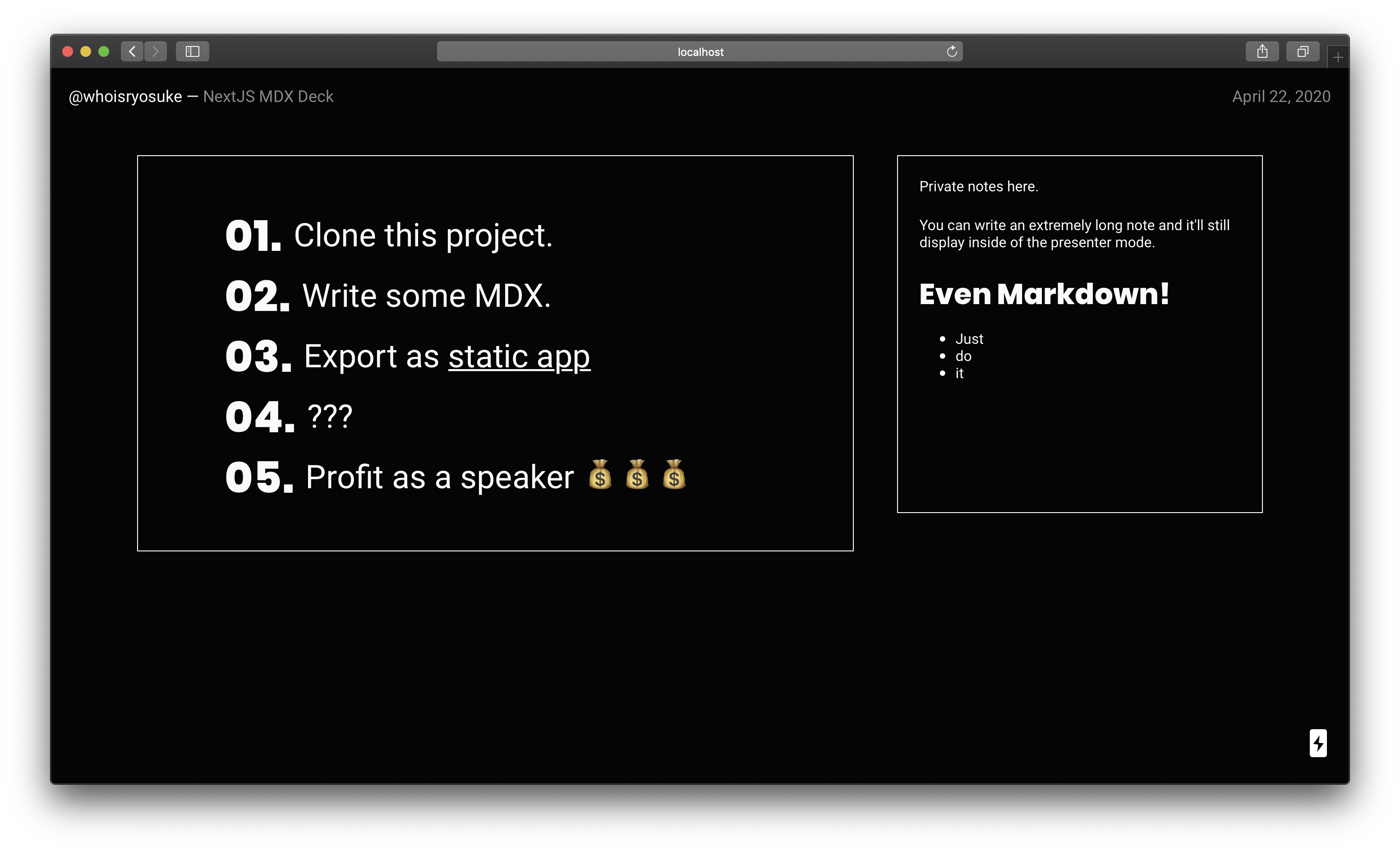
Presentation mode allows you to view the current slide alongside any "speaker notes" included inside the slide.
- Press
ALT/OPT + Pto toggle presentation mode on and off. - You can also add the
modequery parameter to the URL (e.g.http://localhost:3000/slides/1?mode=presentation).
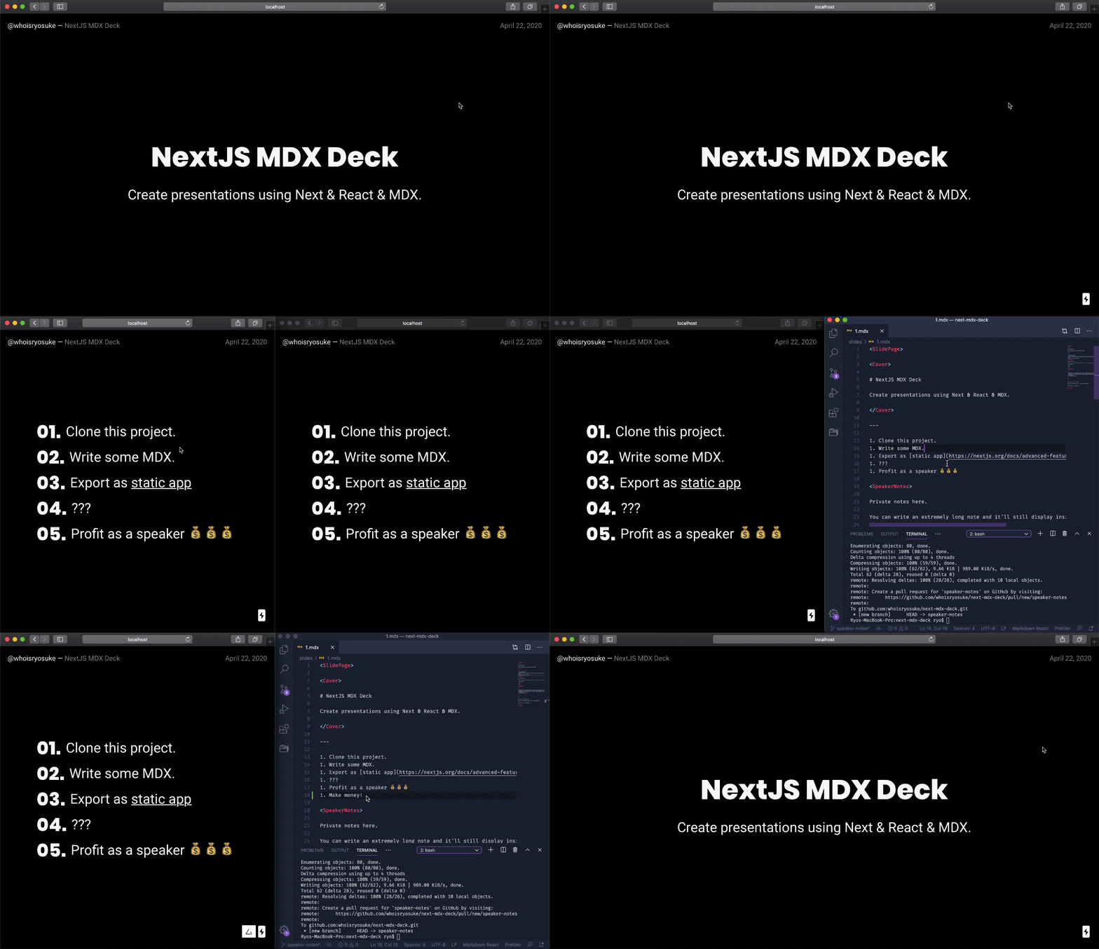
The most common way to use presentation mode:
- Open two browser tabs with any slide page.
- Activate presentation mode in one tab.
- Navigate through slides - they'll be synced in both tabs!
This way you can view your presentation on one monitor, while displaying the slides on another screen. Or if you're livestreaming, you can capture the slideshow window in software like OBS, and view the presentation window privately.
Note that syncing between tabs is achieved using
localStorage. If you want to use an "Incognito" browser, make sure both tabs are "incognito" or they won't sync.
Speaker Notes
Speaker notes are only displayed during presentation mode. This allows you to write private notes to yourself that you can see in "presentation" mode, while the audience only sees the other slide content in "slideshow" mode.
Speaker notes can contain Markdown, MDX/JSX, and even HTML (as JSX). The notes are displayed in a scrollable window to the side of slide content during "presenation" mode.
To create speaker notes, you use the <SpeakerNotes> component inside of your MDX files. No need to import it, it's automatically imported into any MDX slide page. You can also use it multiple times within the same slide, all the notes (per slide) will be combined.
Here's an example:
Slide content would go here.

<SpeakerNotes>

Private notes here.

# Even Markdown!

</SpeakerNotes>
Adding/replacing components in MDX
MDX allows you to use JSX inline or import components, but if you want to use a React component across all slides without importing it, you can use the <MDXProvider> component. This component wraps the app in a "context" that provides MDX with components to pass into the parser.
This also lets you replace Markdown parsed HTML elements with React components, like replacing ## Headings with <Heading as="h2"> instead of the default <h2>. This comes in handy if you have a React component library and you want to use it's primitives like <Text> for paragraphs.
You can pass new components, or swap HTML elements inside the mdComponents object in the /components/MDXProvider.jsx file:
const mdComponents = {
  h1: (props) => <h1 {...props} />,
  CustomButton,
};
Available Components
Framer Motion
You can use any Framer Motion component:
<motion.div
  animate={{scale: 2}}
  transition={{ duration: 0.5 }}
>

# Your animated header

</motion.div>
Cover
Displays content centered and larger, commonly for the first slide in a deck.
<Cover>

# NextJS MDX Deck

Create presentations using Next & React & MDX.

</Cover>
Steps
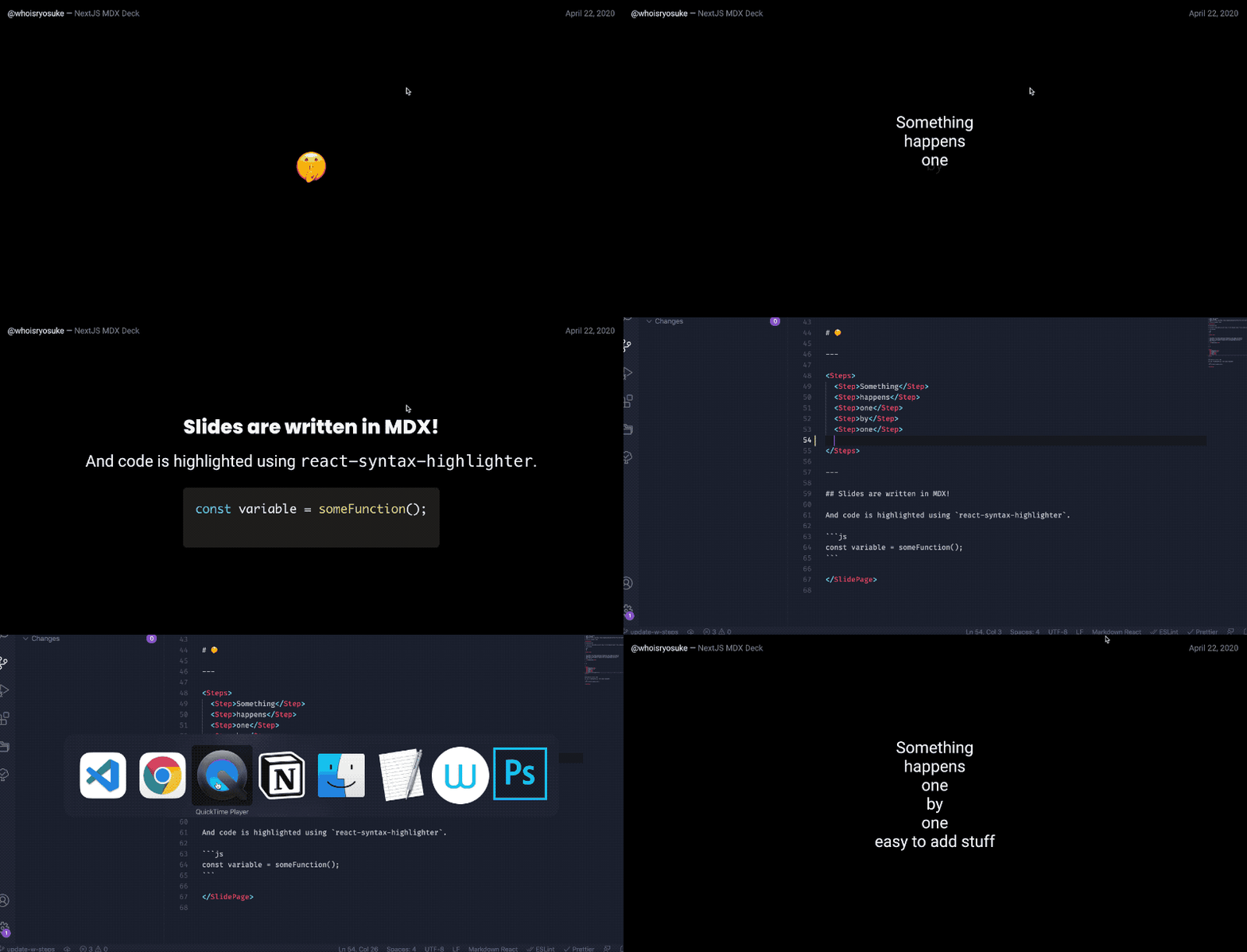
Reveals content step by step as the user does next/prev slide button.
<Steps>
  <Step>Something</Step>
  <Step>happens</Step>
  <Step>one</Step>
  <Step>by</Step>
  <Step>one</Step>
  <Step>easy to add stuff</Step>
</Steps>
Custom order
You can also define the order explicitly:
<Steps>
  <Step order={3}>Third</Step>
  <Step order={2}>Second</Step>
  <Step order={1}>First</Step>
</Steps>
Duration
You can control the animation duration using the prop and providing an integer (representing seconds):
<Steps>
  {/** 3 seconds **/}
  <Step duration={3}>Something</Step>
  <Step>happens</Step>
</Steps>
Learn More
MDX
To learn more about MDX, take a look at the following resources:
Next.js
To learn more about Next.js, take a look at the following resources:
- Next.js Documentation - learn about Next.js features and API.
- Learn Next.js - an interactive Next.js tutorial.


