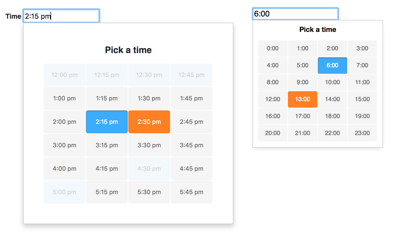
A lightweight, accessible and customizable javascript timepicker widget
- no dependencies
- tiny (6KB minified, 2KB gzipped)
- only the listed times can be picked or entered, no validation necessary
npm i -S appointment-picker
When using inside a static HTML file, add both the stylesheet and the script
<link rel="stylesheet" href="css/appointment-picker.css">
<script src="js/appointment-picker.min.js"></script>

<script type="text/javascript">
    new AppointmentPicker(...);
</script>When using with a module loader, import the node-module
// Webpack (React, Angular, ES6)
import AppointmentPicker from 'appointment-picker';

// CommonJS (Node, Browserify)
const AppointmentPicker = require('appointment-picker');
Initialize the picker using the new keyword
<input id="time" type="text" value="10:00">var picker = new AppointmentPicker(document.getElementById('time'), {});The appointment-picker can be configured with options
intervalsets the interval between appointments in minutes (1-60), if this number gets lower (more possible appointments) the picker will get longermodethe picker can be used in standard24hhour mode or in12hmode - the latter uses am/pm postfixminTimesets the minimum hour that can be picked, default is0what is eqivalent to 12ammaxTimesets the maximum hour that can be picked, default is24startTimehides all appointments below this hour, default is0endTimehides all appointments above this hour, default is24disabledarray of disabled appointments, i.e.['10:30', '1:15pm', ...]- these times cannot be selected or entered and will be skipped using the keyboard arrowslargeincreases the size of the picker and the appointments by setting ais-largemodifierleadingZeroadds leading zero to single-digit hour if true (i.e. 07:15)allowResetwhether a time can be reset once enteredtitledefines the picker's headingtemplateOuterHTML template that renders the picker's outer frame (usually containing a wrapper and title), must contain{{innerHtml}}placeholder (example)templateInnertemplate for repeated list items (time inputs), must contain at least aninputtag,{{time}}and optional{{disabled}}placeholder, i.e.<input type="button" value="{{time}}" {{disabled}}>timeFormat24custom time format for 24h mode (use placeholderHfor hour,Mfor minute), i.e.H/Mcould evaluate to13/45(example)timeFormat12custom time format for am/pm mode (use placeholderapmfor postfix - the algorithm will remove either the a or the p from the pattern), i.e.H.M AP.M.could evaluate to1.30 A.M
Note: with startTime and endTime appointments below and above can be visually removed. If startTime is greater than minTime a lower time can still be manually set via the keyboard. On the other hand the picker does not accept lower hours than minTime and higher than maxTime. Manually entered times outside of the defined bounds will be rejected by the picker, no extra validation is therefore needed. Entering an empty string into the input resets the time.
Now you can pass your options into the the AppointmentPicker invocation
var picker = new AppointmentPicker(document.getElementById('time-2'), {
  interval: 30,
  mode: '12h',
  minTime: 09,
  maxTime: 22,
  startTime: 08,
  endTime: 24,
  disabled: ['16:30', '17:00'],
  templateInner: '<li class="appo-picker-list-item {{disabled}}"><input type="button" tabindex="-1" value="{{time}}" {{disabled}}></li>',
  templateOuter: '<span class="appo-picker-title">{{title}}</span><ul class="appo-picker-list">{{innerHtml}}</ul>'
});The appointment-picker exposes several functions to change its behaviour from outside (example).
| Method | Desc. |
|---|---|
picker.open() |
open the picker popup |
picker.getTime() |
get the current time programmatically from a picker instance, returns an object like { h: 14, m: 30, displayTime: '2:30 pm' } |
picker.setTime('10:30') |
set a time of a picker instance (empty string resets the time) |
picker.close() |
close the picker popup |
picker.destroy() |
destroy the picker instance and remove both the markup and all event listeners |
Appointment-picker exposes events for hooking into the functionality:
change.appo.pickertriggered on each successful value change (event example)open.appo.pickeris fired each time the picker is openedclose.appo.pickeris fired each time the picker is closed
Each event contains 2 properties time and displayTime, i.e. event.time: {'h':14,'m':30} and event.displayTime: '2:30 pm'
document.body.addEventListener('change.appo.picker', function(e) { var time = e.time; }, false);All appointment-picker styles are namespaced with .appo-picker, i.e. .appo-picker-list-item.
You can either copy and modify the provided CSS, or import it using
/* Using sass/scss */
@import '~appointment-picker/css/appointment-picker';
or in your javascript file
// Using a css-loader inside JS (relative path to your node_modules folder)
import '../node_modules/appointment-picker/css/appointment-picker.css';For screen reader support add both a aria-label and aria-live properties on the input field
<input id="time-1" type="text" aria-live="assertive" aria-label="Use up or down arrow keys to change time">- Chrome
- Firefox
- Safari (macOS 10 & iOS 9)
- Edge
- IE11 / IE10
- IE9 (with classList polyfill)
Add the element.classList polyfill by either importing it with a module loader or simply add the polyfill from a CDN in your html head.
If you would like to use the appointment-picker as a jQuery plugin add following code before initializing
$.fn.appointmentPicker = function(options) {
  this.appointmentPicker = new AppointmentPicker(this[0], options);
  return this;
};
Now you can initialize the picker on any text input field using $
<input id="time-1" type="text">var $picker = $('#time-1').appointmentPicker();
// Or pass in options
$('#time-1').appointmentPicker({
interval: 15
});
// And access all exposed methods using jQuery
$picker.appointmentPicker.getTime(); // i.e. { h: 15, m: 30, displayTime: '3:30 pm' }Appointment Picker can be easily integrated into a React component. Simply import the node module and use React.createRef()
to pass the DOM element when calling new AppointmentPicker (see example)
import AppointmentPicker from 'appointment-picker';

class AppoPicker extends React.Component {

  constructor(props) {
    super(props);
    this.pickerRef = React.createRef();
    this.onTimeSelect = this.onTimeSelect.bind(this);
  }

  render() {
    return <input type="text" ref={ this.pickerRef }></input>;
  }

  onTimeSelect(event) {
    console.log(event.time);
  }

  componentDidMount() {
    this.picker = new AppointmentPicker(this.pickerRef.current, {});
    this.pickerRef.current.addEventListener('change.appo.picker', this.onTimeSelect);
  }

  componentWillUnmount() {
    this.pickerRef.current.removeEventListener('change.appo.picker', this.onTimeSelect);
    this.picker.destroy();
  }
}To integrate AppointmentPicker into an Angular component, import it's CSS, create a @ViewChild reference (#pickerInput) and pass it's nativeElement when calling new AppointmentPicker.
/* CSS, SCSS */
@import '~appointment-picker/css/appointment-picker';
<!-- HTML -->
<input #pickerInput type="text">import AppointmentPicker from 'appointment-picker';
@Component({
selector: 'xyz-picker',
templateUrl: './picker.component.html',
styleUrls: ['./picker.component.scss'],
// Disable View Encapsulation to pass down the picker's CSS styles
encapsulation: ViewEncapsulation.None
})
export class PickerComponent implements OnInit, OnDestroy {
@ViewChild('pickerInput') input: ElementRef;
picker: AppointmentPicker;
@HostListener('change.appo.picker', ['$event'])
onChangeTime(event: any) {
console.log('change.appo.picker', event.time);
}
ngOnInit() {
this.picker = new AppointmentPicker(this.input.nativeElement, {});
}
ngOnDestroy() { this.picker.destroy(); }
}- Jan Suwart | MIT License
