react-native-awesome-slider
🚀
JSThread'stoJSThread,UIThread’stoUIThread.
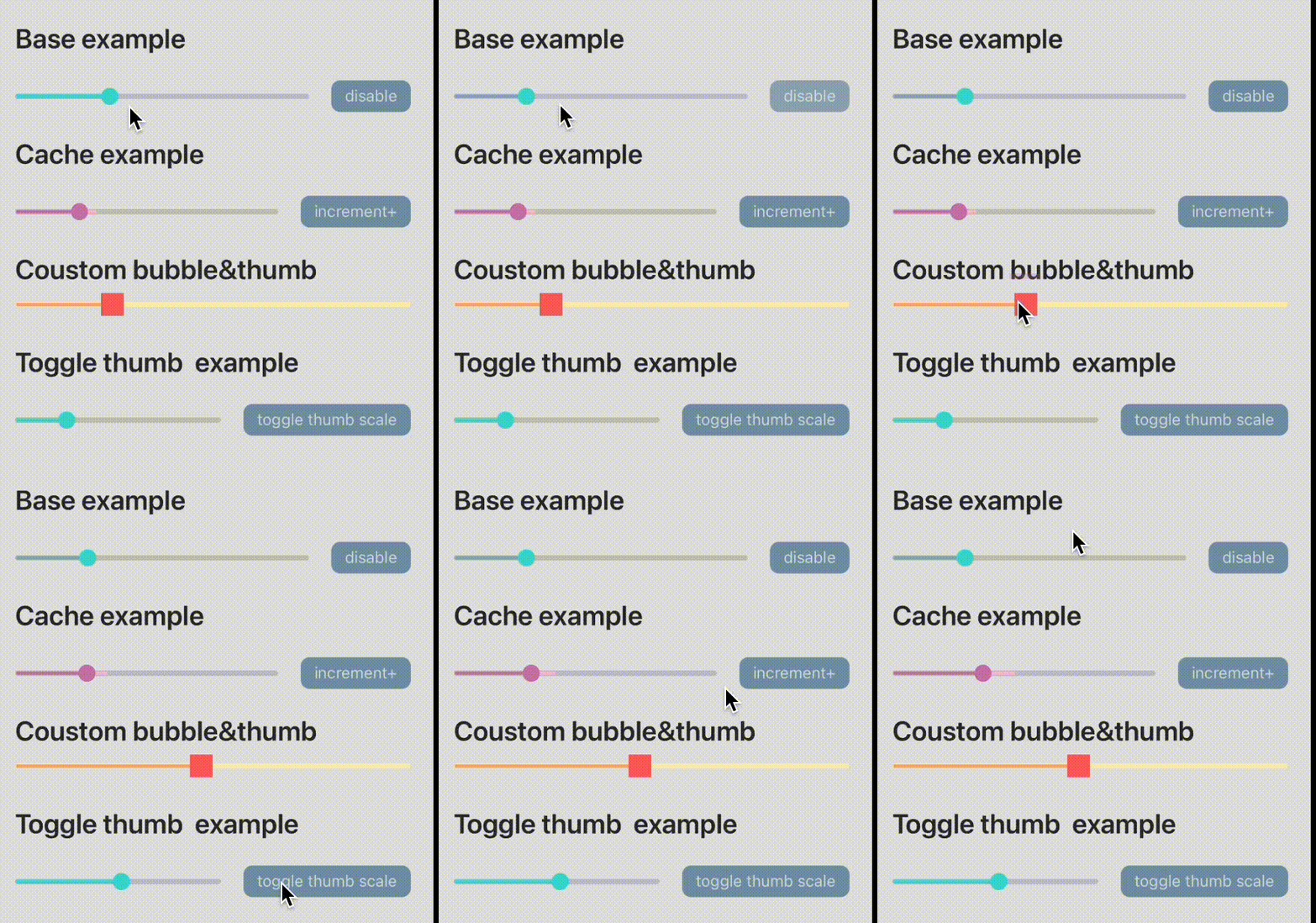
| GIF | VIDEO |
|---|---|
 |
https://user-images.githubusercontent.com/37520667/149308695-d4b9fc4c-eb43-4914-87a6-c89c56030eb3.mp4 |
Install via npm:
npm i react-native-awesome-slider
or
yarn add react-native-awesome-slider
Example Usage:
import { useSharedValue } from 'react-native-reanimated';
import { Slider } from 'react-native-awesome-slider';

export const Example = () => {
    const progress = useSharedValue(30);
    const min = useSharedValue(0);
    const max = useSharedValue(100);
    return (
        <Slider
            style={styles.container}
            progress={progress}
            minimumValue={min}
            maximumValue={max}
        />
    );
};
Why use this library?
- Pure js slider generally use
react-native's gueture/animtion, so when you pan sliding, may trigger the swiper to back event. ❌ - Native slider generally use state update view, not efficient. ❌
So react-native-awesome-slider 100% use reanimated's ShareValue, is running UIThread, is efficient, and react-native-gusture-handle will block your other gesture, let you focus on swiping. ✨
Features
- 100% Written in
TypeScript. - 100% Written in
react-native-reanimatedandreact-native-gusture-handle'. - Event support Tap & Pan triggering.
- and more...
To do list
- Support RTL
- Optimize arrows
- ...
Usage
The <Slider/> component has the following properties:
| Name | Type | Explanation | Required | Default Value |
|---|---|---|---|---|
| minimumTrackTintColor | string | minimum track tint color | ❌ | rgba(61, 219, 209, 1) |
| maximumTrackTintColor | string | minimum track tint colortrack tint color | ❌ | rgba(195, 197, 199, 1) |
| cacheTrackTintColor | string | cache track tint color | ❌ | rgba(39, 41, 46, 1) |
| style | ViewStyle | ❌ | ||
| borderColor | string | Color of the border of the slider, also you can use containerStyle . | ❌ | transparent |
| bubble | (number) => string | Get the current value of the slider as you slide it, and returns a string to be used inside the bubble. | ❌ | (number) => string |
| progress | Animated.SharedValue | Current value of the slider | ✅ | 0 |
| cache | Animated.SharedValue | Cache value of the slider | ❌ | 0 |
| minimumValue | Animated.SharedValue | An Animated.SharedValue from react-native-reanimated library which is the minimum value of the slider. | ✅ | undefined |
| maximumValue | Animated.SharedValue | An Animated.SharedValue from react-native-reanimated library which is the maximum value of the slider. | ✅ | undefined |
| onSlidingStart | () => void | Callback called when the users starts sliding | ❌ | undefined |
| onValueChange | (number) => void | Callback called when slide value change | ❌ | undefined |
| onSlidingComplete | (number) => void | Callback called when the users stops sliding. the new value will be passed as argument | ❌ | undefined |
| renderBubble | () => React.ReactNode | Render custom Bubble to show when sliding. | ❌ | See components |
| setBubbleText | (string) => void | This function will be called while sliding, and should set the text inside your custom bubble. | ❌ | current slider value |
| bubbleTranslateY | number | Value to pass to the container of the bubble as translateY | ❌ | 7 |
| renderThumbImage | () => React.ReactNode | Render custom thumb image. if you need to customize thumb, you also need to set the thumb width | ❌ | ReactNode |
| thumbWidth | number | Thumb elements width | ❌ | 15 |
| disable | boolean | Disable slider | ❌ | false |
| disableMinTrackTintColor | string | Disable slider color, default is minimumTrackTintColor | ❌ | rgba(61, 219, 209, 1) |
| disableTapEvent | boolean | Enable tap event change value, default true | ❌ | true |
| bubbleMaxWidth | number | Bubble elements max width | ❌ | 100 |
| bubbleTextStyle | TextStyle | Bubble textstyle | ❌ | |
| bubbleContainerStyle | ViewStyle | Bubble containe textstyle | ❌ | |
| bubbleBackgroundColor | string | Bubble background color | ❌ | rgba(61, 219, 209, 1) |
| isScrubbing | Animated.SharedValue | callback slider is scrubbing status | ❌ | undefined |
| onTap | () => void | On tap slider event.(This is useful when you doing video-palyer’s scrubber.) | ❌ | undefined |
| thumbScaleValue | Animated.SharedValue | control thumb’s transform-scale animation. | ❌ | undefined |
| sliderHeight | number | Slider height | ❌ | 30 |
| containerStyle | ViewStyle | Slider container style | ❌ | { width: '100%', height: 5, borderRadius: 2, borderColor: borderColor, overflow: 'hidden', borderWidth: 1, backgroundColor: maximumTrackTintColor, }, |
| panHitSlop | { top?: number | undefined;left?: number | undefined;bottom?: number | undefined;right?: number |