By looking at the RITA US domestic flight delay dataset for 2006, 2007 and 2008, this visualization explores the relationship between average flight departure delay and the hour of day. You can also explore the relationship between departure delay and different periods of time such as years, months, day of the month and day of the week.
Why don't you browse the visualization first? And, then come back to read the whole story behind the visualization.
After downloading and unzipping the dataset from RITA for 2006, 2007, 2008, I realized that these files were huge (around 2 GB) and had a lot of information which I didn't need for my visualization. So, I used EDA.Rmd file to process and summarize the data after keeping the necessary information and save it in a new file flights-datetime.csv.
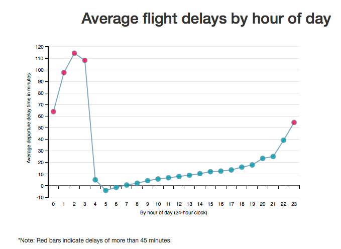
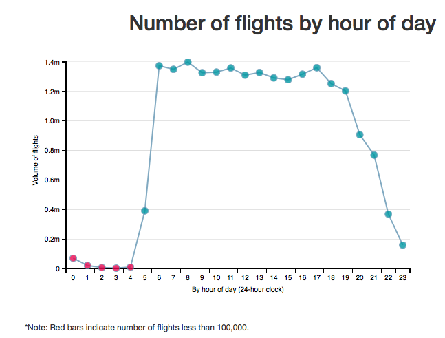
After playing with data and different chart types I decided to go with line charts as the main plot for its simplicity and effectiveness in communicating the message loud and clear. The first line chart explores flight delays by hour of the day which showcases the main idea behind the visualization i.e. avoid booking flights between 11pm-3am. In this chart I added a visual cue to make the data points red which were having flight delays of more than 45 minutes. I chose to explore number of flights by hour of the day as the second bar chart because it visualizes the fact that despite lowest number of flight between 11pm and 3 am, they have the worst flight delays. In this chart I added a visual cue to make the data points red which were having number of flights less than 100,000.
I chose not to combine these two charts for a two reasons. First, combining these two charts made the visualization more complex and second because these two were representing different scales of the data.
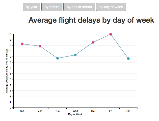
I believe that after going through the first 2 charts, a curious reader will certainly ask what about the other time periods? Is there a relationship? So, satisfy the curiosity of the readers and complete the story, I have included a section where users can toggle between different time periods to see the relationship between chosen time period and departure delay. These line charts show that there is only a couple of minutes difference between the time periods with worst and best delays. Since the flight delay data was in the range of 0 to 16 minutes, I added a visual cue to make the data points red which were greater than 10 minutes in these charts. I added a tooltip message to show the amount of minutes to help the viewer.
While I was working on this visualization, I kept sending the screenshots of the local index.html to keep getting suggestions. I interviewed 3 persons - two colleagues and a friend of mine in persons to get their feedback once I thought I was done. I have included another feedback from the Udacity Project Reviewer. Here is a gist of the same:
I never thought of this but yes, this visualization shows that there is a correlation between time of the day and flight delays. I thought it will be either month (for example December since it has most holidays) or a day (for example Friday or Saturday). On this note, I don't see a graph which shows the relationship between delay and days. I think you should include it to make the flow continuous from time till years.
Thats when I realized that week of the day is another important time period because a number of people choose flights by day of the week. So, after the first feedback I added another chart to show the relationship between day of the week and average departure delays.
I can see that you are using charts to visualize the relationship between different time periods and departure delays. This is some RITA data you are talking about. Can you include a link or some description about the RITA. In the descriptions, I would suggest to make the figures bold which are pertaining to your story. I like your graphs by the way.
Based upon the feedback I received I made some changes in the description to include a link and some description about RITA data. Also, I made some description wherever I thought the numbers needed some attention.
Interesting visualization, I like how you have used different time periods to show their relationship with flight delays. Also, the hovering and red color for higher delays makes it really easy to understand. But you are starting directly with the main point i.e. from hour of the day till years. From my perspective, the intuition would be to start from a year and then drill down further. In BI as well, we start with summary data and drill down to go to detailed data.
I gave it a lot of thought and asked around for more feedback on this. Few people said that yes, it would make sense to start with a bang!! but most people suggested to end with the main point. So, finally rearranged the graphs and added some description to keep the reader interested till the end. I included the message in the title so a reader knows what he is in for.
I like your project and I think you are on track, but the same issue described in the above rubric item also applies here. I think you can communicate the selected finding more effectively by streamlining your analysis and focusing only on the key insight. Given that you did not find your first several charts interesting, I do not think they should be included. I recommend settling on a key finding or two, and focus on telling that story concisely using one or two charts that work together. I recommend adding additional interaction or animation. I also suggest shifting away from using bar charts. Bar charts are effective here, but I would argue that line charts look better (more white space) and are better suited for time series plots.
Based on the feedback, I made some major changes. First change was to start the story with visualizations for the departure delay chart by hour and number of flights by hour since the first four graphs weren't interesting. Second change was to combine the rest 4 graphs and give a users choice if they want to explore the additional time periods or not. I still decided to include because I think without these graphs story will be incomplete. Third change was to convert the bar charts into line charts which I think helps the visualization in consistency and as suggested, I could appreciate the more white space.
The overall feedback and the general consensus showed that the visualizations actually worked in highlighting the main point of the story which is worst delays are experienced in general between 11pm and 3 am despite the lowest number of flights.
- D3.JS Documentation
- Dimple.JS Documentation
- Data Visualization and D3.js (Udacity)
- Stack Overflow posts
- The original files came from 2006, 2007 and 2008 RITA Dataset
- After processing using EDA.rmd, the summary file is saved in data/flights-datetime.csv