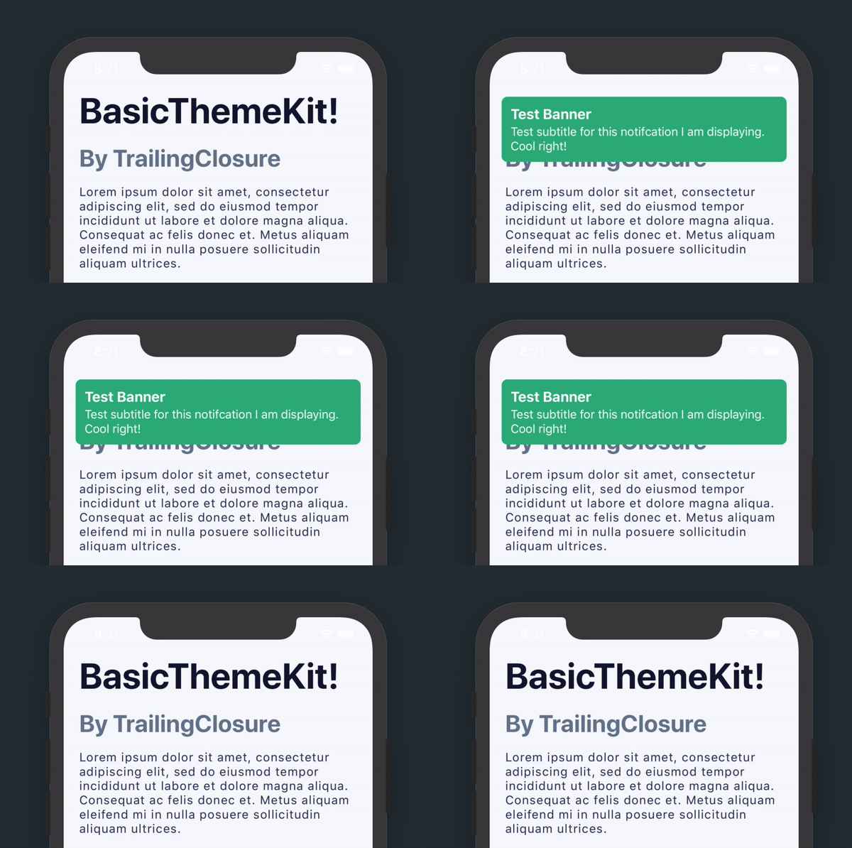
Written for TrailingClosure.com.
BasicThemeKit is a SwiftUI package that allows you to quickly format elements in your app around a common theme. All of the elements in the kit are made as a
ViewModifierwith an extension toView. This allows you to prototype quickly and maintain the readability of your code.
All of the elements are created as a ViewModifier with extensions placed on View.
// H1 Header
Text("H1 Header String")
    .h1()

// H2 Header
Text("H2 Header String")
    .h2()

// H3 Header
Text("H3 Header String")
    .h3()

// H4 Header
Text("H4 Header String")
    .h4()

// Paragraph Styling
Text("This creates text formatted for a paragraph.")
.paragraph()// Primary Button
Button(action: {}) {
Text("Primary Button")
.primaryButton()
.h4() // You can use text styling on buttons too!
}
// Border Button
Button(action: {}) {
Text("Border Button")
.borderButton()
.h4()
}// Block Quote - Primary Styling
Text("Lorem ipsum dolor sit amet, consectetur adipiscing elit, sed do eiusmod tempor incididunt ut labore et dolore magna aliqua.")
.paragraph()
.blockQuote(style: .Primary)
/*
Other Styles:
- .Success
- .Warning
- .Error
*/// Change the bool value to toggle display of the Notification banner.
@State var bannerVisible: Bool = false
ZStack {
// All of your normal content in here.
}
.banner(title: "Test Banner", subtitle: "Test subtitle for this notifcation I am displaying. Cool right!", style: .Primary, isVisible: $bannerVisible)
// Banner will automatically hide after a few seconds. That is why the bool value is passed as a binding.
/*
Other Styles:
- .Success
- .Warning
- .Error
*/Install as a Swift Package using the link for this git repository.
https://github.com/jboullianne/BasicThemeKit.git


