Canal Street Market
Table of Contents
Overview
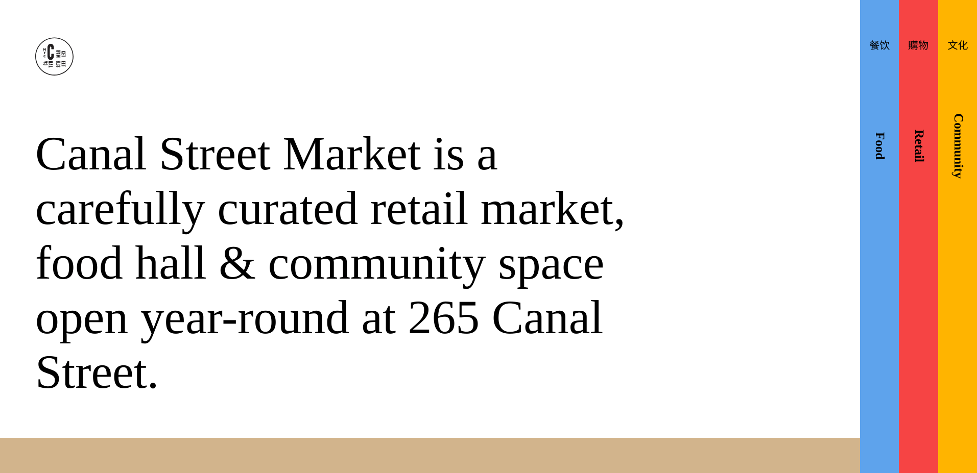
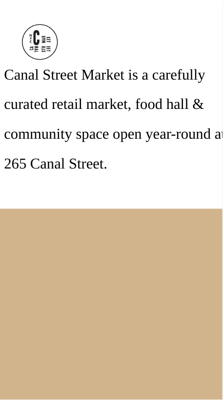
I don't like that the real website has a line break on the address. There is also a picture that blends in with the background and that could have used a box-shadow or a picture replacement. The vertical panels are a striking design choice. Having menu items pop up on hover doesn't really help convert sales or convey info to the customer. It's different just to be different. It was unclear that they could be clicked on because of the hover as well. 'Interested in becoming a vendor?' is a weak, generic call to action. Getting people to click that button is very important and the button should be black at all times to stand out. Real site seems to use javascript to create panel content on load / click. Real site uses GSAP. GSAP doesn't really seem necessary. My clone is missing a favicon.
Built With
- Desktop First
- CSS Grid
- Flexbox
Features
The challenge was to build an application to complete the following user stories:
- User story: Recreate the layout
- User story: Animate the dashed border as seen on the live website (expect double lines).
- User story: Create the sliding vertical panels, each with their own unique content.
Useful Resources
- Canal Street
- Stack Overflow - Scroll Event Not Firing
- Stack Overflow - Scroll Event
- W3 Schools - Sticky Header example
- Vertical Panels - Codepen example
- Stack Overflow - Image on Hover
- Free Frontend - CSS border animations
- Stack Overflow - Dashed border animation *
- What Font is - Replacement for Ogg Roman font
- ffonts - Font downloads

