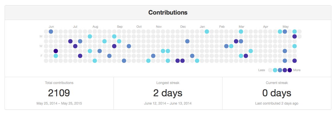
This is a clone of the Contributions chart from the GitHub user page, written in Python.
This is what it looks like with the default settings:
I wrote it so that I could use the GitHub design for other things I want to track, including exercise and reading.
The original graph was introduced by GitHub in 2013. I don't know whose idea it was; I just copied the design and built my own version of it.
Clone this repository onto your computer:
git clone git@github.com:alexwlchan/contributions-graph.git
cd contributions-graph
Install the Python dependencies (I recommend doing this inside a virtualenv):
pip install -r requirements.txt
You also need to build the style sheets. This uses Sass:
sass --scss contributions/static/style.scss:contributions/static/style.css
If you don't want to or can't install Sass, you can also use an online converter, such as Sassmeister.
It should run on Python 2 or 3, although I've only tested it on 2.7.
Create a text file that records each day, with the number of contributions for that day, with a space between the date and the value:
YYYY-MM-DD value
Other notes:
- As with Python source code, anything after a
#is ignored and treated as a comment. - One date/value pair per line.
- Blank lines are fine.
I've included an example file in the repo: example.txt.
Now use the create_graph() function, supplying the name of this text file, and you get the HTML for a simple page with the contributions graph:
from contributions.render_html import create_graph
print create_graph("example.txt")
If you have multiple such files, supplying them as a list to this function will put all the graphs on the same page:
from contributions.render_html import create_graph
print create_graph(["example1.txt", "example2.txt"])
This should work on Python 2 and 3, but I've only tested it in Python 2.7.
Here are some ideas I have for the future:
-
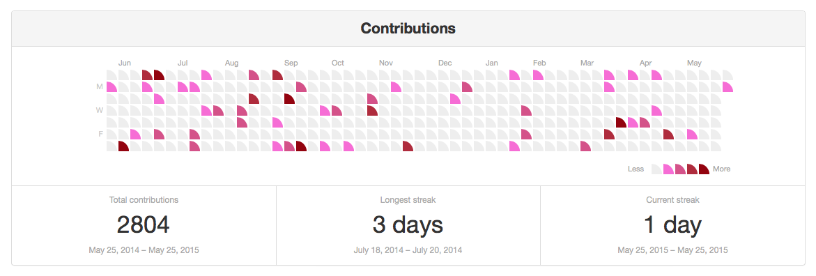
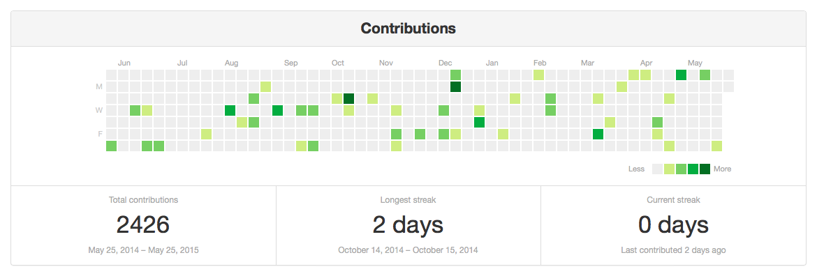
More colours and shapes. Since each cell is just a
<div>, it should be fairly easy to recolour and reshape.Here are a few that I came up with by just tweaking the CSS by hand:


It would be nice for those to be available as options rather than by hand-tweaking.
-
A mobile version. The short and wide version doesn't really work on small screens, but I think this design might work if you rotated through 90 degrees. Weeks along the top, months down the side.
I want to give that a go.
-
Unit tests are awesome. I should write more of them.
-
The ability to customise some of the text. Right now, it only says "Contributions". It would be nice to be able to put other words in as appropriate.
-
More statistics options. I just took the three stats that GitHub offers, but there may be different ones that are useful.
(For example, a graph of steps walked doesn't really have much use for longest/current streak, but might want average daily steps.)
-
Skippable weekends? I think it might be useful to use this for some work-related tasks, but since I don't work weekends, there would be a bunch of blank boxes. It might be nice to have an option for omitting weekends.
-
Squash the bugs! Since this project involves a lot of fiddly stuff with calendars and dates, it's almost certain that somewhere, someday, something will go wrong. I'd like to do some more testing to find out if/where that's going to be.
