Lifegram is a social media platform inspired by Instagram for people who enjoy sharing their life snippets with posts, image uploads, comments, and likes functions.
- Ruby
- JavaScript
- Rails
- React.js
- Redux
- PostGreSQL
- AWS S3
- Sass
- CSS
- HTML
- Heroku
- User authentication
- Posts
- Likes
- Comments
I built a renderEdit function to make sure that users can edit their own profile pages. I used an if statement to secure that the edit profile button will only be showed if the user's profile id is the same as current user id.
// frontend/users/user_profile.jsx

renderEdit() {

        if (this.props.user.id === this.props.currentUser.id) {
            return (
                <div className="edit-profile-button">
                    <Link to={`/users/${this.props.user.id}/edit`} className="edit-link">Edit Profile</Link>
                </div>
            )
        } else {
            return null
        }
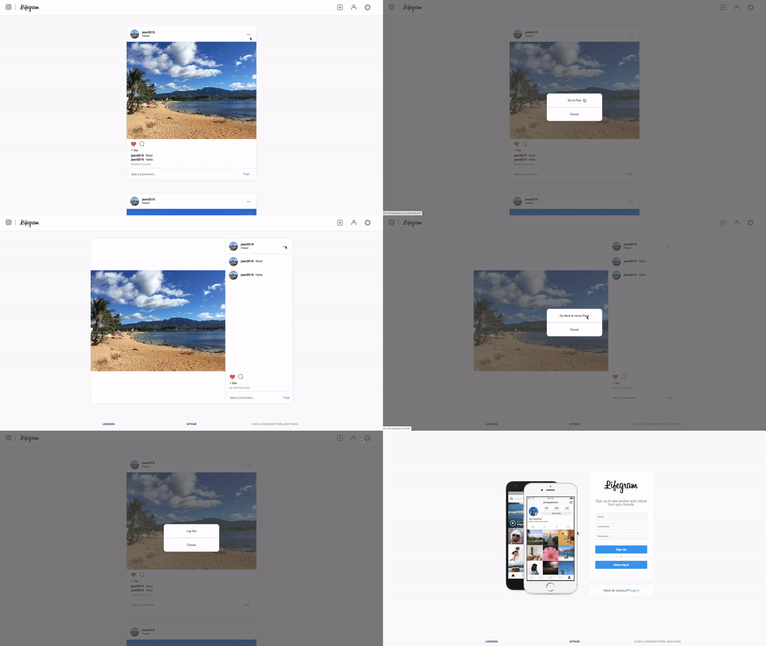
}I implemented a custom modal component to dynamically render various modals throughout the website. I used switch to make sure that only the certain component will be executed when a user click a button. Modals are used to show the different options to upload photos, to logout users, to update user profiles, to go to the post show page, and go back to the index page.
// frontend/components/modal.jsx

function Modal({ modal, closeModal }) {
    if (!modal) {
        return null;
    }
    let component;
    switch (modal) {
        case 'upload':
            component = <PostUploadContainer />;
            break;
        case 'update':
            component = <UpdateProfilePhotoContainer />;
            break;
        case 'logoutOption':
            component = <LogoutOptionContainer />;
            break;
        case 'postOption':
            component = <PostOptionContainer/>
            break;
        case 'showOption':
            component = <ShowOptionContainer />
            break;
        default:
            return null;
    }
    return (
        <div className="modal-background" onClick={closeModal}>
            <div className="modal-child" onClick={e => e.stopPropagation()}>
                {component}
            </div>
        </div>
    );
}

const msp = state => {

    return {
        modal: state.modal,
        postId: state.ui.currentPostId
    };
};

const mdp = dispatch => {
    return {
        closeModal: () => dispatch(closeModal())
    };
};
