This library is a work in progress that will contain some advanced Angular components build on Angular 8 and Bootstrap 4.
npm install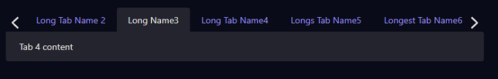
npm run startThis component is a scrollable responsive tab component build on Angular 8 and Bootstrap 4. The left and right nav buttons will scroll one tab at a time. The component will track what tab is open and re-navigate to the open tab when the screen is refreshed. Any bootstrap theme or tab styling will automatically apply to this component. The component should be placed in a container and the angular routing module should be configured in the consuming app.
- Install the package
npm install ngc-scrolling-tabs- Add import to your Angular Module
import { ScrollingTabsModule } from 'ngc-scrolling-tabs';- [firstTabActive] -> Used on page load, if the active tab is not specified the first tab will be marked as active. Default: true
- [scrollToActive] -> Used on page load, the active tab that is marked active will be scrolled to if there are hidden tabs. Default: true
- [trackOpenTab] -> Used to track what tab is open as a url parameter. If the page is refreshed it will default to that tab. Default: true
(selectedTabChanged) -> Fired when a user changes tabs.
<ngc-scrolling-tabs [firstTabActive]="true" [scrollToActive]="true" [trackOpenTab]="false" (selectedTabChanged)="onSelectedTabChanged($event)">
    <ngcScrollingTab id="home" title="Home">
        Tab 1 content
    </ngcScrollingTab>
    <ngcScrollingTab id="settings" title="Settings" [active]="true">
        Tab 2 content
    </ngcScrollingTab>
</ngc-scrolling-tabs>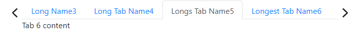
This component is a responsive pager component build on Angular 8 and Bootstrap 4. It keeps track of the total records and number of pages based on page size. It fires a event when the user changes the page or page size.
- Install the package
npm install ngc-pager- Add import to your Angular Module
import { PagerModule } from 'ngc-pager';- [pageinationMetaData] -> Object used to hold and pass page data. Object and default values below.
class PaginationMetadata {
    constructor(public currentPage: number = 1, public totalPages: number = 0, public pageSize: number = 25,
                public totalCount: number = 0, public hasPrevious: boolean = false, public hasNext: boolean = false) {
    }
}- [floatRight] -> Will push the component to the right on larger screens. Default: false
- [resultsHeader] -> Sets the text that will be shown in front of the result count. Default: 'Total Results:'
- [pageSizes] -> A array of integers that will be used to generate the available list of page sizes. Default [5, 10, 25, 50, 100]
(pagerChanged) -> Fired when page or pagesize changes.
<ngc-pager  [pageinationMetaData]="pageinationMetaData"
            [floatRight]="true"
            [resultsHeader]="'Total:'"
            [pageSizes]="pageSizeArray"
            (pagerChanged)="onPagerChanged">
</ngc-pager>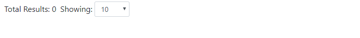
This component is a search input field built on Angular 8 and Bootstrap 4. It listens for input, pauses for a set duration (default 500 ms), checks for unique values, and then emits the text in the search field. Can be used to auto search a datasource automatically as a user is typing. Emits a changed event if the input field is cleared.
- Install the package
npm install ngc-search-input- Add import to your Angular Module
import { SearchInputModule } from 'ngc-search-input';- [config] -> Used to set multiple settings for the component. Pass in config object with the values you want to change. Object with default values listed below.
@Input() config = {
    placeholderText: 'Search...',
    minSearchLength: 3,
    searchLengthError: 'Search term must be at least 3 characters',
    debounceTime: 500
};(searchInputChanged) -> Fired when the search term is changed and greater than the specified length and not the same as the last emitted value or if the search term is empty.
<ngc-search-input [config]="configSettings" (searchInputChanged)="onSearchInputChanged($event)"></ngc-search-input>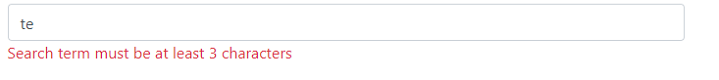
- Run the following command
ng g library search-input --prefix ngc- Change to the directory and init NPM
npm init- Add commands to package.json and show the library in the sample app