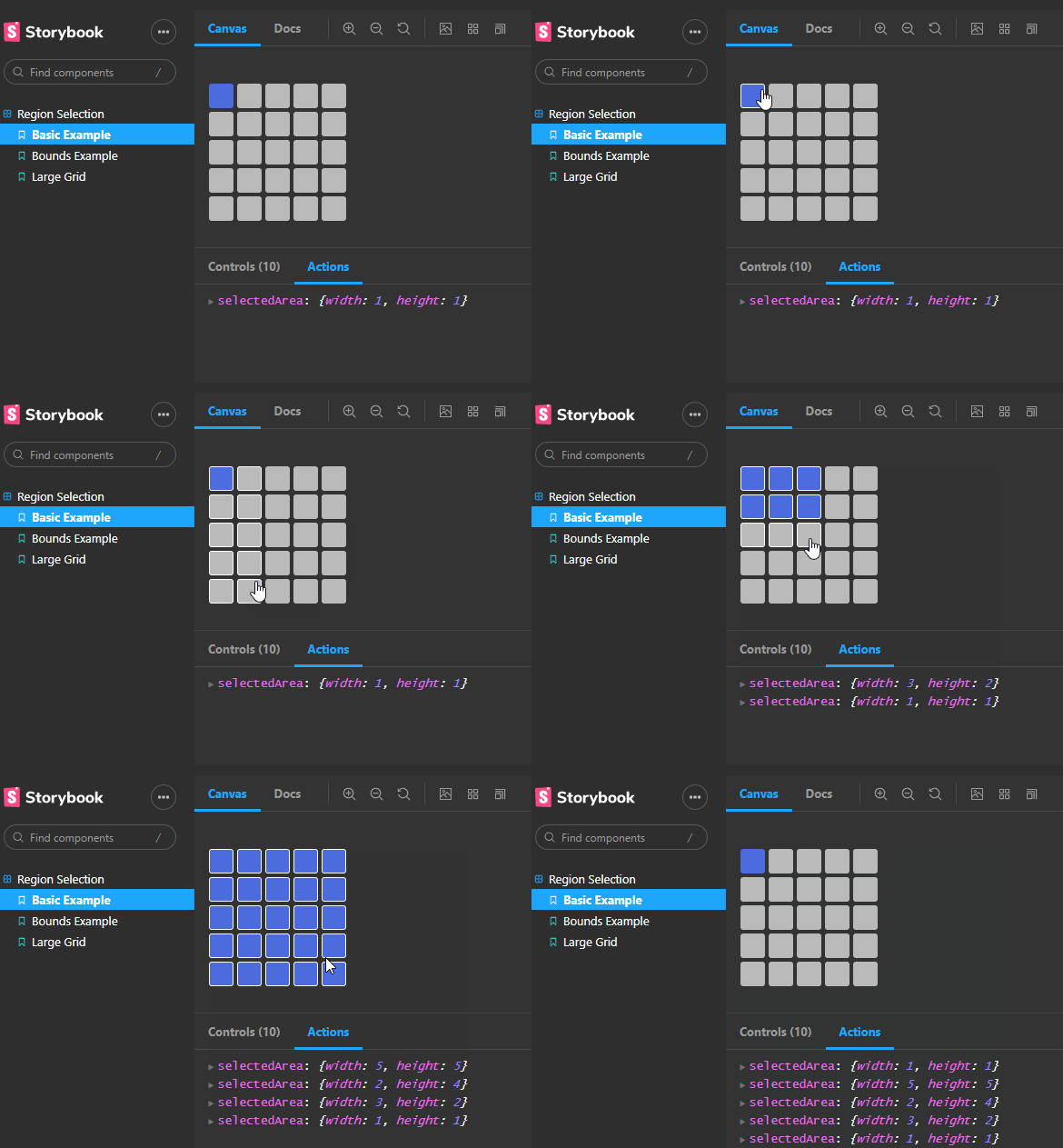
A React component to select a grid size from an available space
Check out the examples:
yarn add react-grid-selector
npm install react-grid-selectimport GridSelect from "react-grid-select";
const Demo = () => {
const [selectedArea, setSelectedArea] = useState({ width: null, height: null });
return (
<GridSelect
cols={5}
rows={5}
onRegionUpdate={setSelectedArea}
/>
);
};| Prop | Type | Default | Description |
|---|---|---|---|
rows |
number | 5 | The number of rows in the grid |
cols |
number | 5 | The number of columns in the grid |
onRegionUpdate |
Function | Log to console | Function describing what to do with the selected area information. Probably set this to a state variable |
cellSize |
number | 25 | Size of each grid cell in pixels |
bounds |
{ maxWidthBlock: { width: number; height: number; }; maxHeightBlock: { width: number; height: number; }; }; |
None | Enabled area of the grid. By default the whole grid is enabled |
disabled |
boolean | false | Whether or not the grid is currently disabled. Disabling will pause the grid in it's current state and apply the disabled style |
styles |
object | See below | Custom styles to apply to the grid |
All default styles can be overridden by using the styles prop which accepts the below options
| Styles | Defaults |
|---|---|
| active | { border: "1px solid #4d6cdd", background: "#4d6cdd" } |
| hover | { border: "1px solid #fff" } |
| cell | { width: cellSize, height: cellSize, background: "#bababa", cursor: "pointer", borderRadius: 3, border: "1px solid #bababa" } |
| grid | { position: "relative", display: "grid", color: "#444", margin: "25px 0", gridGap: "4px 6px", gridTemplateColumns: Array(cols).fill(${cellSize}px).join(" ") } |
| disabled | { filter: "brightness(0.7)" } |


