Reply ❤️ Flutter
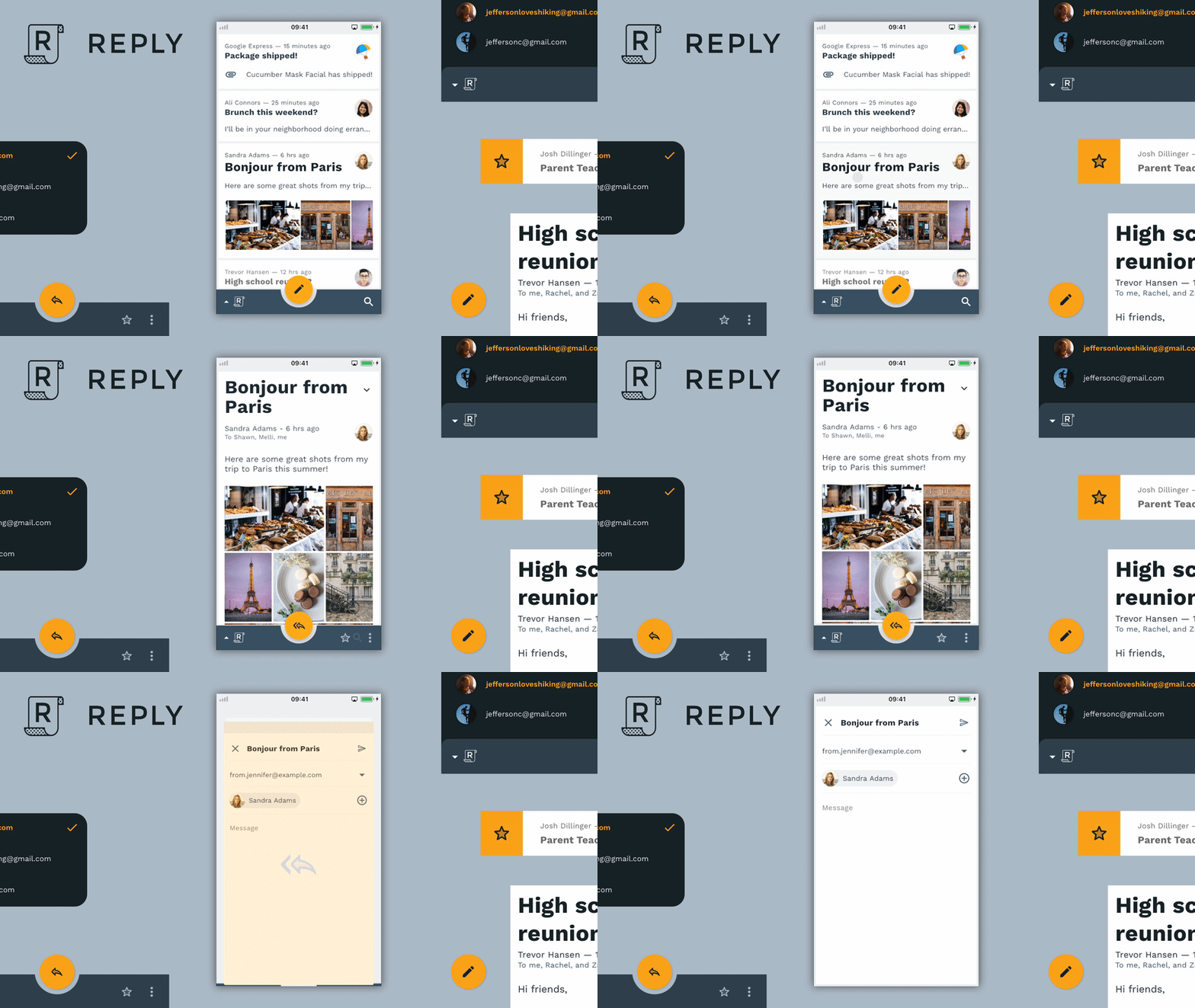
Reply is an email app that uses Material Design components and Material Theming to create an on-brand communication experience.
This project tries to deliver a pixel-perfect implementation of the Reply Material Design Case Study in Flutter. The focus lies on the UI (animation, layout, transition, etc.) and should showcase how powerful Flutter has become as a UI framework.
To install the app on your phone you have two options. For Android you can download a pre-compiled APK file from the 'Releases' tab or use the this direct link.
You can also download and build the project locally - for this you need to have a local Flutter installation.
Just clone the project and inside the root execute flutter run --profile.
This will compile and install the app on your connected device / emulator / simulator.
Also make sure to enable slow animations 😉
Currently most of the work is done with the resources you can find on the official Material page. For some animated icons 2Dimensions' Flare was used, you can find the design files here.
-
Initial animation (list, bottom navigation)
-
Expand transition with shared avatar
-
FAB compose transition
-
Animated FAB icon states
-
Dismissible list elements
-
Bottom sheet menu
-
Selecting list items
-
Disappearing bottom navigation (when scrolled)
-
Dismissible background animation
-
Pull-To-Refresh animation
-
Splash logo animation
-
Tablet / Desktop layout
Please file any issues, bugs, or feature requests in the repo.
If you wish to contribute to this repo, please send me a short DM on Twitter and / or open a pull request.
- @willlarche for providing me some assets for Reply 🎨
- @slightfoot who helped me building the very first POC of the expand transition ✨
- The welcoming Flutter community for supporting me when I got started with Flutter some time ago 🚀

