Automatically create & optimize responsive image transforms, using either native Craft transforms or a service like Imgix, with zero template changes.
Note: This plugin may become a paid add-on when the Craft Plugin store becomes available.
To install ImageOptimize, follow these steps:
- Install with Composer via
composer require nystudio107/craft3-imageoptimizefrom your project directory - Install plugin in the Craft Control Panel under Settings > Plugins
ImageOptimize works on Craft 3.x.
ImageOptimize allows you to automatically create & optimize responsive image transforms from your Craft 3 assets. It works equally well with native Craft image transforms, and image services like Imgix, with zero template changes.
You use the native Craft UI/UX to create your image transforms, whether in the AdminCP or via your templates. ImageOptimize takes care of the rest, optimizing all of your image transforms automatically by running a variety of image optimization tools on them.
ImageOptimize also comes with an OptimizedImages Field that makes creating responsive image sizes for <img srcset=""> or <picture> elements sublimely easy. These responsive image transforms are created when an asset is saved, rather than at page load time, to ensure that frontend performance is optimal.
Because ImageOptimize has already pre-generated and saved the URLs to your optimized image variants, no additional database requests are needed to fetch this information (unlike with Assets or Transforms).
As configured by default, all of these are lossless image optimizations that remove metadata and otherwise optimize the images without changing their appearance in any way.
Out of the box, ImageOptimize allows for the optimization of JPG, PNG, SVG, & GIF images, but you can add whatever additional types you want. It also supports using Imgix to create the responsive image transforms.
It's important to create optimized images for frontend delivery, especially for mobile devices. If you want to learn more about it, read the Creating Optimized Images in Craft CMS article.
Once ImageOptimize is installed, optimized versions of image transforms are created without you having to do anything. This makes it great for client-proofing websites.
ImageOptimize works equally well with both local and remote assets such as Amazon S3 buckets.
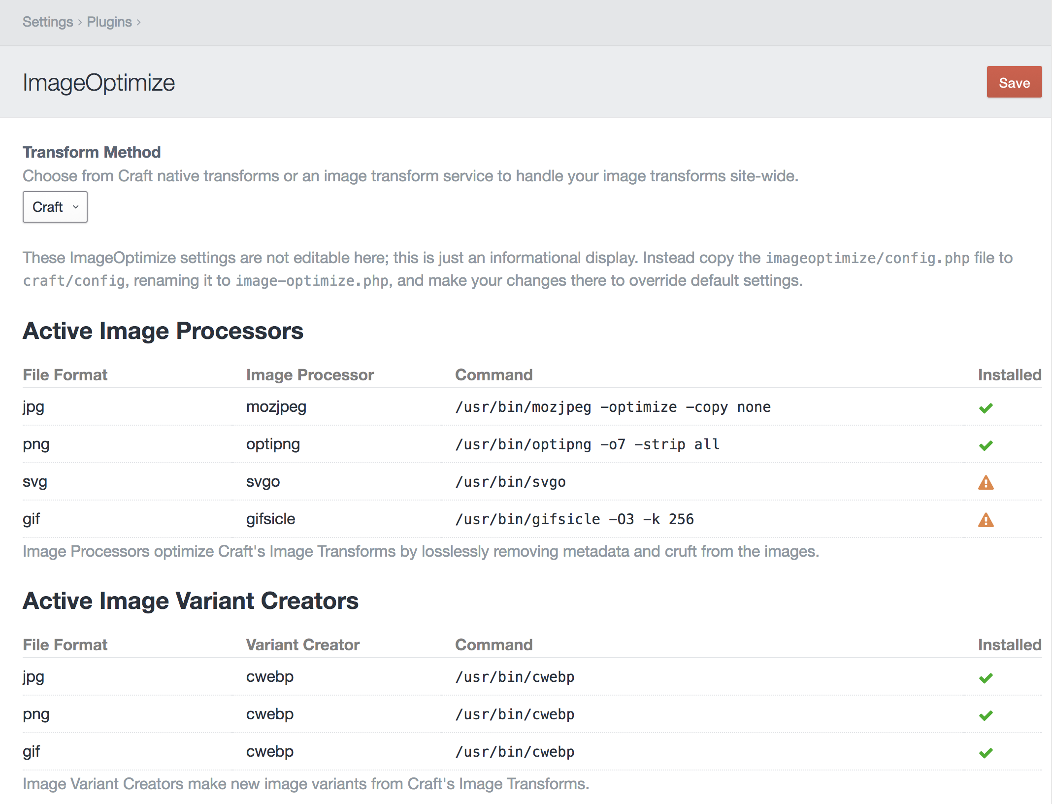
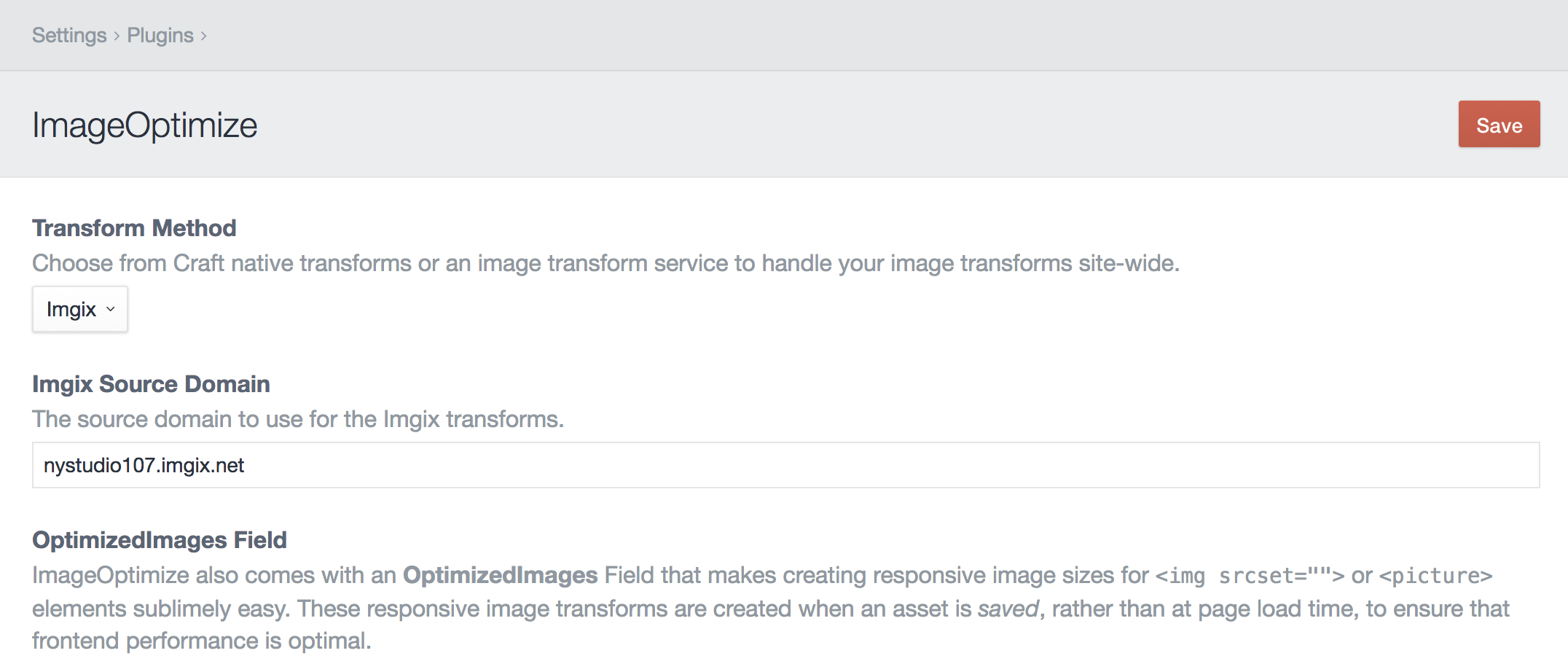
The plugin Settings for ImageOptimize allows you to choose whether to use native Craft image transforms, or an image transform service such as Imgix. The setting you choose here will apply globally to all of your image transforms.
To create client-proof optimized images with native Craft transforms, you'll need to also install the image optimization tools of your choice. The ImageOptimize plugin Settings page will show you the status of your installed image optimization tools:
Here's how to install a few on Ubuntu 16.04:
- jpegoptim -
sudo apt-get install jpegoptim - mozjpeg - Installing mozjpeg on Ubuntu 16.04 (Forge)
- optipng -
sudo apt-get install optipng - svgo -
sudo npm install -g svgo - gifsicle -
sudo apt-get install gifsicle - webp -
sudo apt-get install webp
ImageOptimize's responsive image transforms will work without these tools installed, but it's recommended that you use them to ensure the images are fully optimized.
The only configuration for ImageOptimize is in the config.php file, which is a multi-environment friendly way to store the default settings. Don't edit this file, instead copy it to craft/config as image-optimize.php and make your changes there.
The activeImageProcessors array lets you specify which of the image optimization tools to use for which file types.
The imageProcessors array specifies the path and options for each of the image optimization tools.
The activeImageVariantCreators array lets you specify which of the image variant creators to use for which file types.
The imageVariantCreators array specifies the path and options for each of the image variant creators.
See each image optimization tool's documentation for details on the options they allow you to use.
If you're using the Imgix service, ImageOptimize allows you to use the Craft AdminCP UX/UI to create your image transforms, but have Imgix do all of the heavy lifting for you. This means you can use Imgix with zero template changes.
Craft will then use Imgix for all Asset URLs, including the original image, its thumbnails, and any Asset transforms you create (whether in the AdminCP or via Twig templates).
To utilize Imgix, you'll need to enter your Imgix Source Domain:
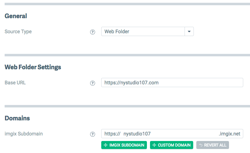
Then configure your Imgix source via your Imgix.com account. If you're using a Web Folder as a source, make sure it's set to the root of your domain, since you can only have one per site:
Regardless of how many separate Craft Asset Volumes you've set up, you'll just have one Web Folder source.
For image transforms, and set both Quality and Format to Auto in the AdminCP, it’ll send along auto=compress,format to Imgix, which will allow Imgix to compress the image as it sees fit. See the Automatic Imgix Documentation for details.
To create responsive image variants for all of your images, create an OptimizedImages Field.
Transform Method let you choose to use the built-in Craft transforms or a service like Imgix for the responsive image variants.
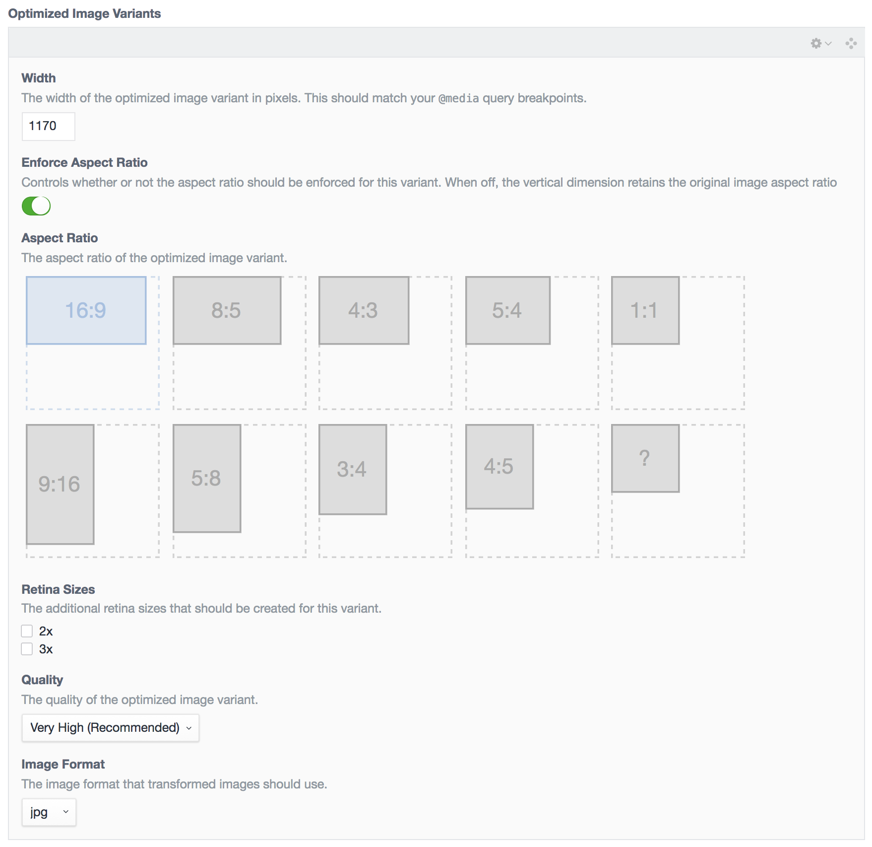
You can then create as many Optimized Image Variants as you like:
You can add, delete, and re-order the Optimized Image Variants just like you can Matrix blocks.
For each Optimized Image Variant, set:
- Width: The width of the image, which should correspond to your CSS
@mediaquery breakpoints or container sizes. For performance, we want to images to be the exact size that they will be displayed on-screen. - Enforce Aspect Ratio: Controls whether or not the aspect ratio should be enforced for this variant. When off, the vertical dimension retains the original image aspect ratio
- Aspect Ratio: Pick an aspect ratio for the image from the available choices, or create your own with the
?aspect ratio. - Retina Sizes: Check any additional retina sizes to create for this variant. For instance, a
100x60image with with a2xretina size would also create a200x120image. - Quality: The quality of the generated image; if Auto is selected, it will use your
config/general.phpsetting fordefaultImageQuality - Image Format: The file format of the generated image; if Auto is selected, it will use the original image's file format. It's recommended that you set this to
jpgfor most images, for client-proofing purposes.
Once you have set up your field, add it to your asset Volume's layout via Settings → Assets, then click on your asset Volume, and click on Field Layout.
Whenever you add an OptimizedImages field to an asset Volume's layout, or make changes to an existing OptimizedImages field's settings, it will automatically generate your responsive image variants for you.
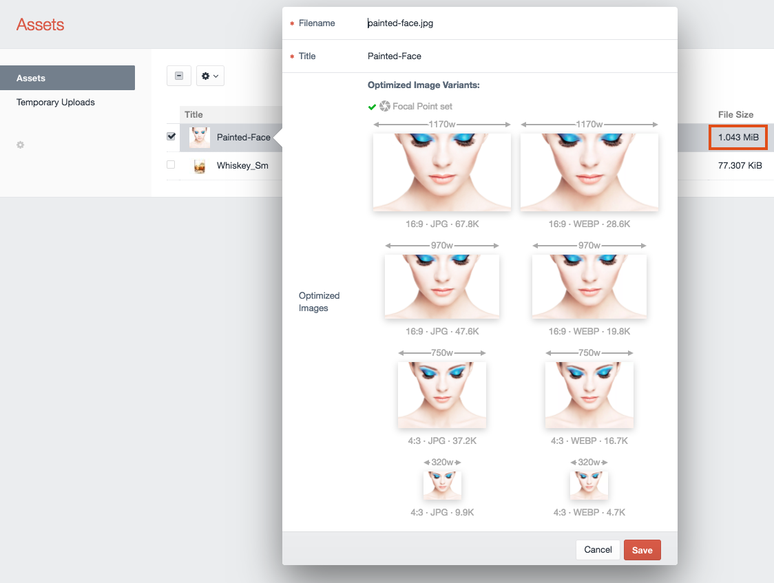
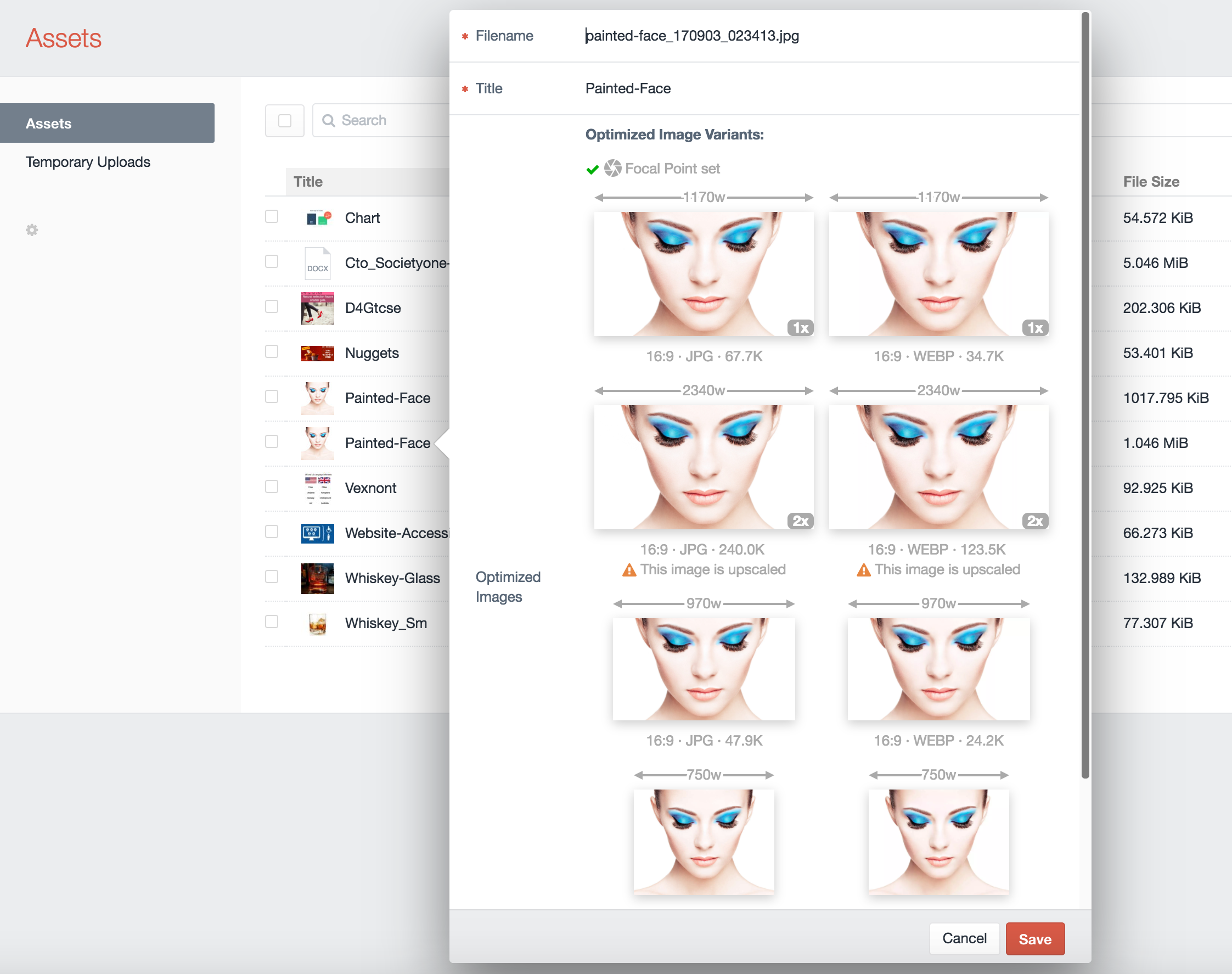
If you double-click on an asset (or click on an asset, and choose Edit Asset from the gear menu), you will now see all of your responsive image variants for that image:
You'll see the responsive width of each image variant above each thumbnail, with the aspect ratio, file format, and file size below it. If you have .webp image variants configured, you will see them here as well.
If you click on an image thumbnail, it will open up the full size image in a new browser tab.
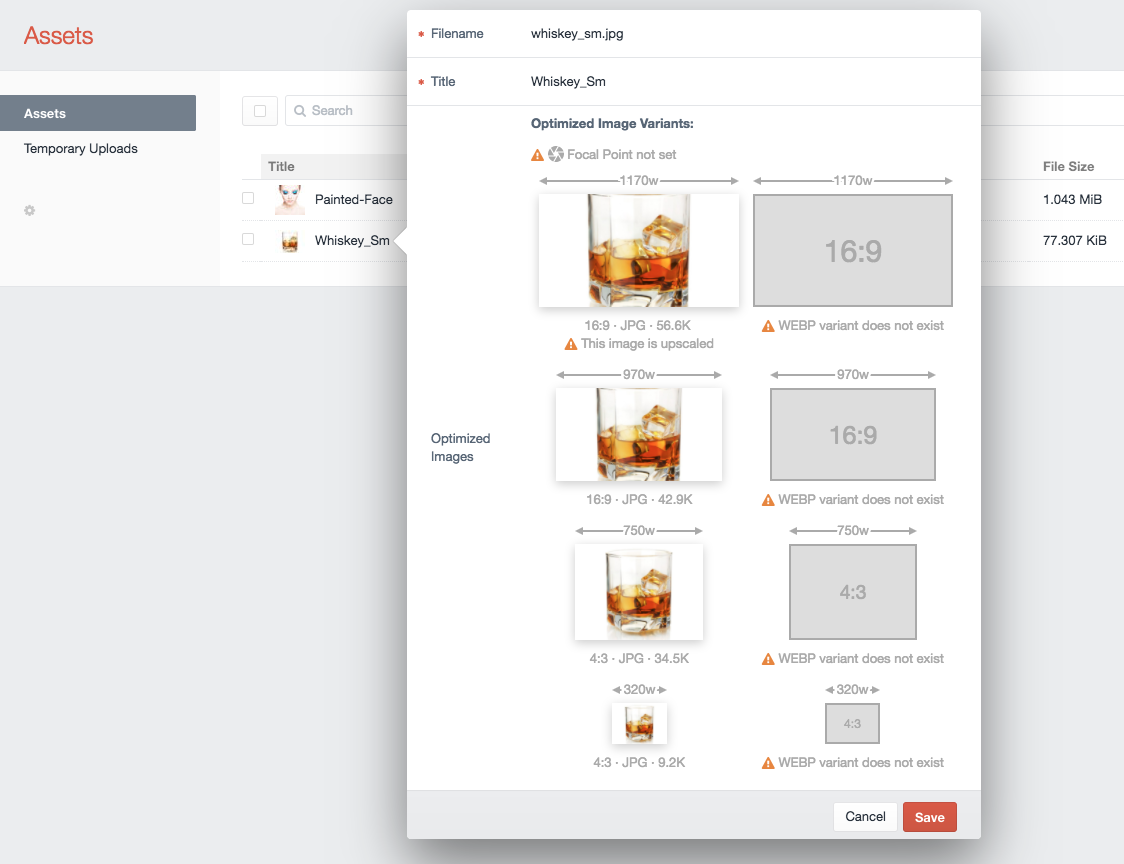
The OptimizedImages field also helps content editors by pointing out potential problems as well:
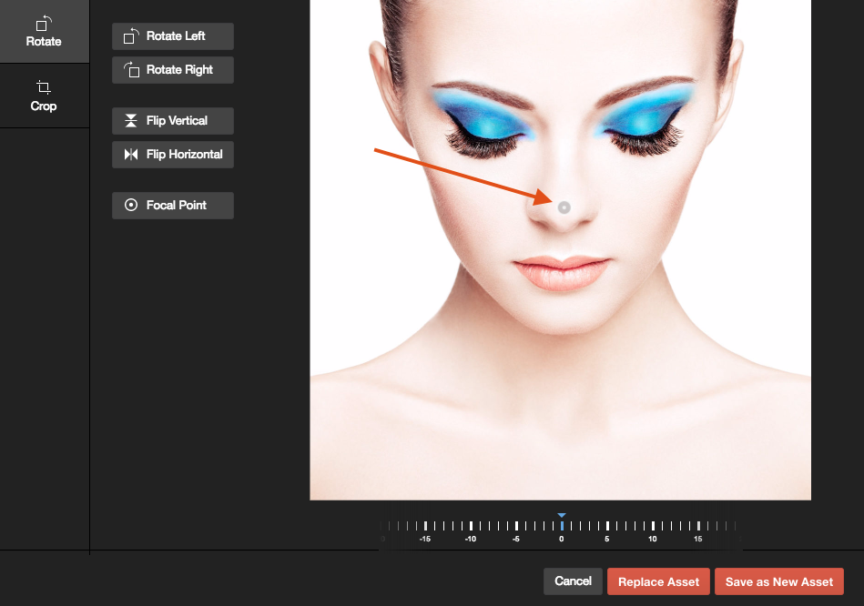
In this example, no Focal Point has been set via Craft 3's built-in image editor. The Focal Point lets content editors choose what portion of the image is most important, and should be kept in the center of any transformed images:
There are also warnings indicating that the original image is too small, and is being upscaled for one of the responsive variants, and that WEBP hasn't been configured, so there are no .webp variants created.
ImageOptimize makes it easy to create responsive images in your frontend templates. There are two primary ways to create responsive images: using the <img srcset=""> element or using the <picture> element.
To use <img srcset=""> elements in your templates, you can just do:
    {% set someAsset = entry.myAssetField %}
    <img src="{{ someAsset.one().optimizedImages.src() }}"
         srcset="{{ someAsset.one().optimizedImages.srcset() }}"
         sizes="100vw" />
...where someAsset is your Assets field handle, and optimizedImages is the handle to your OptimizedImages field. This will result in HTML like this being generated for you:
    <img src="/assets/_1170x658_crop_center-center/painted-face.jpg"
         srcset="/assets/_1170x658_crop_center-center/painted-face.jpg 1170w,
                 /assets/_970x545_crop_center-center/painted-face.jpg 970w,
                 /assets/_750x562_crop_center-center/painted-face.jpg 750w,
                 /assets/_320x240_crop_center-center/painted-face.jpg 320w"
                 sizes="100vw" />
The .src() method simply displays the first responsive image variant, and is typically just used as a fallback for browsers that don't support srcset.
The .srcset() method displays all of the responsive image variants, with their associated source widths.
The sizes attribute here is a simple one that just matches the browser's width, but you can use any media query you like (and typically would have it match your CSS media query breakpoints or container sizes). For information on how srcset works, check out the excellent Responsive Images 101, Part 5: Sizes article.
If you're using the LazySizes JavaScript for lazy image loading, your template code would look like this:
    {% set someAsset = entry.myAssetField %}
    <img src="{{ someAsset.one().optimizedImages.placeholderBox() }}"
         data-srcset="{{ someAsset.one().optimizedImages.srcset() }}"
         data-sizes="100vw" />
To use <picture> in your templates, you can just do:
    {% set someAsset = entry.myAssetField %}
    <picture>
        <sources srcset="{{ someAsset.one().optimizedImages.srcsetWebP() }}"
                 sizes="100vw"
                 type="image/webp" />
        <img src="{{ someAsset.one().optimizedImages.src() }}"
             srcset="{{ someAsset.one().optimizedImages.srcset() }}"
             sizes="100vw" />
     </picture>
...where someAsset is your Assets field handle, and optimizedImages is the handle to your OptimizedImages field. This will result in HTML like this being generated for you:
    <picture>
        <sources srcset="/assets/_1170x658_crop_center-center/painted-face.jpg.webp 1170w,
                         /assets/_970x545_crop_center-center/painted-face.jpg.webp 970w,
                         /assets/_750x562_crop_center-center/painted-face.jpg.webp 750w,
                         /assets/_320x240_crop_center-center/painted-face.jpg.webp 320w"
                 sizes="100vw"
                 type="image/webp" />
        <img src="/assets/_1170x658_crop_center-center/painted-face.jpg"
             srcset="/assets/_1170x658_crop_center-center/painted-face.jpg 1170w,
                     /assets/_970x545_crop_center-center/painted-face.jpg 970w,
                     /assets/_750x562_crop_center-center/painted-face.jpg 750w,
                     /assets/_320x240_crop_center-center/painted-face.jpg 320w"
                     sizes="100vw" />
    </picture>
This assumes you have WEBP image variants configured. This lets the browser choose what to display, if it can handle .webp, it'll pick that (because .webp images are far more efficient than .jpg images), otherwise it'll just use the regular image.
The sizes attribute here is a simple one that just matches the browser's width, but you can use any media query you like (and typically would have it match your CSS media query breakpoints or container sizes). For information on how <picture> works, check out the excellent Responsive Images 101, Part 6: Picture Element article.
If you're using the LazySizes JavaScript for lazy image loading, your template code would look like this:
    {% set someAsset = entry.myAssetField %}
    <picture>
        <sources data-srcset="{{ someAsset.one().optimizedImages.srcsetWebP() }}"
                 data-sizes="100vw"
                 type="image/webp" />
        <img src="{{ someAsset.one().optimizedImages.placeholderBox() }}"
             data-srcset="{{ someAsset.one().optimizedImages.srcset() }}"
             data-sizes="100vw" />
     </picture>
If you need separate srcsets to match your media queries, you can use:
{{ someAsset.one().optimizedImages.srcsetWidth(970) }}
{{ someAsset.one().optimizedImages.srcsetWidthWebP(970) }}
...to output all variants that exactly match the passed in width (which could be more than one, if you have set up 2x or 3x retina variants).
To mimic the min-width media query, you can do:
{{ someAsset.one().optimizedImages.srcsetMinWidth(970) }}
{{ someAsset.one().optimizedImages.srcsetMinWidthWebP(970) }}
...to output all variants that match the passed in width or are larger than the passed in width (which also includes any 2x or 3x retina variants).
To mimic the max-width media query, you can do:
{{ someAsset.one().optimizedImages.srcsetMaxWidth(970) }}
{{ someAsset.one().optimizedImages.srcsetMaxWidthWebP(970) }}
...to output all variants that match the passed in width or are smaller than the passed in width (which also includes any 2x or 3x retina variants).
Image Optimize offers three different flavors of placeholder images you can display while the actual image is being lazy loaded via lazysizes.
All of the placeholder images are stored in the Optimized Image field itself, so no http request is needed to fetch it, and the inline data used to generate them is very small.
The first is .placeholderBox() which displays a simple inline SVG with the background color set to the dominant color of the image:
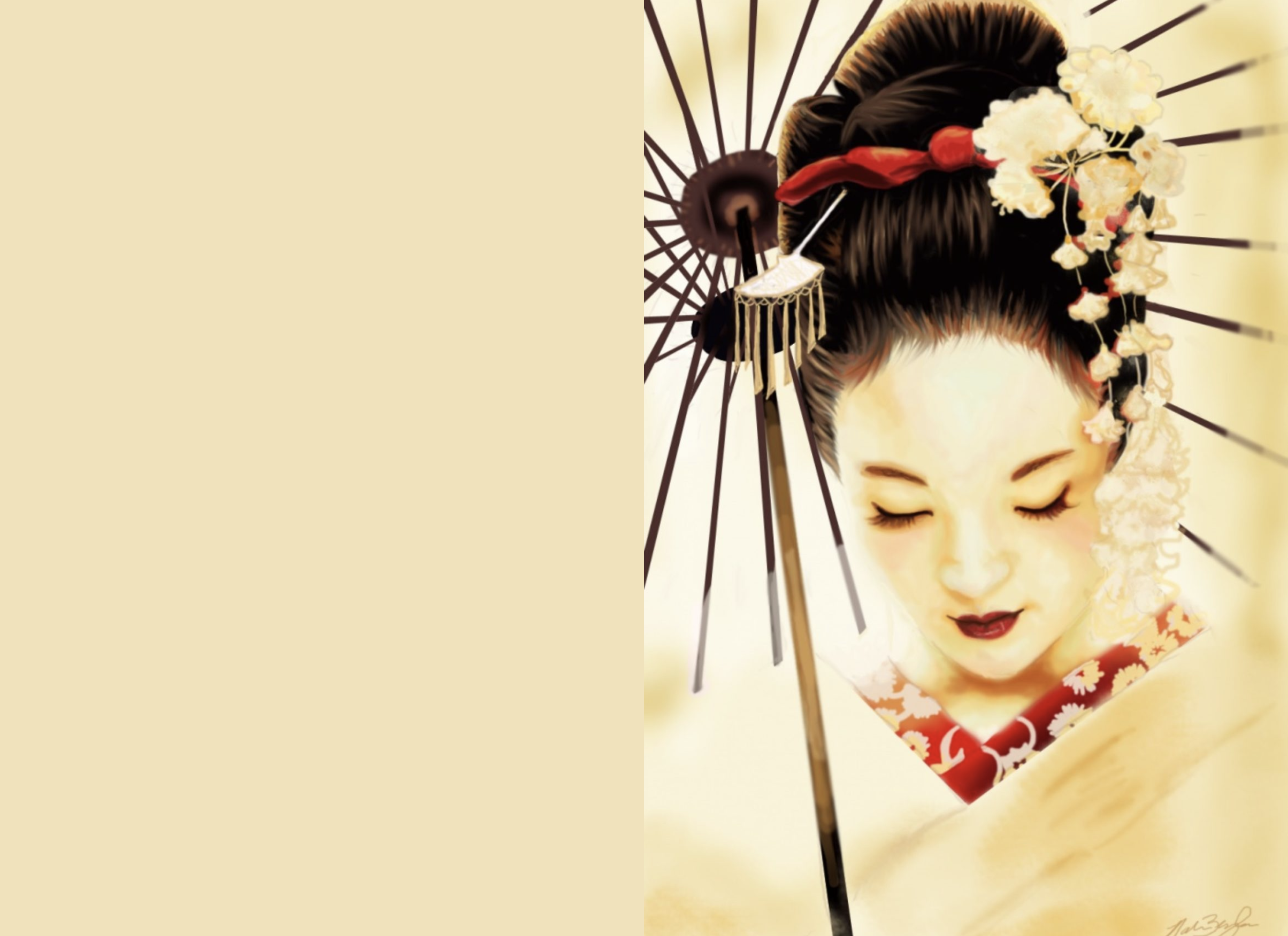 (Placholder on the left, actual image on the right)
The second is .placeholderSilhouette() which displays an inline SVG silhouette generated from the original image:
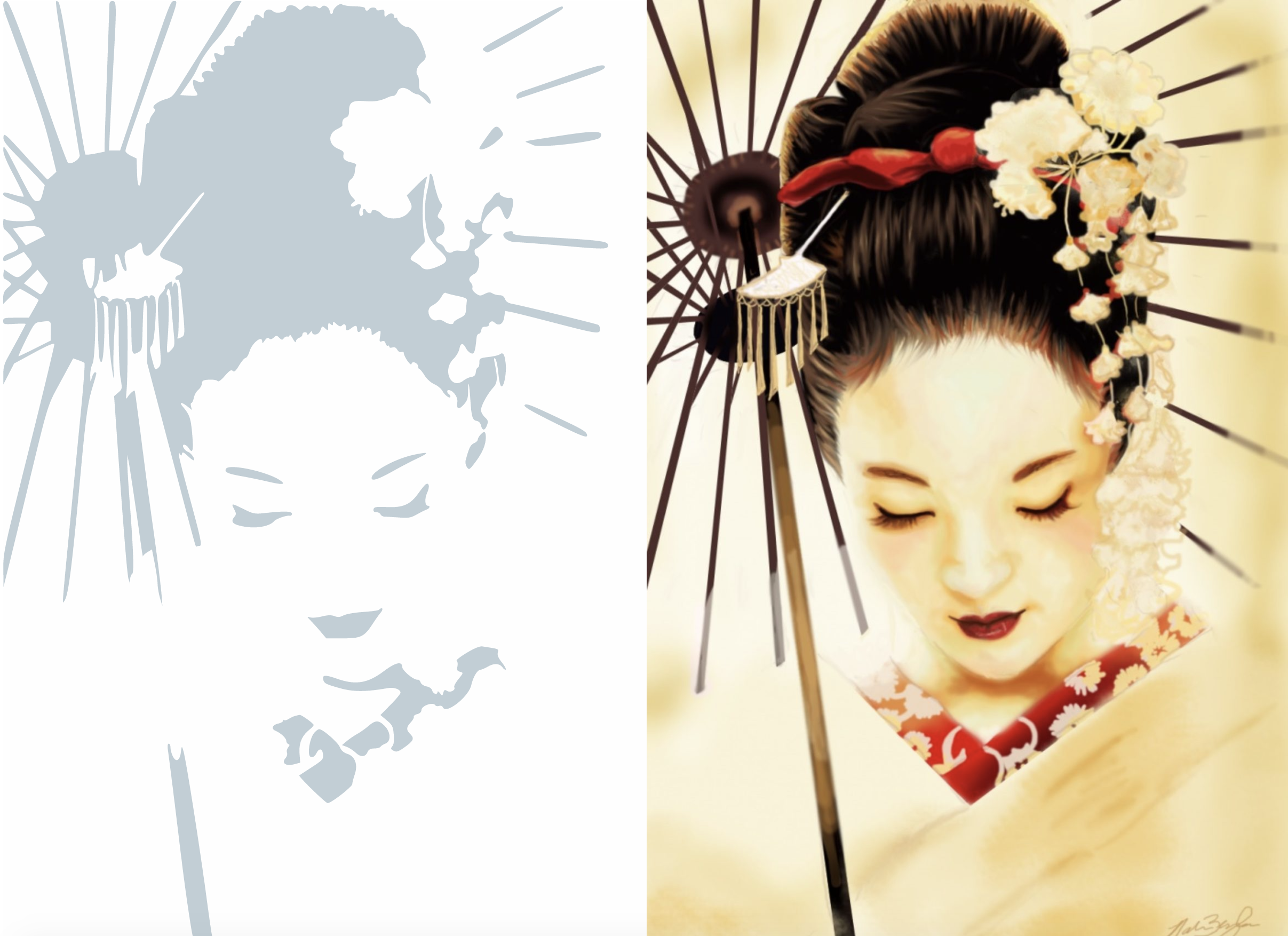 (Placholder on the left, actual image on the right)
The SVG image itself will only be 300px wide, so apply CSS styles to it such as:
.responsive-img {
    width: 100%;
    height: auto;
}
The third is .placeholderImage(), which displays a tiny Instagram-style low resolution placeholder image to display while the image is being lazy loaded.
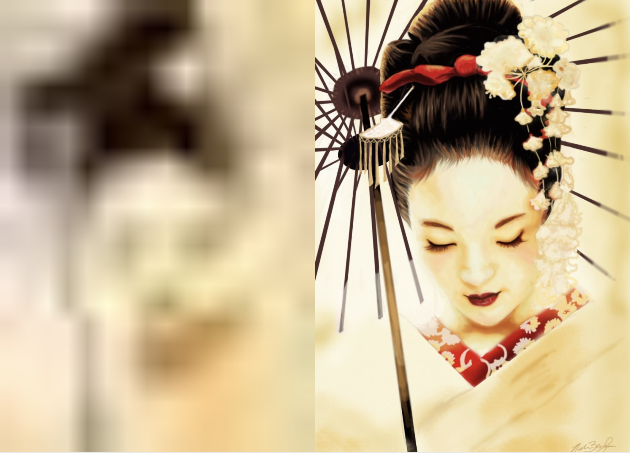 (Placholder on the left, actual image on the right)
The image itself will only be 16px wide, so apply CSS styles to it such as:
.responsive-img {
    width: 100%;
    height: auto;
}
For extra visual lusciousness, you could also apply a CSS blur filter to the .lazyload class.
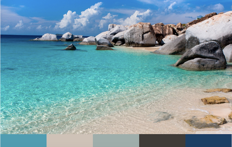
ImageOptimize extracts a color palette composed of the 5 most dominant colors used by an image that you can access from your templates:
    {% set someAsset = entry.myAssetField %}
    {% for color in someAsset.optimizedImages.colorPalette %}
        <div style="background-color: {{ color }}">
        </div>
    {% endfor %}
Dominant Color Palette
These colors are sorted by color dominance, and can be used to style other HTML elements with complimentary colors.
Should you want to iterate through the URLs individually, you can do that via:
    {% set someAsset = entry.myAssetField %}
    {% for url in someAsset.optimizedImages.optimizedImageUrls %}
        {{ url }}
    {% endfor %}
    {% for url in someAsset.optimizedImages.optimizedWebPImageUrls %}
        {{ url }}
    {% endfor %}
Or to get the width as well as the url, you can do:
    {% set someAsset = entry.myAssetField %}
    {% for width,url in someAsset.optimizedImages.optimizedImageUrls %}
        {{ width ~ ' - ' ~ url }}
    {% endfor %}
    {% for width,url in someAsset.optimizedImages.optimizedWebPImageUrls %}
        {{ width ~ ' - ' ~ url }}
    {% endfor %}
Once ImageOptimize is set up and configured, there's nothing left to do for optimizing your image transforms. It just works.
If you have devMode on, ImageOptimize will log stats for images that it optimizes, e.g.:
2017-03-12 07:49:27 [192.168.10.1][1][-][info][nystudio107\ImageOptimize\services\Optimize::handleGenerateTransformEvent] zappa.png -> Original: 129.5K, Optimized: 100.8K -> Savings: 28.4%
ImageOptimize can also automatically create image variants for transformed images. Whenever an image transform is created, ImageTransform can create the same image in multiple file formats.
This is especially useful when implementing webp images, so that you can make .webp images available to browsers that support them, while falling back on traditional .png and .jpg images for browsers that don't.
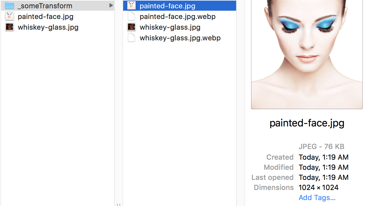
Here's an example of what it looks like for images with the transform Some Transform applied to them:
The savings from using .webp can be significant, without sacrificing image quality:
webp also supports transparency, so it can be used as a viable substitute for both .jpg and .png
For .webp image variants, the suffix .webp is simply added to the name of the transformed image, so painted-face.jpg becomes painted-face.jpg.webp. So you can display the URL via {{ entry.someAsset.one().getUrl('someTransform') ~ '.webp' }}
To serve up .webp variant images, you can either use the HTML5 <picture> element to let browser choose what to display, or you can have your web server serve them up automatically. Some CDNs even support serving up .webp images automatically.
If you have devMode on, ImageOptimize will log stats for images that it creates variants for, e.g.:
2017-09-10 07:28:23 [192.168.10.1][1][-][info][nystudio107\imageoptimize\services\Optimize::createImageVariants] painted-face_170903_02341359b54c06c953b6.23303620.jpg -> painted-face_170903_02341359b54c06c953b6.23303620.jpg.webp -> Original: 36.9K, Variant: 12.8K -> Savings: 65.3%
Some things to do, and ideas for potential features:
- Consider supporting image optimization services like Cloudinary, TinyPNG, kraken.io, Uploadcare, and ImageOptim
- Add support for additional image optimization tools
Brought to you by nystudio107
