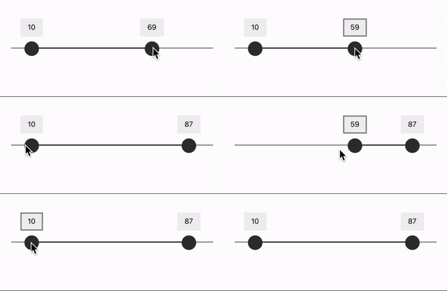
A slider that supports assistive devices, like screen readers, out of the box.
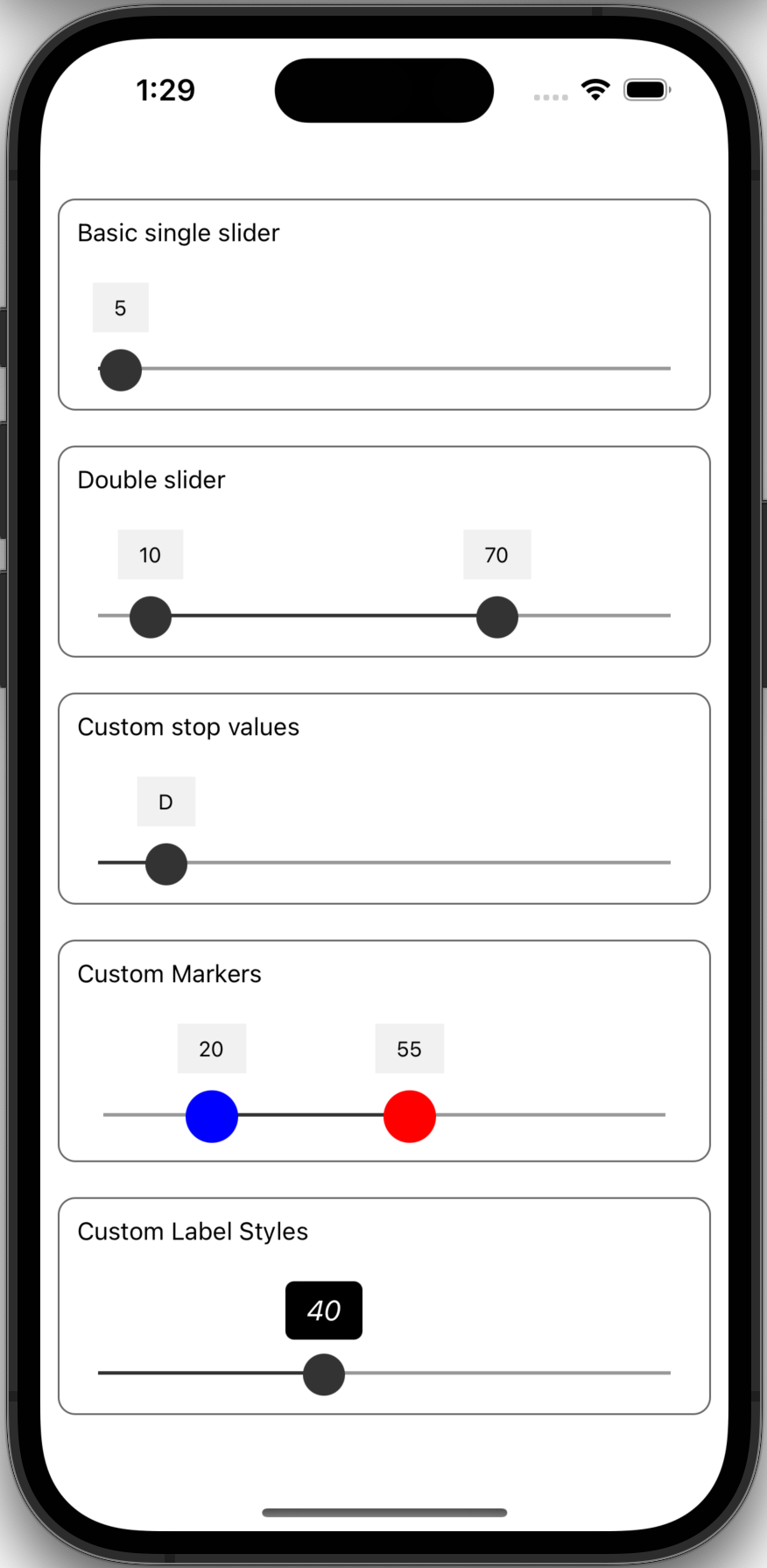
The slider can be setup to either have a single value or define a two value range (min/max).
yarn add react-native-a11y-slideror
npm install -S react-native-a11y-sliderCreates a basic slider that with a min/max slider and a total range from 1 to 100.
import Slider from "react-native-a11y-slider";

function Example() {
  return <Slider min={1} max={100} values={[10, 87]} />;
}| Prop name | Default | Type | Description |
|---|---|---|---|
| values | [0] | number[] |
The initial values of the sliders. If the array has two values, there will be two slider markers |
| min | number |
The minimum value of the slider scale | |
| max | number |
The max value of the slider scale | |
| increment | 1 | number |
If min and max are defined, this is the increment between slider steps |
| sliderValues | number[] |
Hardcode the slider step values. If this is used, min and max are ignored |
|
| markerColor | #333333 |
'string' | The hex color to use for the slider marker thumb |
| style | ViewStyle |
The style to apply to the slider container | |
| trackStyle | ViewStyle |
The style to apply to the slider track | |
| labelStyle | ViewStyle |
The style to apply to the floating label | |
| labelTextStyle | ViewStyle |
The style to apply to the floating label text | |
| selectedTrackStyle | ViewStyle |
The style to apply to the selected section of the slider track | |
| showLabel | true |
boolean |
Show the floating marker label over the slider marker |
| onChange | (values) => void | Fired when the slider value changes | |
| onSlidingStart | (type) => void | Fired when one of the markers starts to be dragged | |
| onSlidingComplete | (type) => void | Fired when one of the markers finishes being dragged | |
| labelComponent | src/Label |
Component | The component used for the floating marker label |
| markerComponent | srv/Marker |
Component | The component used for the marker thumb. Note, this needs to have a static size property. (see below) |
| setA11yMarkerProps | Function | Customize the accessibility values (see below) | |
| hitSlop | Insets | Defines how far a touch event can start away from the marker |
You can customize the marker dot (also known as a "thumb") by passing a custom Marker Component in the props.
NOTE: In order for the slider to know how to calculate steps without unnecessary rendering flashes, your component MUST define a static size property.
You can use Marker.tsx as an example
import React from "react";
import { View } from "react-native";
import { MarkerProps } from "react-native-a11y-slider";

function MyMarker({ color }: MarkerProps) {
  return (
    <View
      style={{
        backgroundColor: "red",
        height: MyMarker.size,
        width: MyMarker.size,
      }}
    />
  );
}
Marker.size = 30;
export default MyMarker;
import Slider from "react-native-a11y-slider";
import MyMarker from "./MyMarker";
function SliderExample() {
return (
<Slider min={1} max={100} values={[10, 87]} markerComponent={MyMarker} />
);
}For a screen reader, each slider marker thumb will have the following accessibility attributes defined:
- accessibilityLabel
- accessibilityRole: 'adjustable'
- accessibilityValue
- min
- max
- now
- text
- accessibilityActions:
[{ name: "increment" }, { name: "decrement" }] - onAccessibilityAction:
<internal function>
(learn more about React Native accessibility attributes)
If you want to customize any of the values (except for accessibilityActions and onAccessibilityAction), you can define a setA11yMarkerProps callback function. This function will be called each time the marker is rendered or moved.
import React from "react";
import Slider, {
  MarkerType,
  setA11yMarkerPropsFunctionArgs,
} from "react-native-a11y-slider";
import MyMarker from "./MyMarker";

function DistanceSlider() {
  const setA11yProps = useCallback(
    ({ markerType, value, minValue, maxValue }: setA11yMarkerPropsFunctionArgs) => {

      let accessibilityLabel = "Min distance";
      if (markerType === MarkerType.UPPER) {
        accessibilityLabel = "Max distance";
      }

      const accessibilityValue = {
        min: minValue,
        max: maxValue,
        now: value,
        text: `${value} miles`,
      },

      return {
        accessibilityLabel,
        accessibilityValue
      };
    },
    []
  );

  return (
    <Slider
      min={1}
      max={100}
      values={[10, 87]}
      setA11yMarkerProps={setA11yProps}
    />
  );
}

