tsplot
This package provides a method of querying for raw time series data from the GCM APIs and additionally plotting that data for use in other applications.
This came to be due to what we consider a small limitation in the Google APIs which require us to re-draw graphs to include them in other applications such as Slack bots. There is no facility in the Google API that provides a PNG of already graphed data.
Authentication
This package makes no effort to assist in authentication to the Google APIs. Instead, it will expect the caller to supply an authenticated client.
More information on authentication can be found in the official Google Cloud documentation.
Query
tsplot helps to facilitate easy querying of the Google Cloud Monitoring API for time series matching the supplied criteria. In addition it provides methods of overriding certain aspects of the query.
For example, the following code snippet will return a single time series for the following metric descriptor: custom.googleapis.com/opencensus/fishnet/queuereader_fishnet/messages_total.
func main() {

    ... snip ...

    now := time.Now()
    mq := &tsplot.MetricQuery{
      Project: "bitly-gcp-prod"
      MetricDescriptor: "custom.googleapis.com/opencensus/fishnet/queuereader_fishnet/messages_total"
      StartTime: now.Add(-time.Hour * 2) // start two hours ago
      EndTime: now
    }


    // enable cross series reducer
    query.SetReduce(true)

    tsi, err := mq.PerformWithClient(client)
    if err != nil {
        fmt.Printf("error performing query: %v\n", err)
        os.Exit(1)
}
Plotting
To plot the data, tsplot leverages the open source package gonum/plot to create a graph and plot the data for a given time series.
The example below creates a new graph containing a singular time series, plots it, and saves the resulting plot to disk.
func main() {

    ... snip ...

    ts := tsplot.TimeSeries{}

    timeSeries, _ := tsi.Next()
    ts[metric] = ts.GetPoints()

    // create the plot with some formatting options
    p, err := ts.Plot([]tsplot.PlotOption{
      tsplot.WithXAxisName("UTC"),
      tsplot.WIthGrid(colornames.Darkgrey),
      tsplot.WithTitle(metric)}...)

    if err != nil {
      return err
    }

    // optionally save the plot to disk
    p.Save(8*vg.Inch, 4*vg.Inch, "./my-graph.png")
}
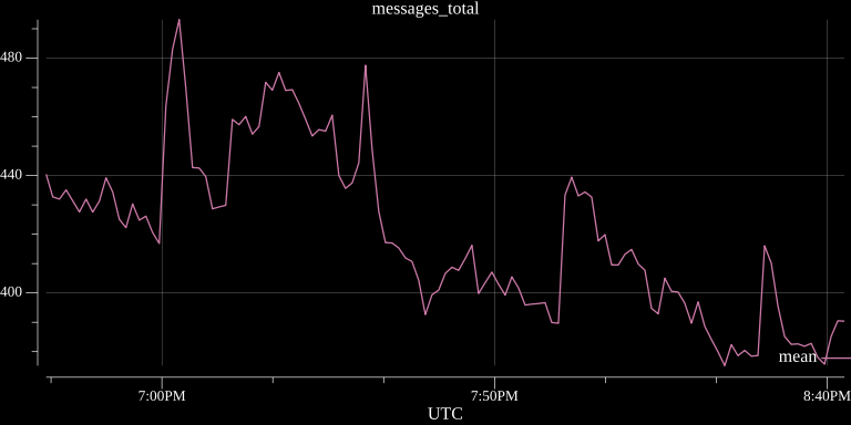
Example generated graphs:
Query across multiple time series with mean reducer:

Graph Color Scheme
I'm not a UX designer, but I have selected colors that I find higher contrast and easier to see. I am basing this completely off my colorblindness which is unique to me. Improvements to the color palette used are welcome.